utilitarian
19 designs
Showing 19 of 19 (19 total)
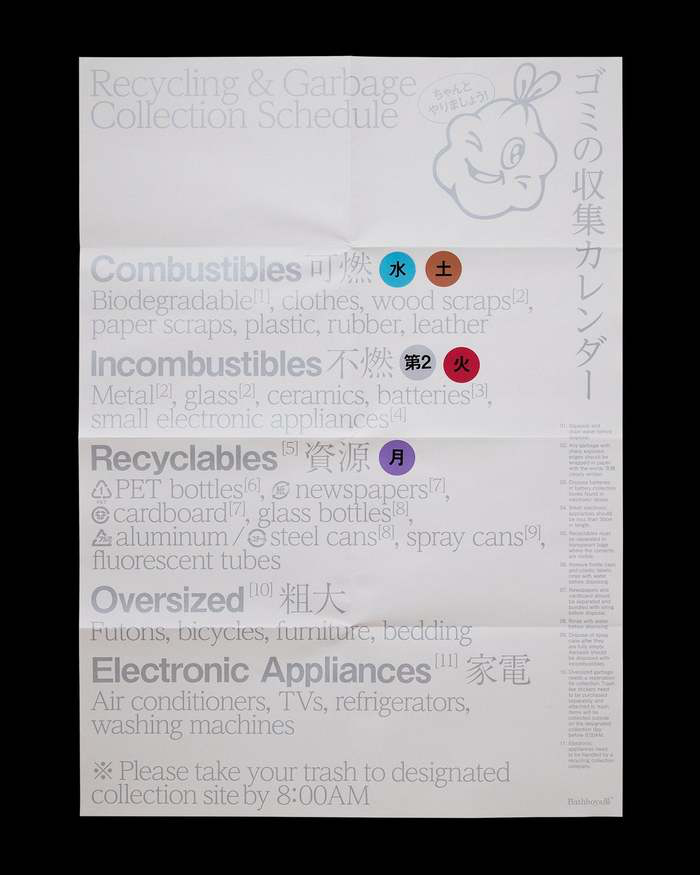
This image is a dense, highly functional informational document, likely a public guide or sorting instruction. The design prioritizes clear categorization and textual density over aesthetic appeal, resulting in a purely utilitarian visual language.
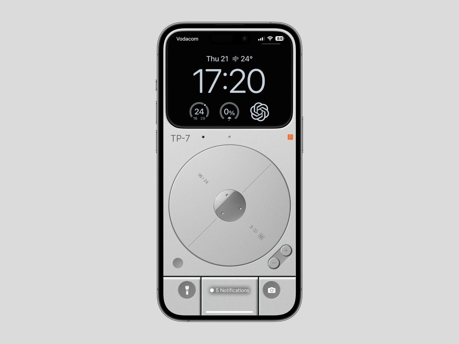
This design showcases a highly functional and minimalist approach to mobile interface design, prioritizing clear information hierarchy. The visual language relies on clean lines, ample negative space, and a monochromatic palette to ensure readability and a straightforward user experience.
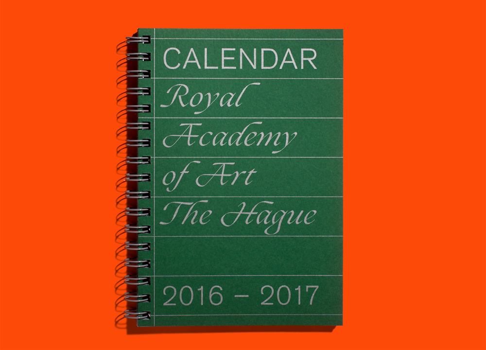
This image features a simple, utilitarian notebook cover with clean, serif typography set against a vibrant orange background. The design conveys a sense of academic formality and organized record-keeping through its minimalist yet structured presentation.
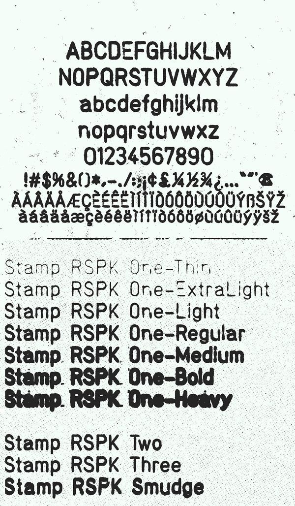
This image presents a stark, utilitarian display of alphanumeric characters and various stamp variations, suggesting a technical or archival context. The design relies heavily on simple, high-contrast text to convey specific designations and weights.
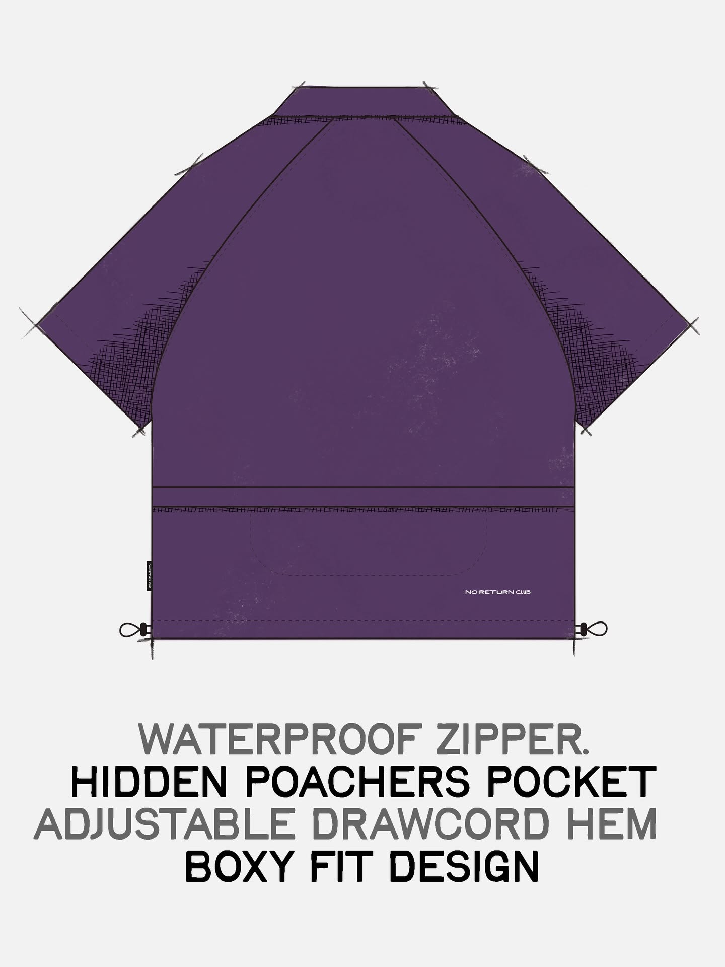
This image showcases the back view of a garment, likely a jacket or bag, emphasizing functional details like a waterproof zipper and pocket. The design is minimalist and utilitarian, focusing on clean lines and practical features.
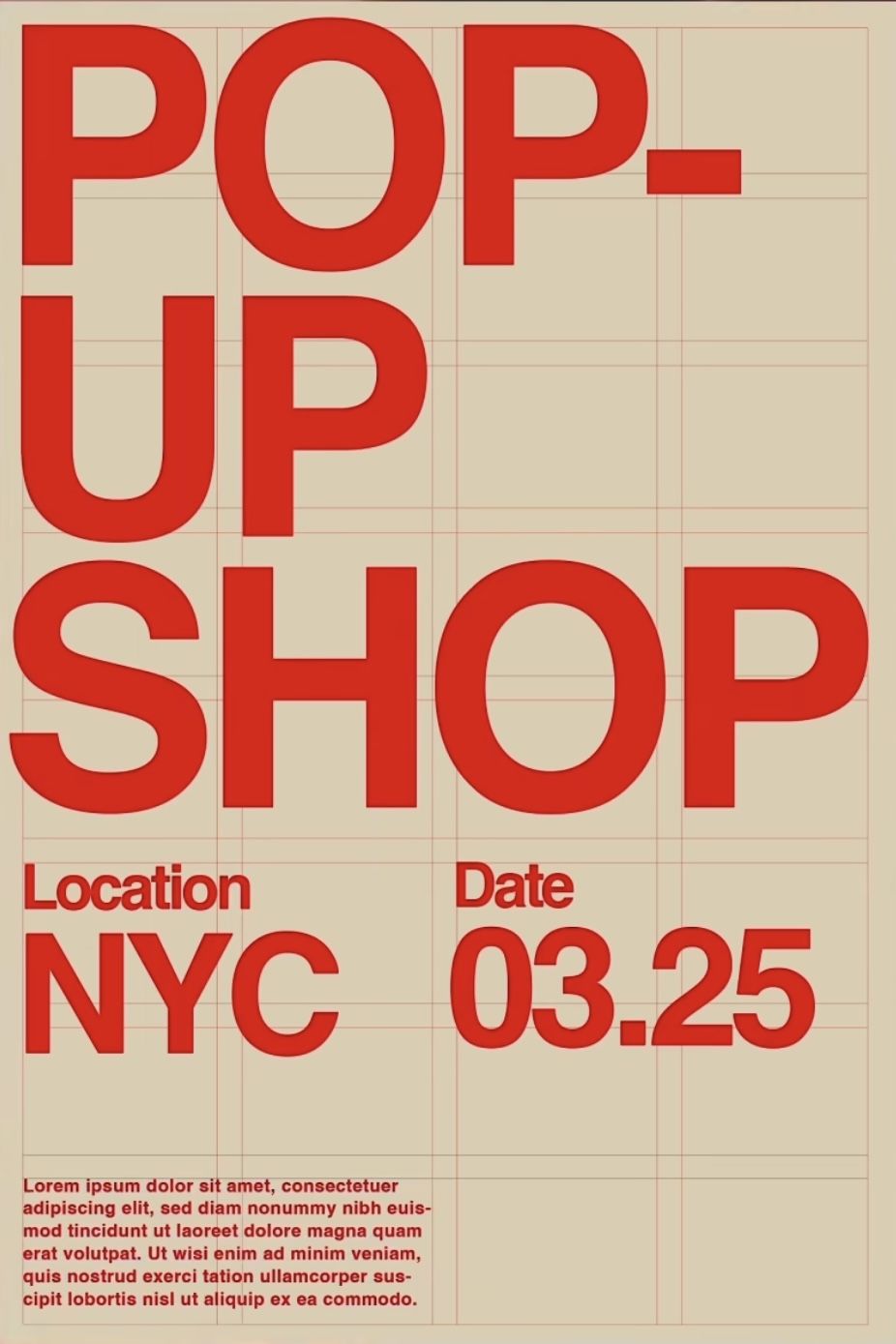
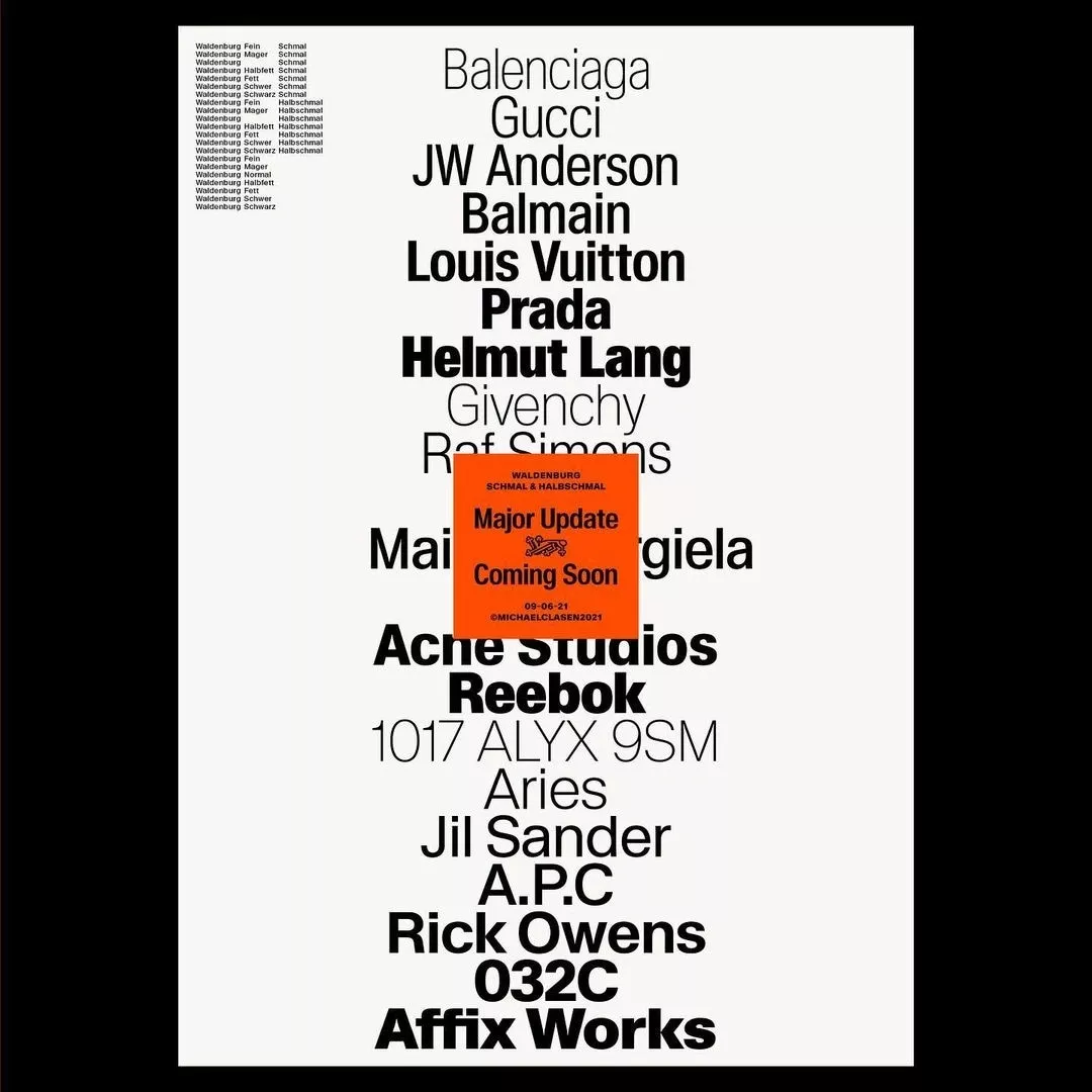
This poster utilizes a bold, high-contrast design with large, sans-serif typography set against a subtle grid background. The visual language is direct and utilitarian, relying on strong color blocking to emphasize the main subject matter.
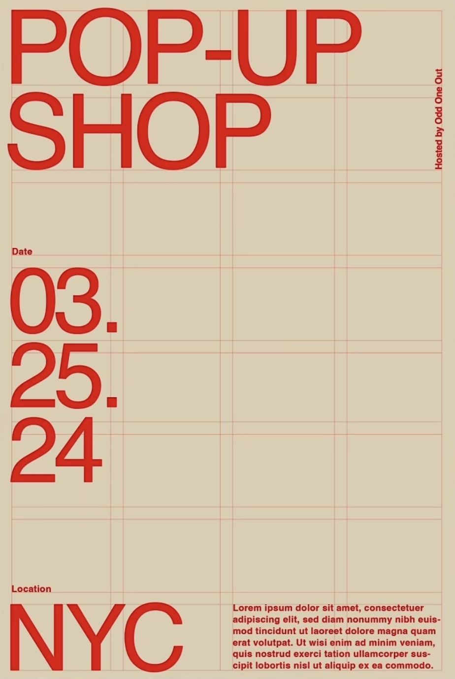
The design is minimalist and functional, utilizing a light, muted background with bold, high-contrast red typography to convey an urgent and direct message. The layout is structured using faint grid lines, lending a sense of organization and precision to the event details.
This is a simple, utilitarian identification tag featuring a solid, muted green background with clear white typography. The design relies on high contrast and minimalist elements to convey official branding in a straightforward manner.

A product photography display of three decorative carabiners or key straps arranged vertically, each featuring coordinated fabric bands with distinct color schemes and textured patterns. The design showcases functional accessories with a focus on material variety, combining leather, woven textiles, and patterned fabrics in a clean, minimalist presentation against a neutral background.
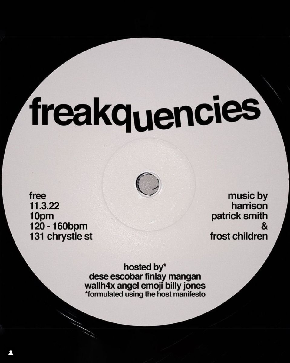
A minimalist vinyl record design featuring bold, experimental typography centered on a light gray circular label. The layout employs stark contrast and utilitarian design principles typical of underground electronic music culture, with event details distributed across the disc surface in a deliberately asymmetrical arrangement.
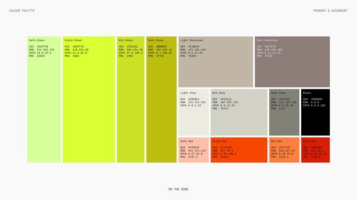
A systematic color palette reference chart displaying a curated selection of colors organized in vertical and horizontal arrangements. The design uses a minimalist, technical approach with small text annotations showing color codes and specifications for each swatch. The overall aesthetic is clean, functional, and designed for professional color selection and documentation.
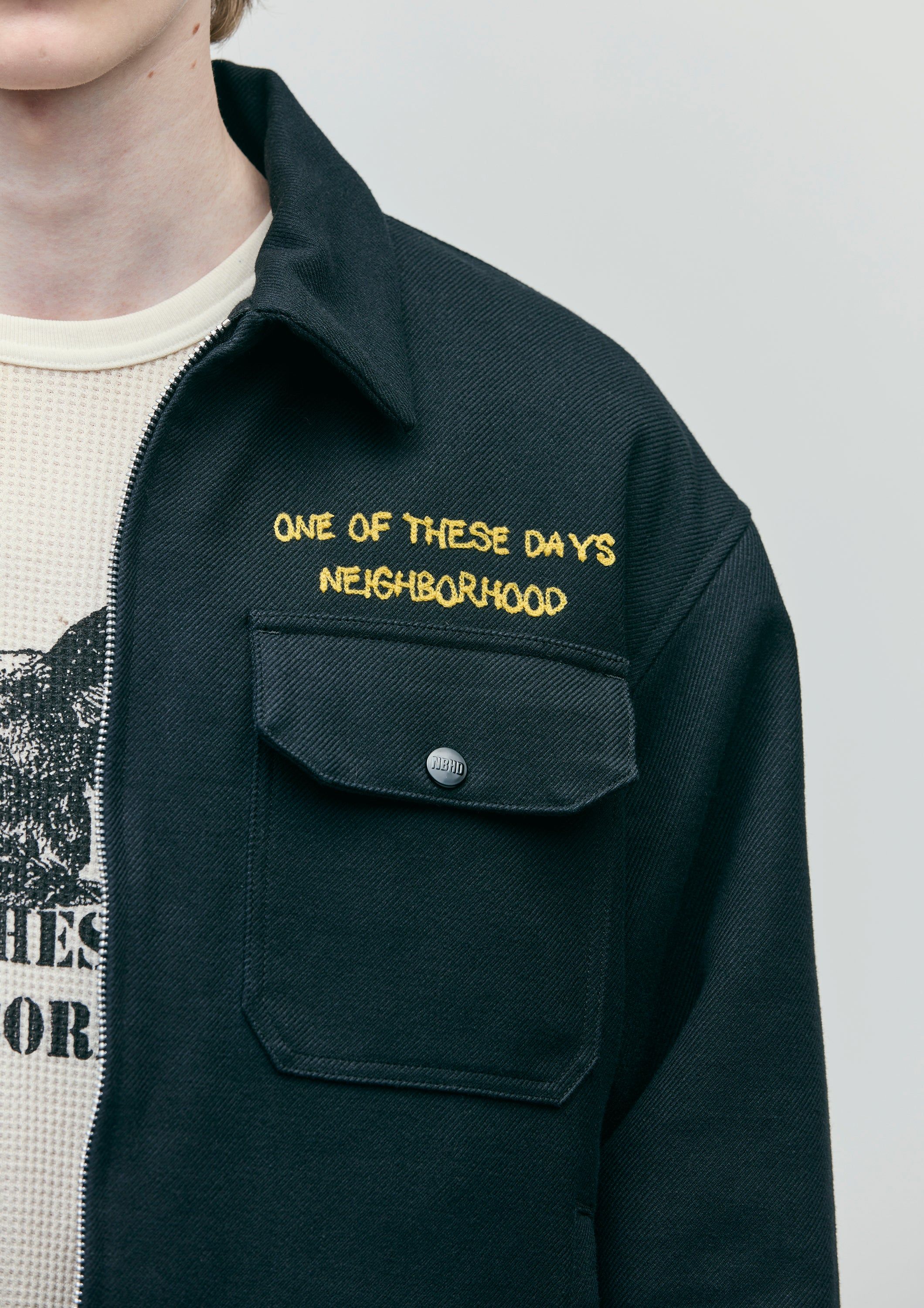
A contemporary streetwear-inspired overshirt featuring utilitarian design elements with embroidered text branding. The piece combines minimalist aesthetics with functional details, layered over a graphic tee, creating a casual yet intentional visual statement.
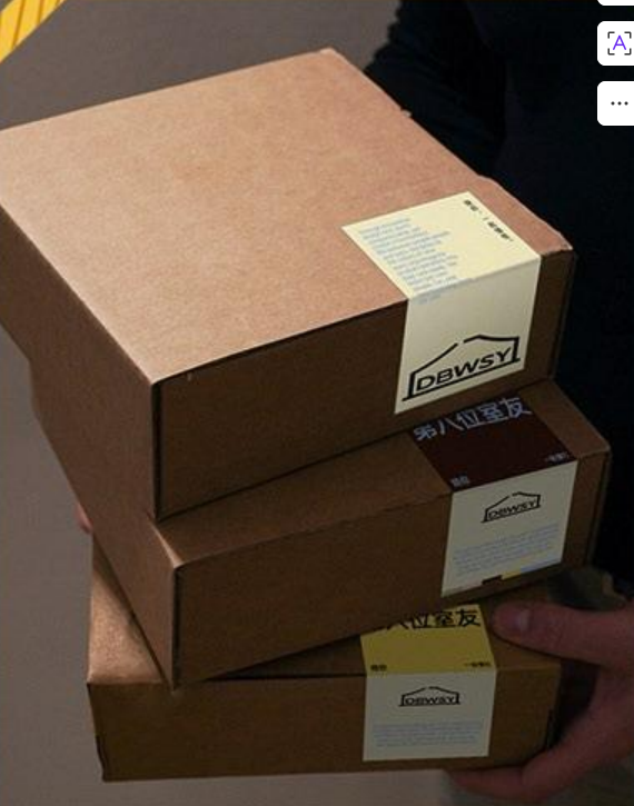
A stack of three kraft cardboard shipping boxes photographed in natural lighting, showcasing minimalist packaging design with simple label placement. The composition emphasizes texture, materiality, and functional industrial aesthetics with warm, earthy tones.
This image presents a stark, text-heavy list or directory format, characterized by a minimalist and utilitarian design. The layout relies entirely on stacked typography to convey information, resulting in a dense yet clean visual hierarchy.
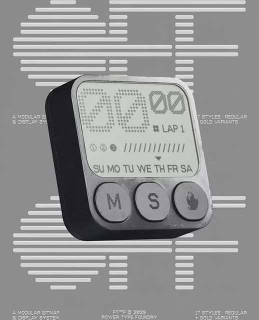
The image presents a close-up of a rugged, utilitarian electronic device, likely a field calculator or specialized tool. The design emphasizes function over form with a monochrome palette and clear, tactile controls, suggesting durability and precision engineering.

This is a minimalist, utilitarian electronic device featuring a clear digital display against a matte black casing. The design emphasizes function and readability through high contrast, resulting in a clean, modern, and robust aesthetic.
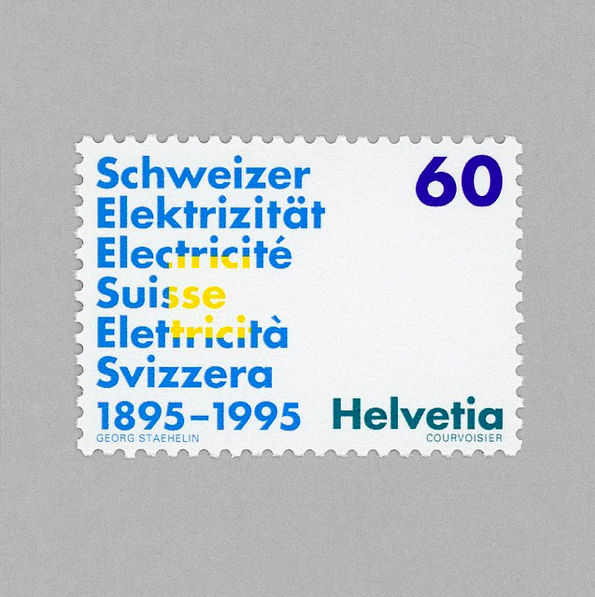
This design utilizes a clean, typographic layout typical of official commemorative stamps, pairing historical text about electricity and Swiss identity with institutional formatting. The visual language is structured and formal, relying on clear contrast between dark blue lettering and a subtle gray background to convey authority.
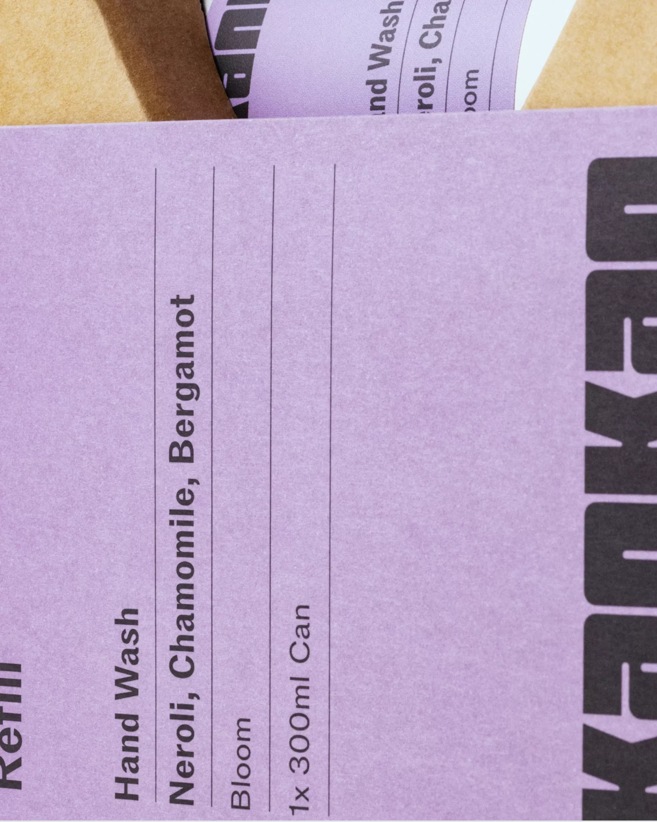
This design employs a clean, minimalist approach utilizing ample negative space and clear hierarchy to present product information in an organized, functional manner. The visual language is calm and professional, focusing entirely on readability and essential details.

This image features a minimalist, unstructured cap design rendered in neutral tones, emphasizing clean lines and simple texture. The visual language is quiet and utilitarian, relying on subtle details like the embroidered text to convey a sense of brand or identity.