line graph
5 designs
Showing 5 of 5 (5 total)

This is a minimalist line graph visualization set against a dark background, employing a vibrant green line to depict an upward trend. The design is clean, modern, and focuses purely on conveying a positive growth trajectory.
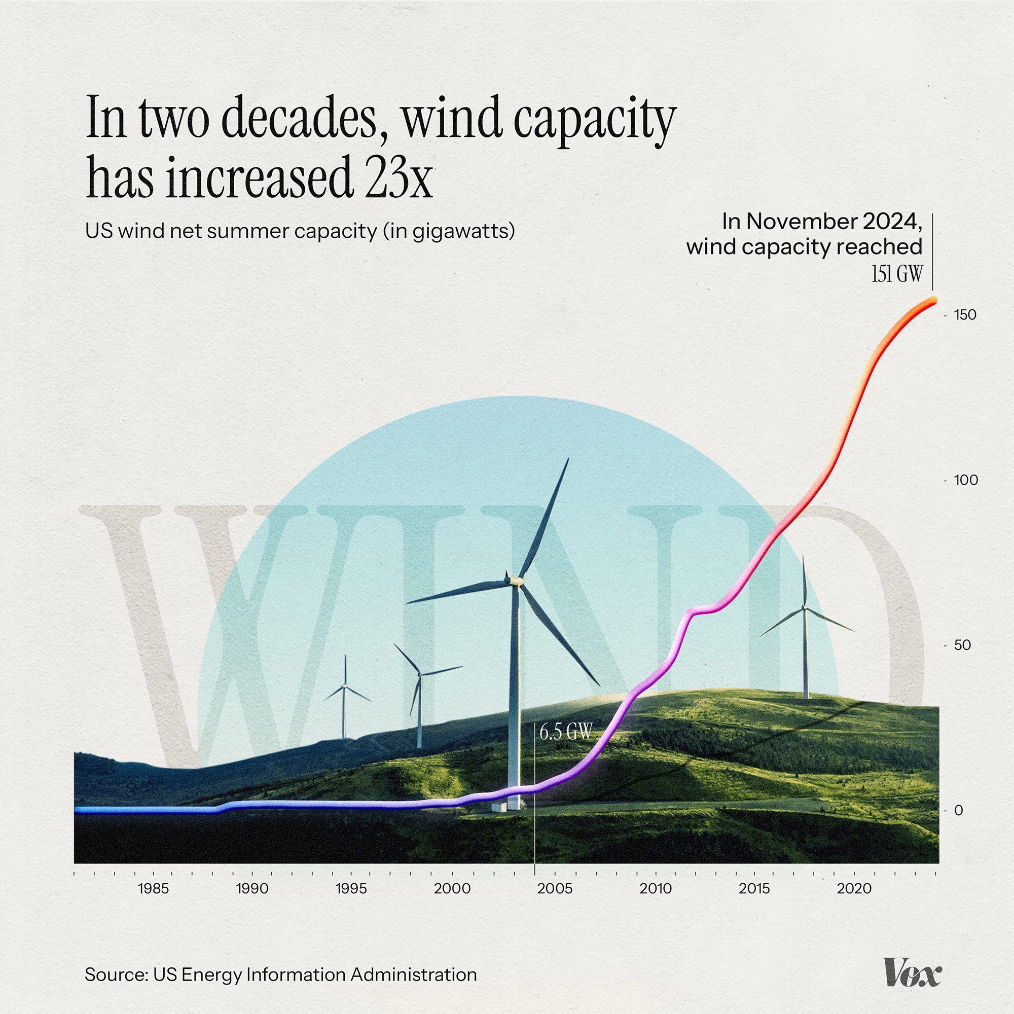
This is an infographic visualizing the exponential growth of US wind energy capacity over two decades, using a clean, modern line graph overlaid on a subtle landscape silhouette. The design effectively communicates a significant trend using clear data visualization principles.
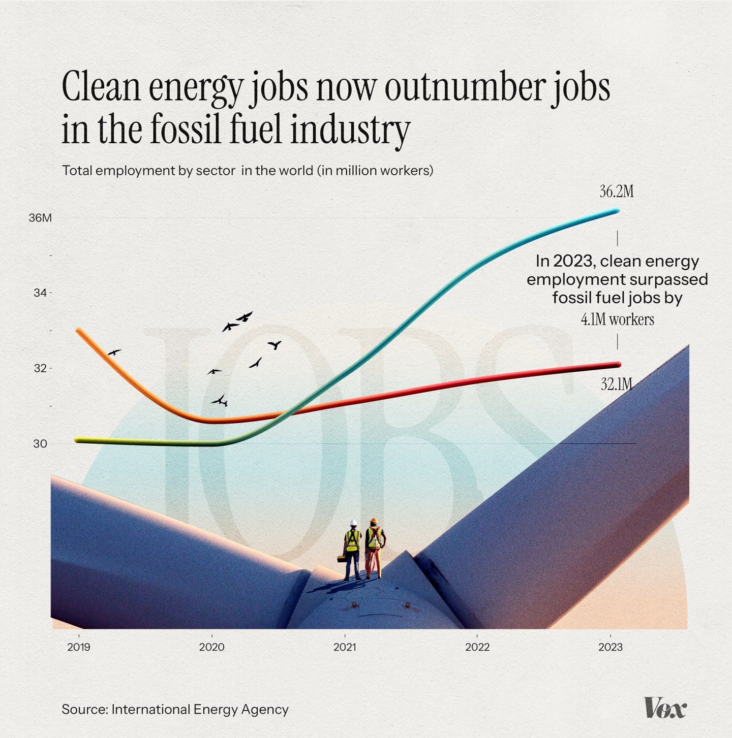
The infographic uses a clean, modern, and optimistic visual language to present data comparing job growth in the clean energy sector against the fossil fuel industry over time. The design relies on a simple line graph overlaid on a stylized landscape to create a narrative about transition and positive change.
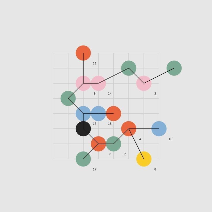
This is a scatter plot visualization using colored circles to represent data points, connected by lines to suggest relationships or sequences. The design is clean and minimalist, relying primarily on color and position to convey information.
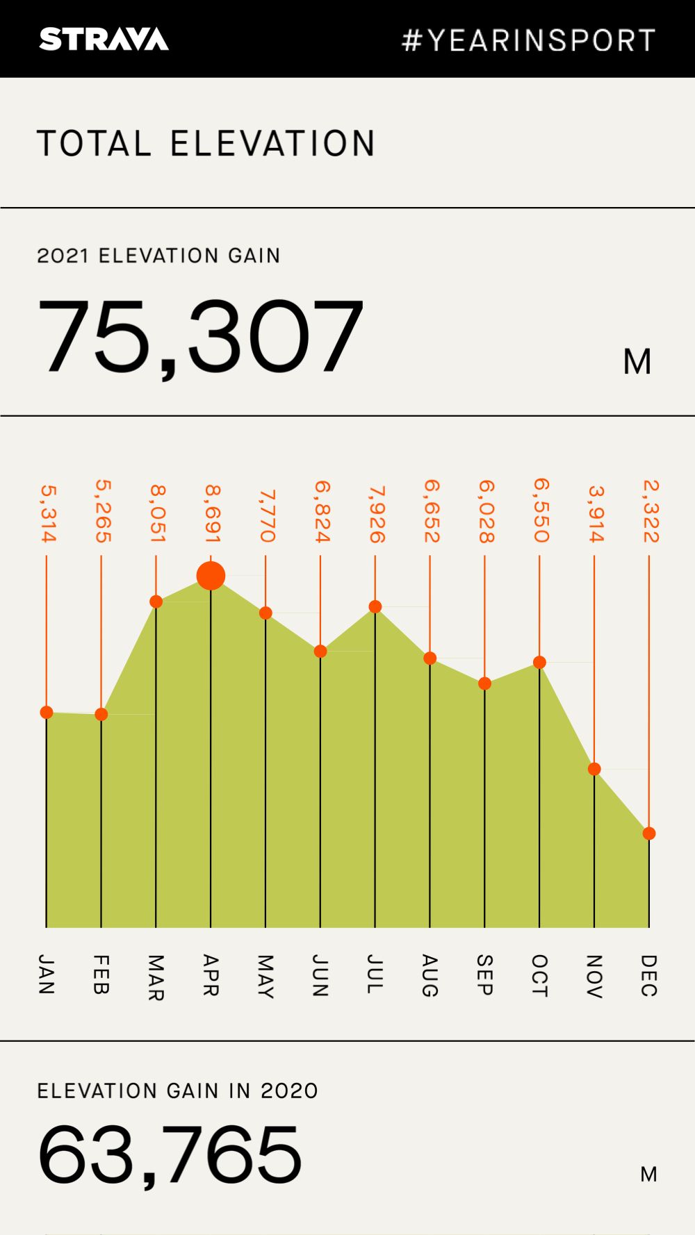
This is a data visualization screen, likely from a fitness tracking app, presenting elevation gain over the course of a year. The design is clean, minimalist, and functional, relying heavily on a simple bar chart to convey performance metrics clearly.