financial
22 designs
Showing 22 of 22 (22 total)
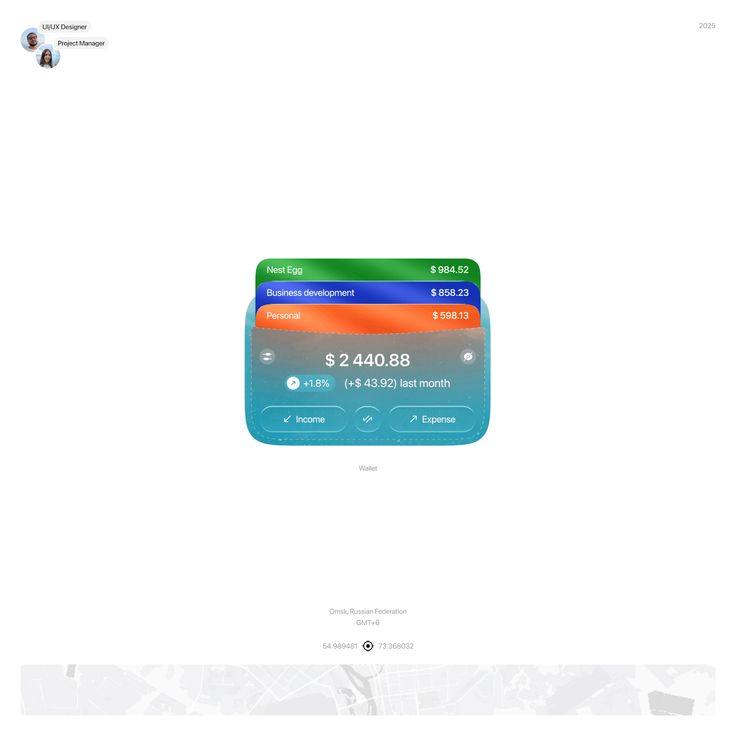
This interface presents a clean, modern data visualization style focused on financial tracking and budgeting. The design utilizes distinct color coding across segmented cards to clearly differentiate between various financial categories, resulting in a highly organized and accessible user experience.
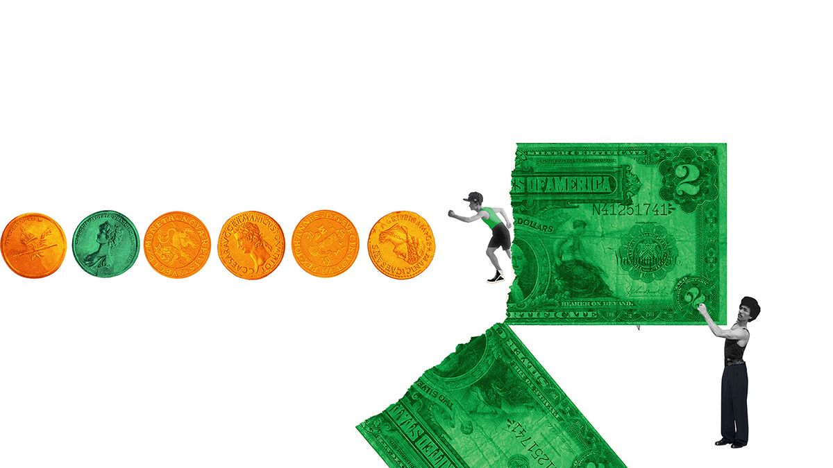
This graphic uses a striking juxtaposition of metallic gold elements and vibrant green currency to symbolize wealth, value, and finance. The visual language is clean and symbolic, employing a linear progression to guide the viewer from abstract representations of value to a tangible banknote.
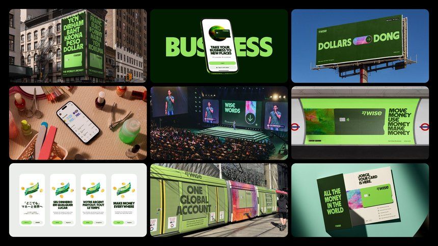
This image is a collage of various digital and physical representations related to finance, business, and currency exchange. The design is modern and direct, using high-contrast visuals to convey concepts related to money, investment, and global transactions.
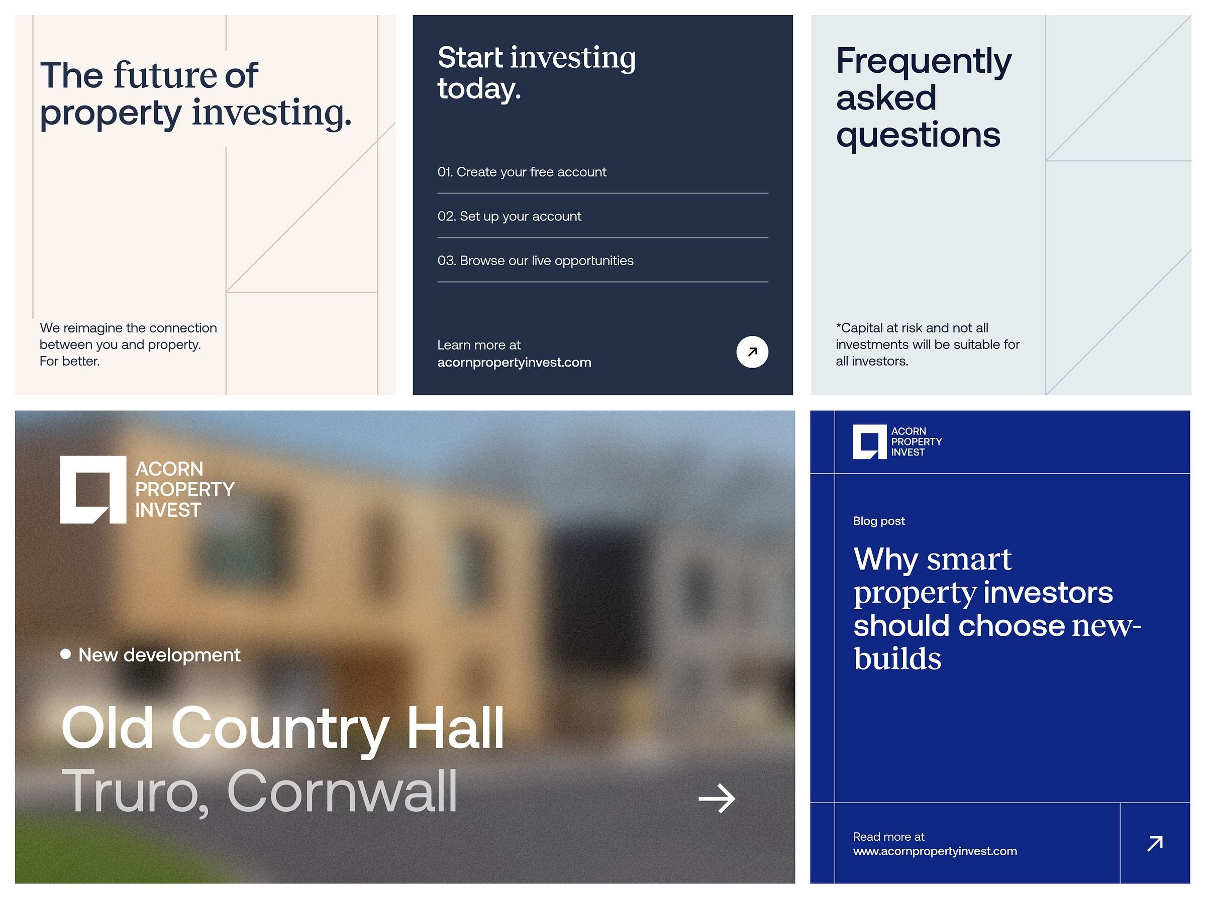
A professional financial services website layout featuring a modular grid design with clean typography and strategic use of white space. The design combines minimalist UI elements with lifestyle photography, presenting investment opportunities through a contemporary, corporate aesthetic.
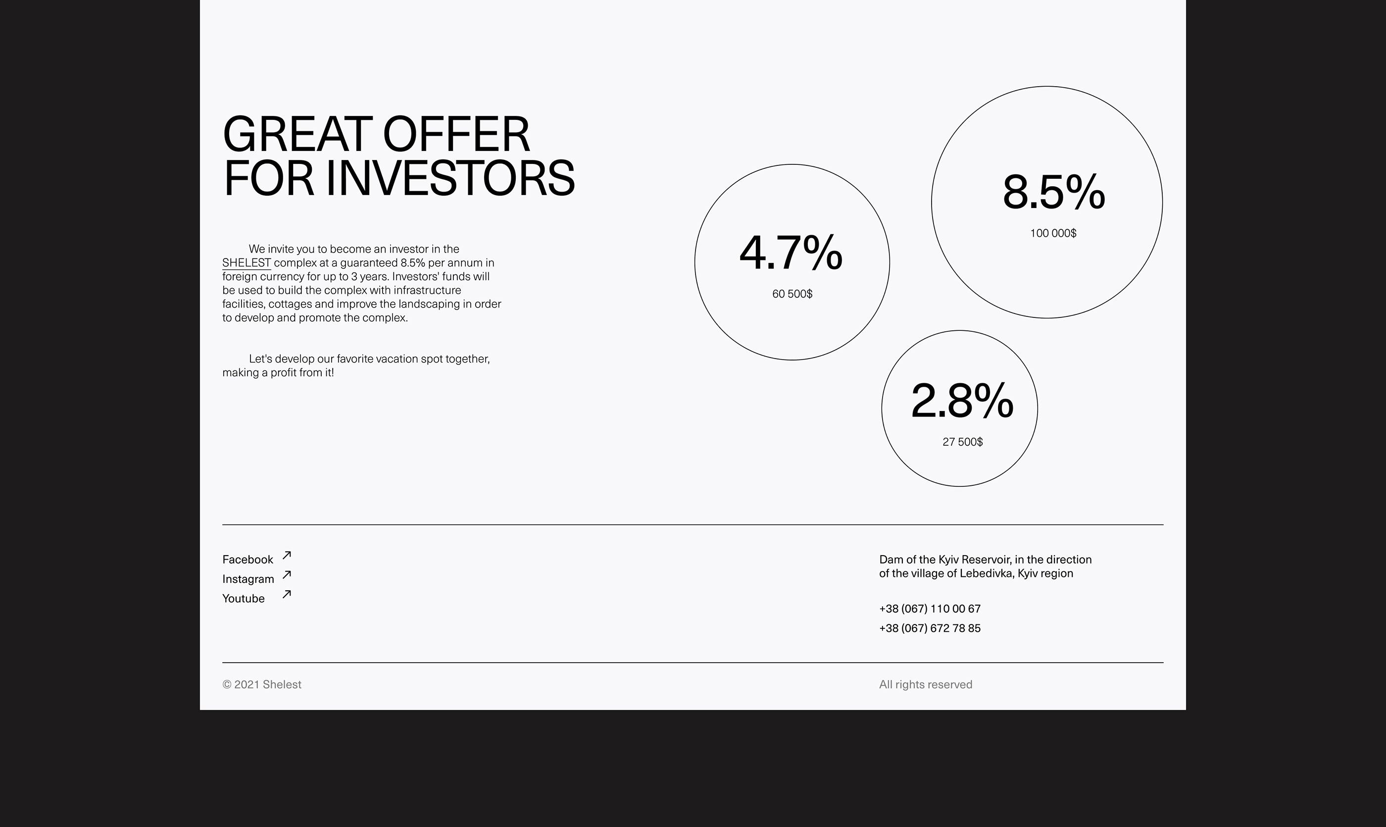
A minimalist financial presentation layout featuring bold typography and data visualization through circular percentage indicators. The design employs a clean, professional aesthetic with ample whitespace and a stark black-and-white color scheme that conveys trust and clarity.
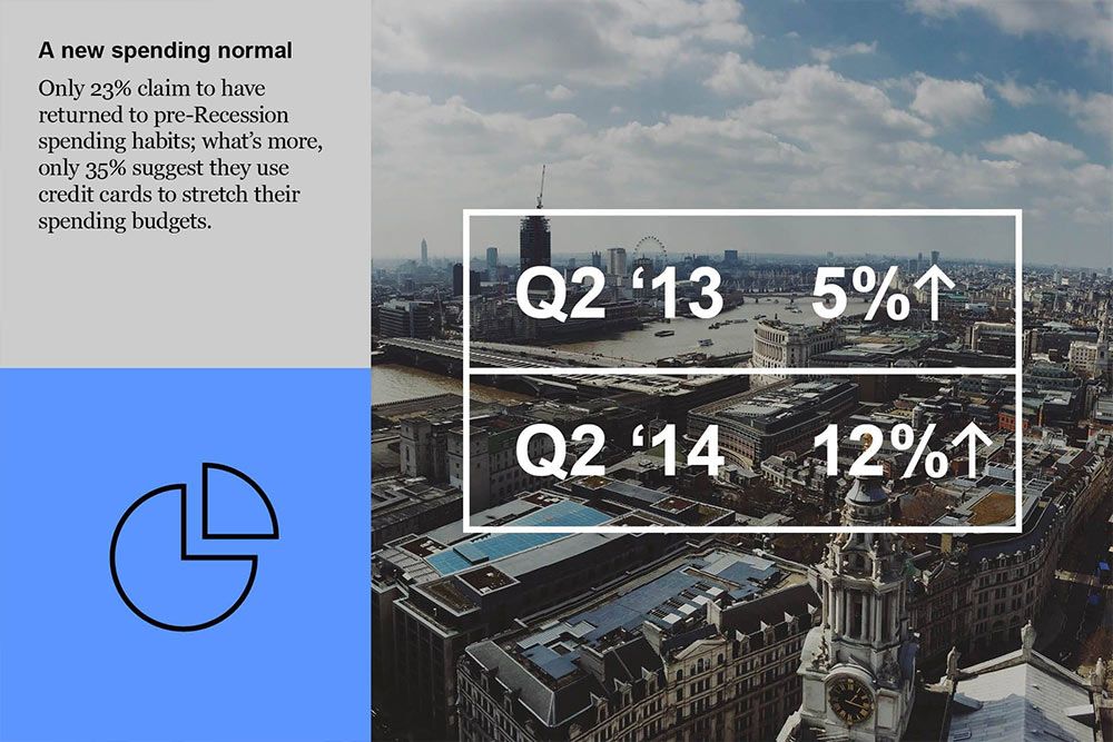
The image is a professional, data-driven infographic blending text and photographic imagery to present economic statistics. It uses a clean, modern layout with clear segmentation between textual information and a panoramic cityscape photo to convey financial trends.
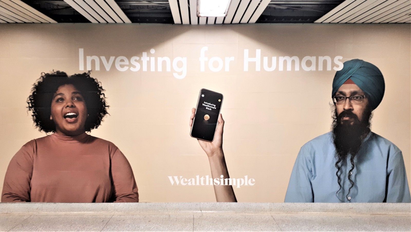
The image features a professional, modern setup with a clean, minimalist aesthetic, focusing on a financial or investment theme. The lighting is bright and even, highlighting the subjects and the text overlay, creating a sense of trust and expertise.
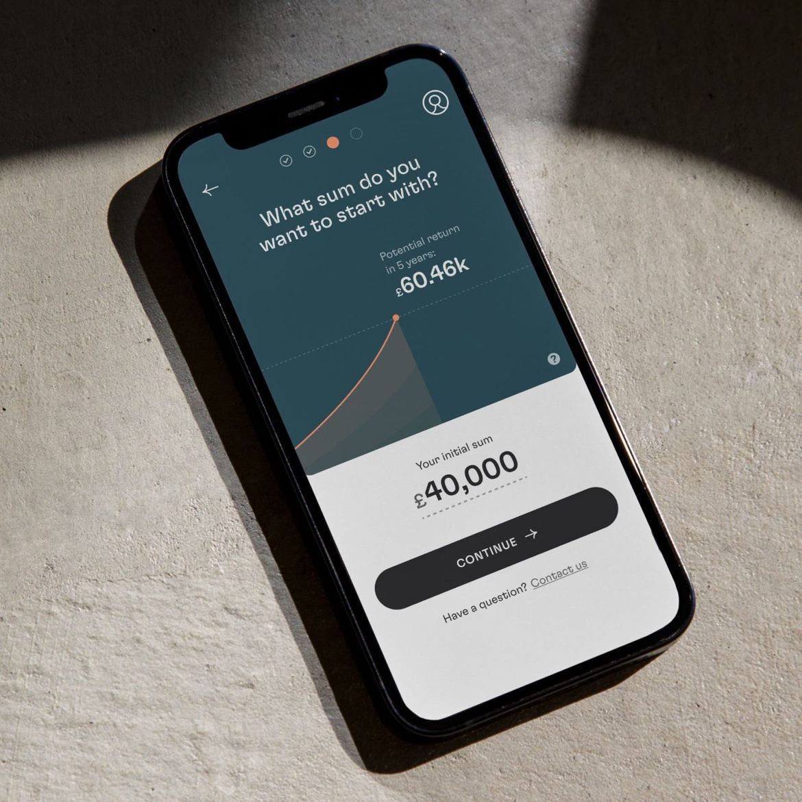
This is a clean, modern mobile application screen featuring a financial projection interface. The design utilizes a dark teal/green gradient for emphasis against a light background, conveying professionalism and trust.
The design is clean, modern, and professional, utilizing ample white space to present financial benefits clearly. It employs a simple layout with clear calls to action and prominent use of color to draw attention to key figures.
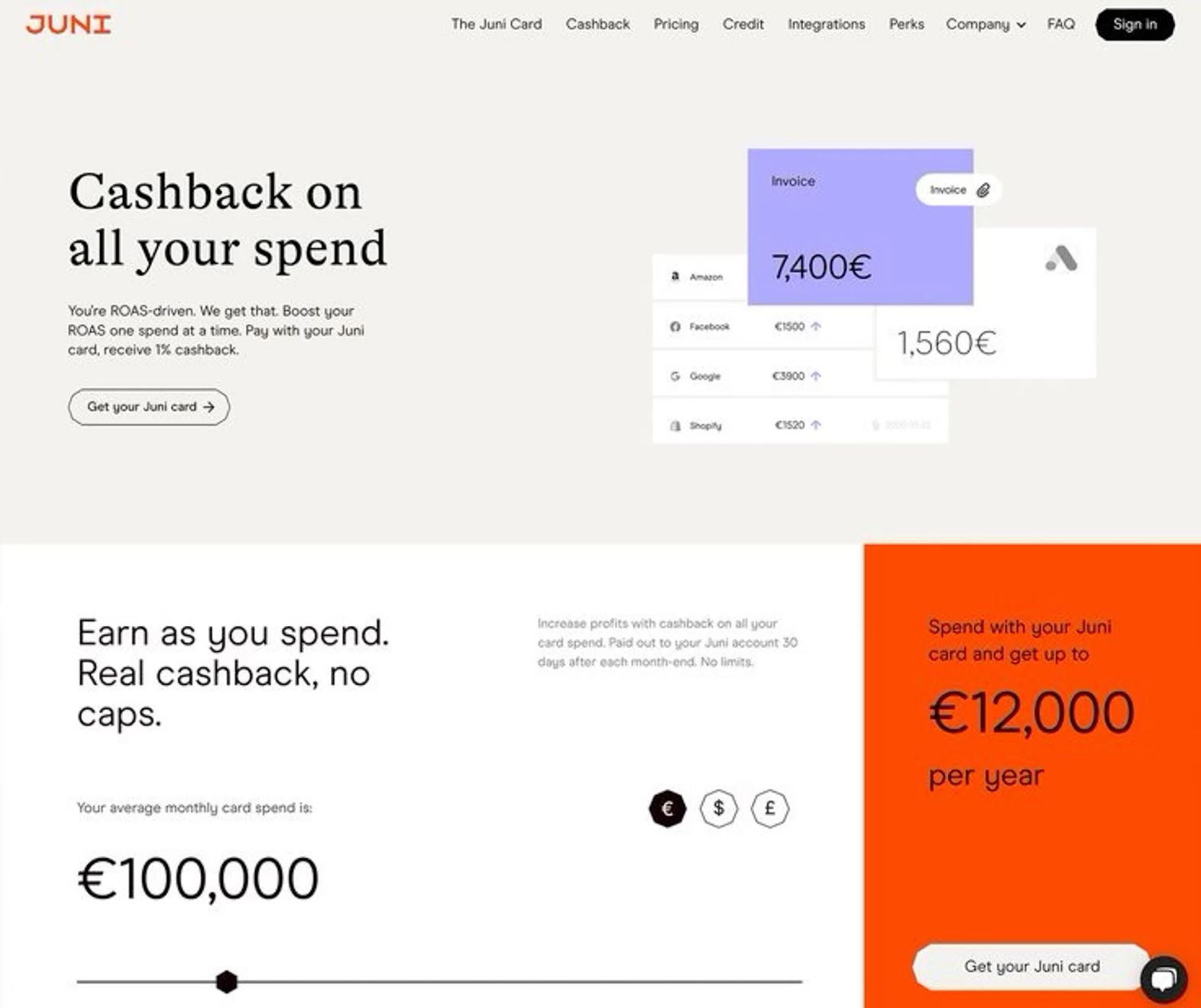
The interface presents a clean, modern financial tracking dashboard with a light, airy aesthetic dominated by muted greens and warm oranges. The design prioritizes clear data visualization through progress bars and large percentage callouts, suggesting a professional and trustworthy financial application.
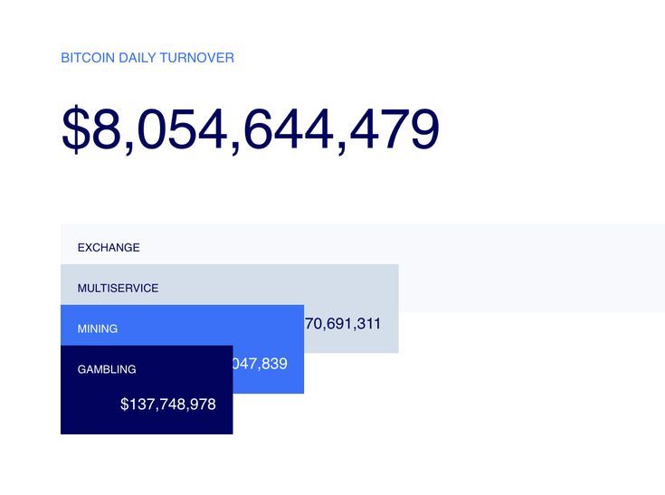
The design is minimalist and data-focused, utilizing a clean white background to emphasize the large numerical turnover. The layout is straightforward, presenting key metrics in a hierarchical manner with clear separation between the main figure and its components.
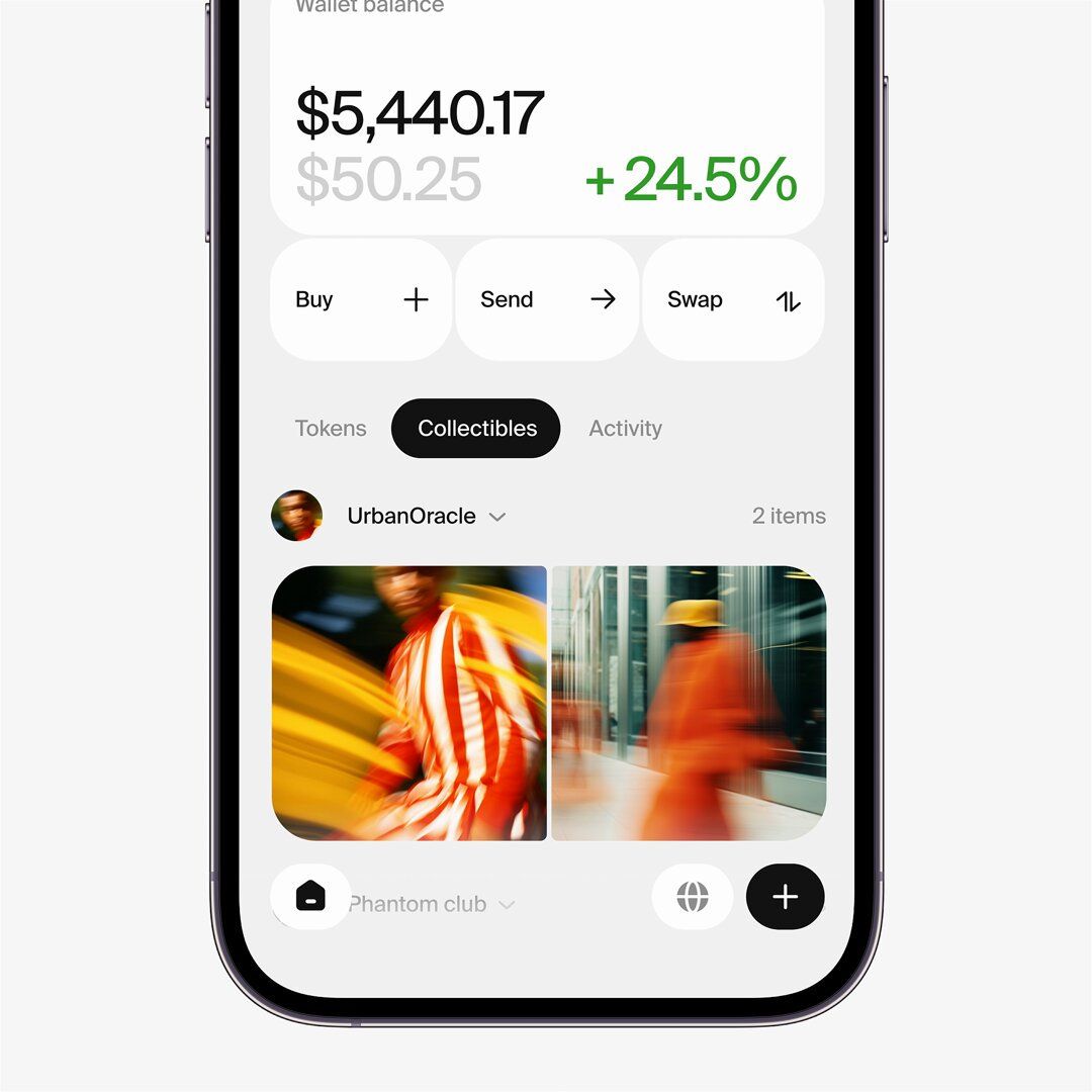
This image displays a clean, modern mobile application interface, characterized by ample white space and clear hierarchy. The design utilizes subtle gradients and high-contrast text to present financial information in an accessible and professional manner.
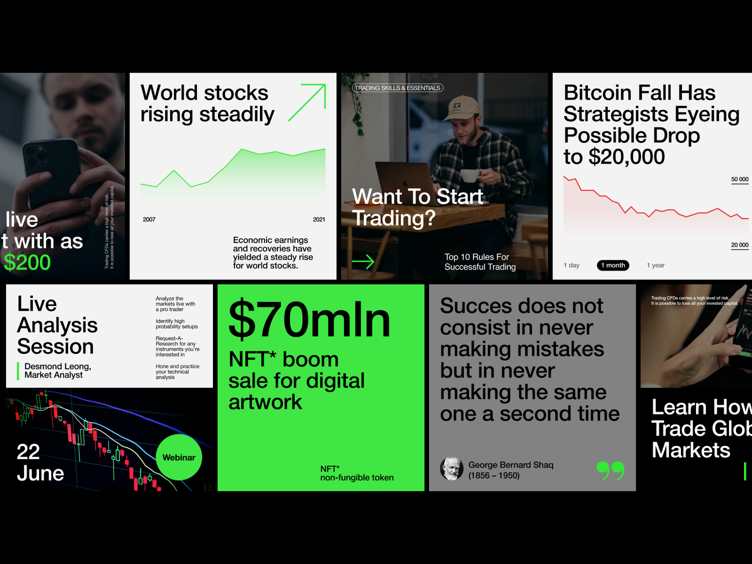
The image is a montage of various financial and investment-related video thumbnails, characterized by bright, contrasting text overlays on muted background footage. The overall design is dense and information-heavy, typical of financial content promotion.
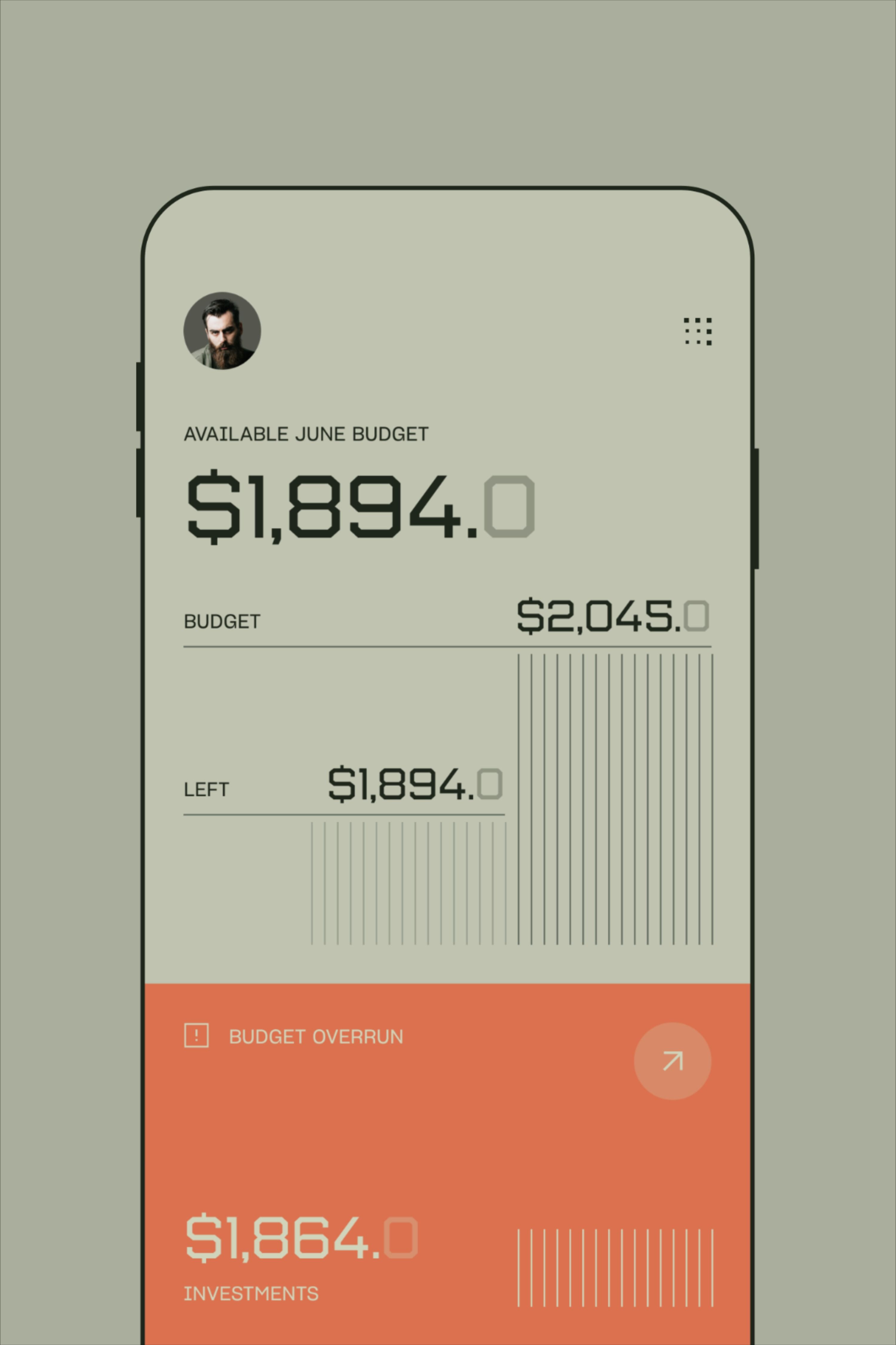
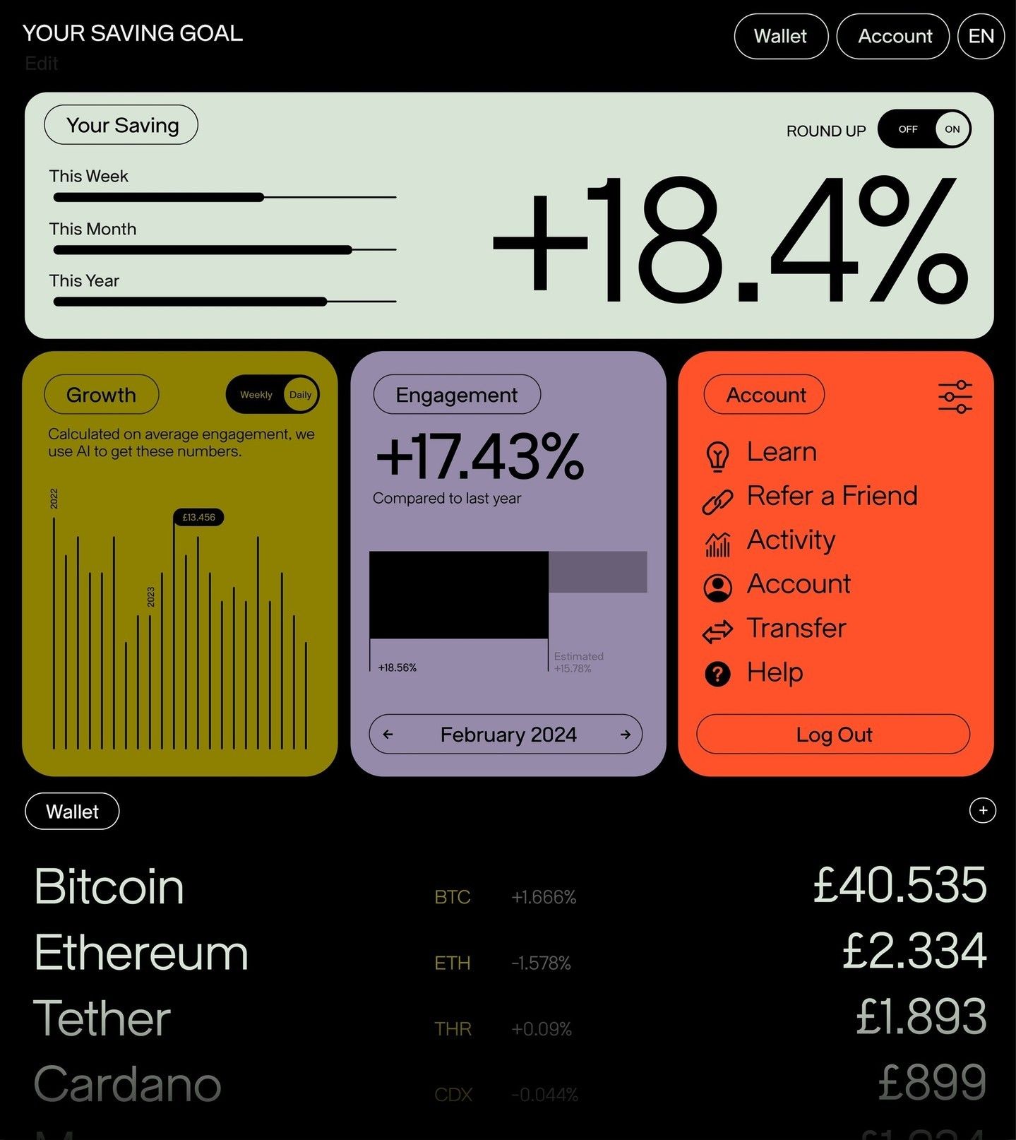
This design features a clean, minimalist mobile user interface dedicated to financial tracking. The visual language relies on muted earth tones and clear typography to present complex budget data in an easily digestible format. The overall feel is professional, organized, and highly functional.
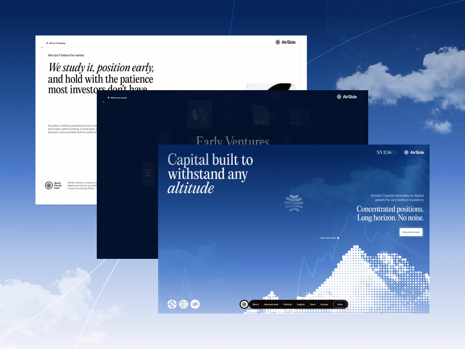
This design employs a professional, modern aesthetic using deep blues and atmospheric overlays to convey trust and stability. The visual language is clean and corporate, utilizing layered semi-transparent elements and subtle graphical motifs to create depth and focus on the core message of investment.
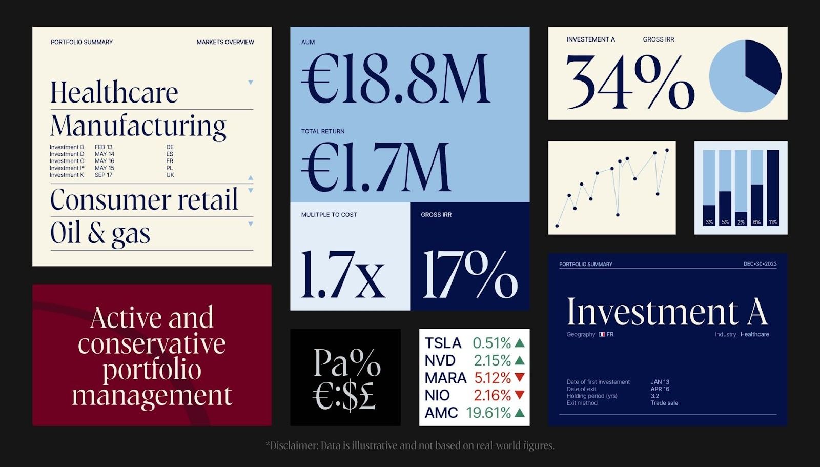
This dashboard utilizes a sophisticated dark mode theme to present complex financial data in a highly structured and analytical manner. The visual language relies on clear typography, contrasting accents, and organized charts to ensure data readability and professional presentation.
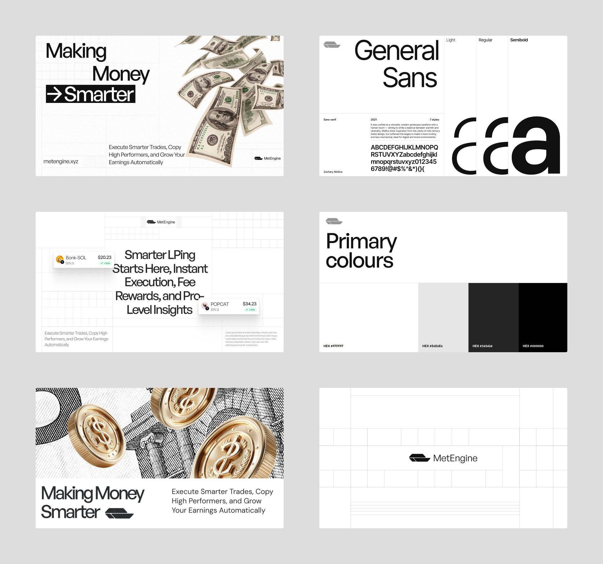
This collection demonstrates a highly professional and modern design aesthetic characterized by clean lines, strong typography, and strategic use of negative space. The visual language is minimalist and structured, effectively conveying trust and precision through a sophisticated monochromatic palette.
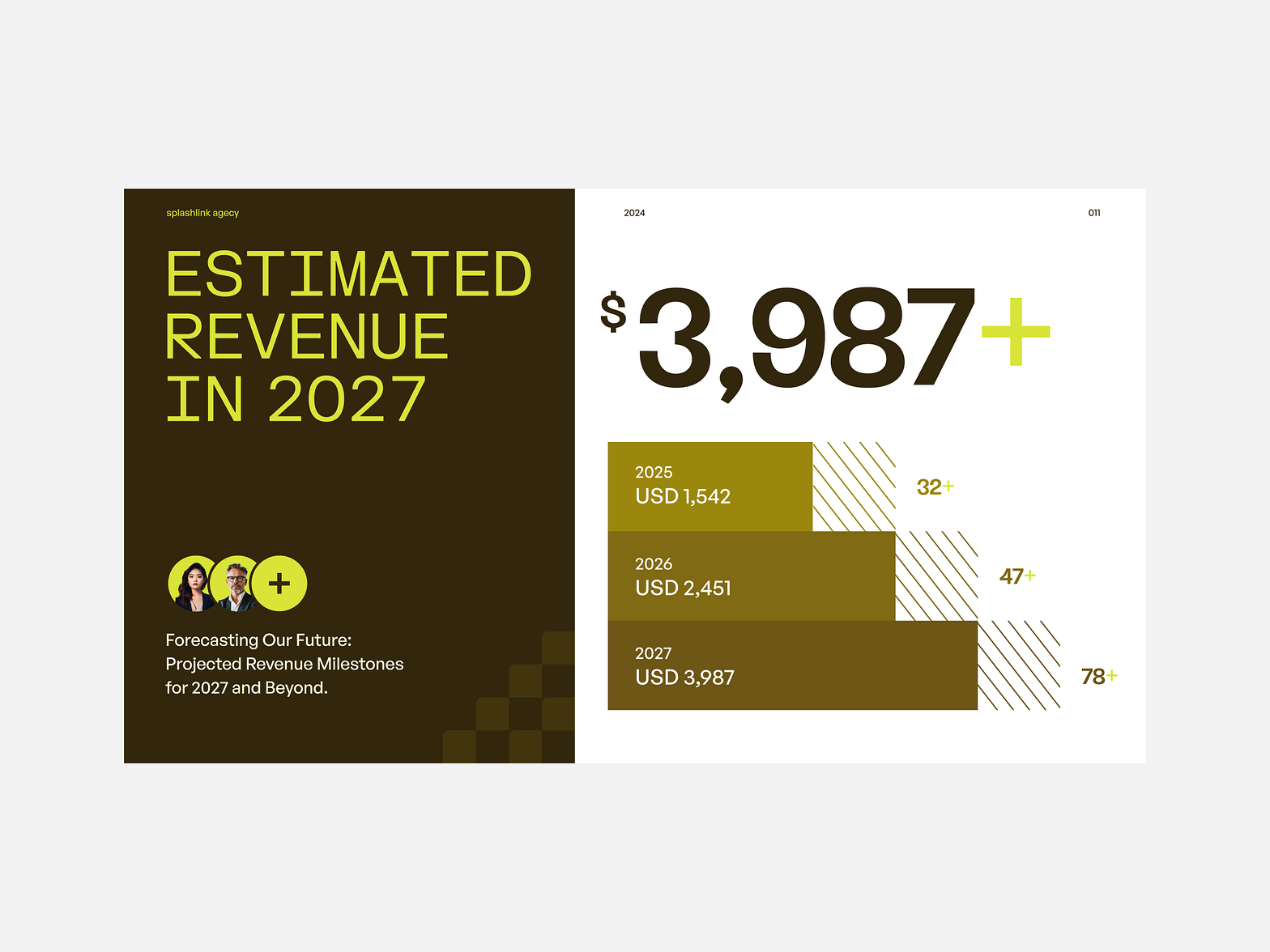
This is a professional financial infographic using a dark, earthy color palette to present future revenue projections. The design utilizes clean lines and contrasting yellow-green accents against a muted background, establishing a clear visual hierarchy for complex data.
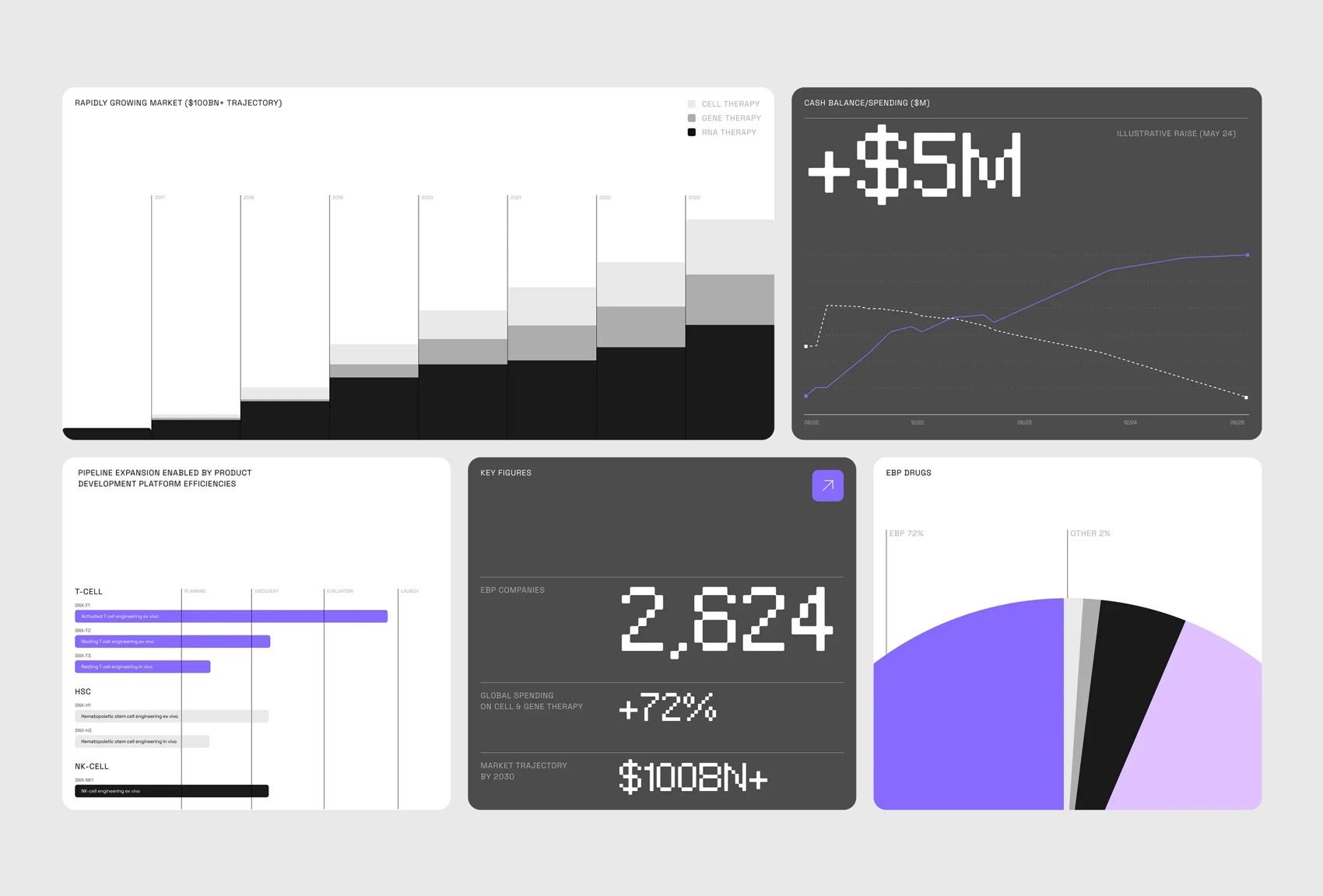
This is a clean, modern data dashboard utilizing a dark theme to present complex financial and market metrics. The design emphasizes clarity through segmented visualizations, combining line graphs, bar charts, and large numeric calls to action.
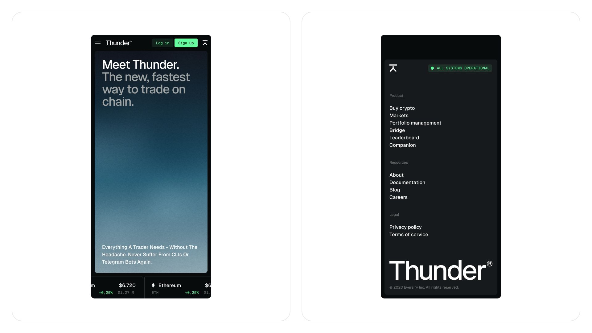
The design utilizes a sophisticated dark theme to establish a serious, professional tone suitable for a FinTech product. The visual language is clean and modern, employing high contrast and organized typography to prioritize key features and market data.
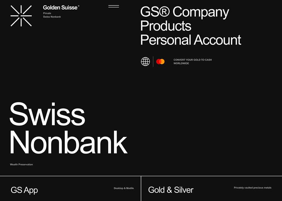
This design employs a sophisticated dark mode aesthetic, using high contrast to convey trust and professionalism. The visual language is minimalist and clean, relying on strong typography and strategic use of accent colors to guide the viewer through the brand's offerings.
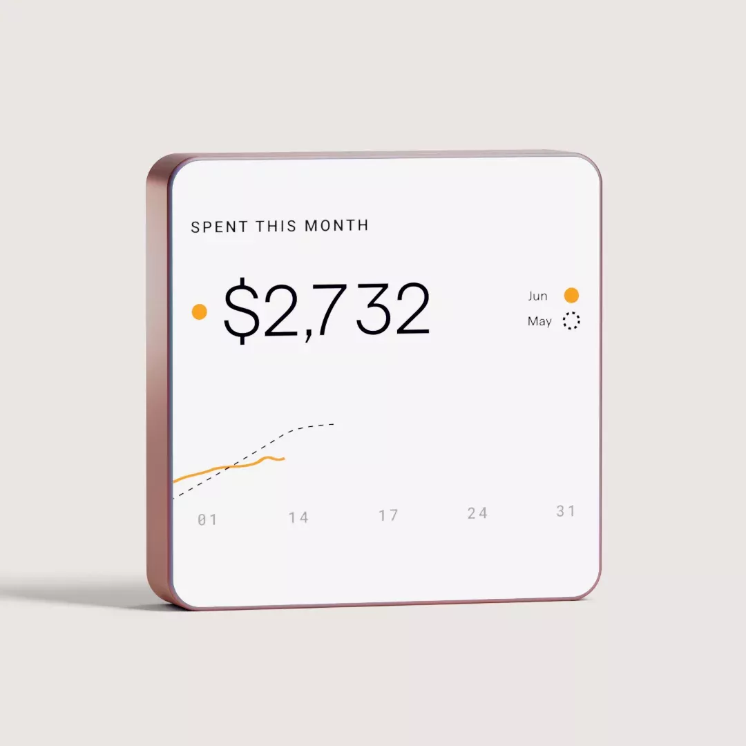
This design exemplifies a clean and minimalist approach to data visualization, utilizing ample negative space to emphasize the key financial figures. The visual language is professional and approachable, combining soft earthy tones with crisp typography to create a trustworthy and organized user experience.