enterprise
5 designs
Showing 5 of 5 (5 total)
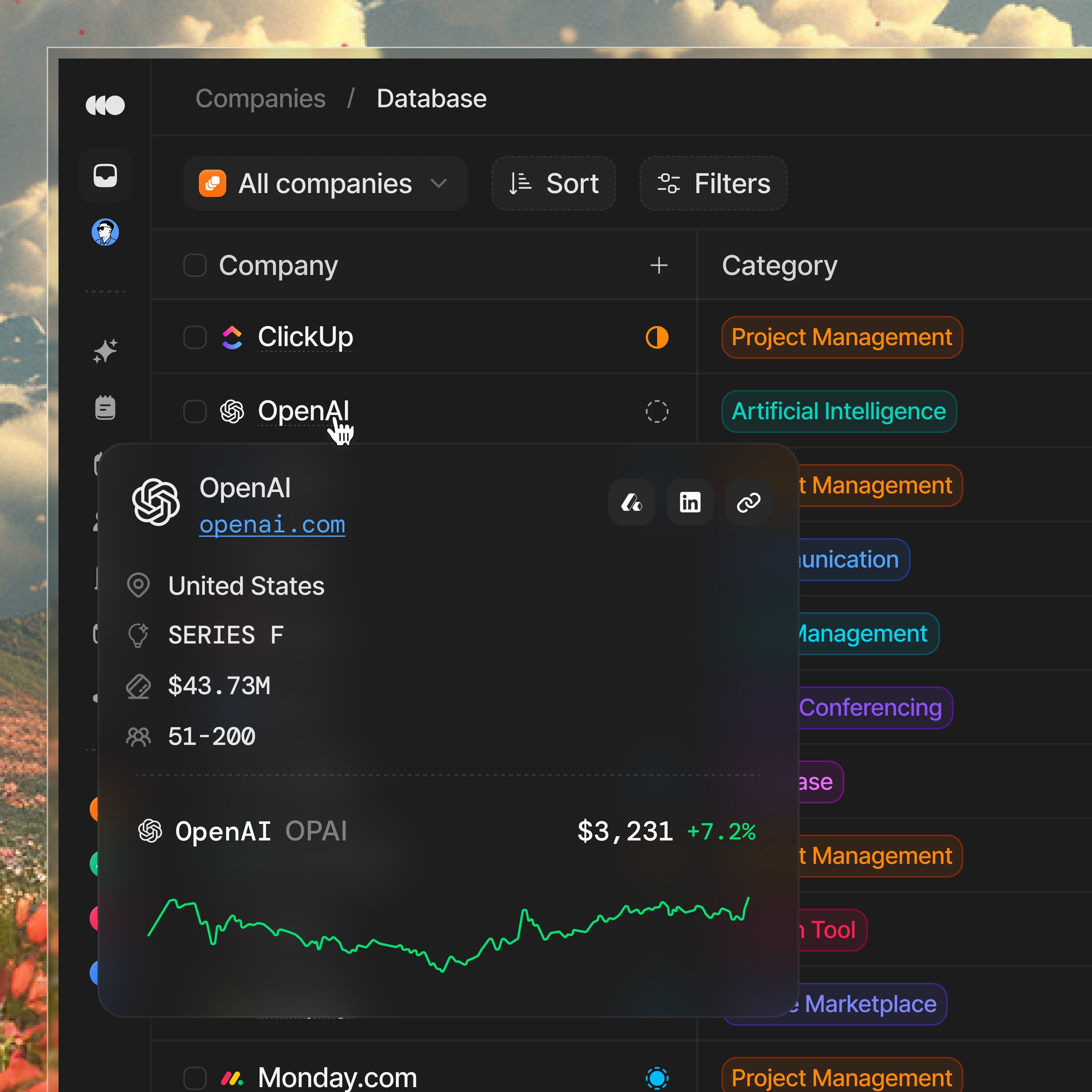
The interface presents a clean, data-driven dashboard layout with a dark mode aesthetic, emphasizing clear categorization and hierarchical information through list views. The design is functional and professional, utilizing subtle color cues to differentiate entities within a structured environment.
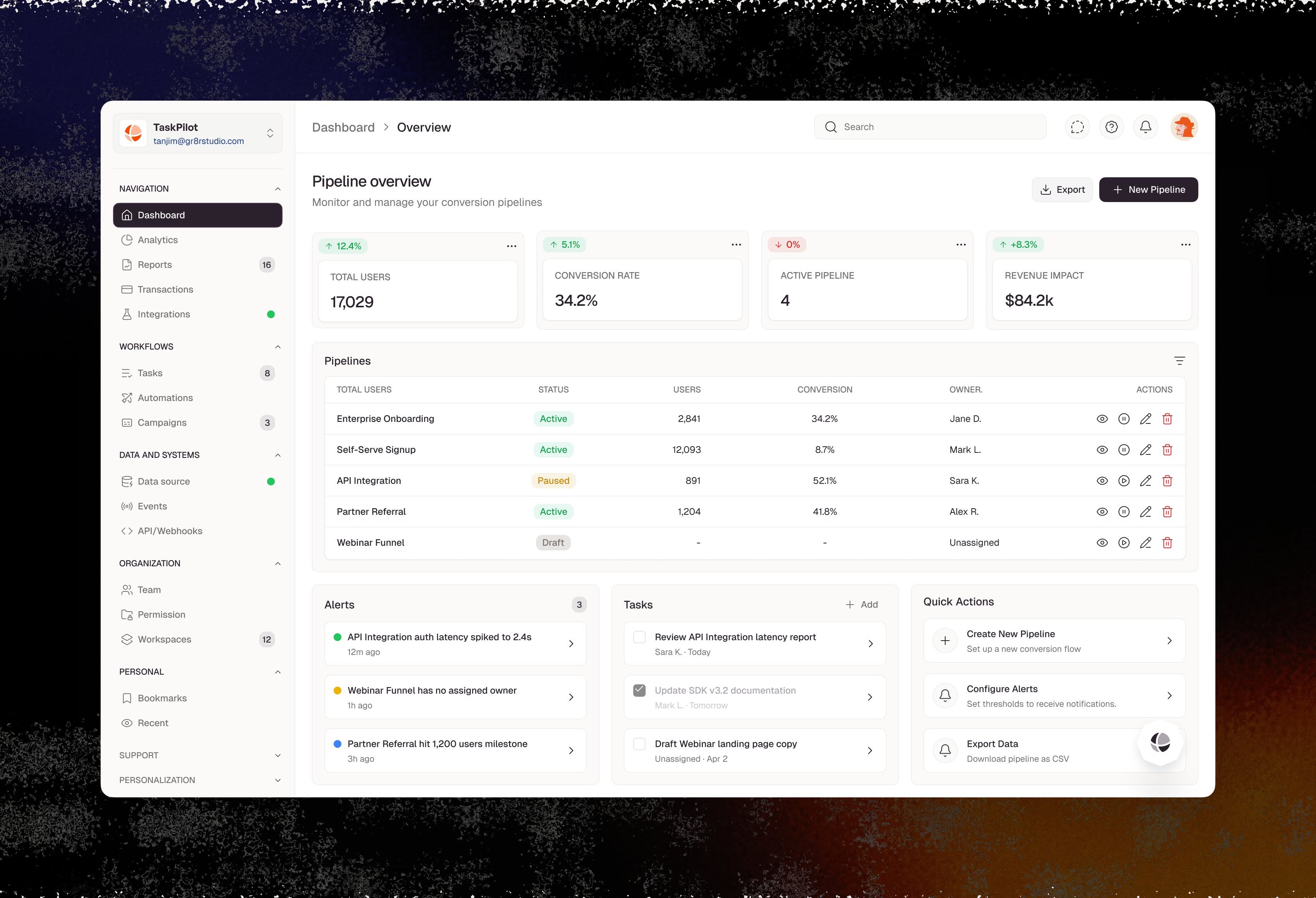
The interface presents a clean, data-heavy dashboard design utilizing a light background with high contrast elements for readability. The layout is organized into distinct sections using cards and clear typography, aiming for a professional and functional user experience.
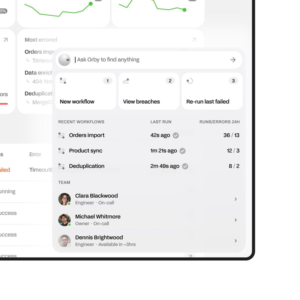
This interface utilizes a clean, card-based design to present complex workflow data and metrics in an organized manner. The visual language is professional and minimalist, prioritizing clarity and ease of use over decorative elements.
This interface presents a highly functional and structured dashboard, utilizing a clean, professional aesthetic typical of enterprise software. The visual language is minimalist, relying heavily on white space and clear hierarchy to organize complex information effectively. The overall feel is highly efficient, organized, and business-focused.
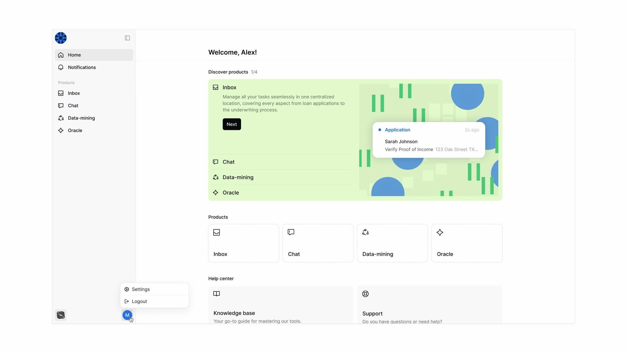
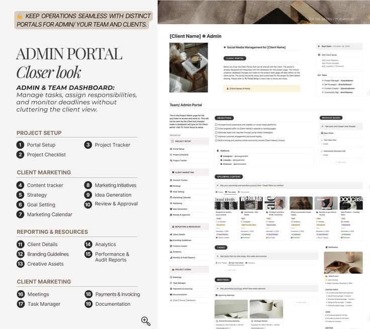
The design exhibits a clean, modern interface characterized by generous whitespace and clear information hierarchy. The visual language relies on soft greens and neutrals to convey professionalism and calmness, ensuring high readability and a focused user experience.