comparison
3 designs
Showing 3 of 3 (3 total)
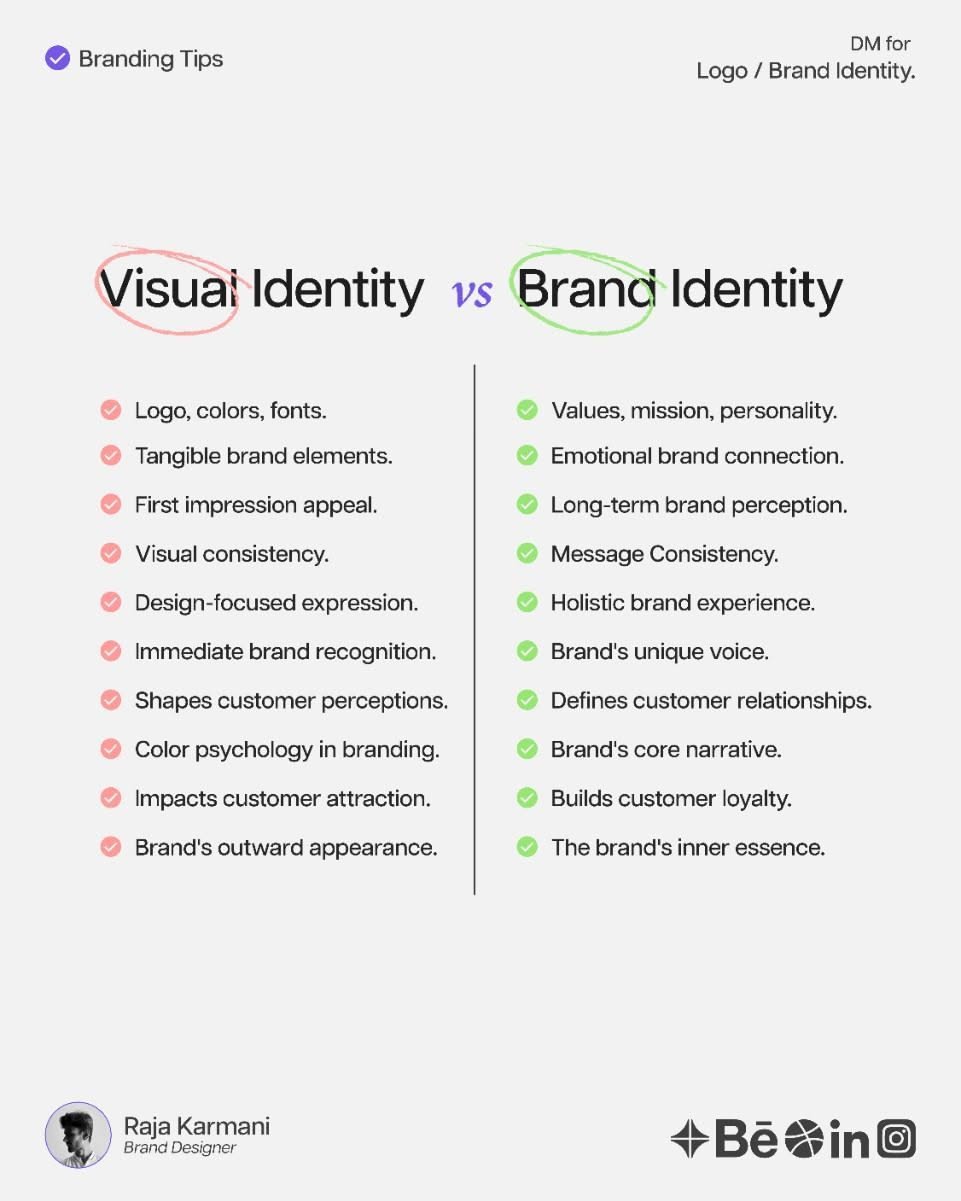
This is a clean, academic comparison chart designed to differentiate between Visual Identity and Brand Identity. The design utilizes clear typography and a minimalist layout to present complex concepts in an easily digestible format for educational purposes.
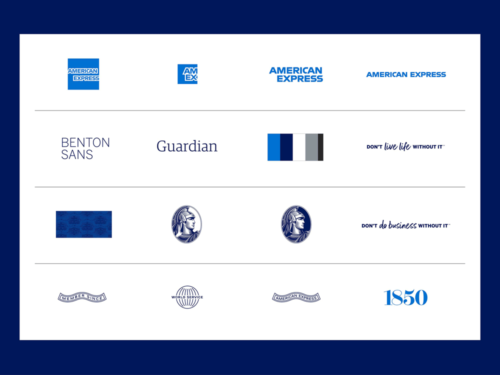
This design utilizes a clean, minimalist layout to present a comparison of various entities, relying heavily on typography and simple geometric icons. The visual language is highly structured, emphasizing clarity, organization, and a professional corporate feel.
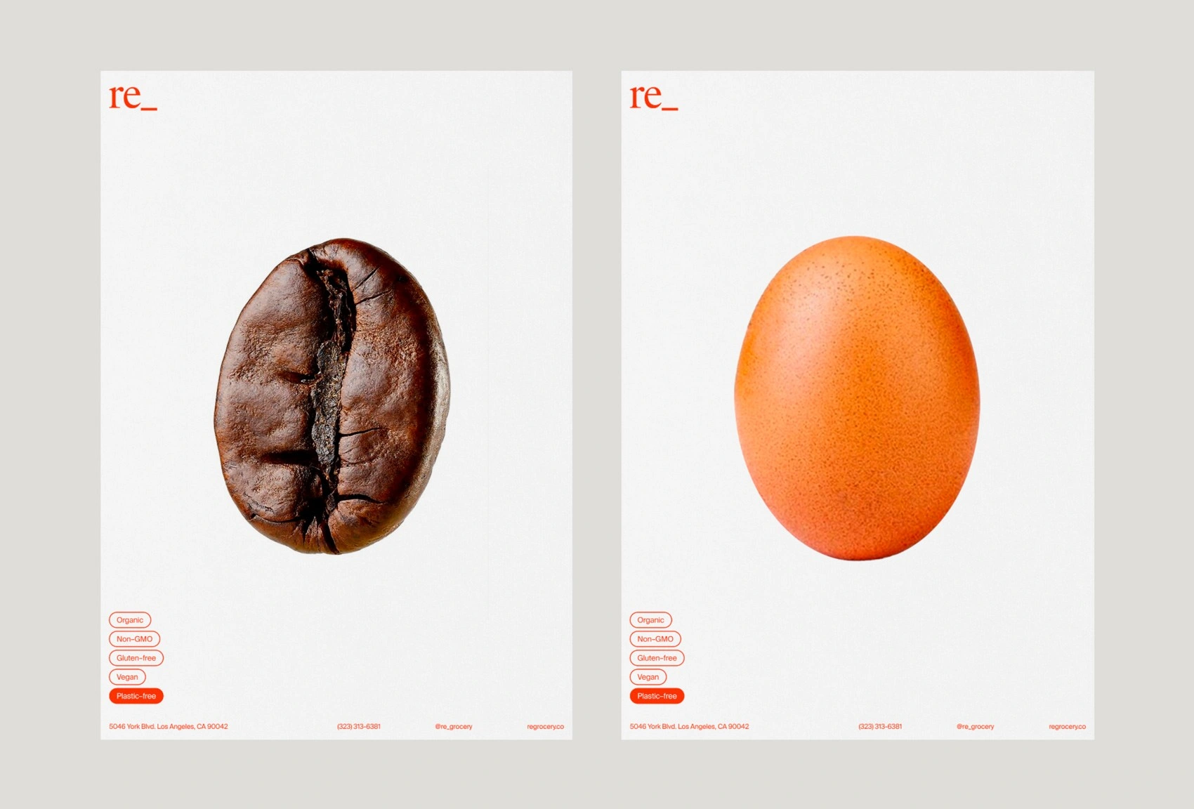
A minimalist product comparison design featuring two vertically-oriented posters with centered, high-resolution photography of a coffee bean and an apricot against clean white backgrounds. The layout employs a restrained color palette with red accent branding, creating a sophisticated and contemporary visual language that emphasizes clarity and product focus.