supportive
44 designs
Showing 24 of 44 (44 total)
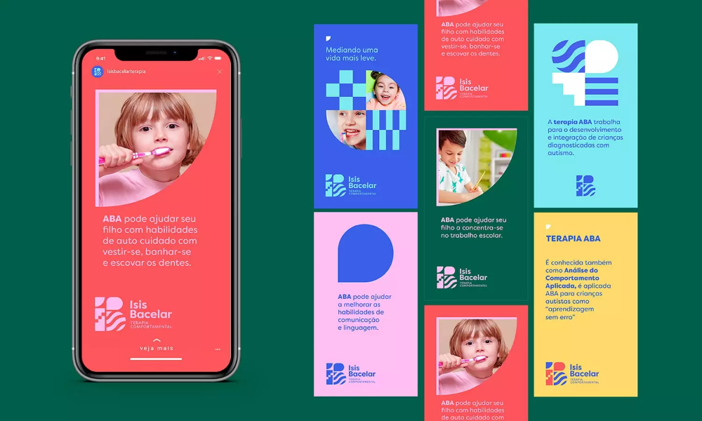
This visual presents a vibrant and engaging collection of digital assets, primarily focused on educational or therapeutic content for children. The design employs bright colors and friendly imagery to create an inviting and supportive atmosphere.
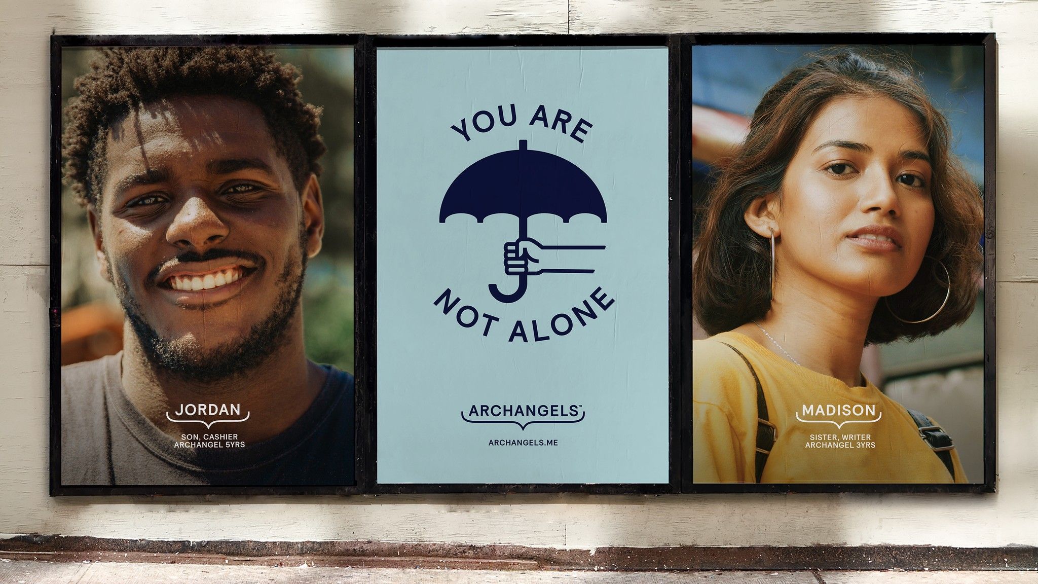
This triptych employs a warm, photographic style combined with minimalist graphic elements to convey a message of solidarity and personal connection. The visual language is grounded and empathetic, using soft lighting and simple typography to focus attention on the human subjects and the central theme.
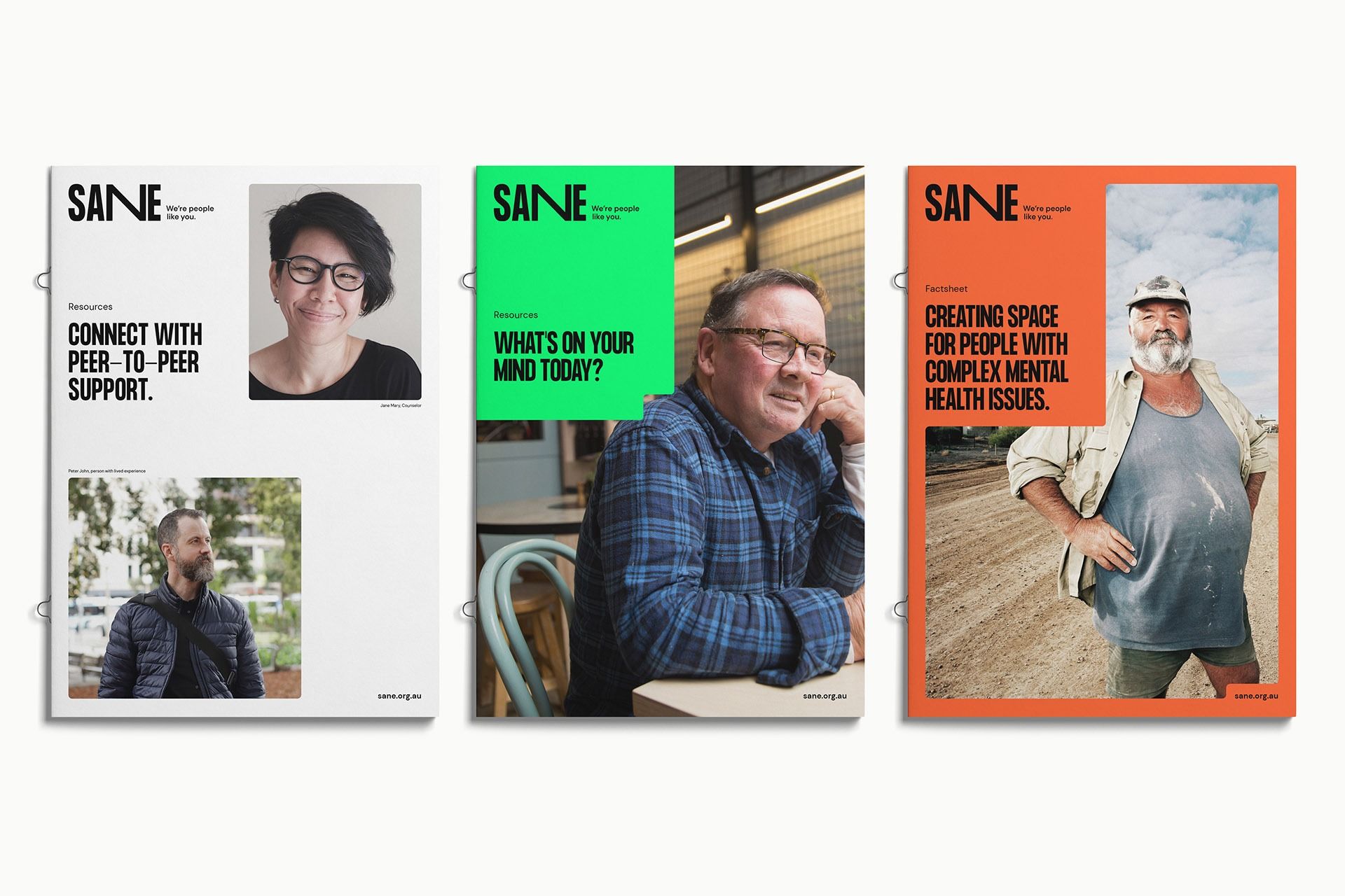
The design utilizes a clean, modern layout with high contrast between photographic elements and clear textual information. It employs distinct color blocking across the three panels to segment different support themes while maintaining a professional and empathetic visual language.
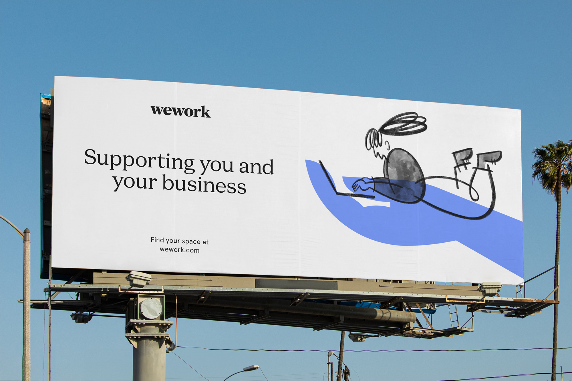
This design employs a clean, minimalist aesthetic typical of modern corporate branding, utilizing ample white space to ensure high readability. The visual language is supportive and professional, pairing clear typography with a simple, illustrative line drawing to convey a message of partnership.
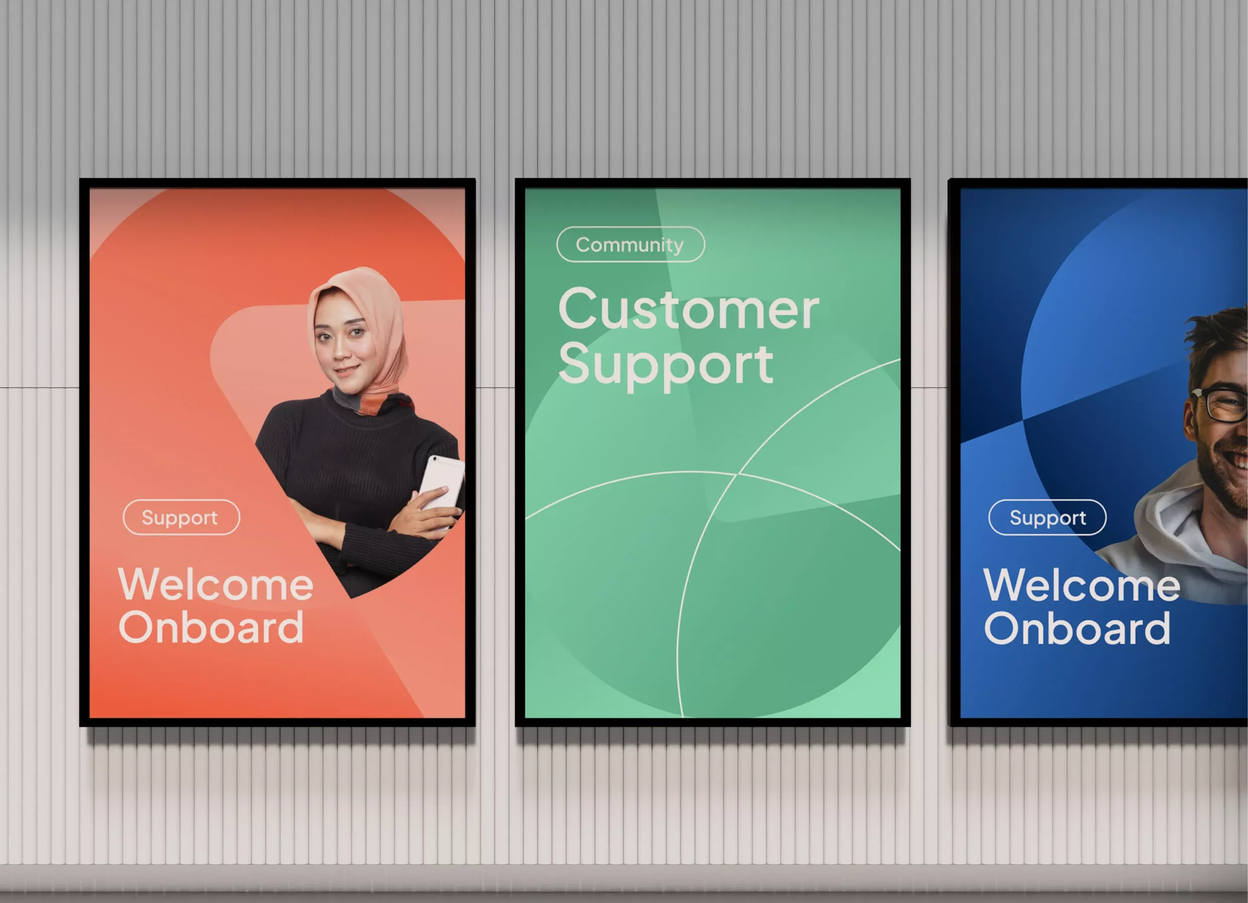
This set of visual panels employs a clean, modern aesthetic using bold color blocking and soft gradients to convey trust and approachability. The design effectively uses imagery and clear typography to segment different support services, creating a cohesive yet distinct visual language for user onboarding.
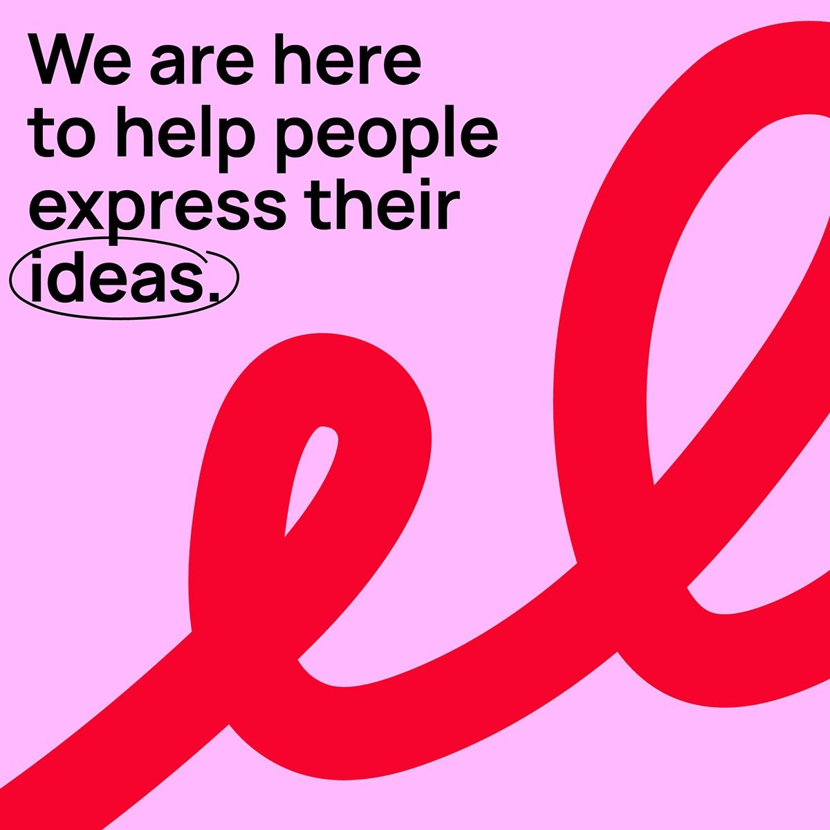
This design uses a soft pink background contrasted with bold red and black elements to convey a message of support and creative expression. The visual language is clean and modern, utilizing a strong, flowing graphic element to symbolize ideas taking shape. The overall feel is encouraging, open, and professional.
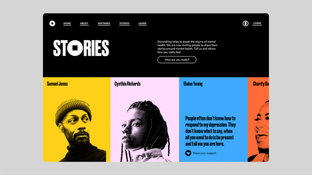
The design utilizes a clean, high-contrast layout with bold typography to create a professional and empathetic tone. The visual language is modern and structured, effectively using color blocking to separate featured content while maintaining a cohesive brand identity.
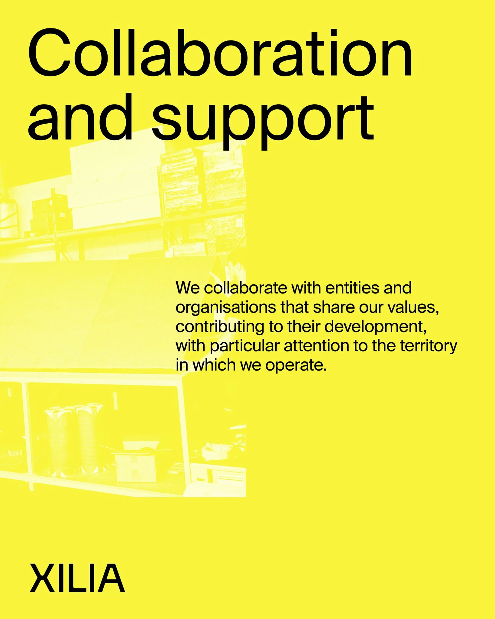
This design utilizes a high-contrast, minimalist approach dominated by a vibrant yellow field to convey clarity and optimism. The visual language is direct and professional, using strong typography against a blurred background to emphasize the core message of collaboration.
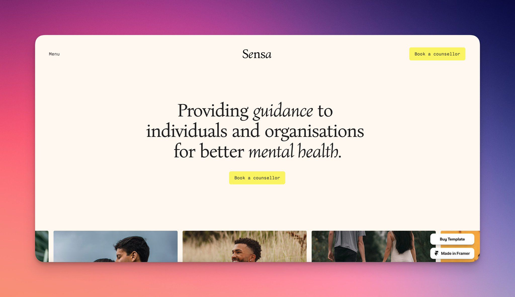
This design utilizes a sophisticated, high-contrast palette to convey trust and professionalism. The layout is clean and balanced, using negative space effectively to separate the brand identity from the core message. The visual language is warm yet authoritative, suggesting a supportive guidance service.
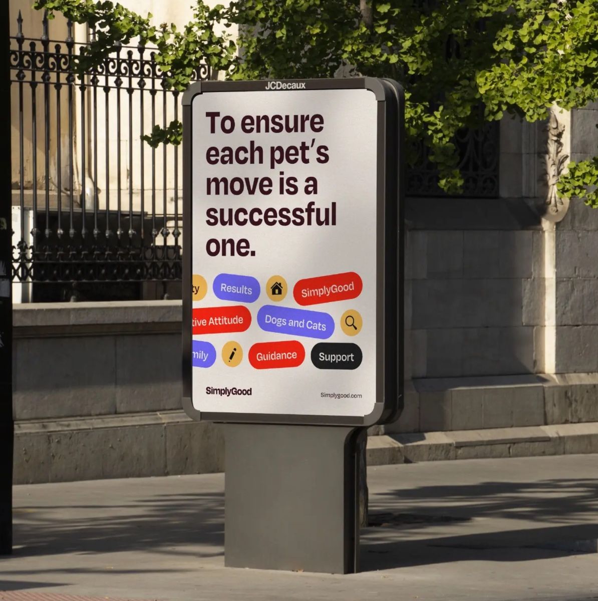
The image displays a clean, modern informational sign with a clear, direct message. The design utilizes high contrast and simple iconography to convey a positive, supportive message related to pet care. The overall feel is professional, trustworthy, and straightforward.
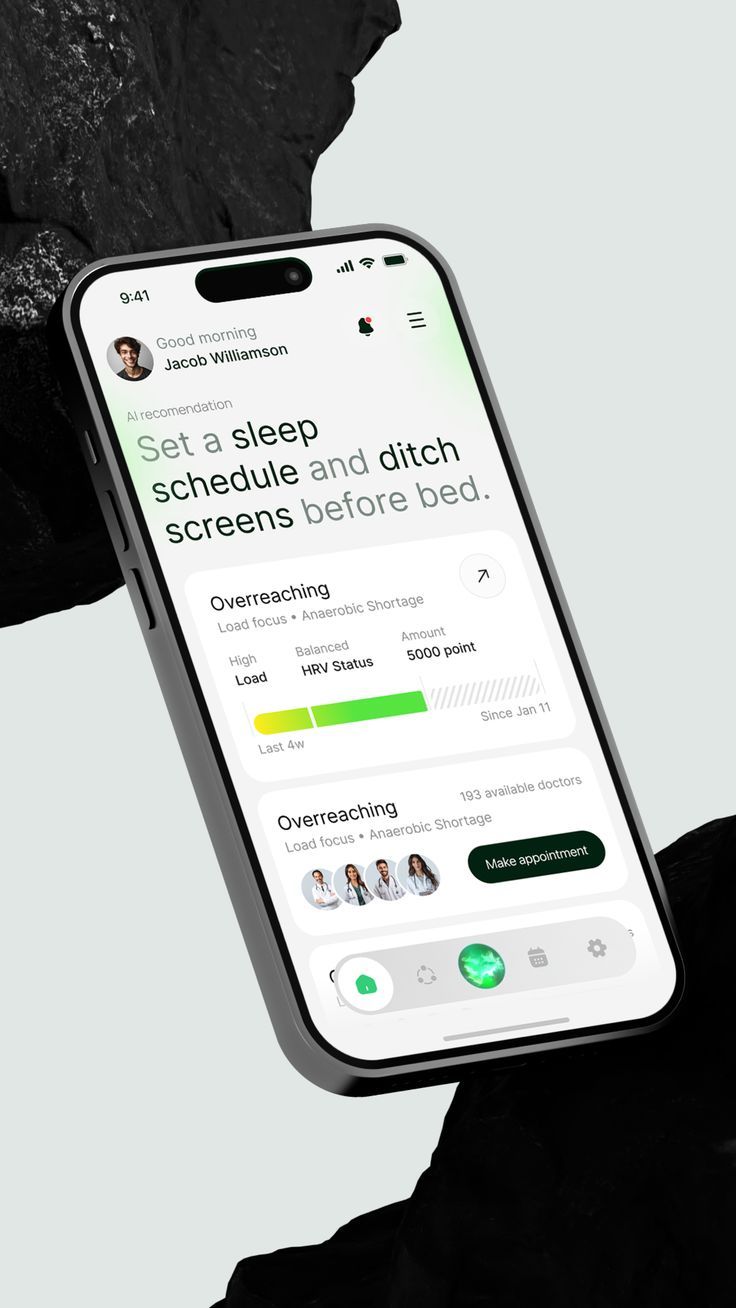
A minimalist health and wellness app interface displayed on a modern smartphone, featuring a clean white background with strategic use of lime green accents. The design emphasizes readability and user engagement through a hierarchical layout focused on sleep tracking and behavioral recommendations.
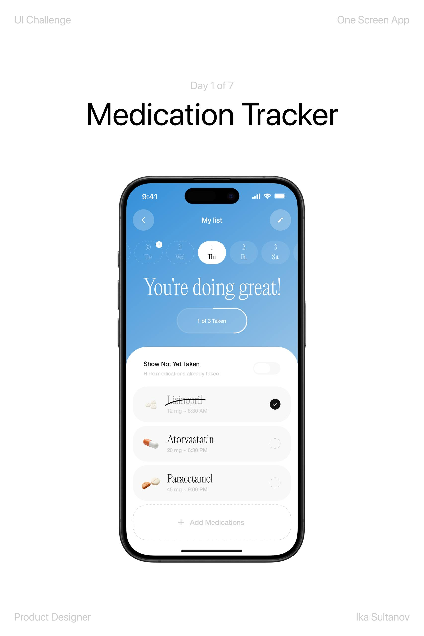
A clean, modern mobile app interface for medication tracking that combines motivational messaging with functional list organization. The design uses a soft blue gradient background with white cards and subtle iconography to create an approachable healthcare experience. The interface balances positive reinforcement with practical medication management in a minimalist aesthetic.
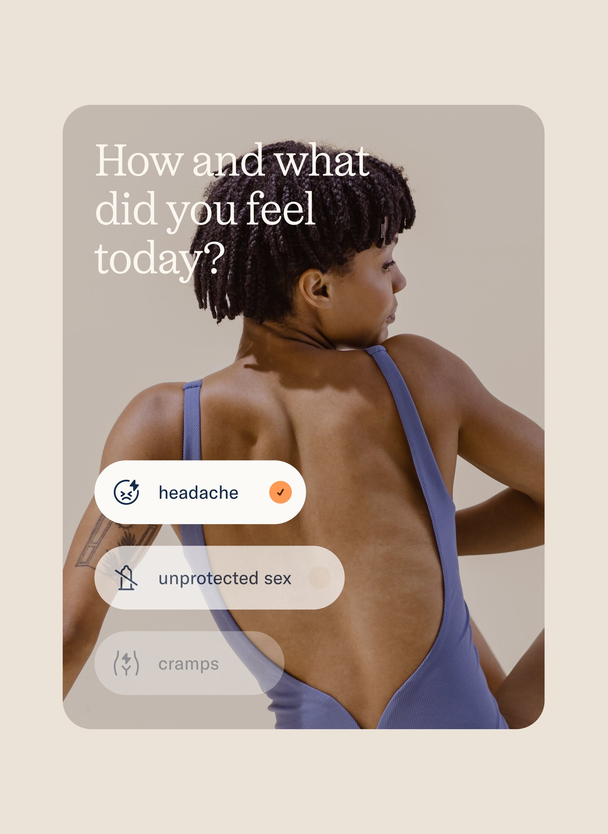
A contemporary health and wellness interface featuring a portrait-oriented mobile design with a minimalist aesthetic. The layout combines a candid photograph of a person with an interactive symptom-tracking overlay, using soft neutral tones and clean typography to create an approachable, non-judgmental digital health experience.
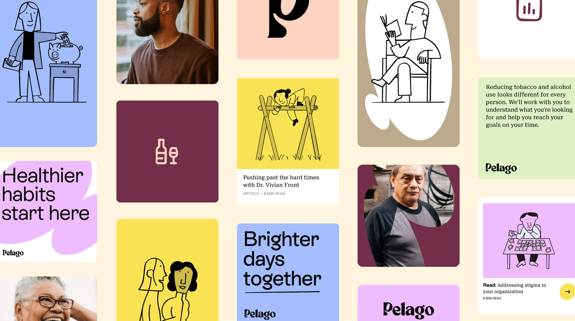
The image presents a grid-based layout featuring soft, muted color blocks and minimalist line art illustrations. The design employs a clean, modern aesthetic with a focus on conveying health, wellness, and support through simple, approachable visuals.
The design is minimalist and sophisticated, utilizing a muted, monochromatic color scheme with clean typography to convey a serious and supportive tone. The layout is balanced, employing significant negative space to draw focus to the central text.
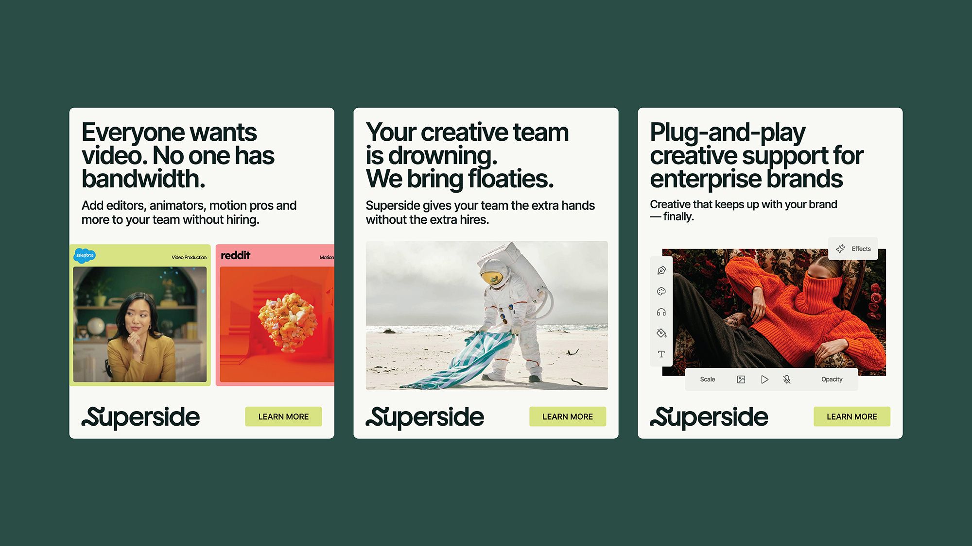
The image displays three distinct, clean, and modern promotional cards or tiles, likely for a service called 'Superside'. The design uses strong typography and high-contrast imagery to convey a message of creative support and solutions.
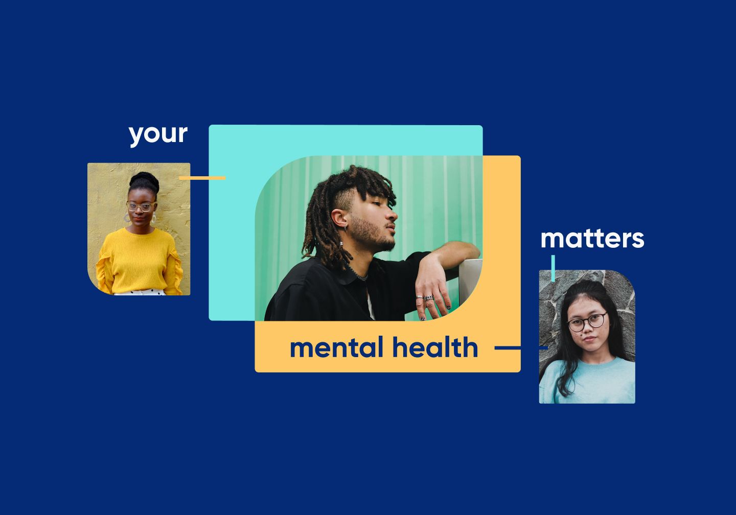
The image uses a clean, modern layout with soft pastel accents against a deep blue background. It features photographic elements paired with clear text labels to convey a message about mental health awareness.
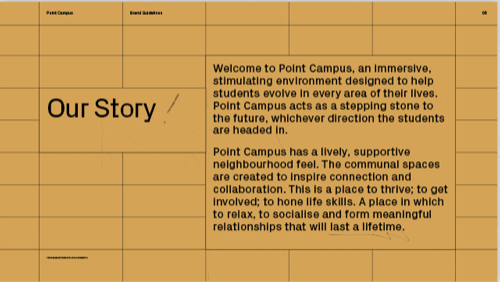
The design is clean, minimalist, and uses a muted, earthy color palette with a grid structure to convey a sense of order and groundedness. The visual language is straightforward, focusing on clear typography against a subtle background texture.
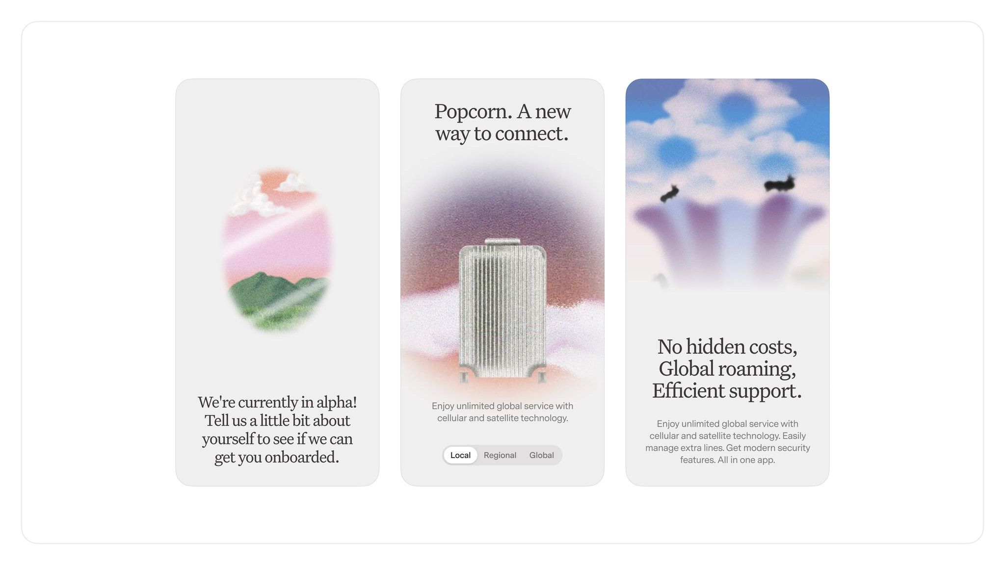
The image presents a clean, modern, and minimalist design featuring three distinct cards or panels arranged horizontally. The visual language is soft, utilizing pastel gradients and subtle photographic elements to convey a sense of connection, support, and service. The overall feel is professional yet approachable and trustworthy.
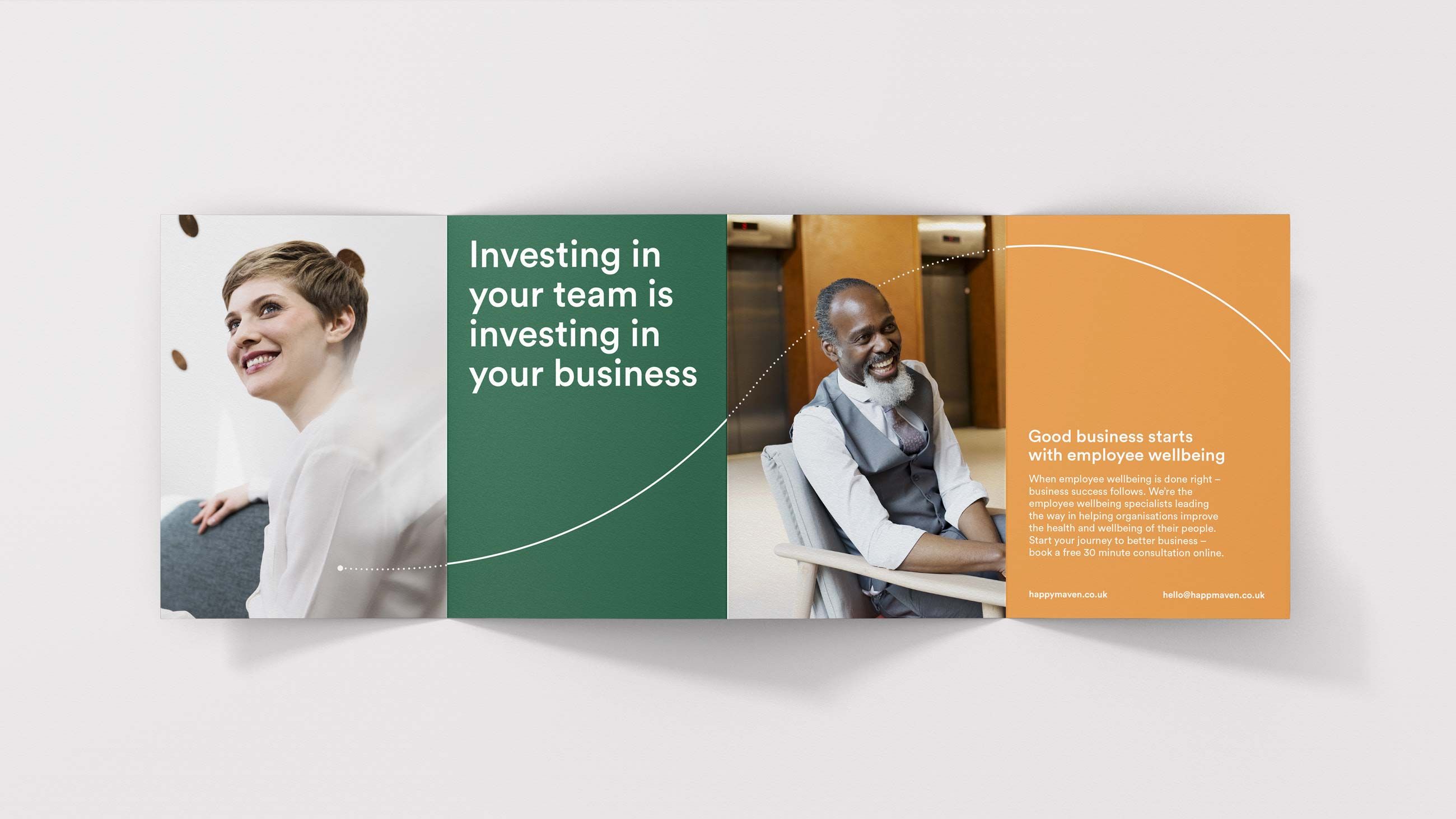
This is a clean, modern brochure or presentation layout using a tripartite division of color and imagery to convey a message about employee investment. The design is professional, balanced, and uses soft lighting and warm tones to create an inviting yet corporate feel.
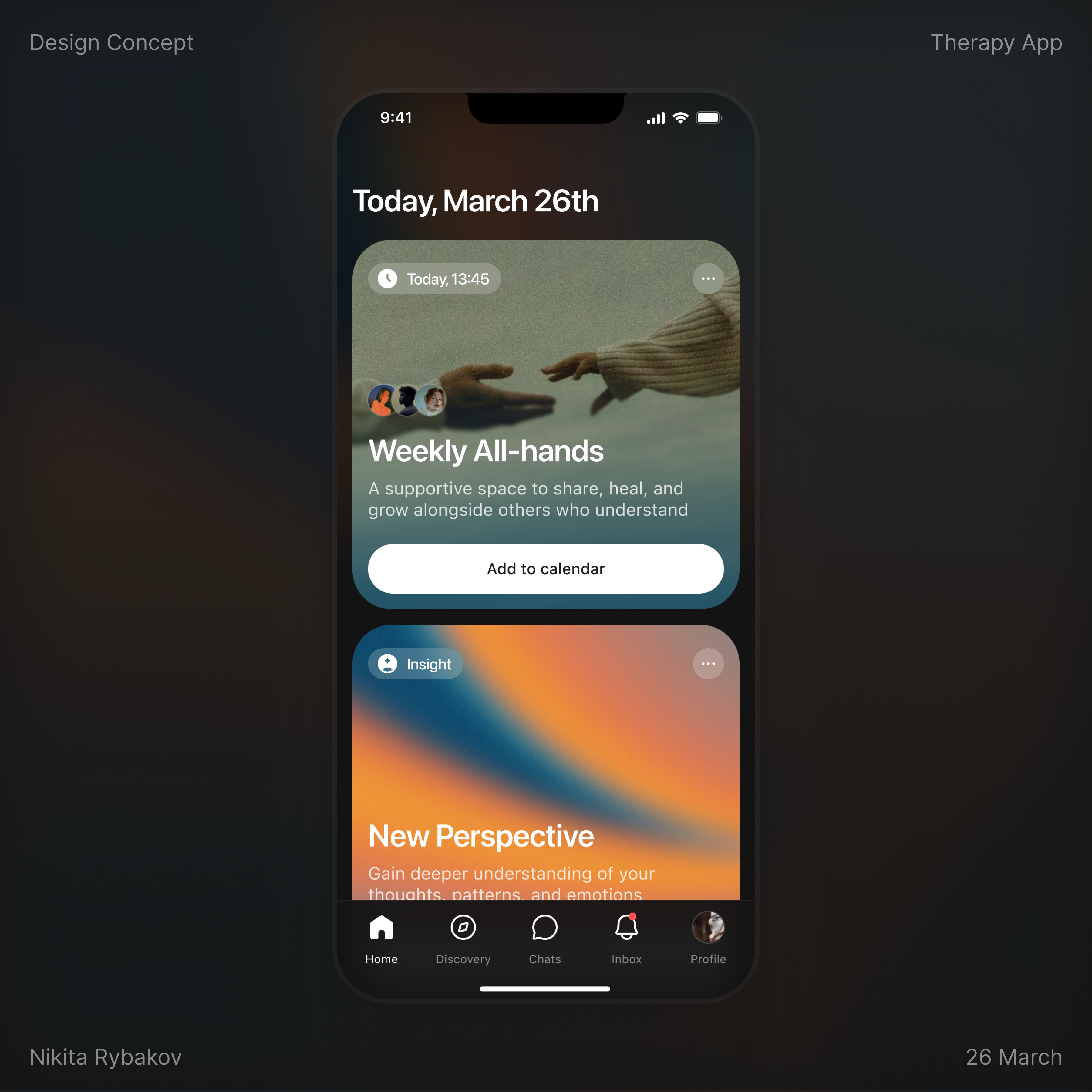
The design presents a clean, modern, and minimalist interface for a therapy application, utilizing a dark mode aesthetic with soft gradients and clear, legible typography. The visual language is calm and professional, aiming for a supportive yet sophisticated user experience.
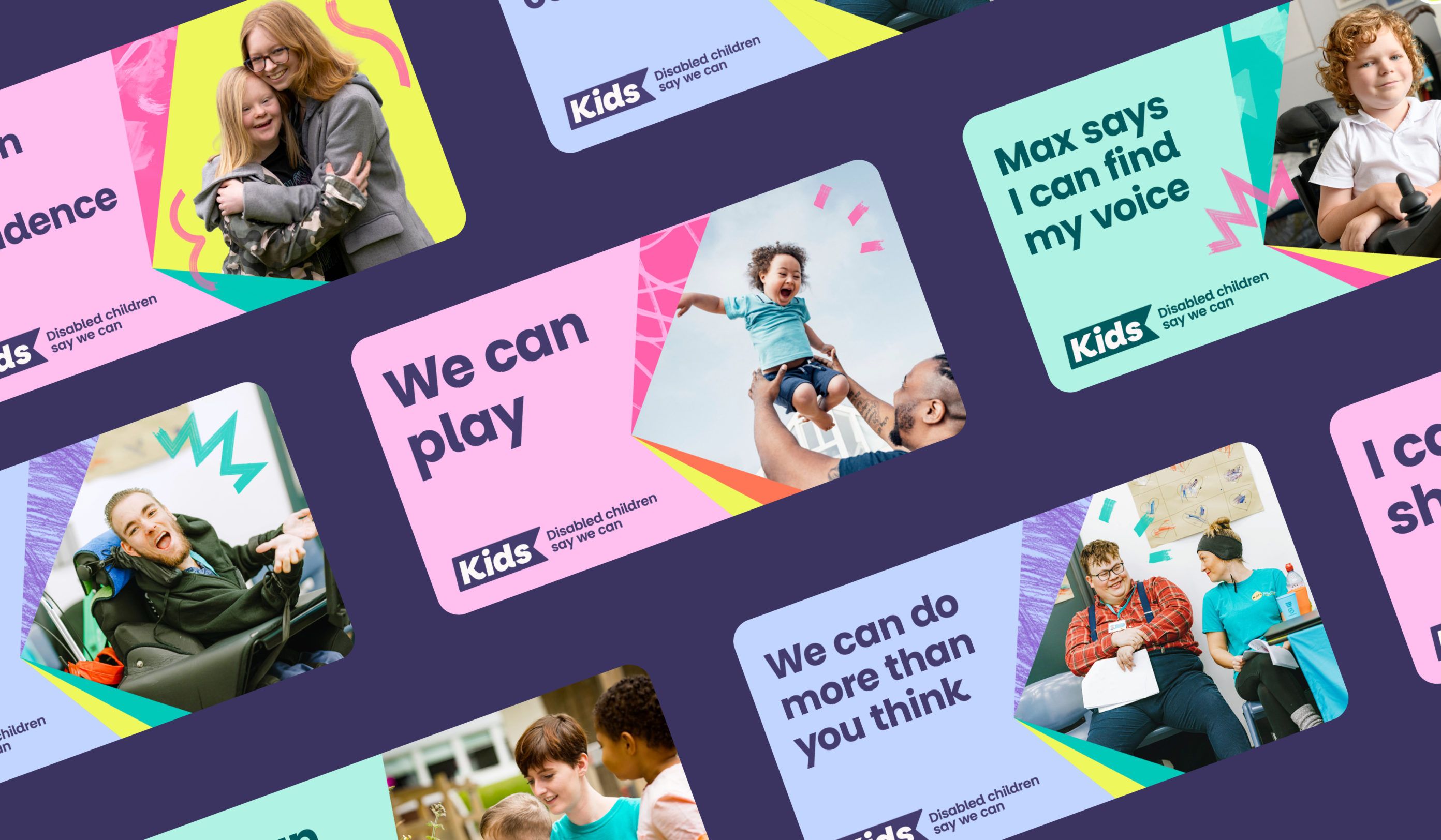
The image is a collage of bright, modern graphic cards featuring diverse individuals, likely promoting inclusion or disability awareness. The design uses bold color blocking and clean layouts to present testimonials or concepts in an engaging, positive manner.
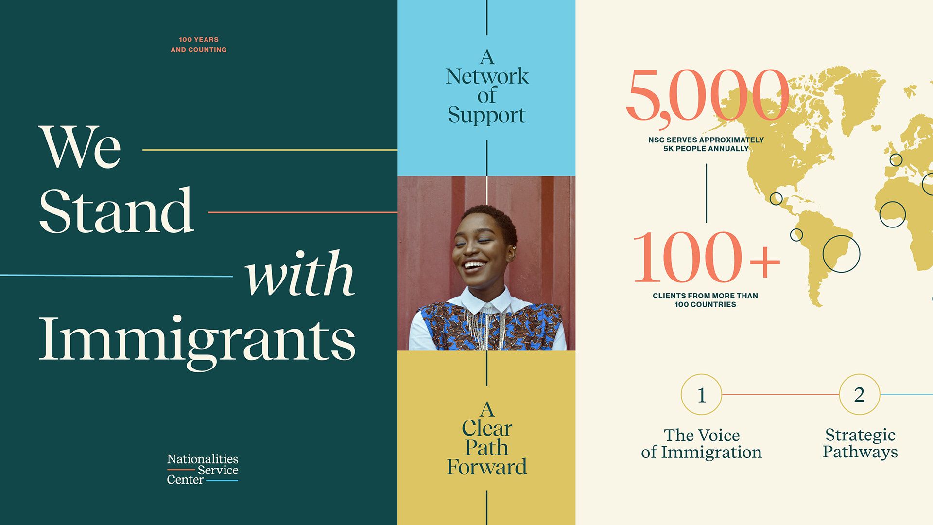
The design is clean, professional, and uses a muted, earthy color palette with strong horizontal divisions to convey trust and stability. The layout is balanced, using negative space effectively to highlight key statistics and the central message.
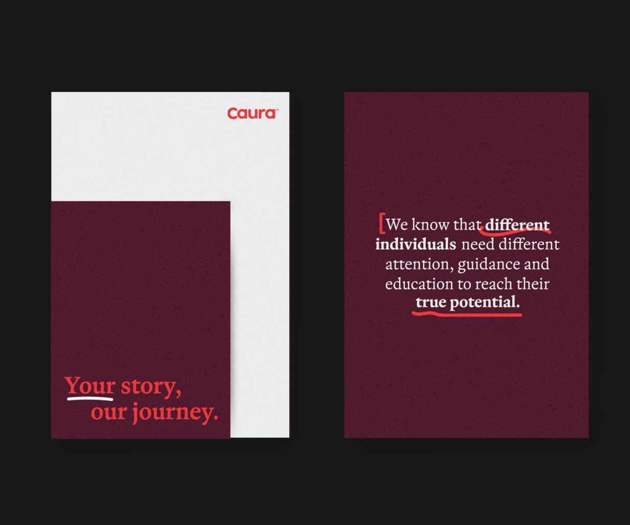
The design is clean, minimalist, and professional, utilizing ample white space to convey a sense of calm and trust. The layout is centered and straightforward, focusing the user's attention on the core mission statement.