impactful
37 designs
Showing 24 of 37 (37 total)
This design uses high-contrast, bold graphic elements to convey a message of sustainability and forward-thinking. The visual language is clean and modern, utilizing strong yellow accents against a dark background to create immediate impact. The motion blur in the foreground adds a dynamic, energetic layer to the static graphic elements.
This is a high-contrast, abstract graphic mark characterized by sharp, angular lines radiating outward from a central point. The design utilizes negative space effectively to create a dynamic, starburst-like effect that conveys energy and precision. The overall visual language is clean, modern, and highly symbolic.
This design employs a clean, minimalist aesthetic using an earthy color palette to convey trust and professionalism. The visual language is soft yet structured, effectively pairing high-quality photography with clear statistical data to build credibility.
The image displays a layered composition of text elements, featuring bold, capitalized typography against contrasting background colors. The design utilizes strong visual hierarchy through size and color blocking to convey a direct, impactful message.
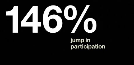
This is a stark, high-contrast graphic featuring large white text against a pure black background. The design is minimalist and direct, relying solely on typography to convey a significant percentage increase.
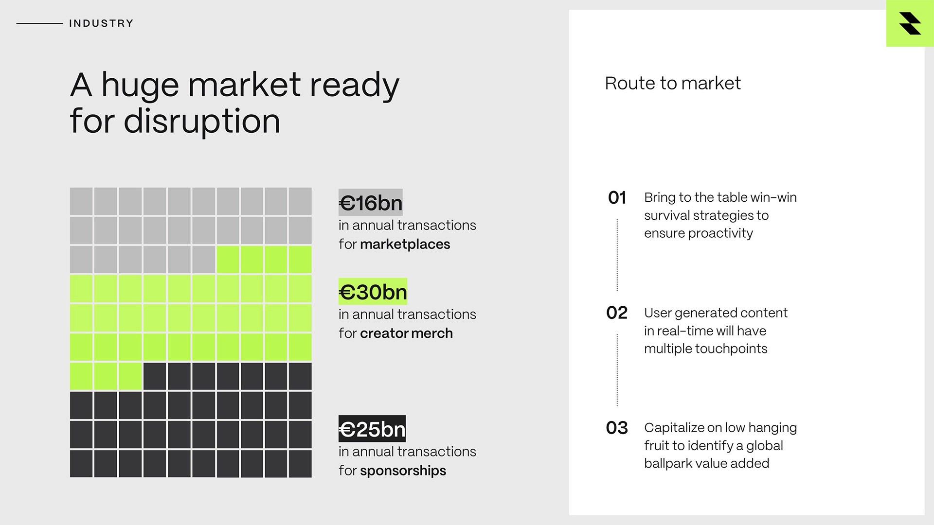
The image presents a data-driven, infographic-style visualization using a grid to represent market size segments. The design is clean and uses color blocking effectively to differentiate between different revenue streams, conveying a sense of quantitative analysis.
The design features large, bold, sans-serif typography dominating the frame with a muted, pale yellow background. The composition is minimalist and relies heavily on negative space to emphasize the large text, creating a modern and impactful visual statement.
The design is stark, minimalist, and highly graphic, utilizing strong negative space and bold, solid shapes to convey a sense of modern, perhaps slightly severe, information delivery. The visual language relies heavily on high contrast between black and white to create a clean, impactful aesthetic.
This is a stark, minimalist typographic design featuring bold, capitalized text against a pure black background, utilizing a single vibrant orange color for high contrast. The design conveys a sense of definitive statement and stark finality through its severe simplicity.
A bold, modern poster design featuring dynamic diagonal lines and strong typography set against a vibrant blue background. The composition uses high-contrast colors and an italicized sans-serif typeface to convey energy and urgency, with a contemporary graphic design aesthetic that feels both professional and rebellious.
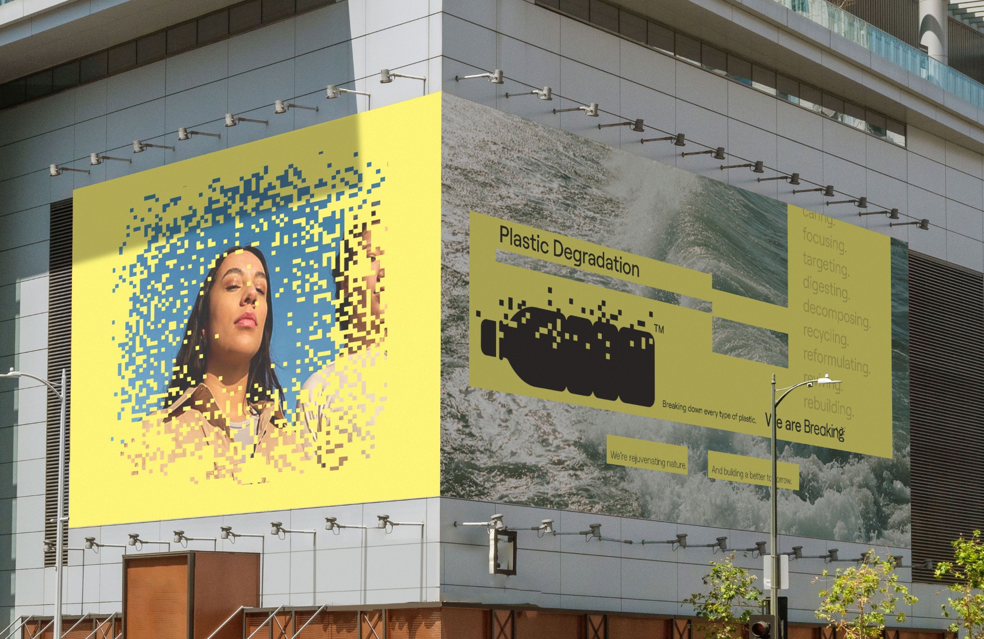
A bold, contemporary public art installation featuring large-scale digital billboards with vibrant yellow backgrounds and pixelated imagery. The design combines environmental awareness messaging with striking visual contrast, utilizing bright color blocking and fragmented digital aesthetics to create an eye-catching urban intervention.
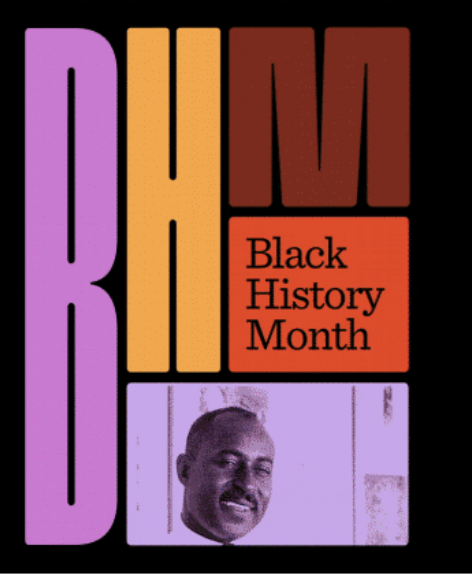
A bold, modernist poster celebrating Black History Month featuring geometric color blocking with vibrant magenta, gold, and rust tones. The design combines large sans-serif typography with a photographic portrait element, creating a striking visual hierarchy against a black background. The composition balances abstract letterforms with representational imagery in a distinctly retro-contemporary aesthetic.
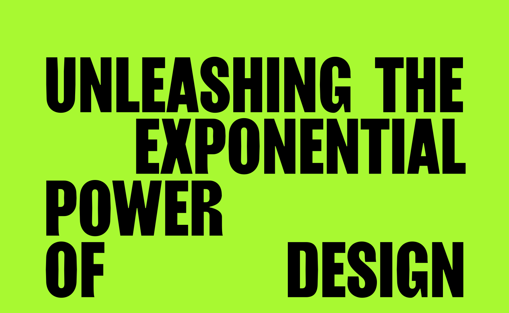
A bold, high-contrast typographic design featuring large black sans-serif text on a vibrant lime green background. The layout uses dynamic spatial arrangement with fragmented text placement to create visual tension and energy, emphasizing the message about exponential design power.
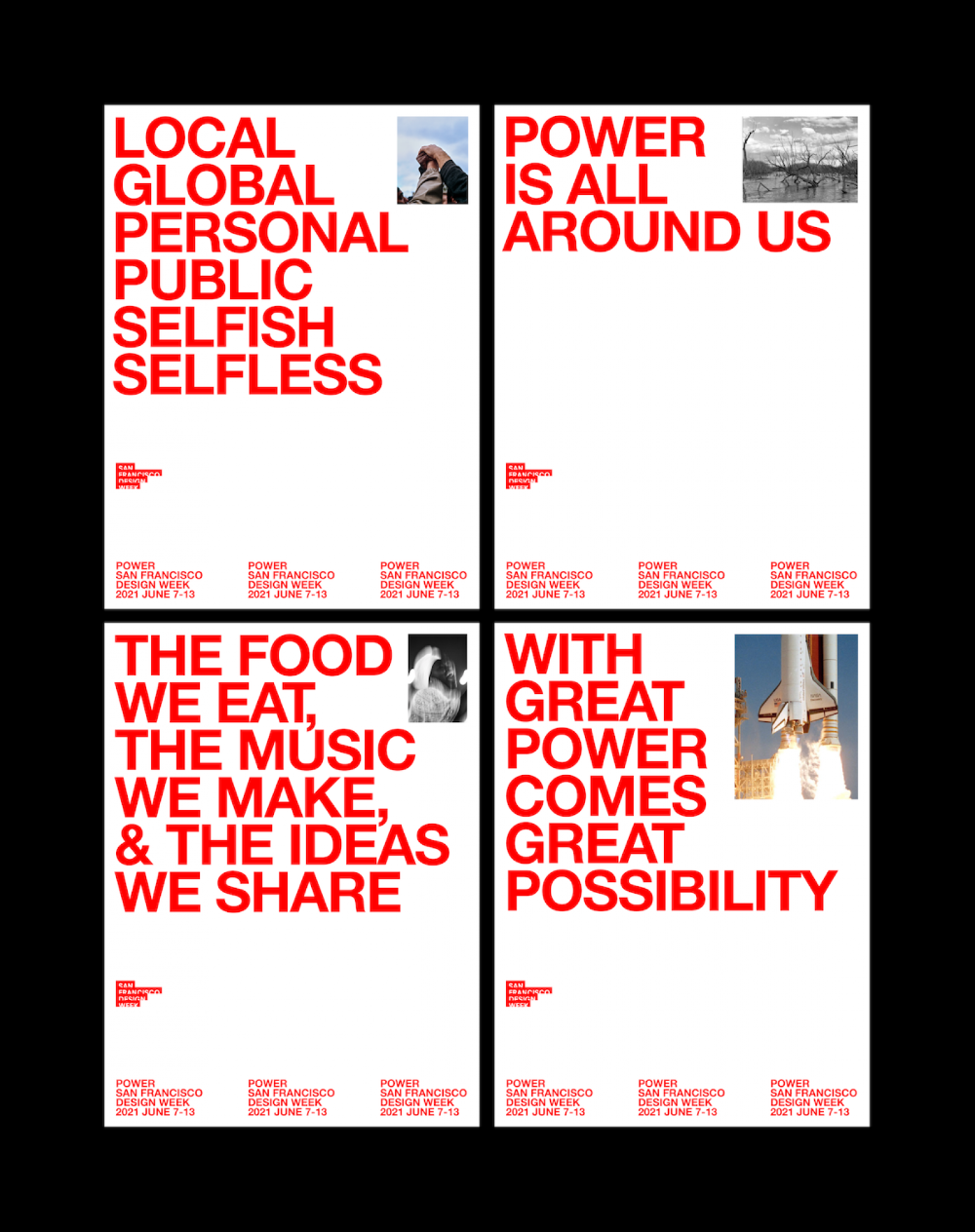
A bold, modernist poster series featuring large red sans-serif typography paired with documentary-style photography. The design employs a minimalist grid layout with high contrast between white space and vibrant red text, creating a striking visual hierarchy that emphasizes messaging over imagery.
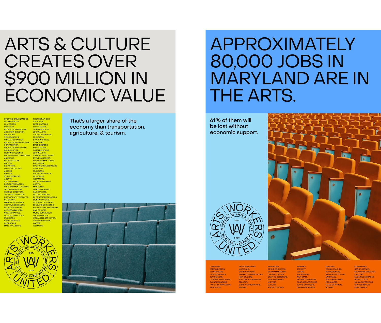
A bold, data-driven infographic campaign split into two panels using stark color blocking and photographic elements to communicate economic impact of arts and culture. The design employs a modernist approach with sans-serif typography, vibrant color fields, and documentary photography to create visual hierarchy and emotional resonance around cultural statistics.
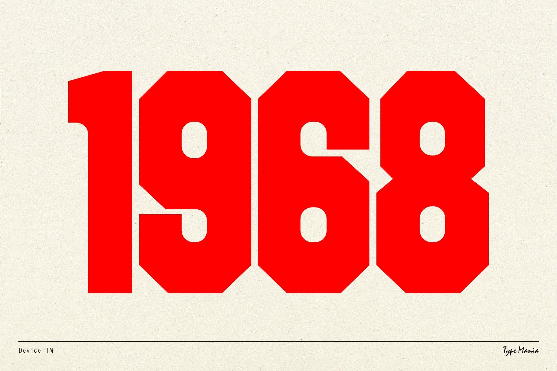
A bold, minimalist typographic design featuring the year 1968 in large red geometric numerals against a cream background. The design employs a strong modernist aesthetic with clean lines and a vintage poster sensibility, emphasizing historical significance through stark visual contrast.
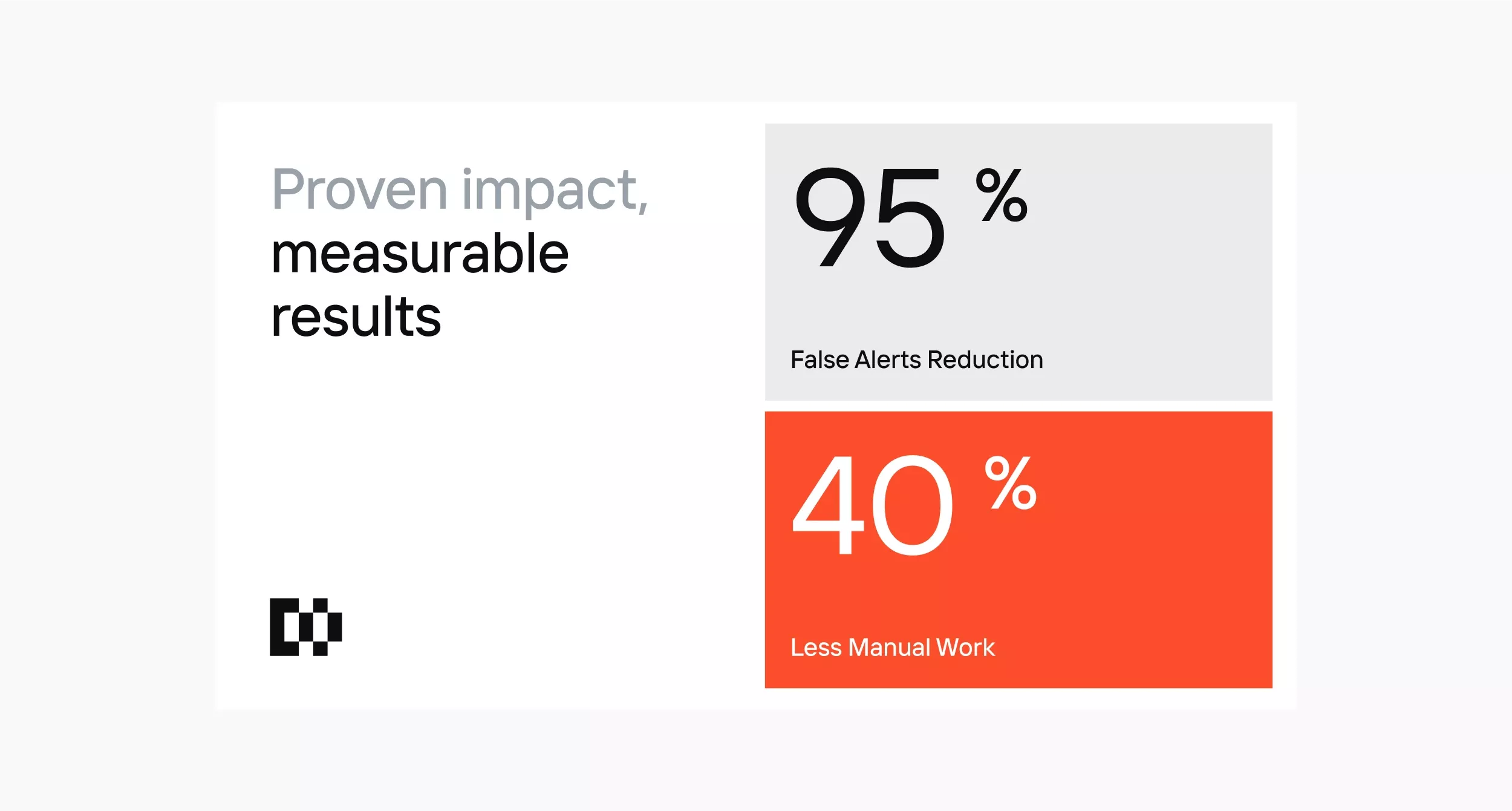
The design is clean, modern, and data-focused, utilizing a stark white background to highlight key performance metrics. It employs strong color blocking (black/white and bright orange) to draw immediate attention to the results.
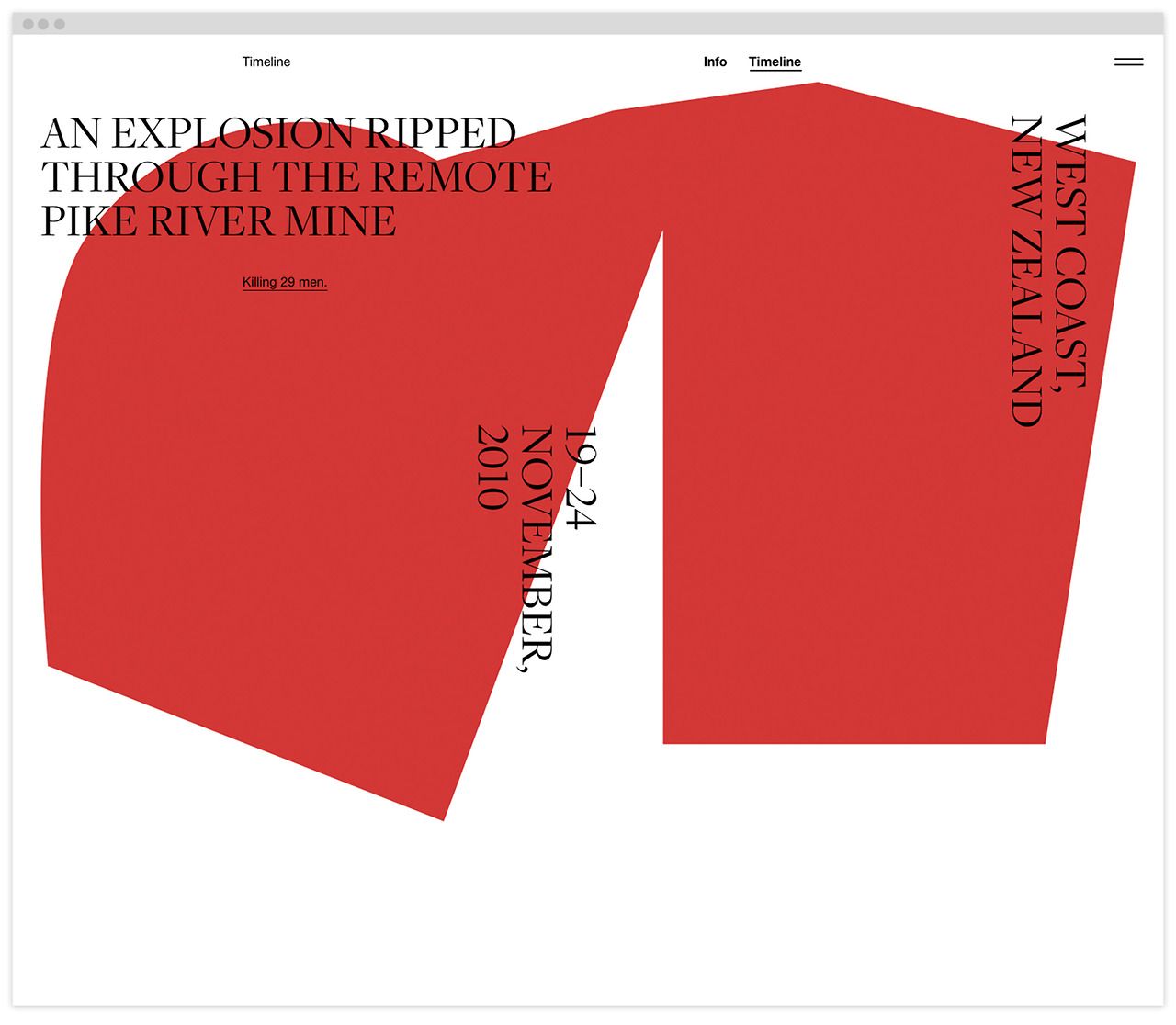
The design utilizes a bold, minimalist timeline visualization with a strong, monochromatic color palette to convey a serious or historical narrative. The layout is dominated by large, overlapping shapes that suggest progression or impact across a timeline.
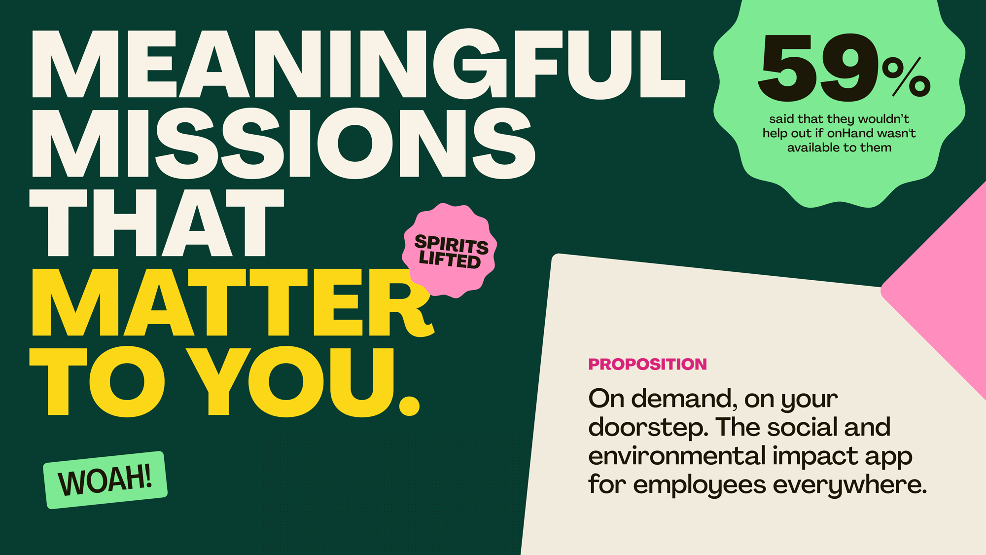
The design uses a dark, deep green background contrasted with bright yellow text and accents, creating a bold and impactful visual. The layout is clean, using large, capitalized text to emphasize the core message, supported by a circular badge for a statistic.
The image uses a stark, minimalist design with high contrast between white space and bold red text to convey a strong, assertive message. The layout is clean and direct, focusing entirely on the provocative question and subsequent declarative statements.
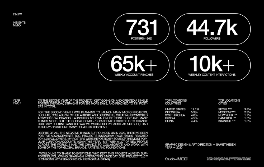
The image is a minimalist, dark-themed infographic or profile summary, utilizing large, bold numbers against a stark black background to convey metrics and achievements. The design is clean, modern, and focused entirely on presenting quantifiable success.
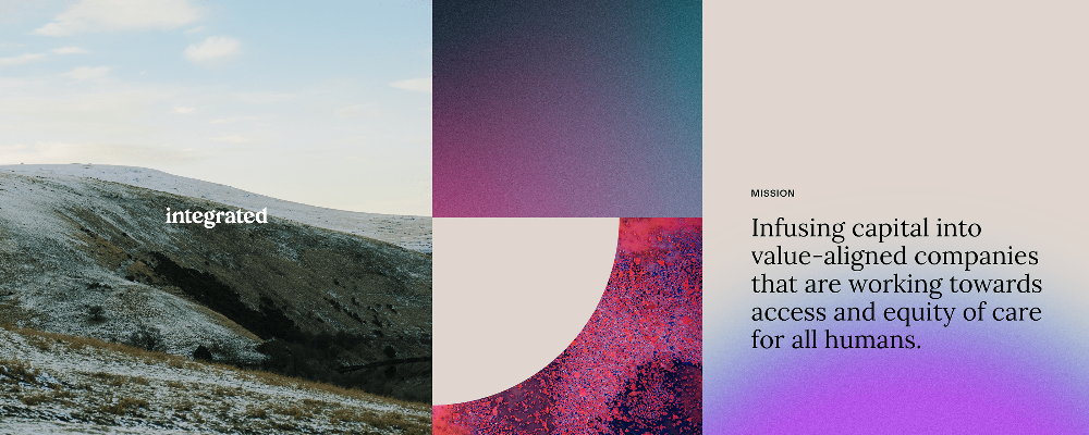
This design utilizes a sophisticated tripartite layout, combining natural landscape photography with bold color blocking to convey a sense of grounded professionalism and social mission. The visual language is clean and modern, effectively uses transitions between textures and solid colors to create depth and focus. The overall feel is serious yet hopeful, balancing earthy tones with vibrant accents.
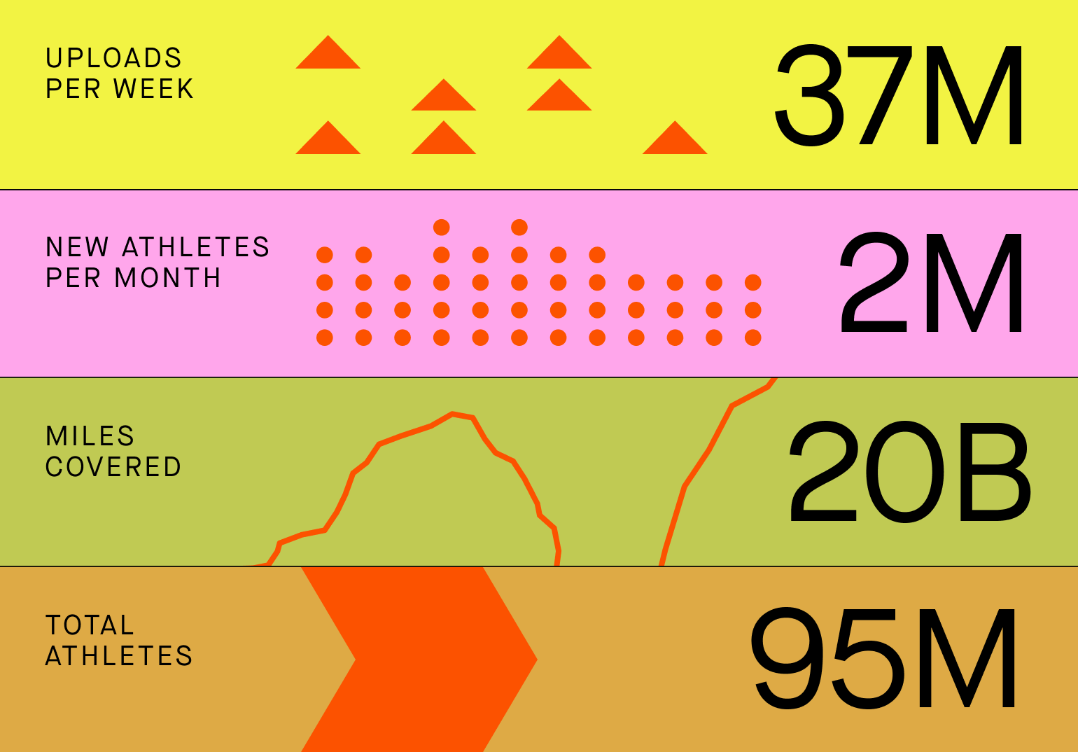
this is a clean and modern data visualization infographic that effectively stacks four key metrics using bright, distinct colors. the design prioritizes readability and immediate impact, making complex quantitative data easy to digest quickly.
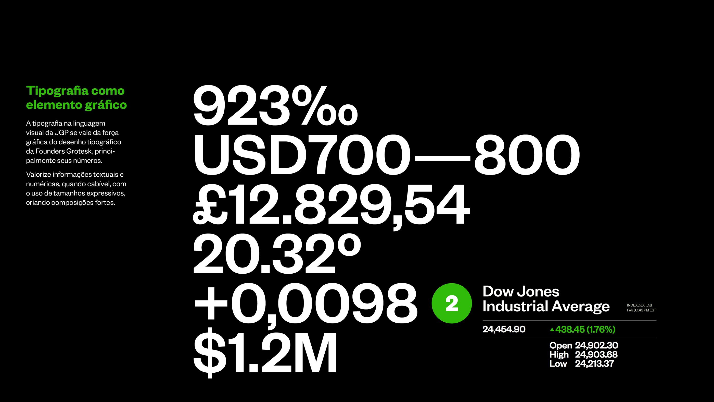
This graphic utilizes a stark, high-contrast minimalist design to present quantitative data with maximum visual impact. The layout is clean and focused, relying purely on typography and numerical hierarchy to convey complex financial statistics efficiently. The overall feel is professional, analytical, and assertive.