documentary
12 designs
Showing 12 of 12 (12 total)
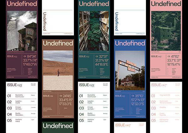
This image presents a clean, structured grid of editorial covers and issue pages, utilizing high-contrast photography and minimalist typography to convey a serious, documentary feel. The design emphasizes visual storytelling through strong imagery juxtaposed with clear textual information.
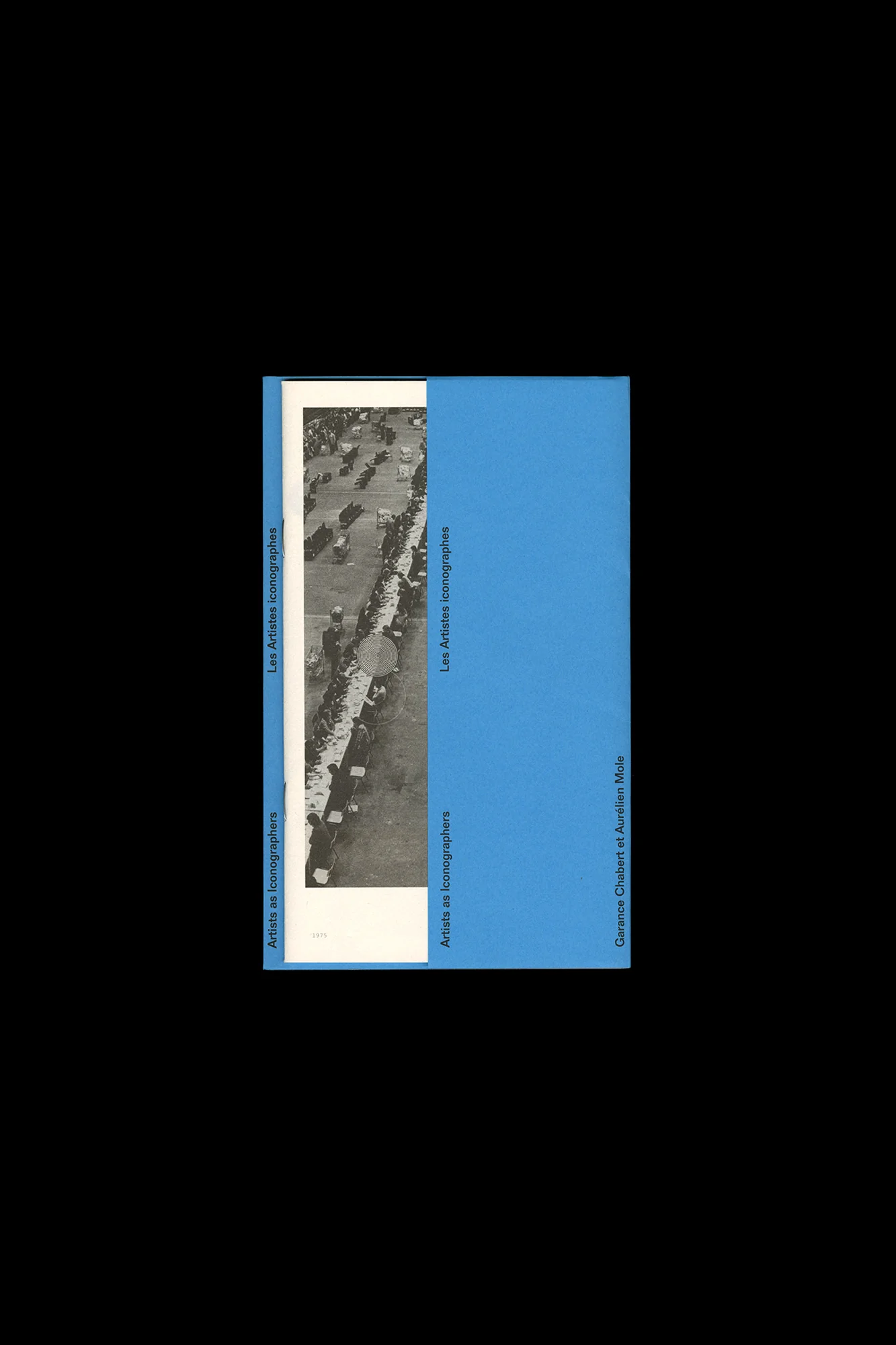
The design is minimalist and academic, utilizing a stark contrast between a photographic element and a solid block of color. It employs a clean, vertical layout typical of archival or exhibition material, conveying a sense of seriousness and historical documentation.
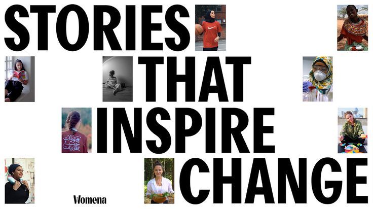
A bold, editorial design featuring large-scale typography overlaid with scattered photographic portraits. The layout combines inspirational messaging with authentic human imagery, creating a dynamic and purposeful visual narrative that emphasizes storytelling and social impact.
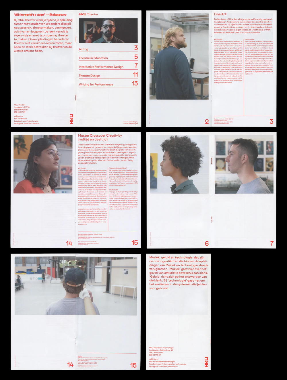
A minimalist editorial design system featuring documentary-style photography paired with structured typography and generous whitespace. The layout employs a clean grid system with strategic use of red accent text against predominantly white backgrounds, creating a contemporary and professional publication aesthetic.
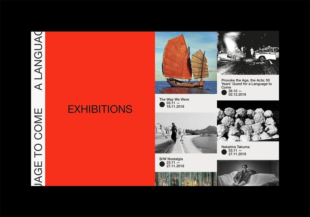
A bold, modernist exhibition catalog cover featuring a striking red field with geometric composition and a grid of archival photography. The design employs Swiss-style typography and stark black-and-white imagery alongside vibrant color blocking, creating a sophisticated institutional aesthetic.
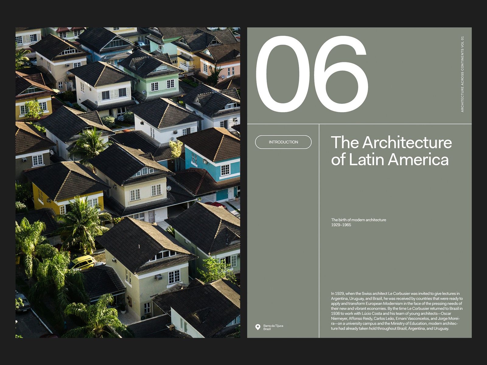
A contemporary editorial layout featuring an aerial photograph of residential architecture paired with minimalist typography and muted color blocking. The design employs a clean, asymmetrical grid structure that balances documentary photography with refined typographic hierarchy, creating a sophisticated publication aesthetic.
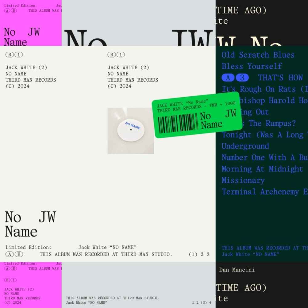
The image displays a collection of what appears to be physical music releases or catalog entries, characterized by stark, minimalist layouts typical of independent music or archival documentation. The design relies heavily on white space and simple black text, suggesting a focus on the content rather than elaborate graphic design.
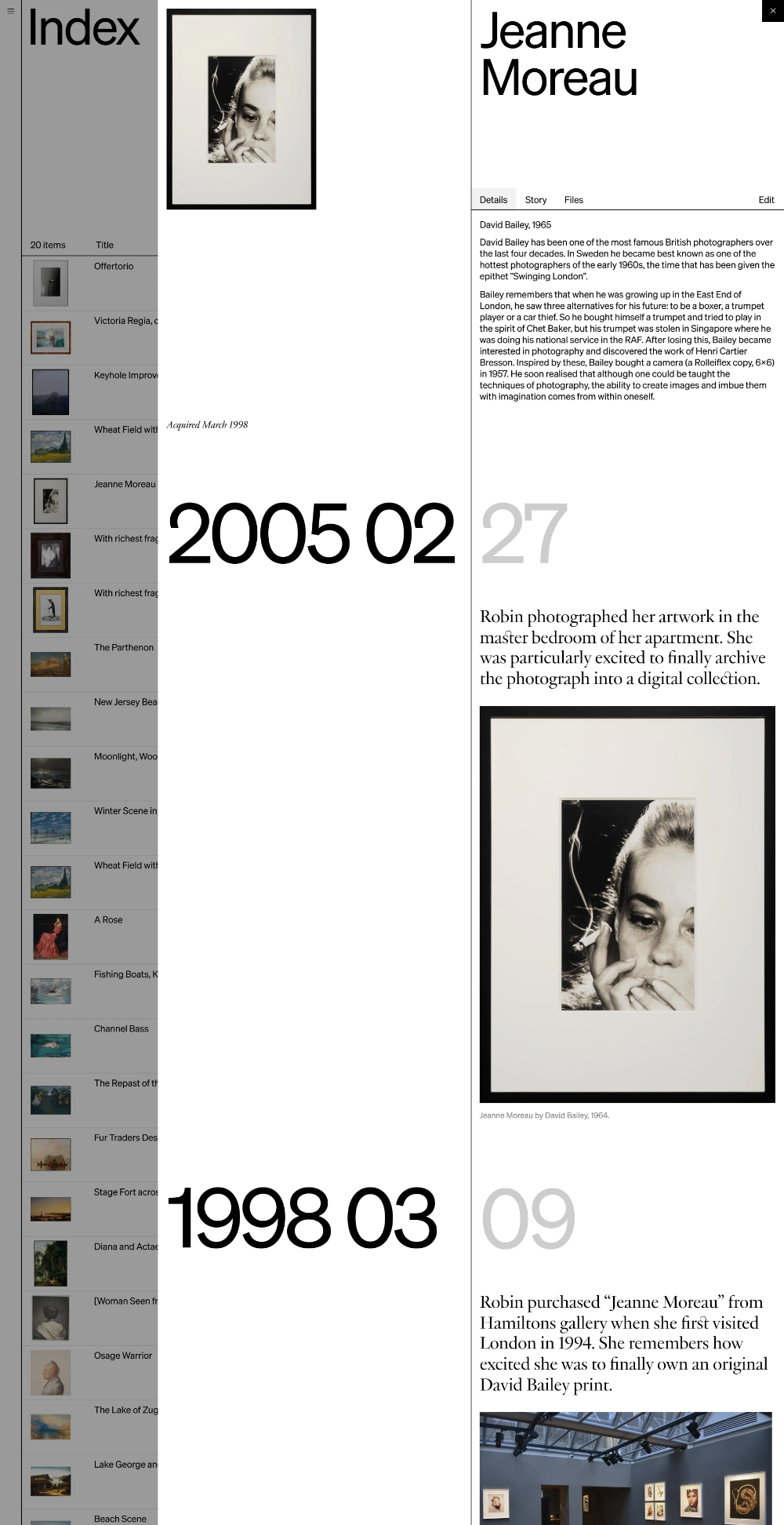
The image presents a stark, minimalist index or archive page with a clean, academic layout. It uses ample white space to separate chronological entries and photographic examples, conveying a sense of curated historical documentation.
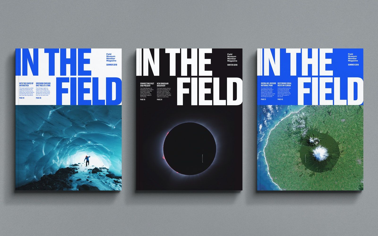
This is a cohesive set of three poster designs for a publication titled 'In the Field,' utilizing stark, high-contrast imagery to evoke themes of exploration, nature, and scientific discovery. The visual language is dominated by deep blues, dark tones, and vibrant natural greens, creating a sense of both vastness and intimate focus.
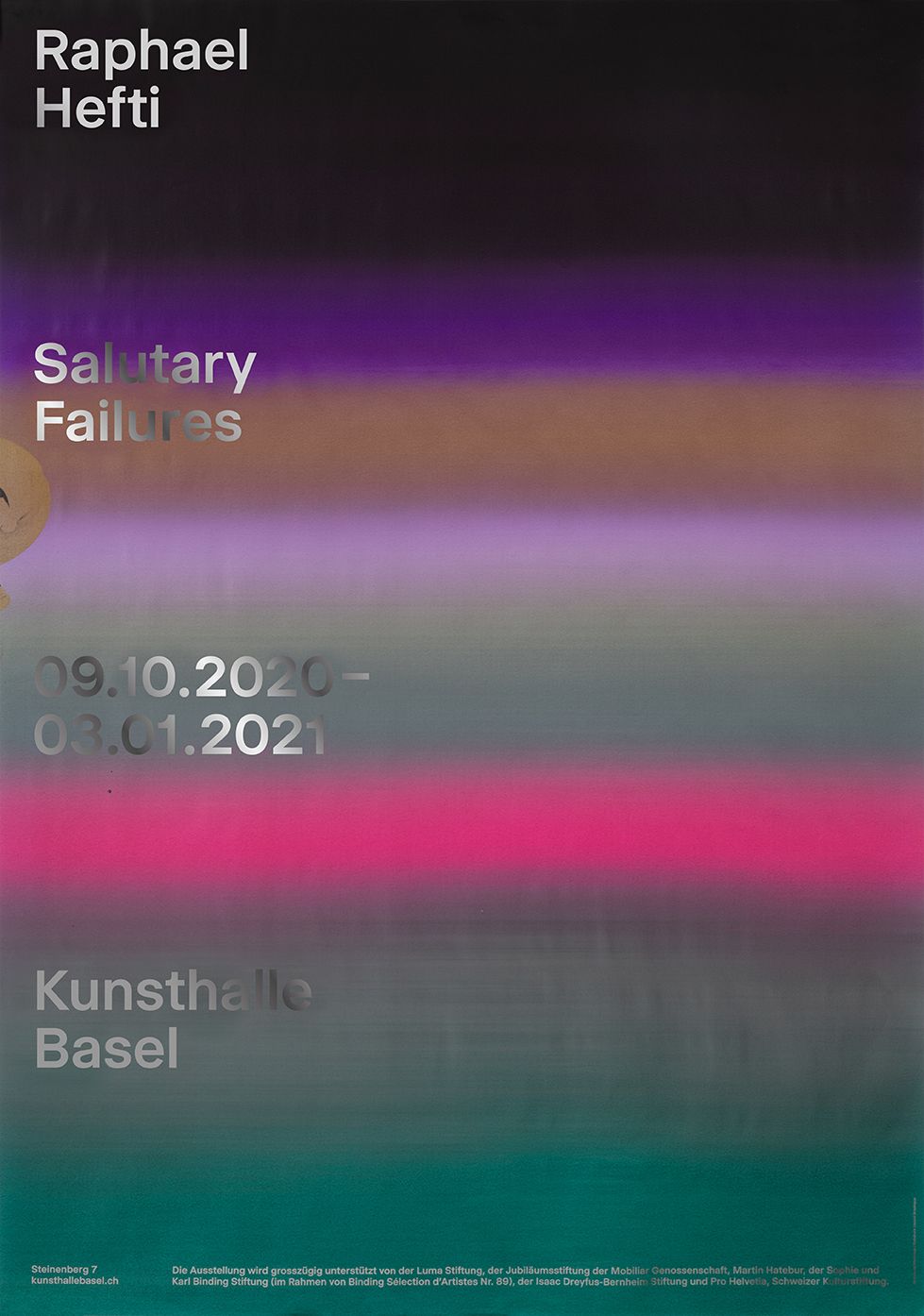
The design is minimalist and professional, utilizing a muted, gradient color scheme to convey a sense of seriousness and temporal documentation. The layout is clean and text-heavy, focusing attention on the title and dates against a subtle background wash.
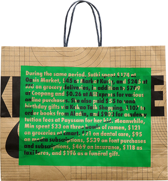
This image presents a personal, archival document—a handwritten financial list—set against a textured, structured background. The design utilizes high contrast between the vibrant green ink and the muted earth tones of the paper and surrounding structure, lending it a personal yet organized feel.
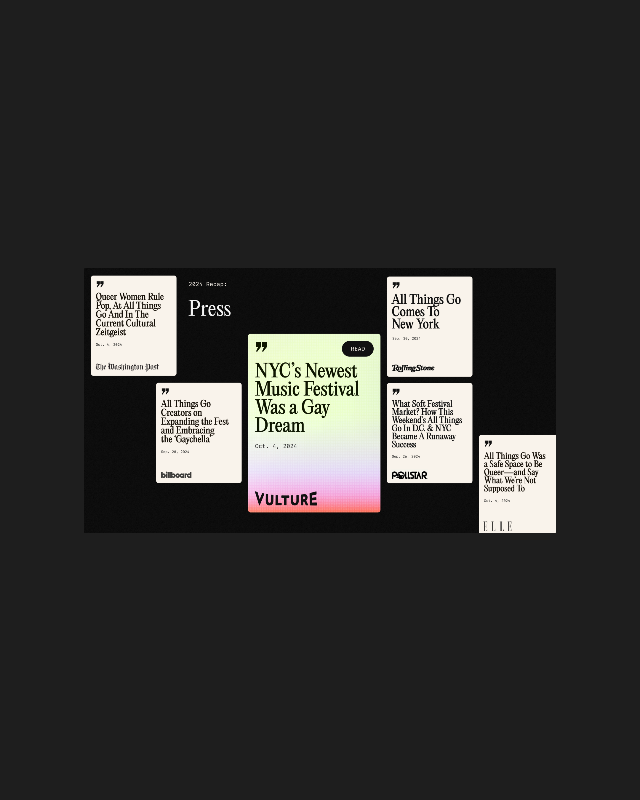
This design utilizes a minimalist, high-contrast grid structure, reminiscent of editorial magazine covers or journalistic snippets. The visual language is clean and severe, relying heavily on negative space and stark typography to draw attention to the headlines.