cautionary
10 designs
Showing 10 of 10 (10 total)
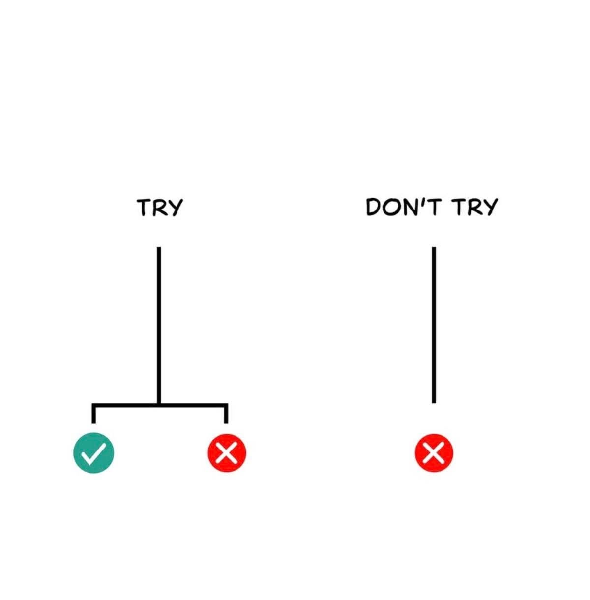
This design uses a stark, minimalist visual language to present a clear binary choice between an affirmative action and a negative prohibition. The use of simple line art combined with universally recognized symbols (check mark and X) creates immediate, unambiguous communication.

This is a clean, modern user interface design used to convey an important environmental warning regarding plastic recycling. The design uses a warm orange background paired with crisp white and blue accents to ensure high contrast and readability for the cautionary message.
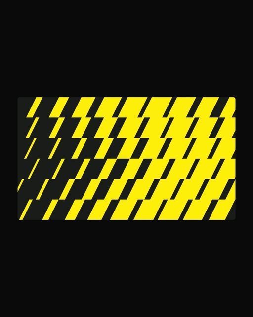
This image features a high-contrast, repeating pattern of diagonal stripes, strongly reminiscent of hazard tape or warning signs. The design is bold and graphic, relying purely on line work and color blocking to convey a sense of urgency or caution.
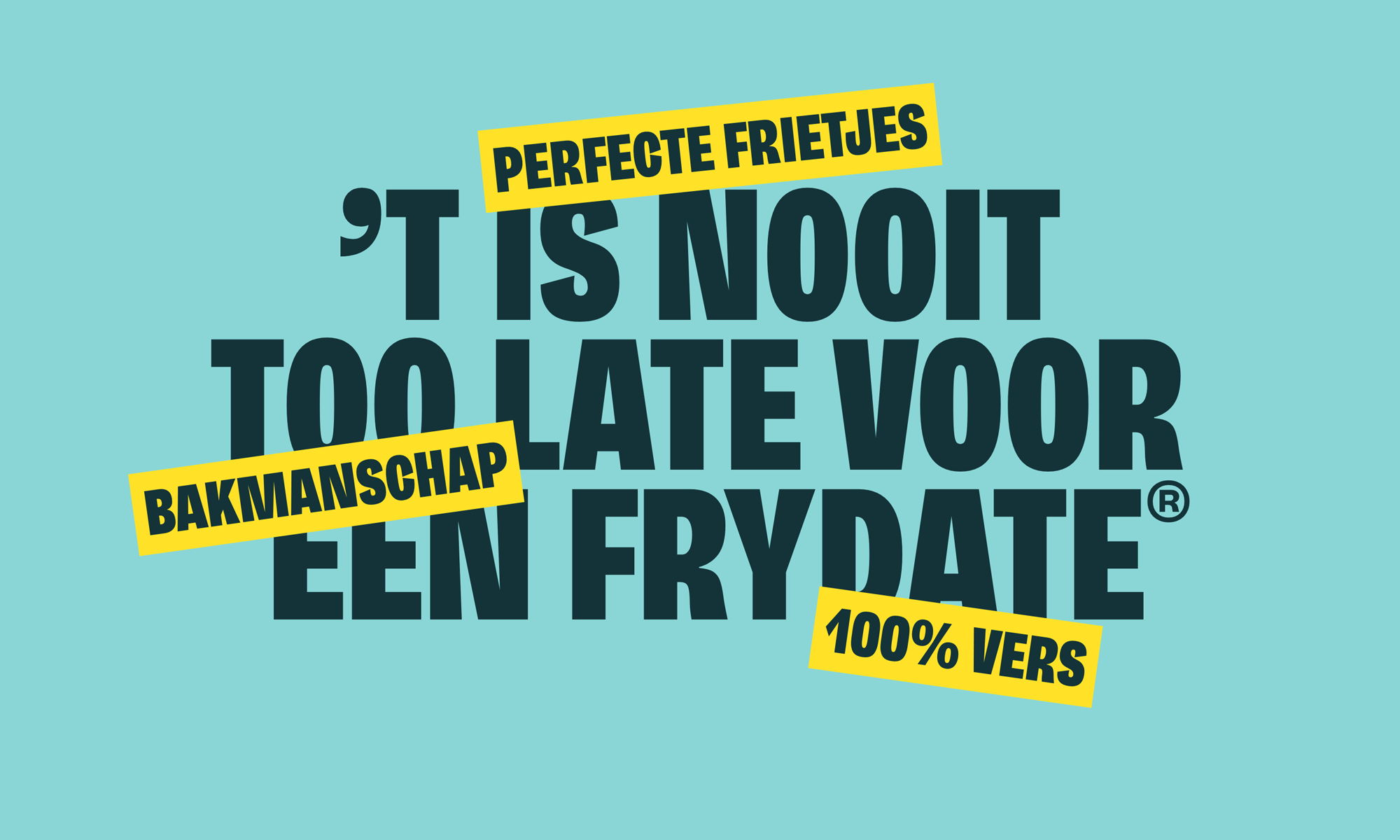
A bold, Dutch-language public health or safety campaign featuring large, heavy sans-serif typography in dark teal against a bright turquoise background. The design uses contrasting yellow accent bars with white text to emphasize key messages, creating an urgent and attention-grabbing visual hierarchy.
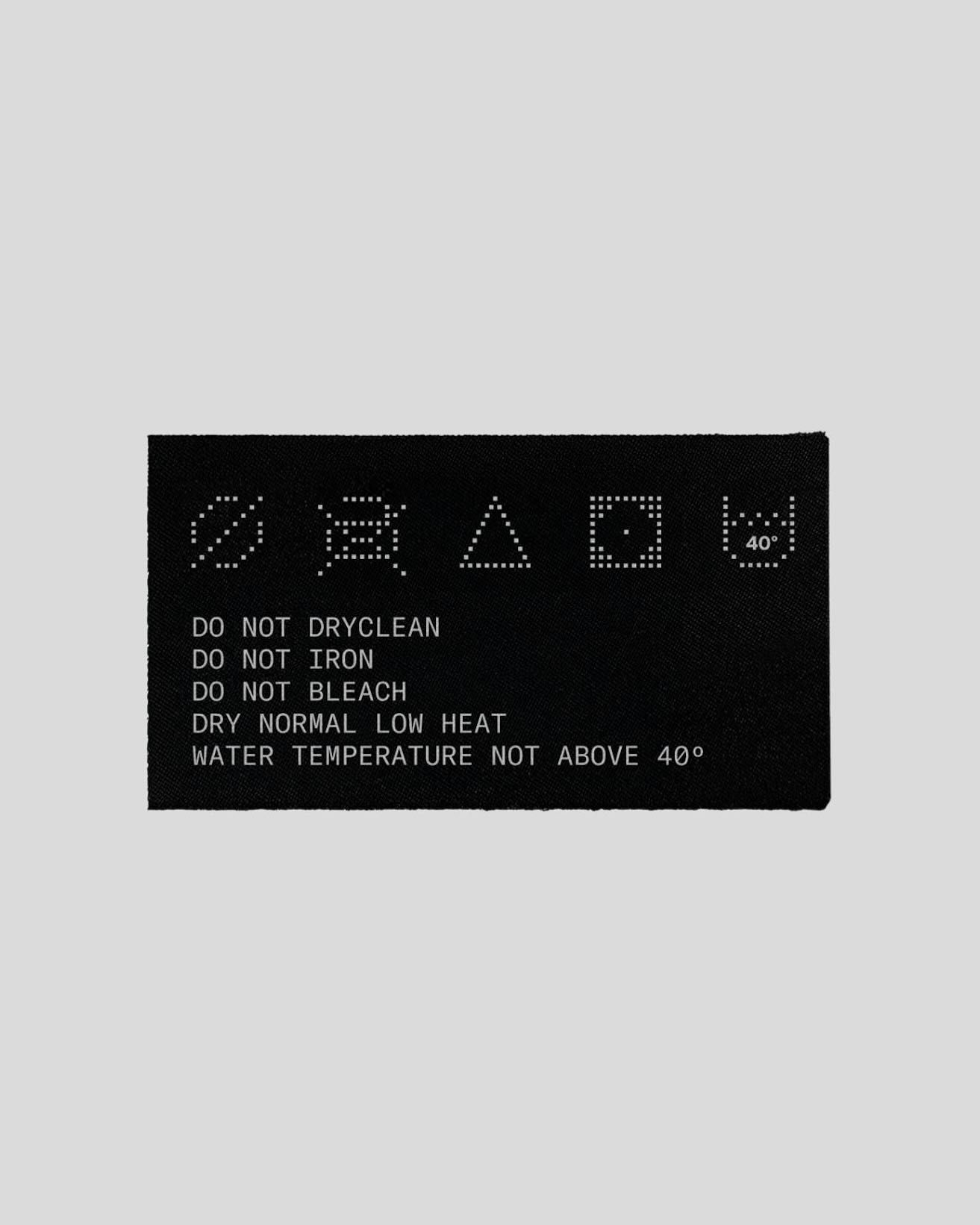
This design utilizes a stark, high-contrast visual language to convey mandatory cautionary instructions. The typography employs a discrete, almost pixelated or stencil-like texture, lending the piece a functional and technical aesthetic. The overall feel is strictly utilitarian and serious, prioritizing clarity over decorative elements.
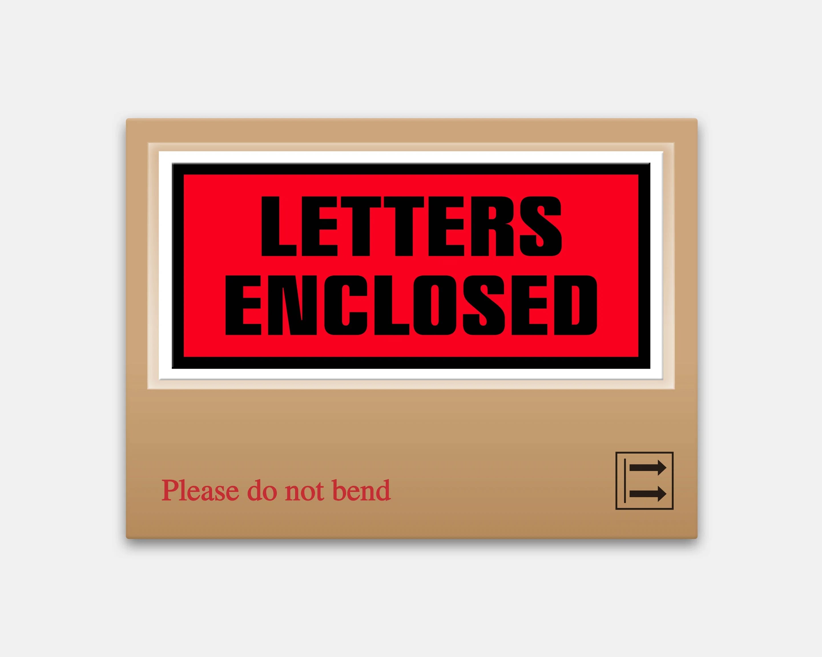
This is a highly functional and minimalist design utilizing strong color blocking to convey clear instructional information. The use of contrasting red and black against a neutral tan background creates immediate visual hierarchy, ensuring the key message is instantly legible and actionable.
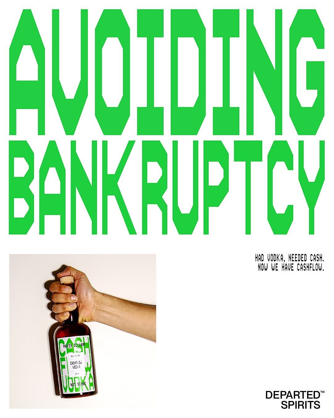
This design employs a high-contrast, graphic style using vibrant lime green against a stark white background to create an immediate and bold statement. The visual language is clean, direct, and uses strong typography to convey a financial/lifestyle message related to the product.
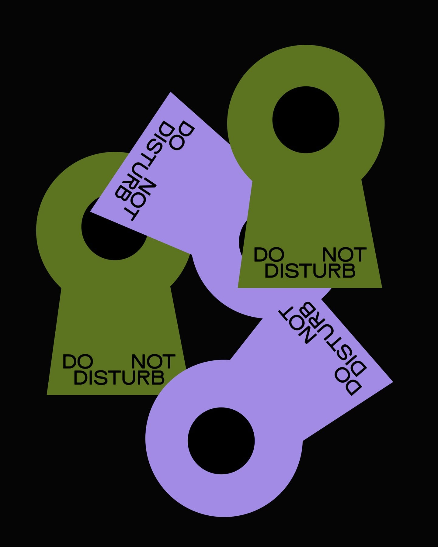
This design utilizes bold geometric shapes and contrasting muted tones to create a clear, cautionary message. The overlapping elements suggest layered warnings or interconnected rules, establishing a serious and instructional visual hierarchy.
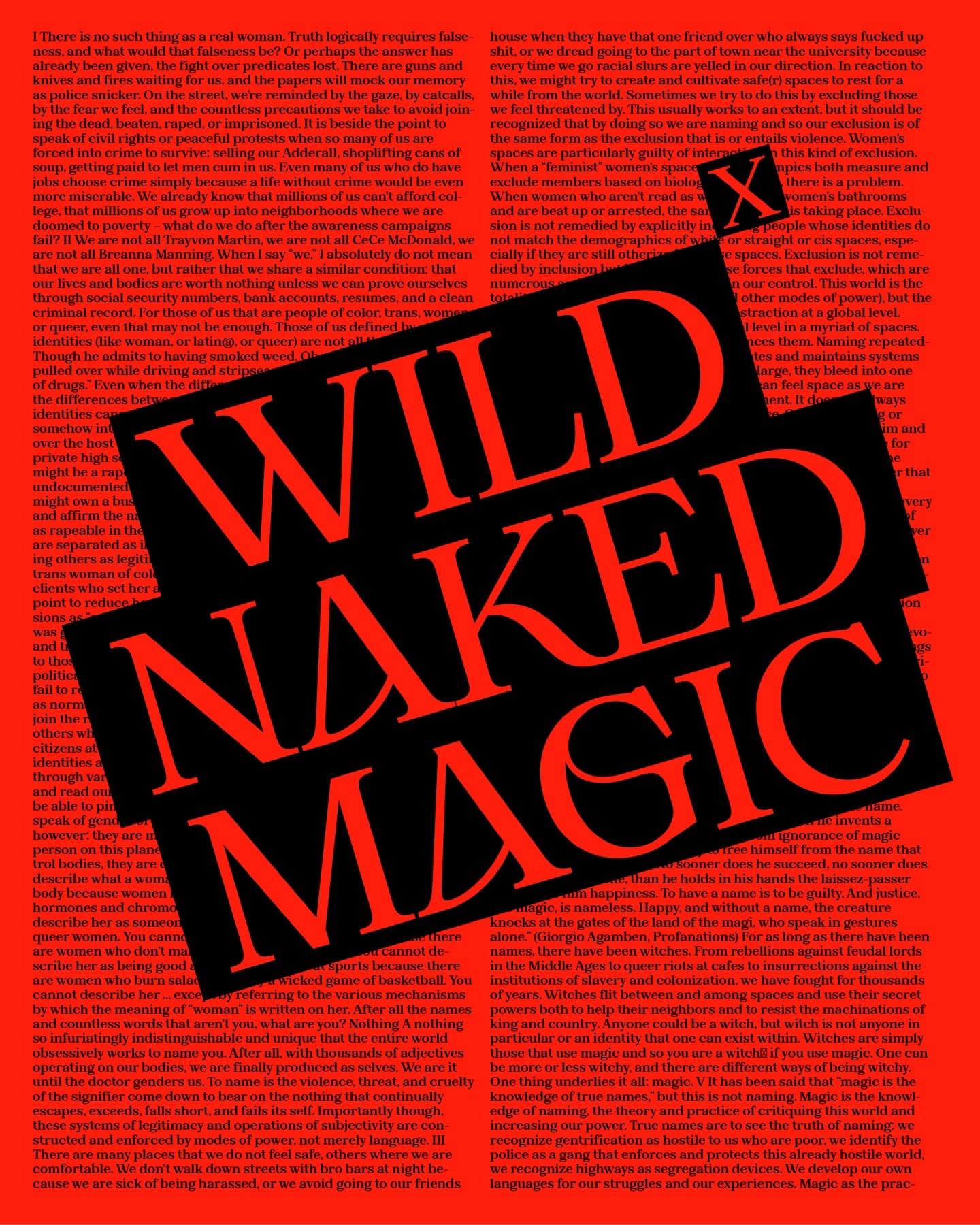
The design employs a stark, high-contrast approach using heavy, dense typography against a pure black background. The visual language is direct and serious, utilizing scale differences to create immediate emphasis on key phrases.
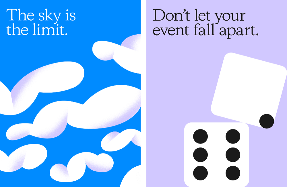
This visual uses a stark split to juxtapose aspirational freedom (sky/limit) with cautionary advice (event failure), employing clean, minimalist graphics and strong color blocking. The design effectively communicates a message of ambition while simultaneously warning against precarious situations.