austere
214 designs
Showing 24 of 214 (214 total)
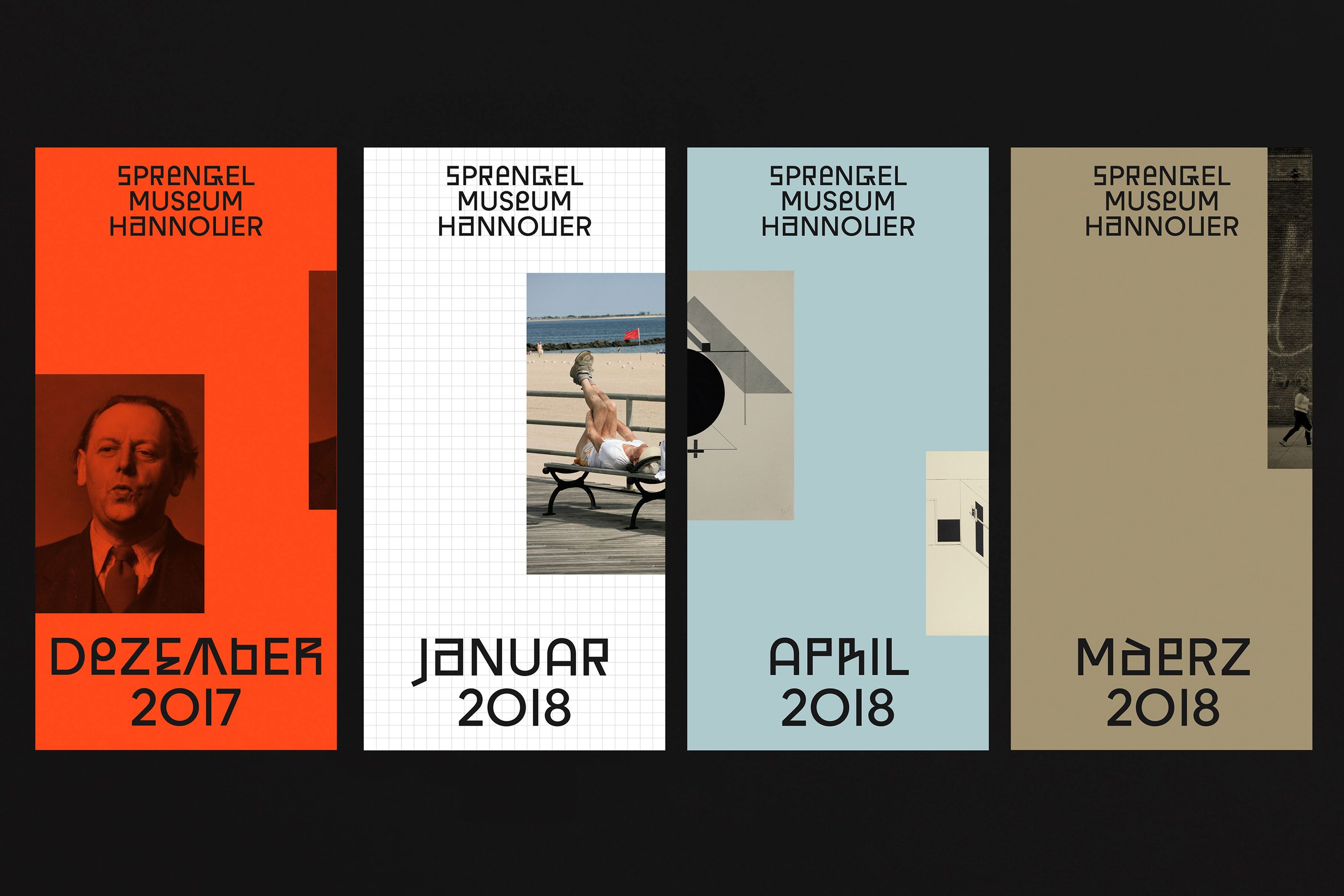
This design utilizes a stark, modular grid structure to present archival information in a minimalist and highly structured manner. The visual language relies on contrasting solid color blocks and photographic elements to create a sense of temporal layering.
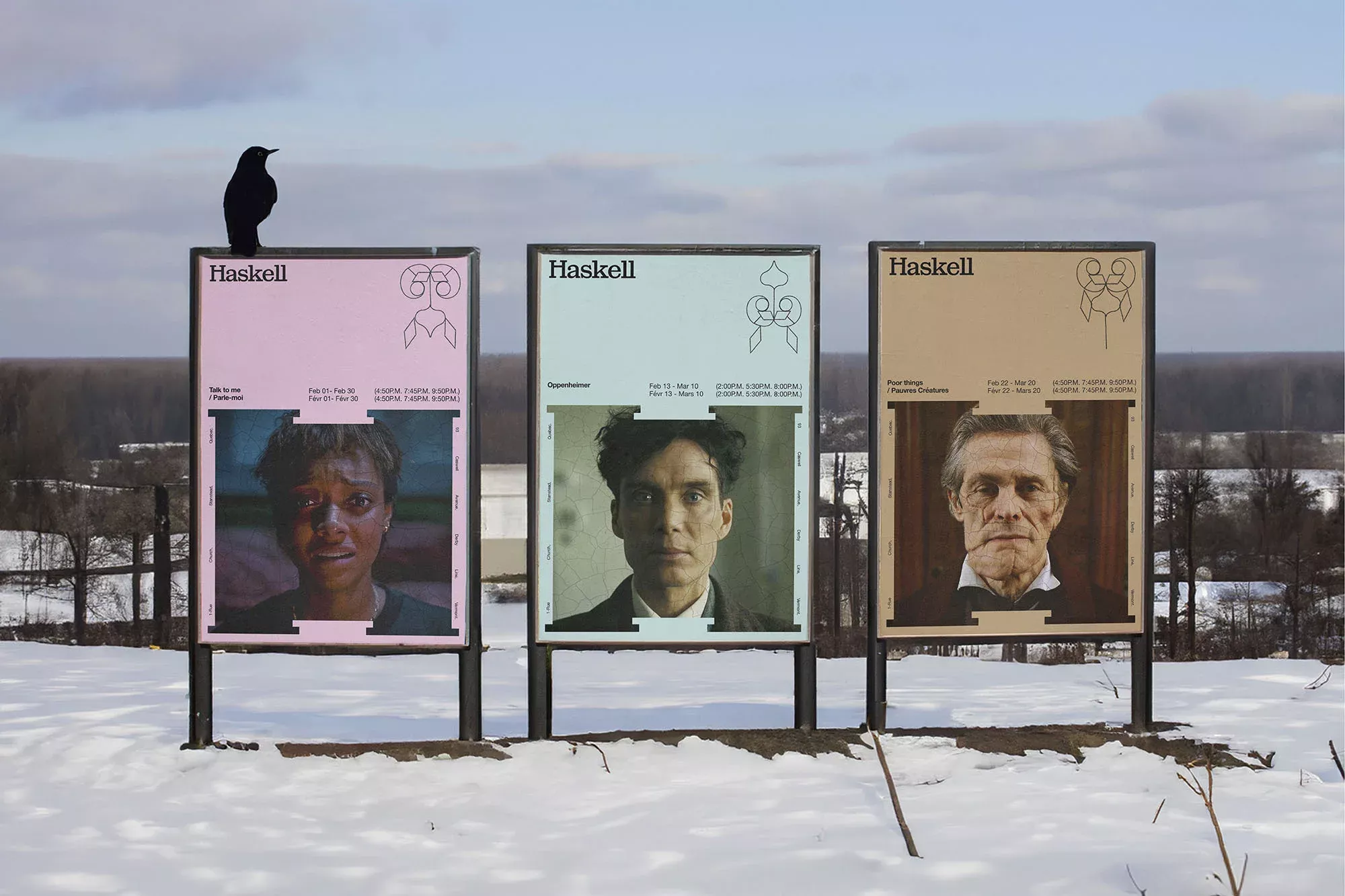
This is an outdoor exhibition featuring three vertical panels displaying photographic portraits and minimalist text, suggesting a historical or artistic retrospective. The design relies on stark contrast and simple composition to present the subjects in a raw, documentary manner.

This image captures a stark, minimalist architectural study where clean white lines of modern design contrast sharply with the muted tones of a snowy winter landscape. The visual language emphasizes geometric purity and the interplay between built form and natural environment.
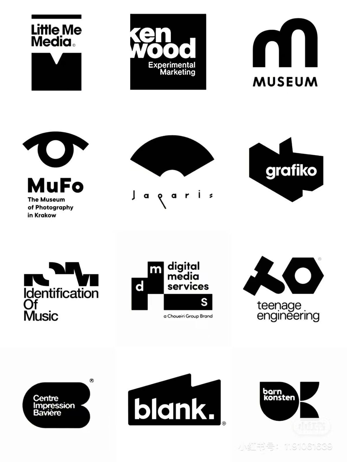
This image presents a collection of stark, minimalist logotypes and wordmarks, characterized by strong geometric shapes and clean, sans-serif typography. The overall visual language is modern, corporate, and precise, relying heavily on negative space and solid black forms to convey a sense of established professionalism.
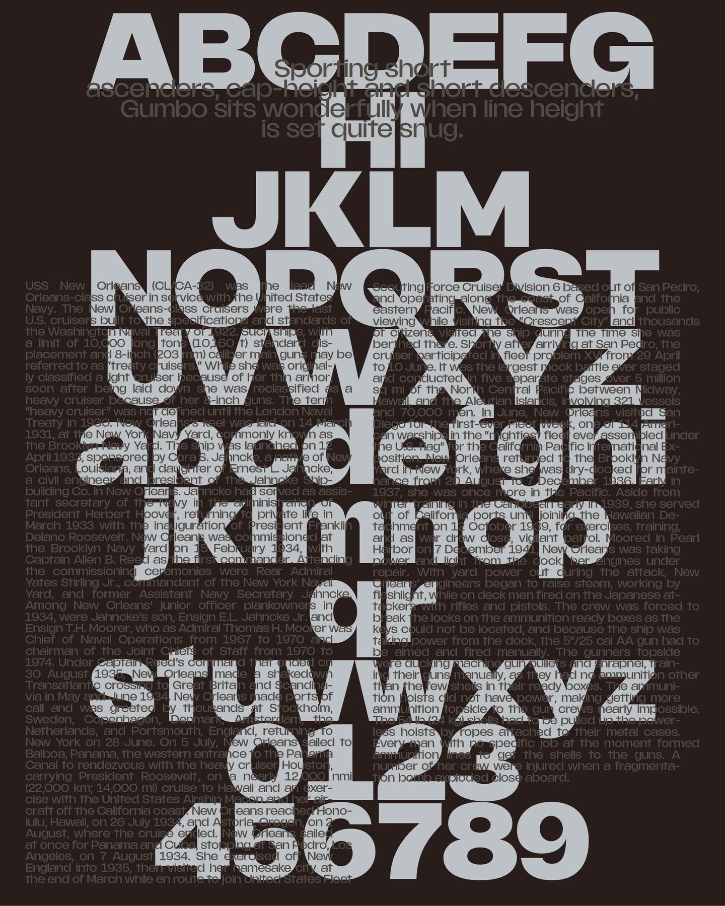
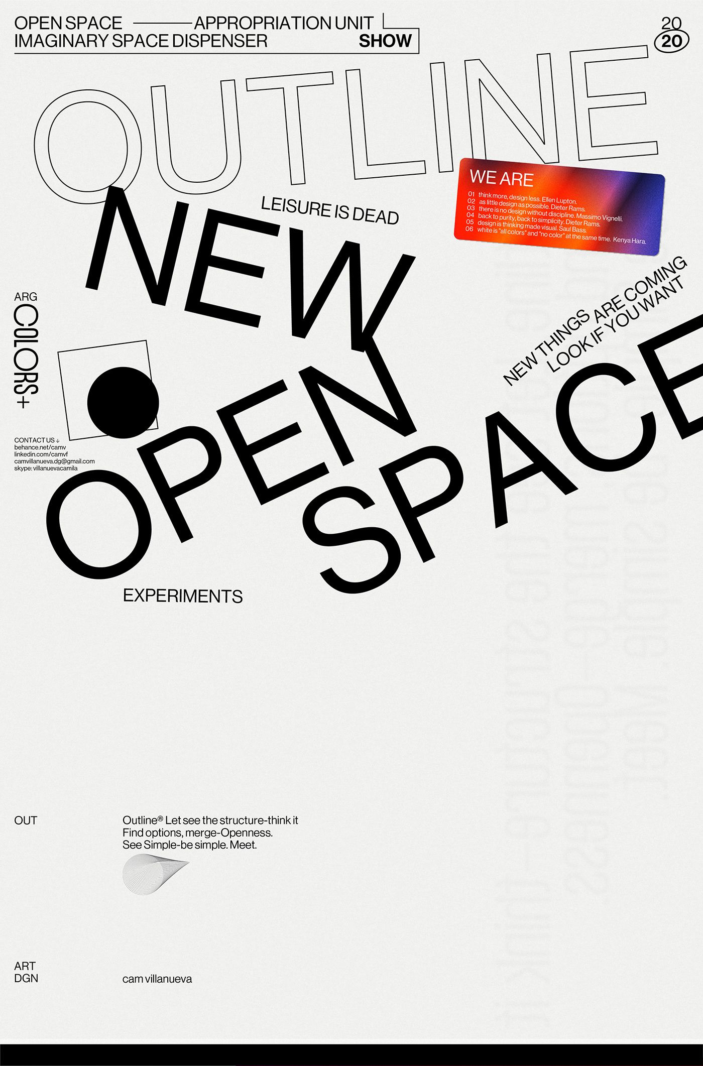
This image is a high-contrast typographic study, utilizing the alphabet as the primary visual texture. The design relies on dense layering and fragmentation of letterforms to create an abstract, almost chaotic yet structured visual field. The overall feel is stark, intellectual, and deeply textural.
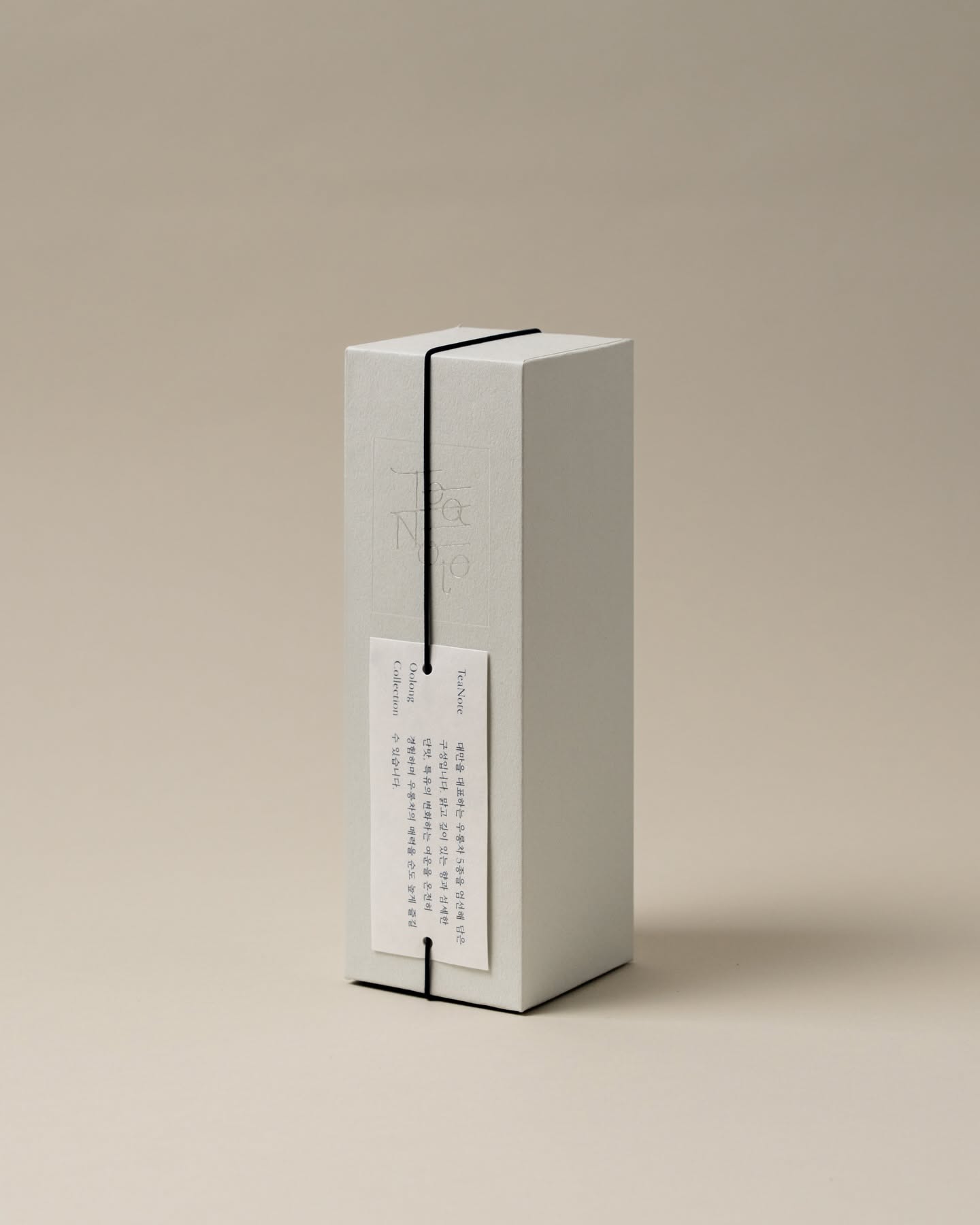
This design exemplifies extreme minimalism through clean geometric forms and restrained use of color. The visual language relies on precise lines, negative space, and a muted palette to convey sophistication and quiet luxury. The overall feel is highly structured, calm, and contemporary.
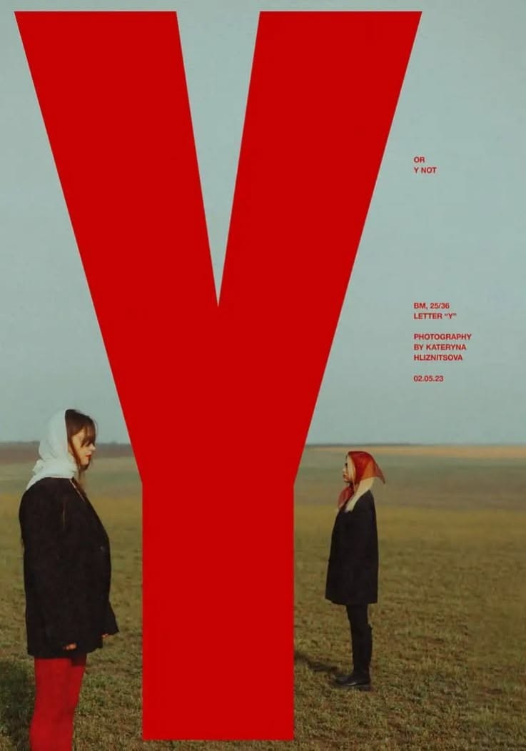
This design utilizes high contrast and scale to create a striking visual statement, dominated by a massive red letterform that dwarfs the human figures below. The visual language is stark and conceptual, employing simple forms and muted natural tones to draw attention to the interplay between typography and human presence.
This is a minimalist, high-contrast typographic exploration using stark black and white space. The design relies heavily on negative space and the clean, geometric forms of the letters to create a sophisticated and architectural feel.
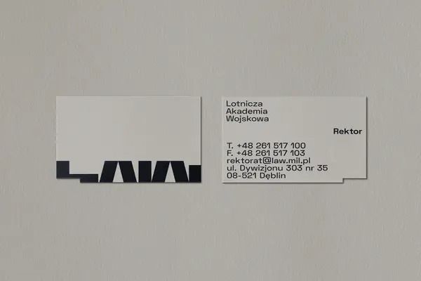
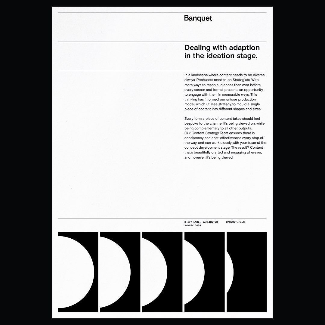
The image presents a minimalist and corporate identity display, featuring stark black typography against a light, neutral background. The design emphasizes clean lines and negative space, conveying a sense of modern professionalism and institutional authority.
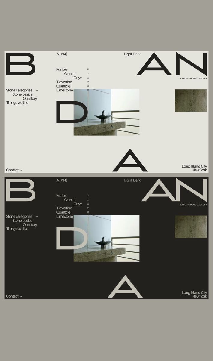
The design is stark, minimalist, and conceptual, utilizing negative space heavily to create a dynamic yet restrained visual hierarchy. It employs bold, sans-serif typography and geometric shapes to convey an intellectual or avant-garde tone.
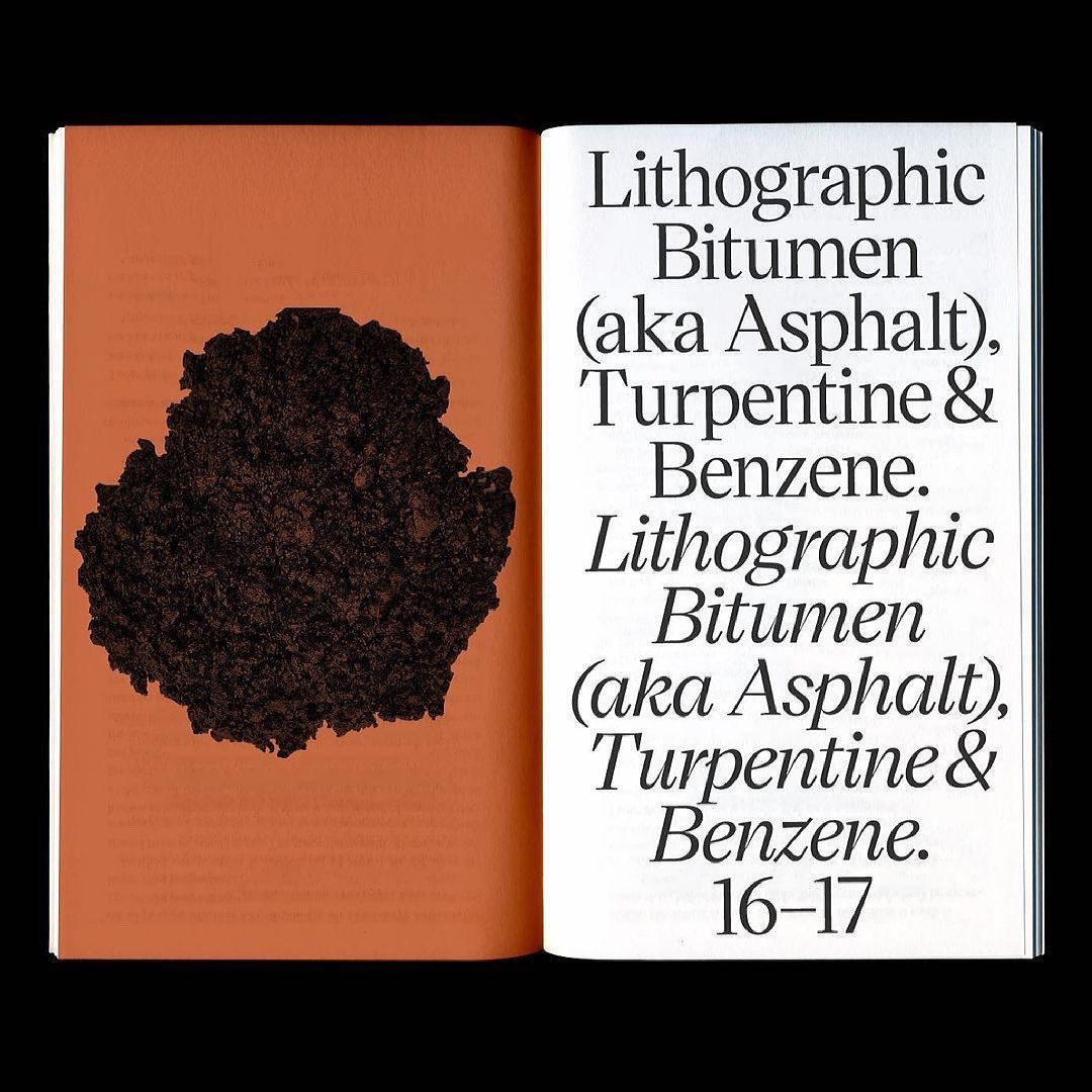
The image presents a stark, minimalist layout typical of technical or academic documentation. It features a high-contrast pairing of a warm, muted background with crisp black text and a dark, organic sample, conveying a sense of scientific precision and archival seriousness.
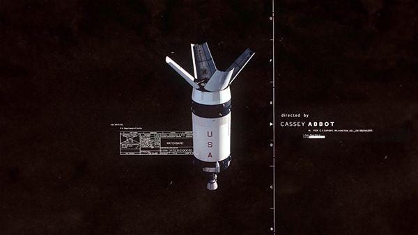
This image presents a stark, high-contrast visual of a spacecraft or satellite, emphasizing technical precision and a sense of historical or governmental achievement. The design is minimalist, focusing on the functional form of the hardware against a deep, dark background.
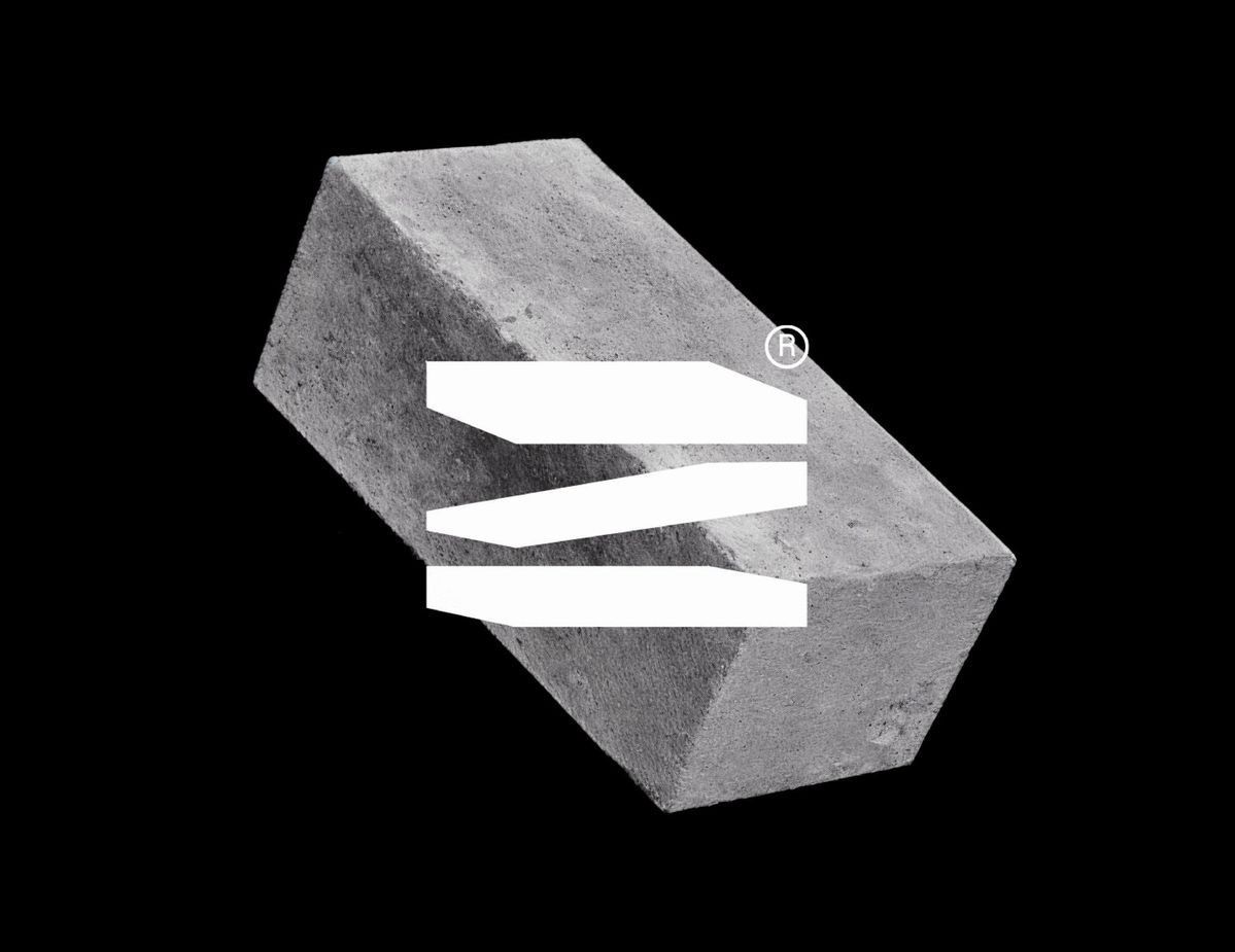
The image presents a stark, minimalist study in form and negative space, featuring a monolithic, geometric block intersected by clean, horizontal white elements. The visual language is severe and modern, emphasizing solidity and precise interruption.
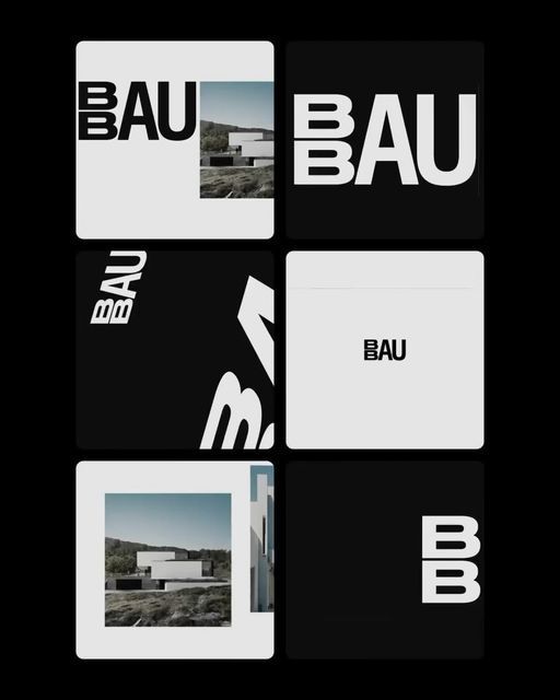
This image presents a stark, minimalist grid of monochrome branding elements, relying heavily on negative space and high contrast to convey a modern, corporate, and sophisticated aesthetic. The design is clean, structured, and emphasizes brand recognition through bold typography.
The design is minimalist and stark, relying on high contrast between white text and a black background. It conveys a sense of modern, clean, and sophisticated presentation typical of gallery or exhibition materials.
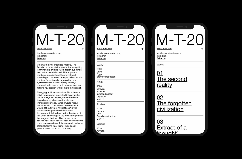
The image displays a series of minimalist, vertically stacked digital cards or screens, suggesting a clean, modern, and academic presentation style. The design relies heavily on negative space and clear typography to present structured information.
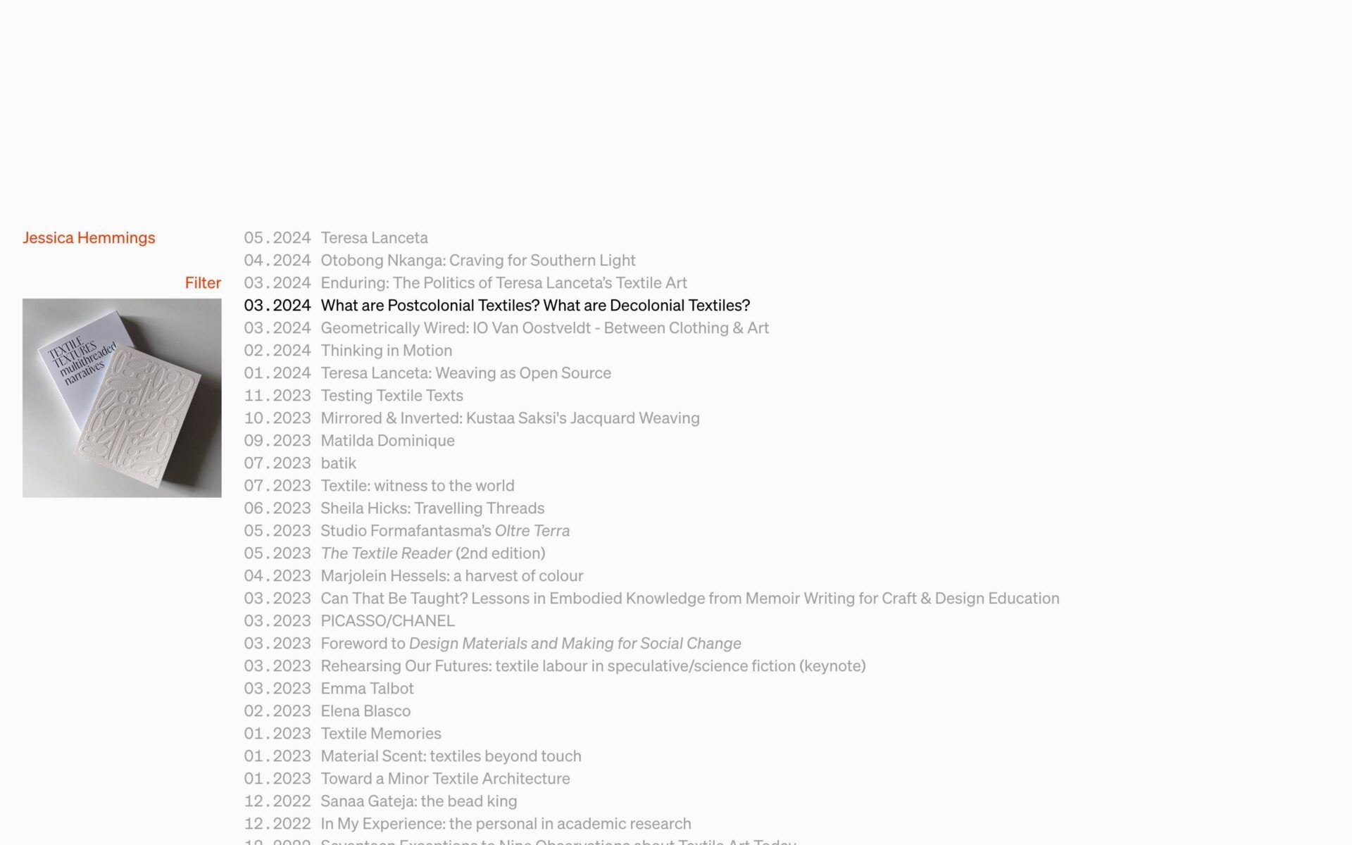
This image displays a chronological list of publications or works, suggesting an academic, literary, or artistic archive. The design is minimalist and text-heavy, relying on clean typography and simple formatting to present dense information clearly.
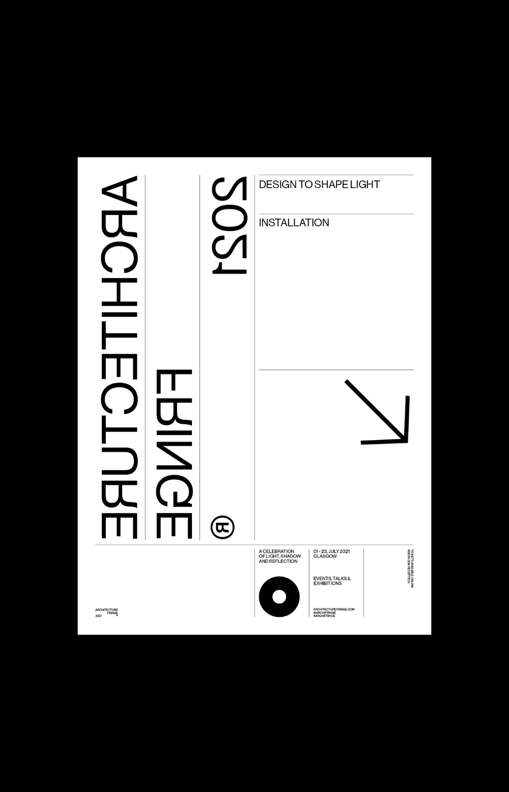
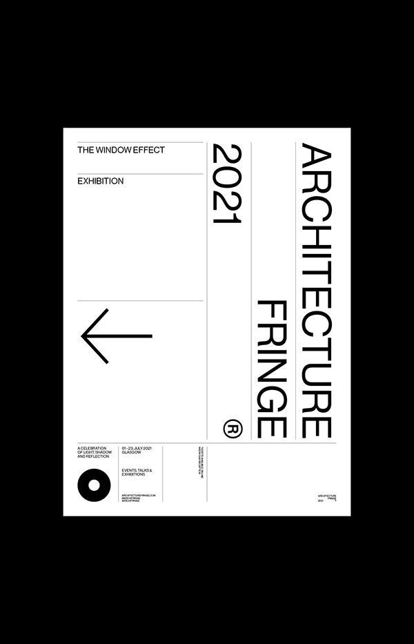
The image presents a stark, minimalist design, likely a technical or installation specification sheet. It relies heavily on negative space and clean lines to convey information with an objective, modern aesthetic.
This is a stark, minimalist exhibition label design characterized by high contrast and severe asymmetry. The visual language relies heavily on negative space and clean, sans-serif typography to convey a sense of academic rigor and modern precision.
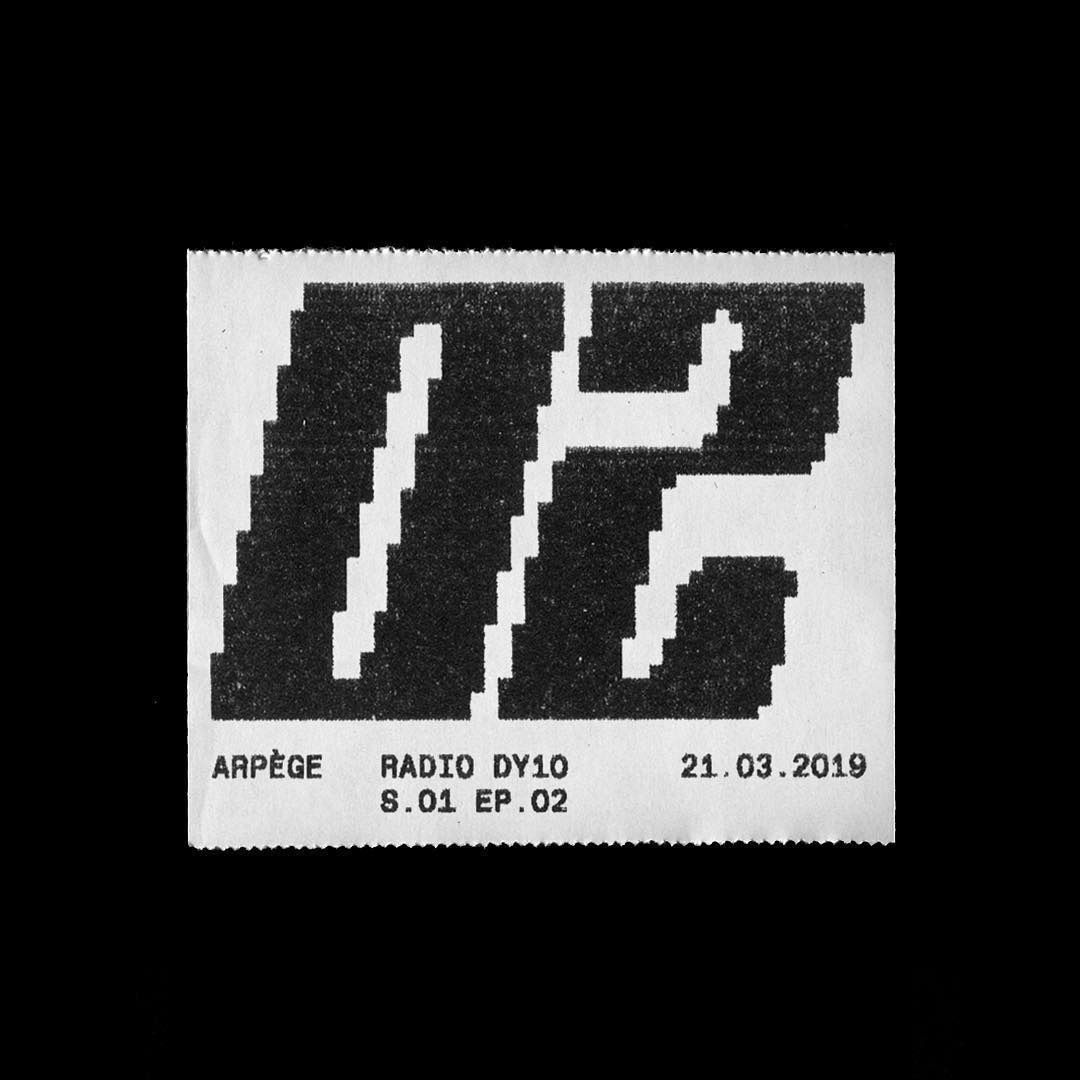
This image is a stark, high-contrast graphic featuring large, bold numerals printed on what appears to be a postage stamp or similar small paper item. The design relies heavily on negative space and the texture created by the printing process, giving it a raw, utilitarian aesthetic.
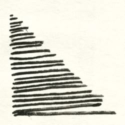
This image is a stark, abstract graphic composed entirely of parallel, horizontal lines that converge towards the upper left, creating a dynamic sense of direction or tapering form. The visual language is minimalist and linear, relying purely on line weight and negative space to convey structure.
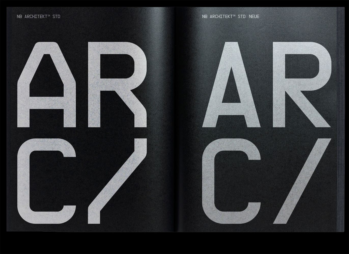
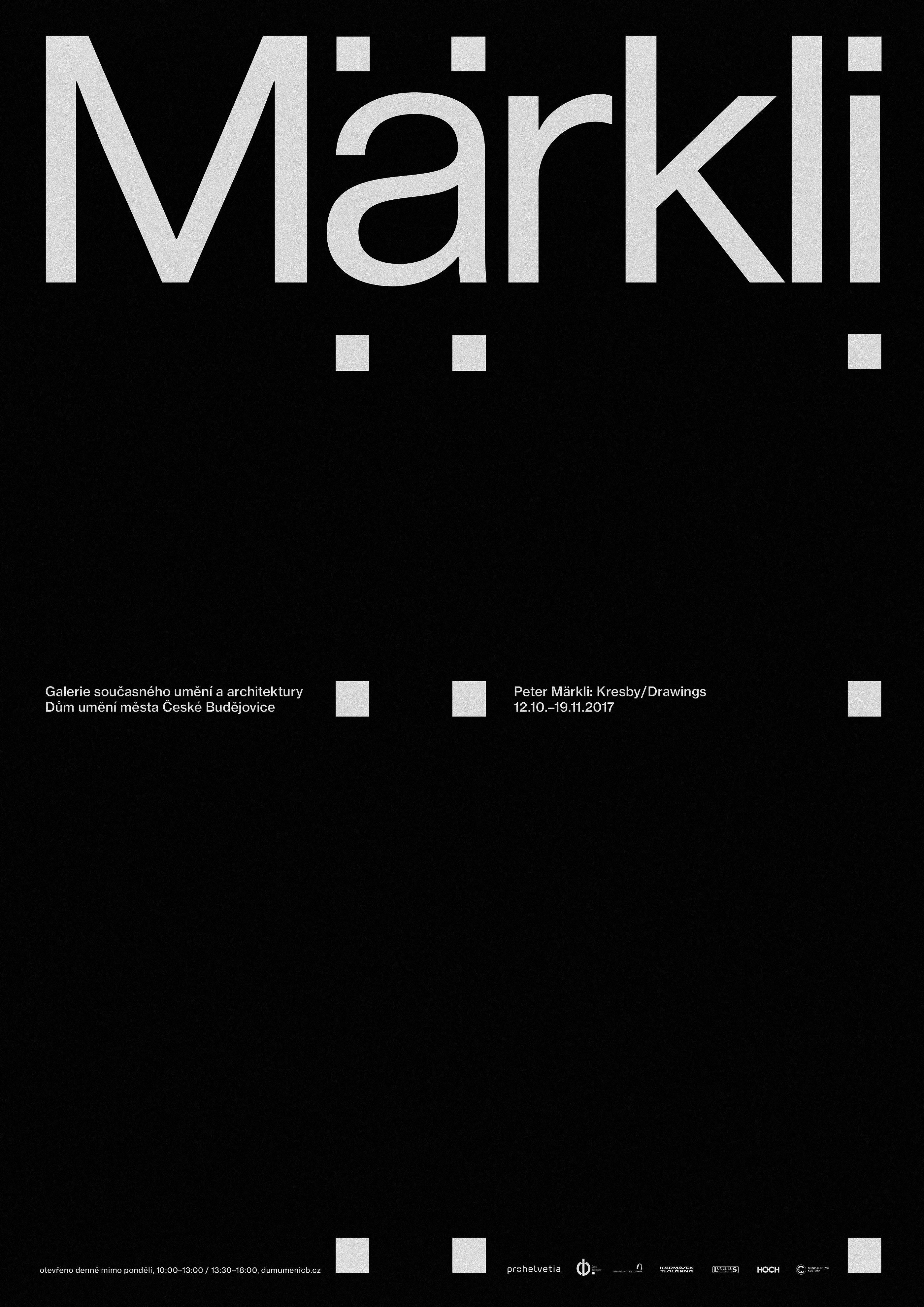
This is a stark, high-contrast typographic design featuring large, bold, sans-serif letters that create a strong, monolithic visual impact. The composition relies heavily on negative space and the juxtaposition of light gray text against a deep black background, conveying a sense of modern minimalism and architectural precision.
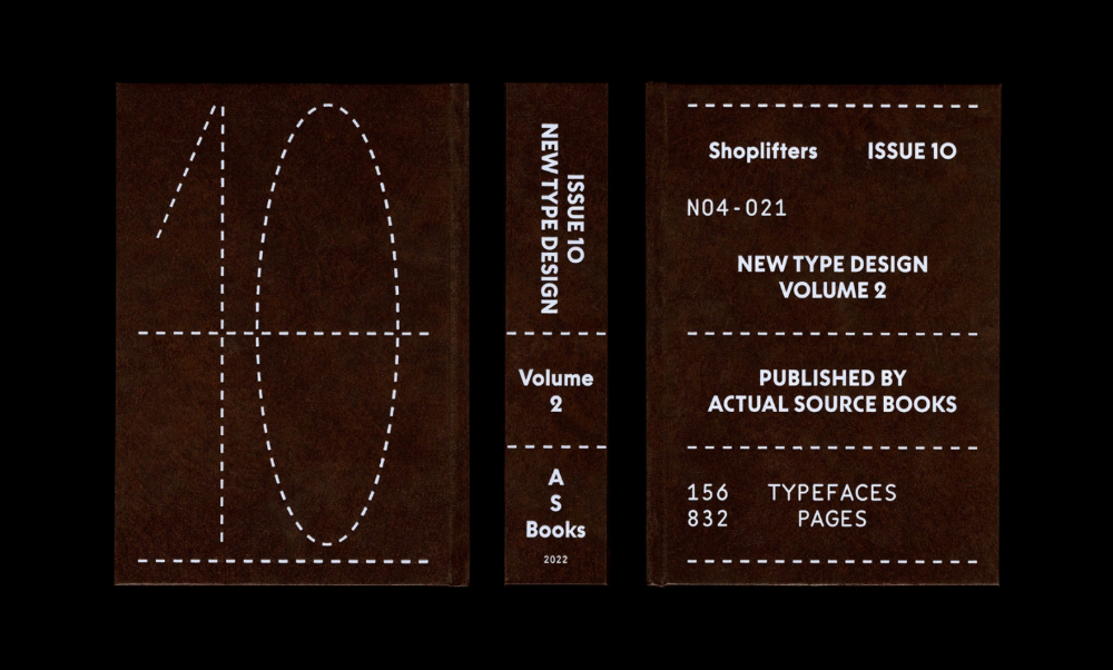
The image presents a stark, minimalist design reminiscent of an archival or academic publication cover. It utilizes strong negative space and a monochromatic, earthy tone to convey a sense of seriousness and established knowledge.
The design is minimalist and academic, utilizing a stark black and white palette with clean typography to convey a serious, professional tone. The layout is sparse, relying heavily on negative space to draw focus to the centered text and the strong graphic element at the bottom.