analytical
665 designs
Showing 24 of 665 (665 total)
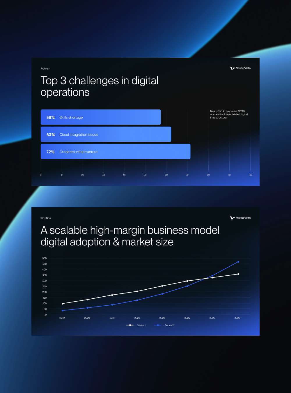
This image presents two distinct data visualizations set against a deep blue background, emphasizing corporate and analytical reporting. The design utilizes clear bar charts and line graphs to communicate complex business challenges and growth trends effectively.
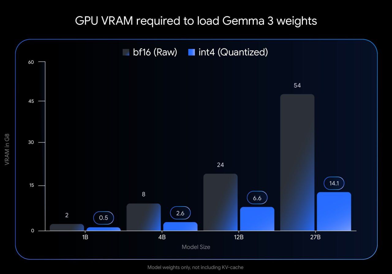
This is a data visualization presenting the required GPU VRAM for loading different sizes of Gemma 3 weights, comparing raw (bf16) and quantized (int4) versions. The design is functional and stark, focusing purely on comparative performance metrics.
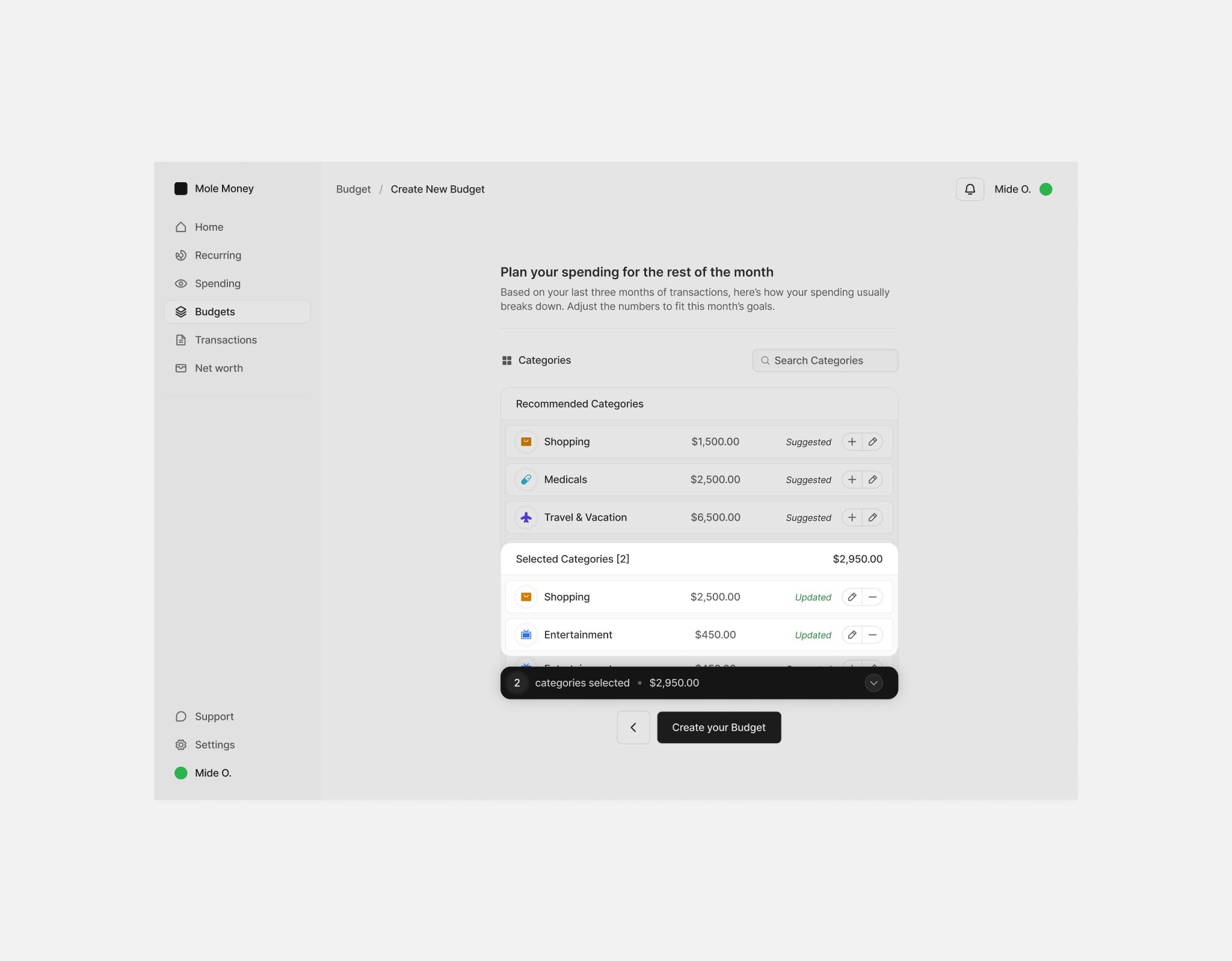
The design presents a highly functional and clean interface typical of personal finance applications, prioritizing clear navigation and data organization. The visual language is minimalist, relying on ample white space to ensure readability and focus on the financial data.
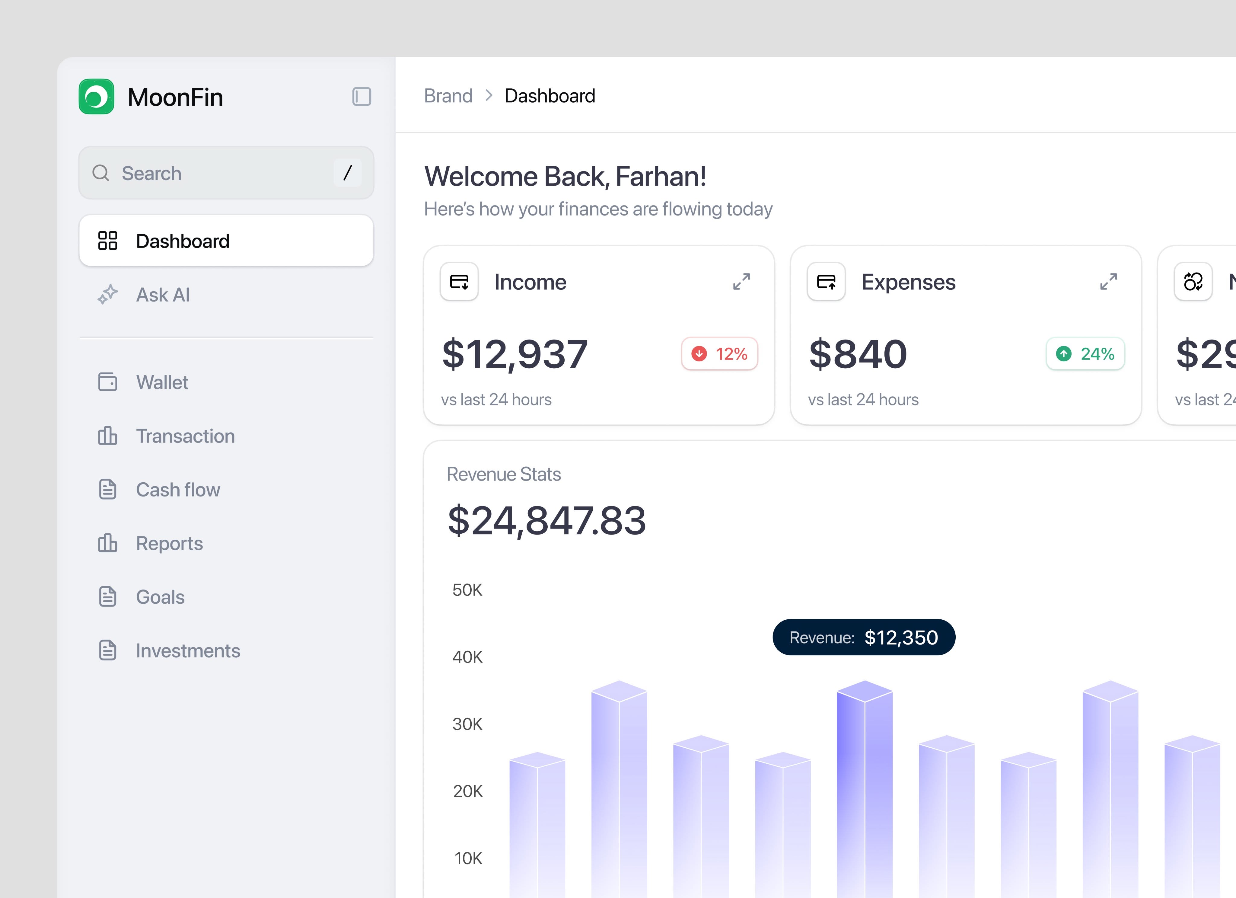
This design presents a clean, data-dense financial dashboard utilizing a light background and cool blue accents to guide the user's attention to key metrics. The visual language is straightforward and functional, prioritizing readability and clear representation of financial flows.
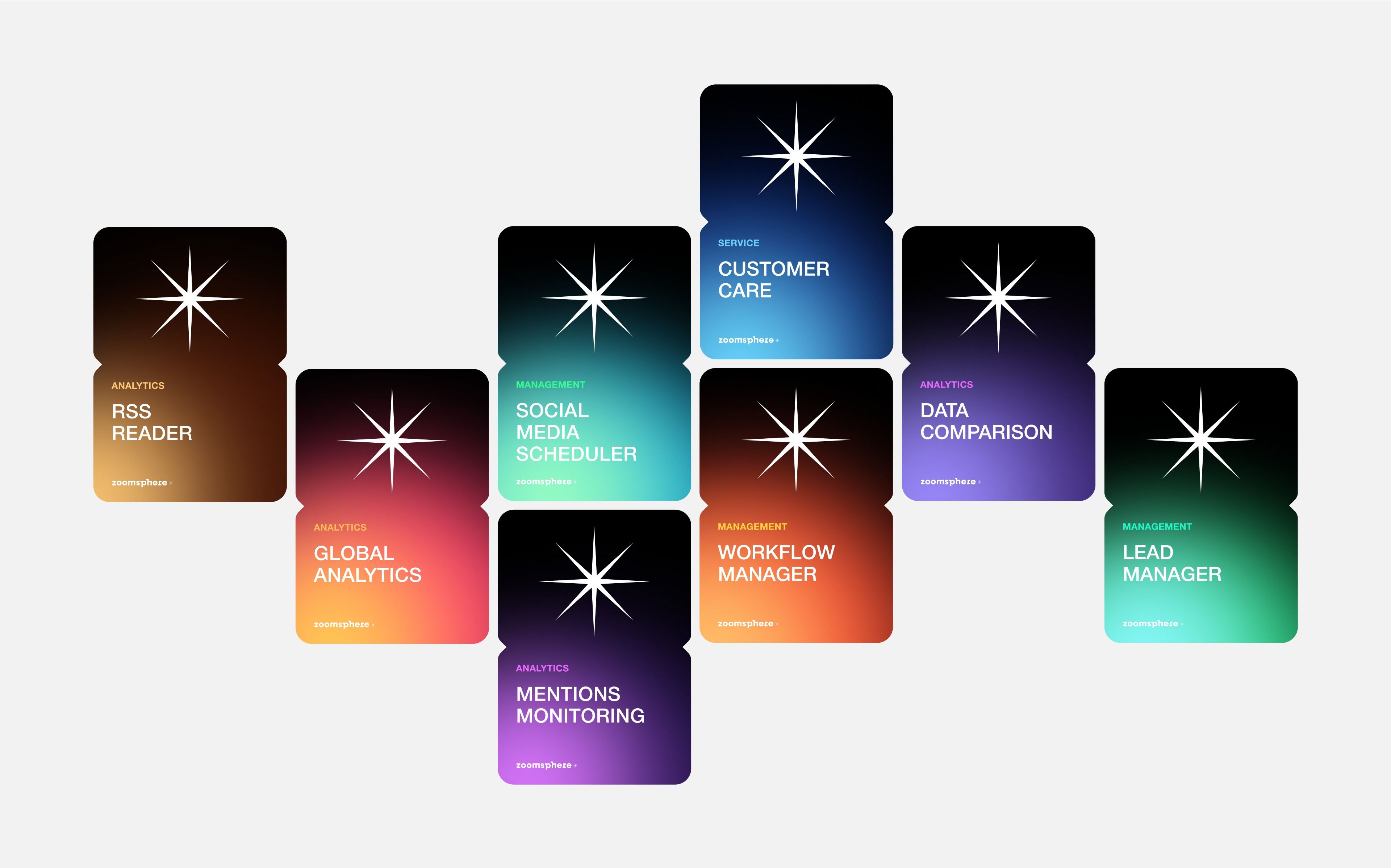
This design utilizes a dark, modular aesthetic to present various analytical tools or services. The visual language is clean and modern, relying on distinct blocks of color to differentiate functional modules while maintaining a consistent starburst icon motif.
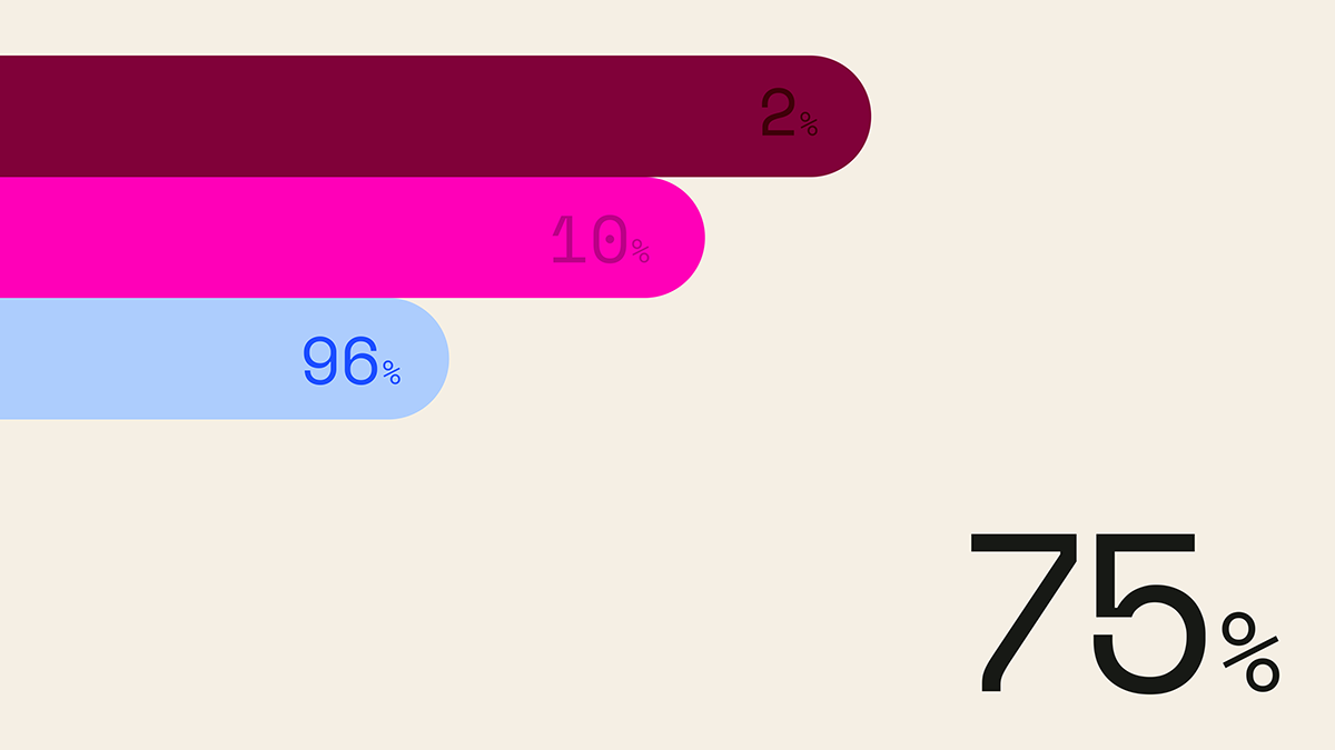
This is a clean, minimalist data visualization utilizing horizontal bars of varying saturation and length to represent percentages. The design relies on strong color contrast against a neutral background to clearly communicate quantitative information.
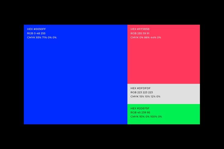
This image presents a highly technical and clean visualization of color separation, likely related to printing profiles or color mixing. The design relies on bold, distinct blocks of primary and secondary colors to clearly delineate different color spaces. The overall feel is analytical, precise, and purely informational.
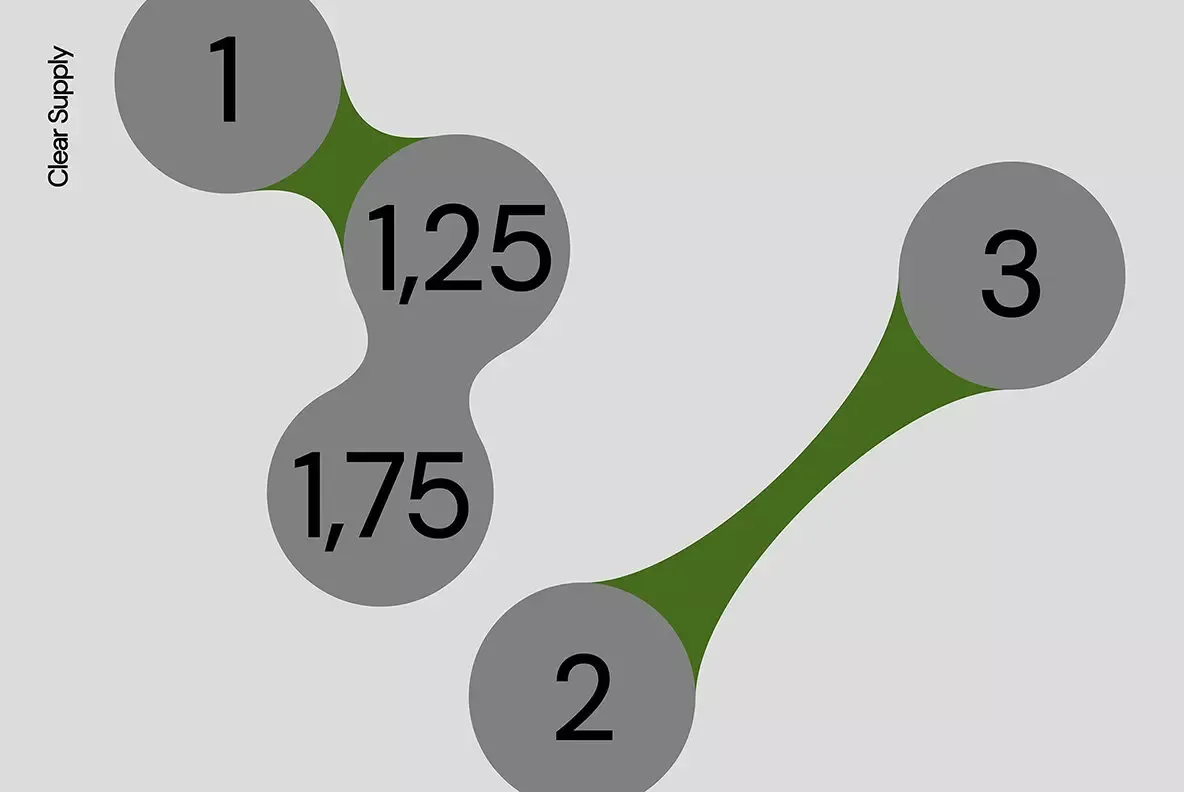
This is a clean, minimalist infographic design utilizing organic, irregular shapes to represent interconnected data points or steps. The visual language relies on subtle tonal variations between gray and olive green to establish hierarchy and connection.
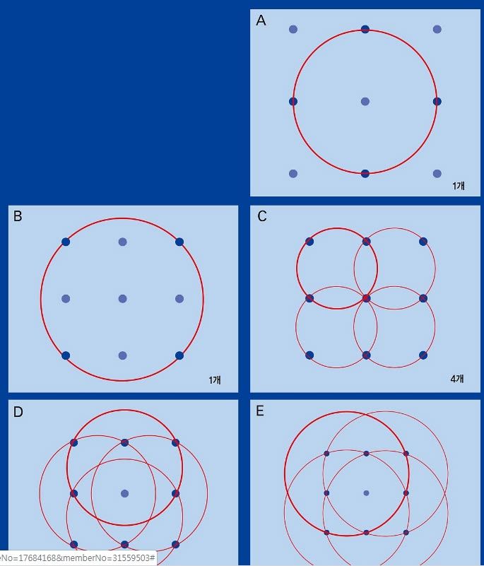
This image presents a series of abstract geometric diagrams illustrating relationships and set theory concepts through overlapping circles and points. The visual language is clean, precise, and relies heavily on line work to define boundaries and intersections. The overall feel is analytical and structured, suitable for academic or conceptual visualization.
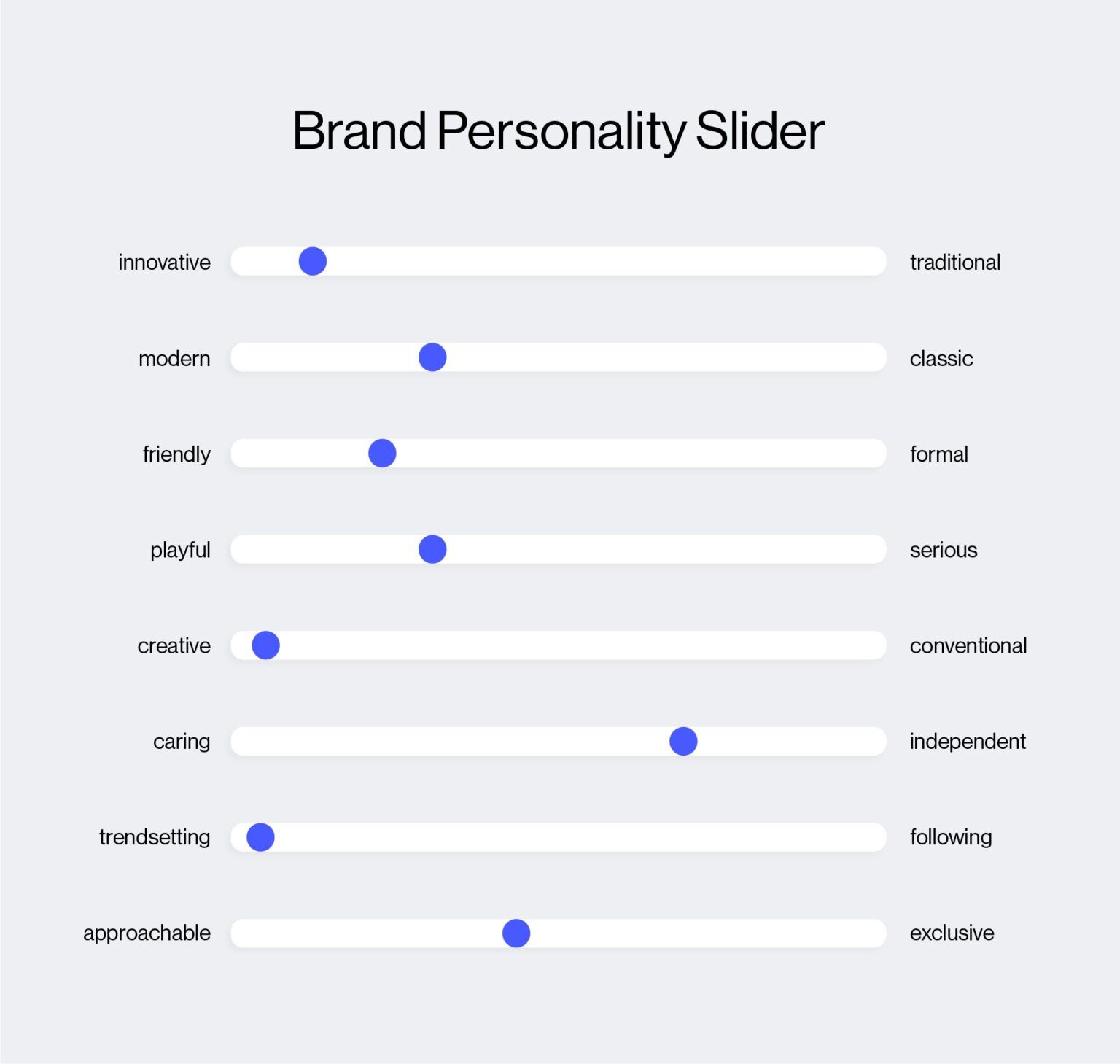
This is a clean, minimalist data visualization tool presenting brand personality traits through a linear slider format. The design uses simple horizontal lines and distinct blue markers to clearly map subjective attributes onto a spectrum, offering an objective way to assess brand positioning.
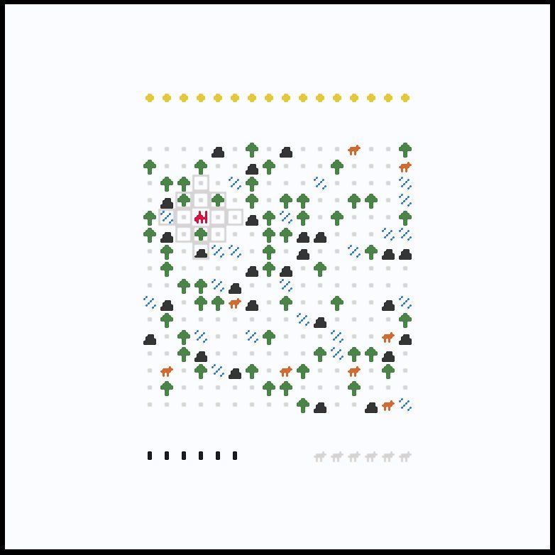
This image presents an abstract, dense pattern composed of various colored icons scattered across a white background, suggesting a form of data visualization or pattern recognition exercise. The design balances organized structure with the randomness of scattered elements, creating a visually engaging yet systematic texture.
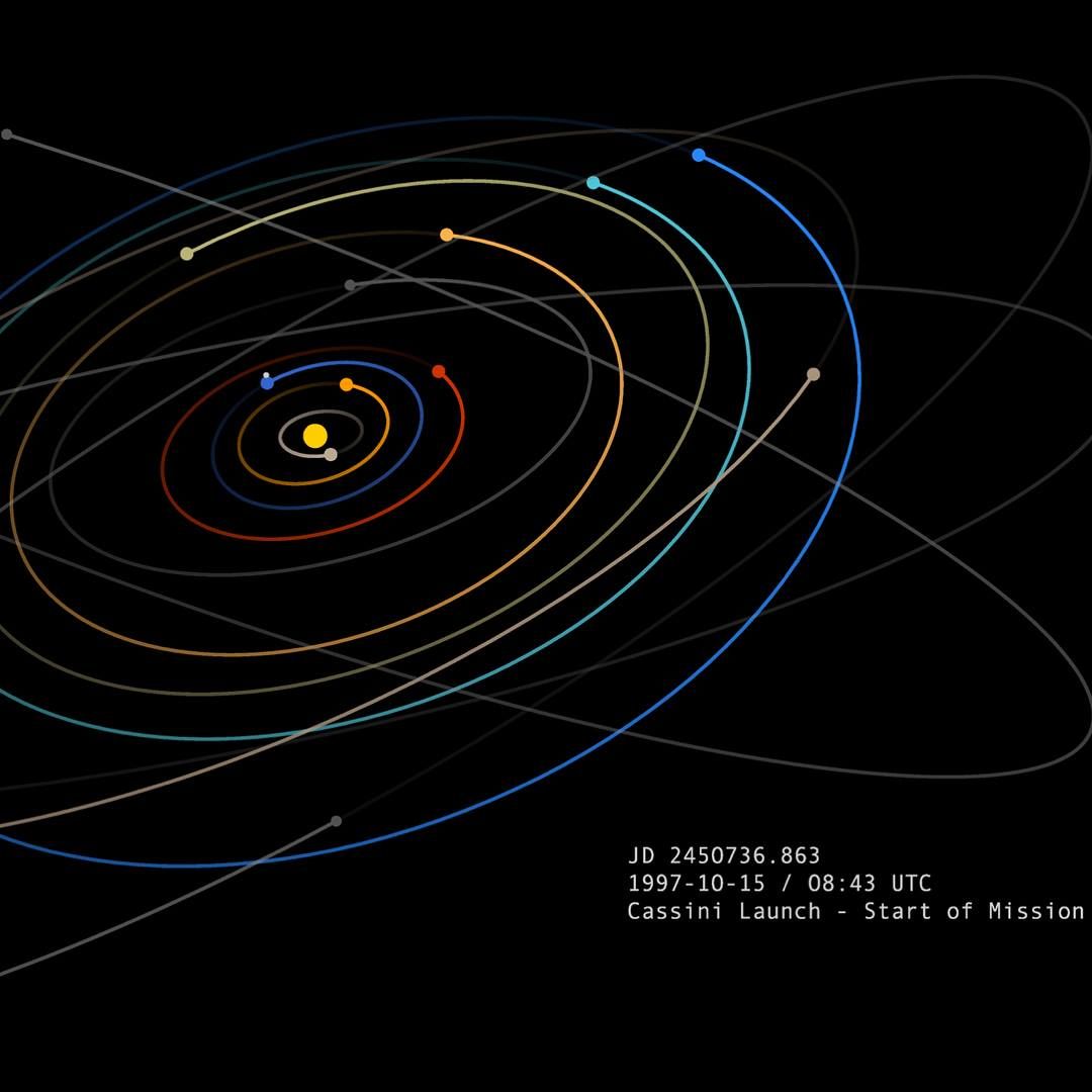
This visualization uses concentric elliptical lines against a dark background to represent orbital paths or trajectories, creating a sense of precision and movement. The design employs a limited, warm-to-cool color gradient to emphasize the progression of these paths. The overall feel is highly technical, analytical, and evokes themes of space exploration and scientific tracking.
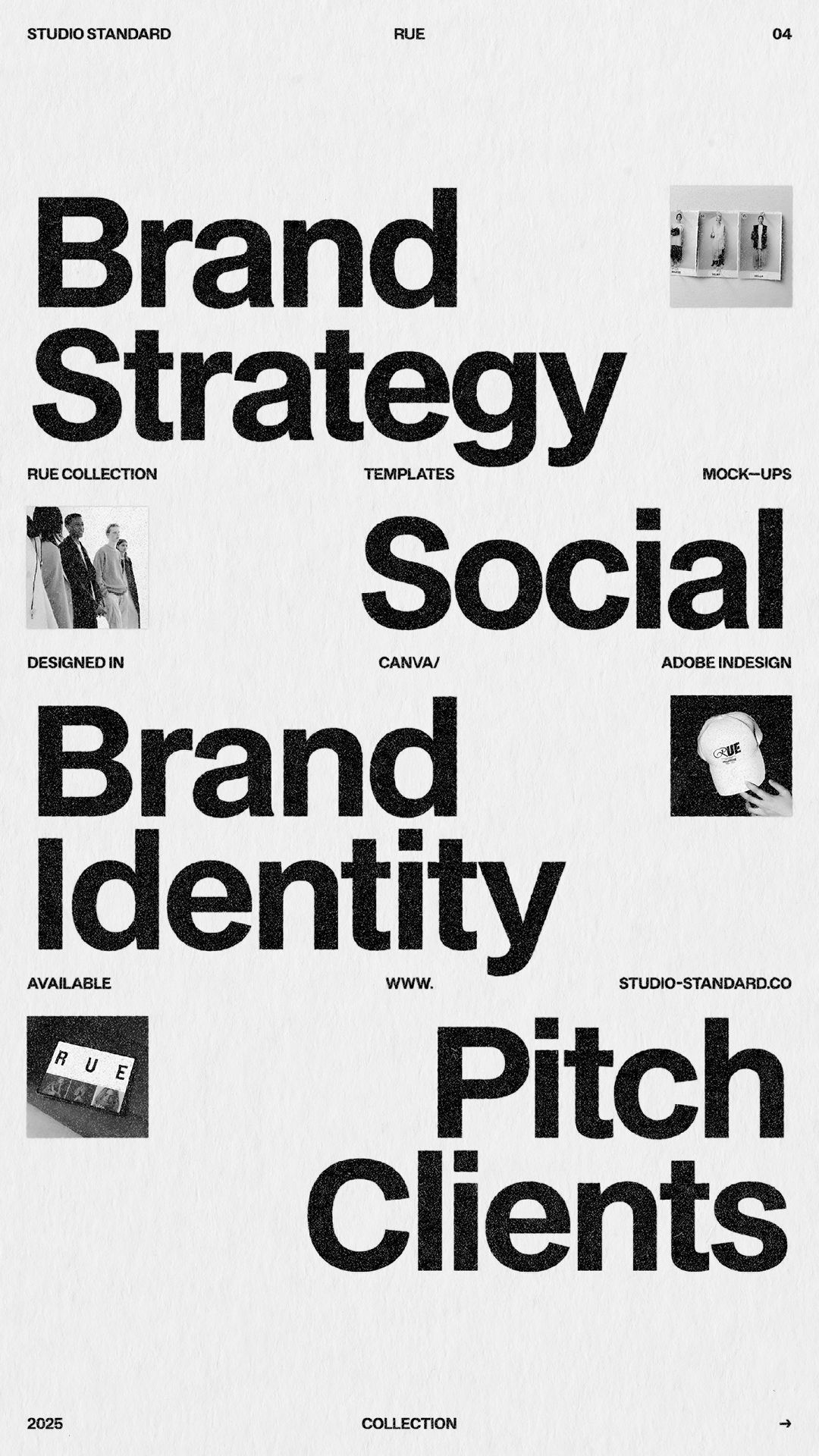
This design employs a stark, high-contrast minimalist approach, relying heavily on typography and negative space to convey professional authority. The visual language is clean, direct, and academic, focusing the viewer entirely on the strategic concepts presented.
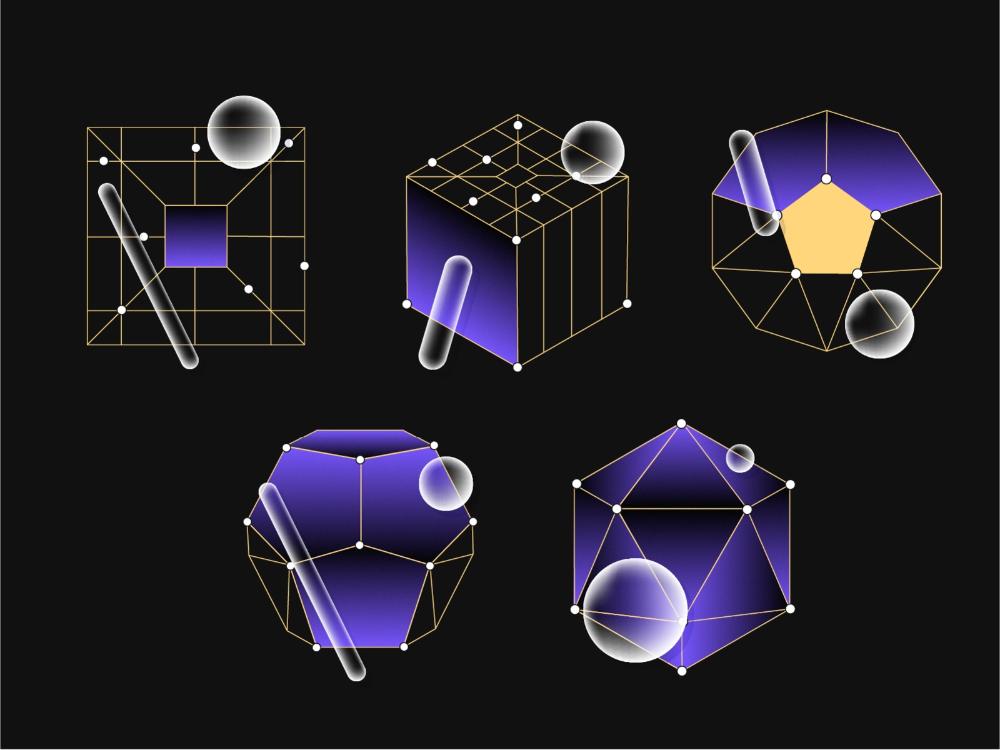
This image presents a collection of abstract, three-dimensional geometric models rendered with wireframes and volumetric shading. The visual language is clean and technical, emphasizing spatial relationships and dimensionality through precise lines and translucent forms. The overall feel is sophisticated, analytical, and futuristic.
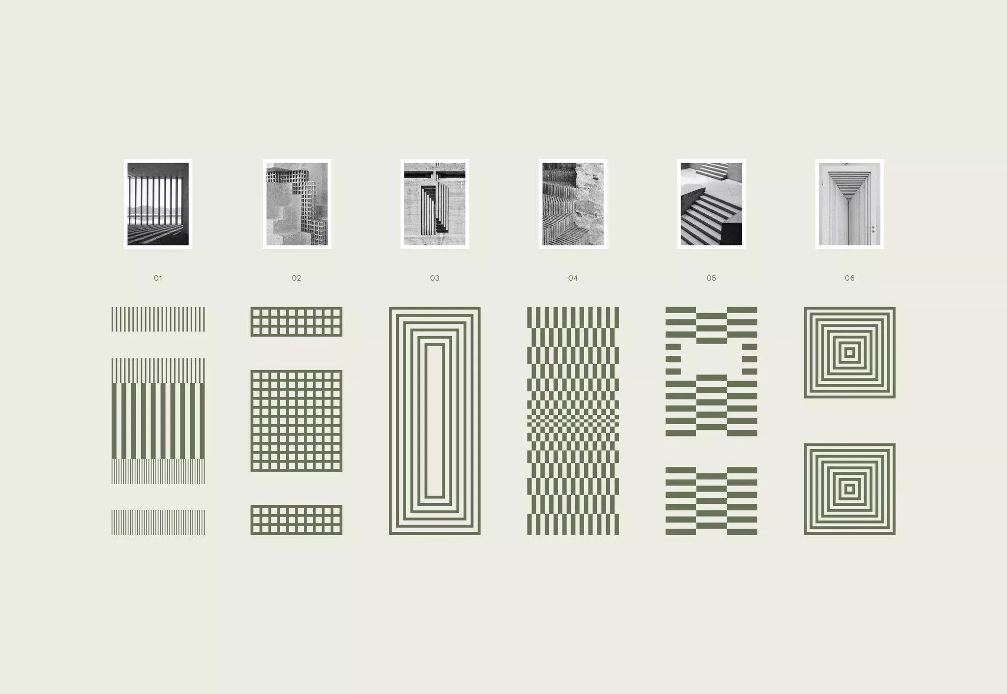
This visual presentation showcases a collection of abstract and geometric patterns, likely derived from architectural studies or texture design. The design employs a strict monochromatic palette and precise line work to create a clean, analytical, and highly structured aesthetic.
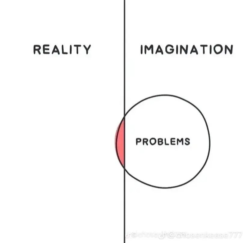
This is a stark, minimalist conceptual design utilizing a vertical dichotomy to separate 'Reality' and 'Imagination.' The clean line work and simple typography create a focused, analytical visual language centered around the concept of 'Problems.'
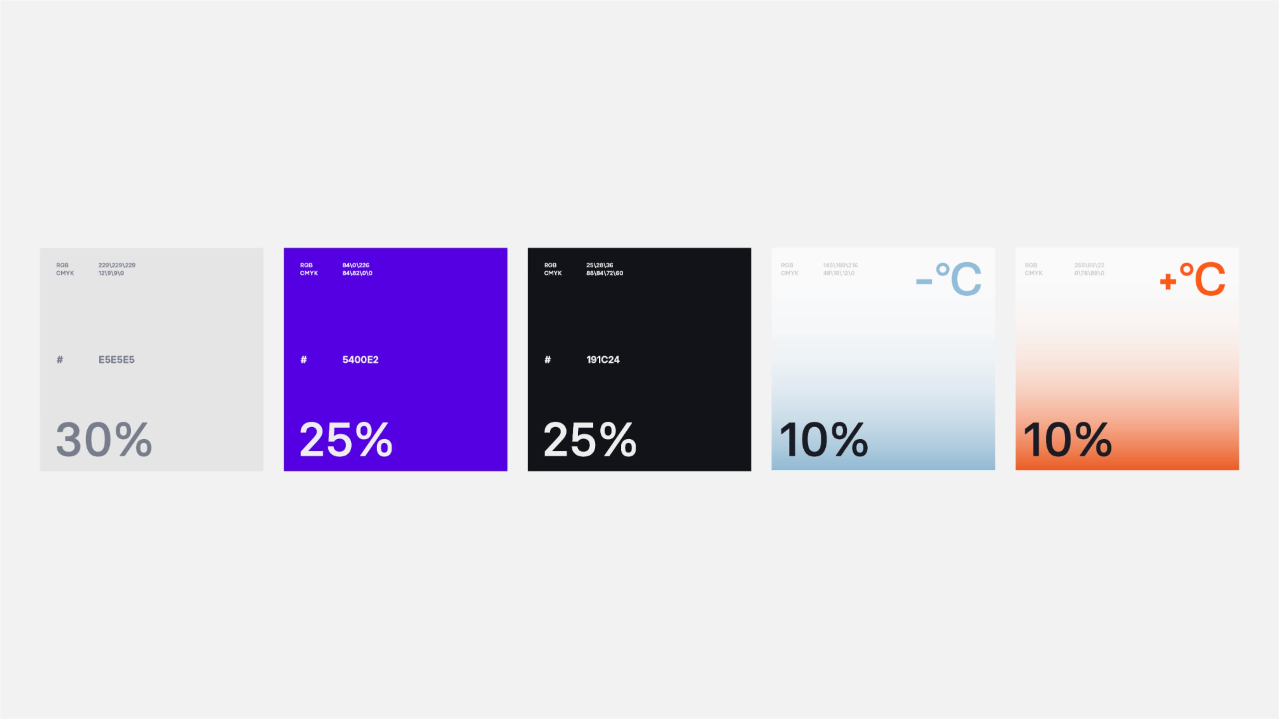
This image presents a clean, modern data visualization using five distinct panels arranged horizontally. The design relies heavily on color blocking—ranging from cool purples and blacks to warm oranges—to differentiate metrics effectively. The overall visual language is minimalist, precise, and highly structured for quick information consumption.
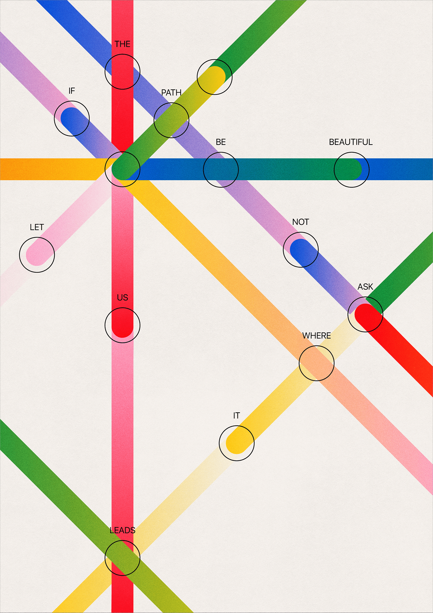
This image presents a vibrant, abstract diagram utilizing intersecting lines and colored nodes to illustrate conceptual relationships between various terms. The visual language is clean and structured, relying heavily on color coding to differentiate pathways and connections.
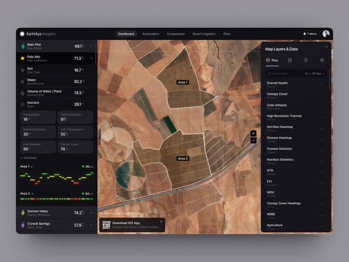
This dashboard features a professional, data-intensive design utilizing a dark theme to emphasize the geospatial imagery. The visual language is clean and functional, prioritizing clear data presentation over decorative elements to create an analytical and immersive user experience.
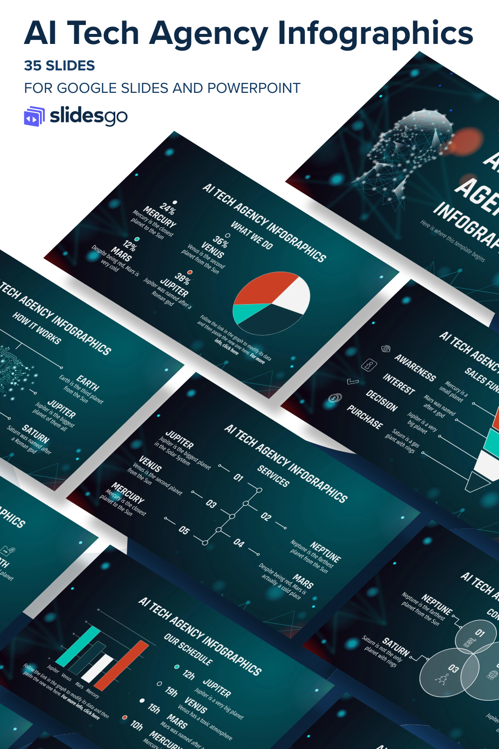
This is a set of modern, data-focused presentation templates characterized by a dark, high-contrast aesthetic. The visual language relies heavily on geometric shapes and clean lines to effectively organize complex information for corporate use.
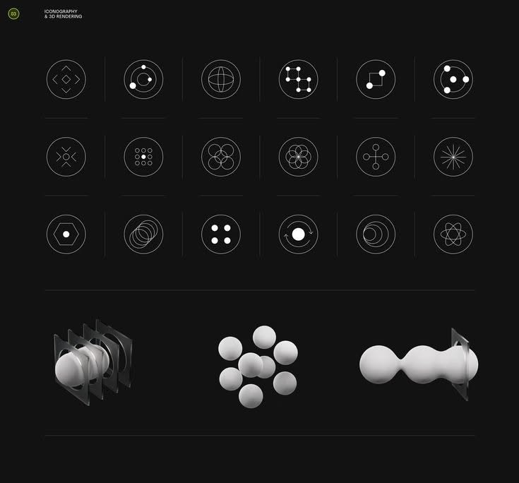
This image presents a highly structured, minimalist collection of abstract geometric icons and three rendered 3D forms against a stark black background. The visual language is clean, precise, and technical, emphasizing connectivity, structure, and modern design principles.
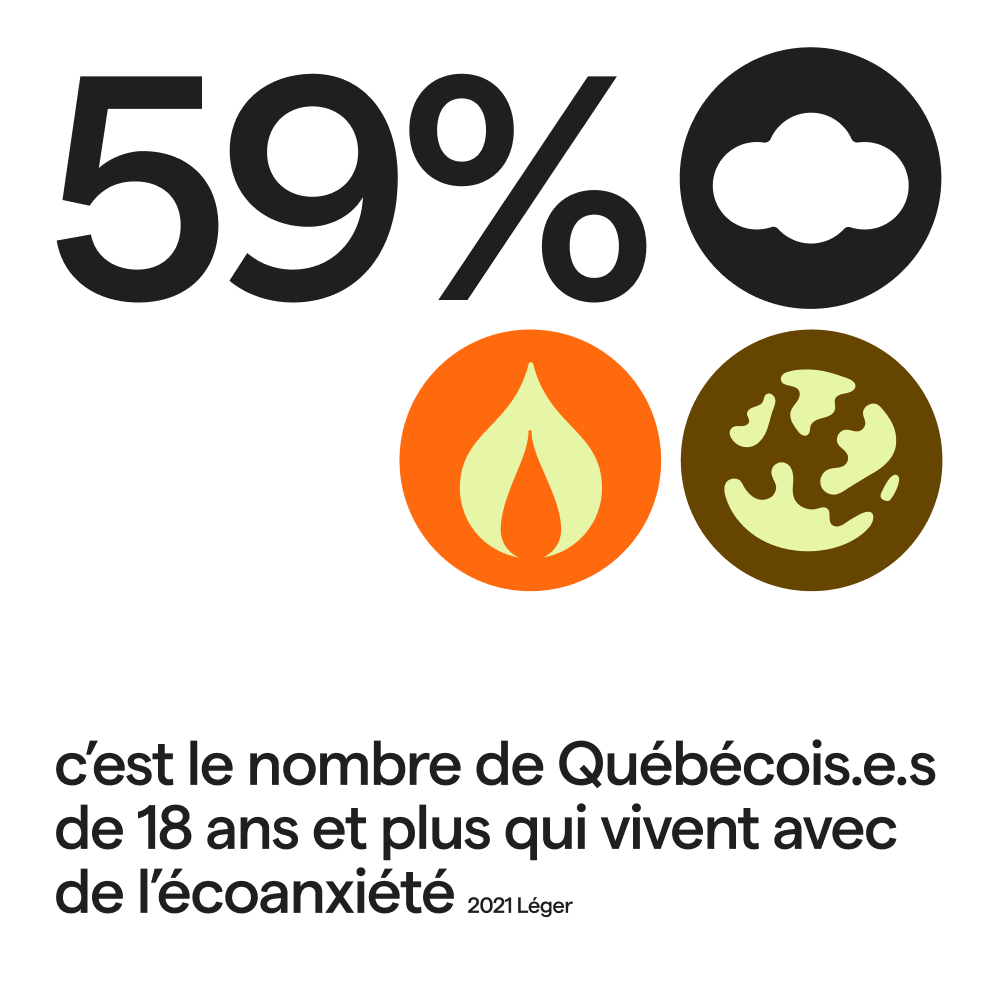
This is a clean, data-driven infographic design utilizing bold typography and symbolic icons to present a statistic. The visual language is stark and modern, relying on high contrast between black elements and warm, earthy tones to convey serious information.
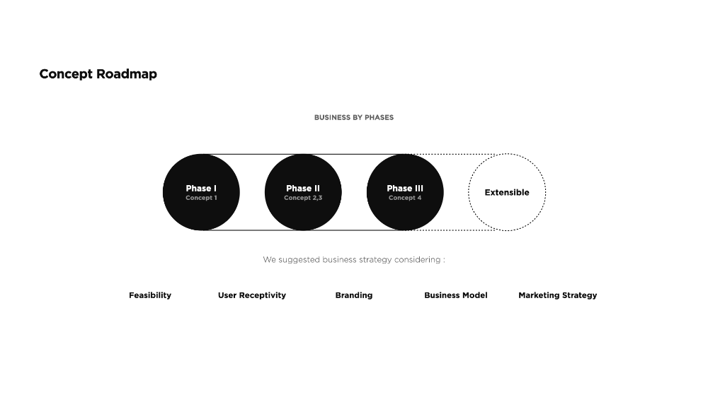
This is a highly structured, minimalist concept roadmap that effectively visualizes a linear progression through business phases. The design prioritizes clarity and sequential flow using simple geometric shapes against a stark white background.
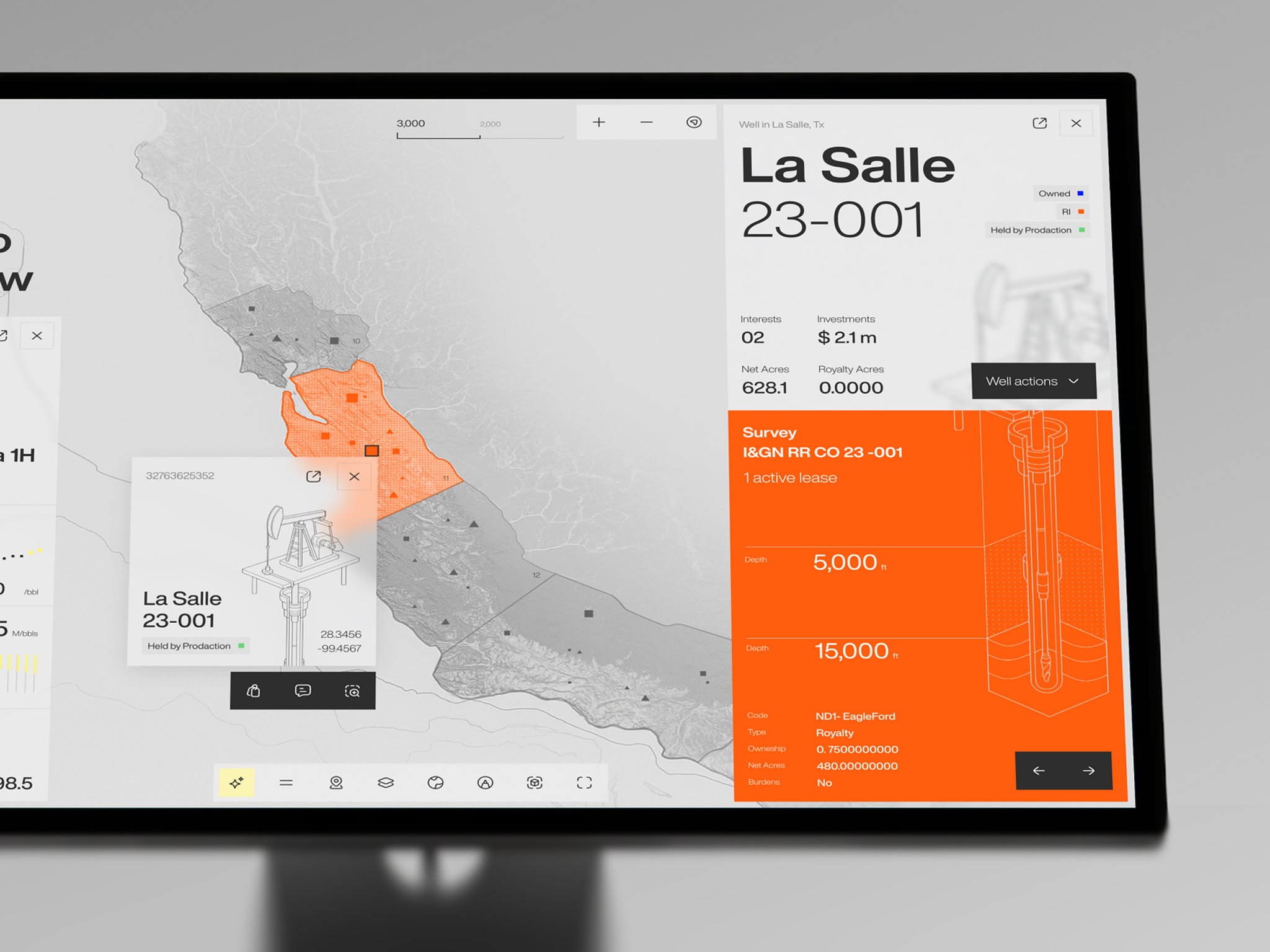
The design is highly functional, prioritizing the clear presentation of geospatial data through a clean, high-contrast interface. The visual language relies on strong segmentation between the map context and detailed numerical information, creating an analytical and professional feel.