statistics
68 designs
Showing 24 of 68 (68 total)
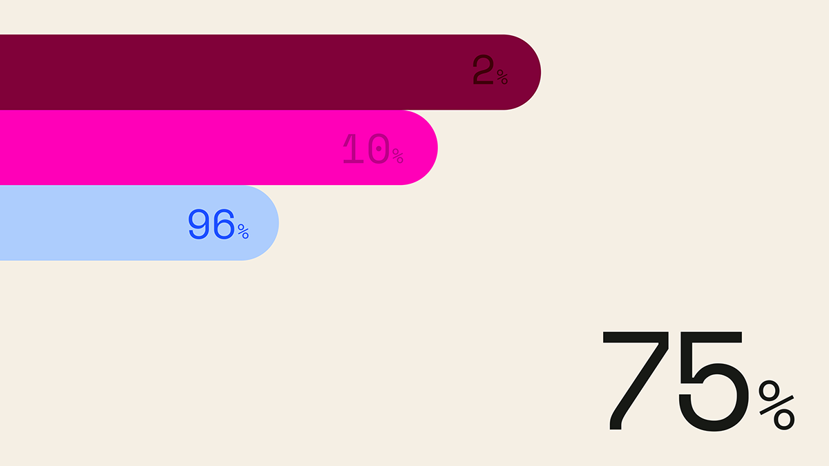
This is a clean, minimalist data visualization utilizing horizontal bars of varying saturation and length to represent percentages. The design relies on strong color contrast against a neutral background to clearly communicate quantitative information.
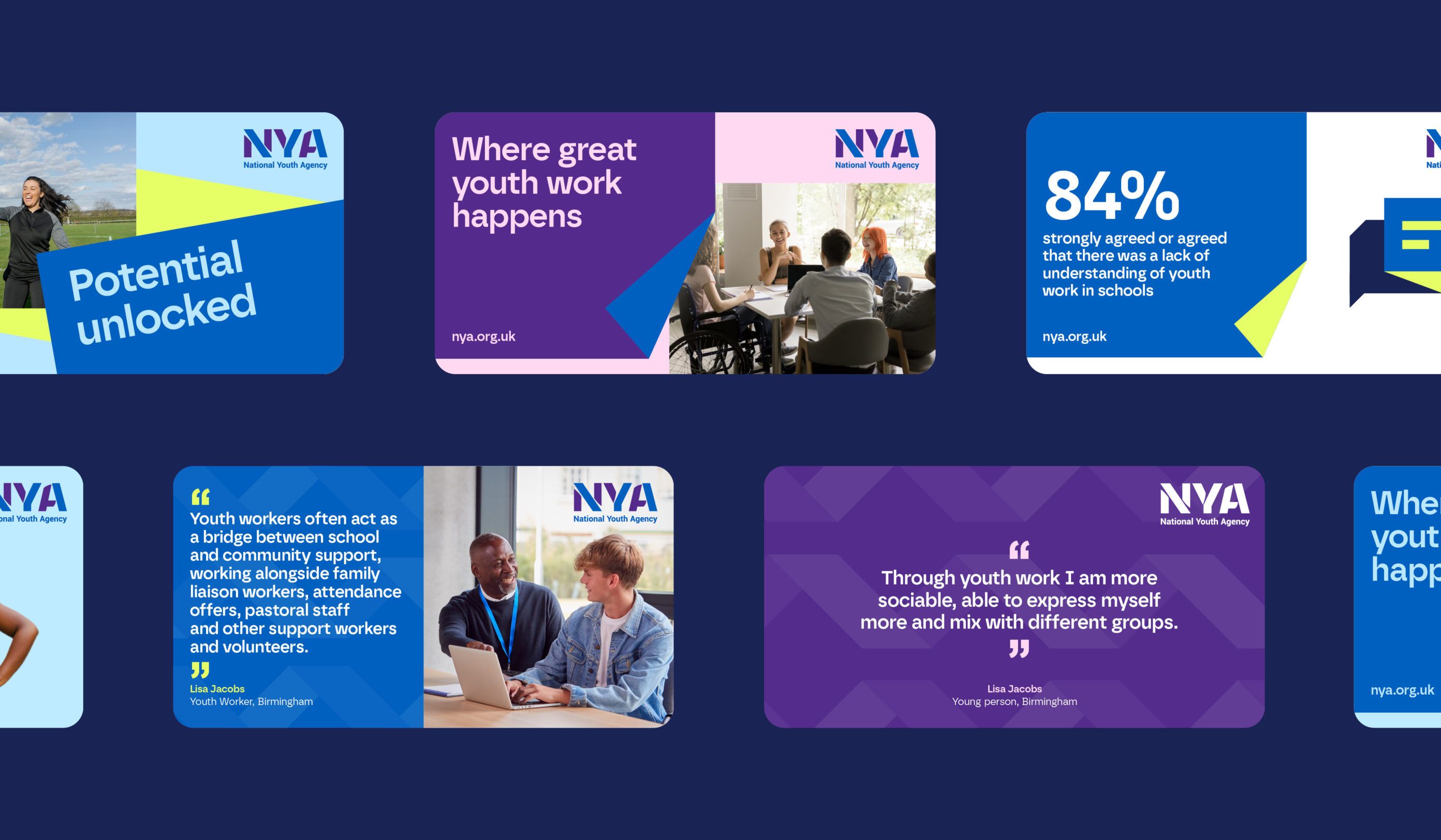
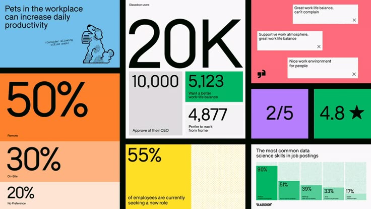
This design utilizes a clean, modern aesthetic characterized by strong color blocking and high contrast against a dark background. The visual language is professional and data-driven, employing distinct modular cards to present statistics and testimonials clearly. The overall feel is trustworthy, organized, and contemporary.
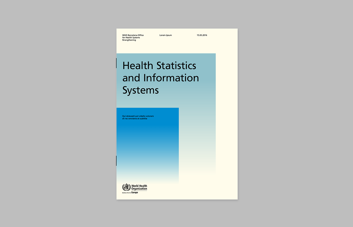
This design employs a clean, minimalist aesthetic typical of institutional reports, using ample white space and a subtle blue gradient to convey clarity and data. The visual language is highly professional, focusing attention directly on the title through balanced composition.
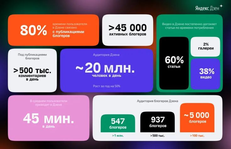
This is a highly structured data visualization dashboard utilizing bold color blocking and clear typography to present statistical information. The design employs a modern flat aesthetic, prioritizing readability and the immediate comprehension of large metrics.
The image presents a stark, minimalist data visualization using a high-contrast color scheme against a deep blue background. It employs simple geometric shapes and clear percentage indicators to convey statistical information in a direct, analytical manner.
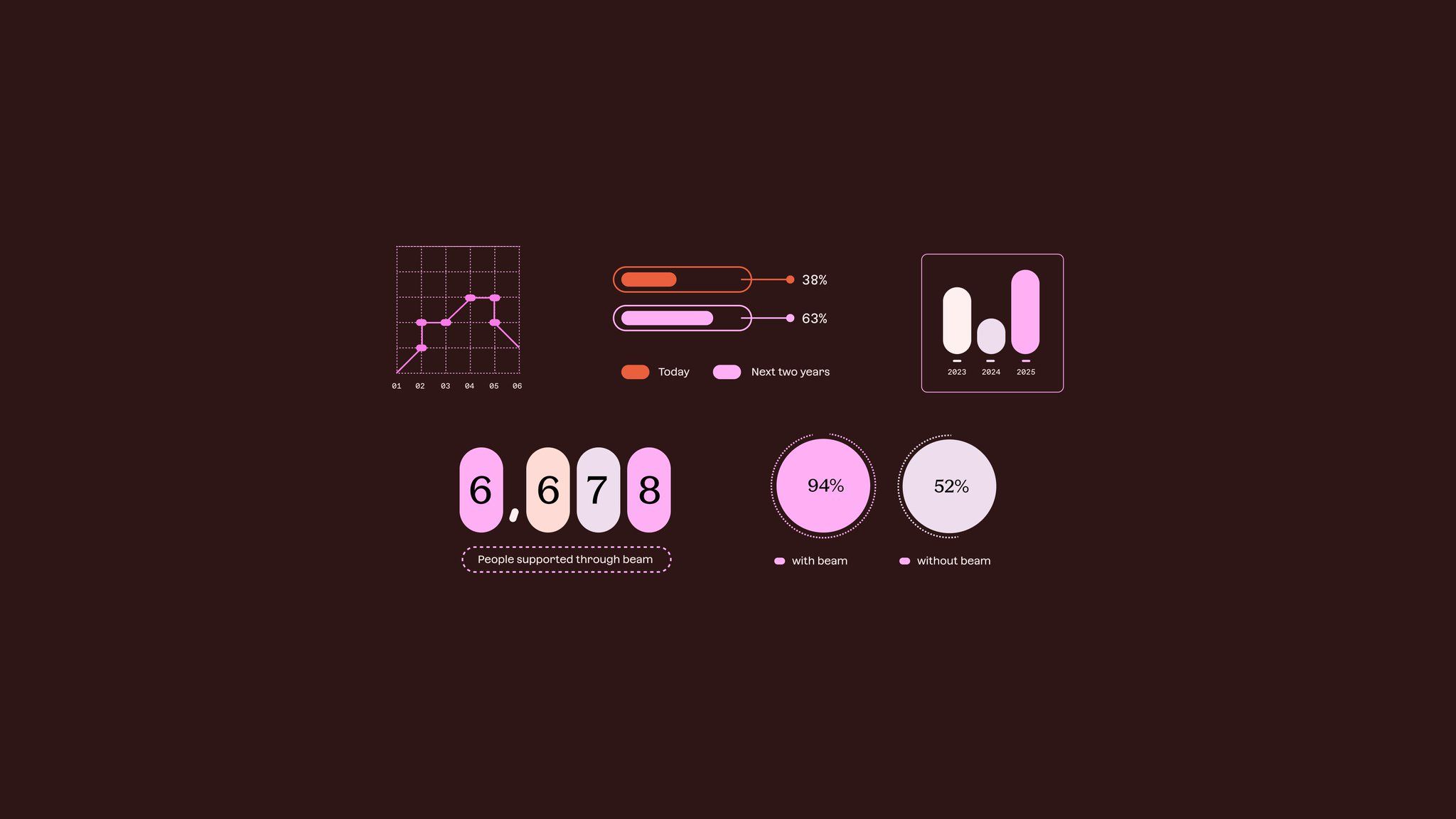
The image presents a minimalist, data-driven infographic style using muted tones and simple geometric shapes to convey statistical information. The design is clean, modern, and focuses heavily on clear visual hierarchy for presenting comparative data points.
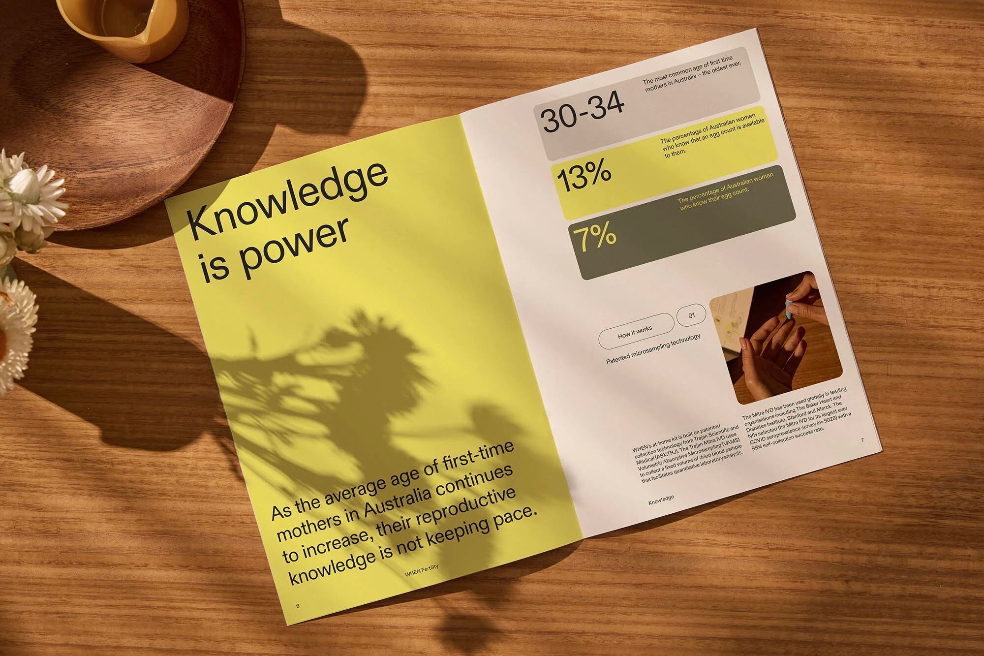
The design is clean, modern, and professional, utilizing a light yellow background contrasted with dark green accents to present statistical information clearly. The layout is organized, using ample white space around the key data points and large typography for impact.
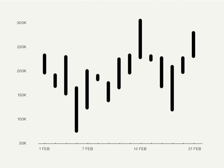
This is a line chart displaying fluctuating data points over time, characterized by a stark, minimalist design focused purely on the visual representation of the trend. The chart uses high contrast between the black data line and the light background to emphasize volatility in the measured values.
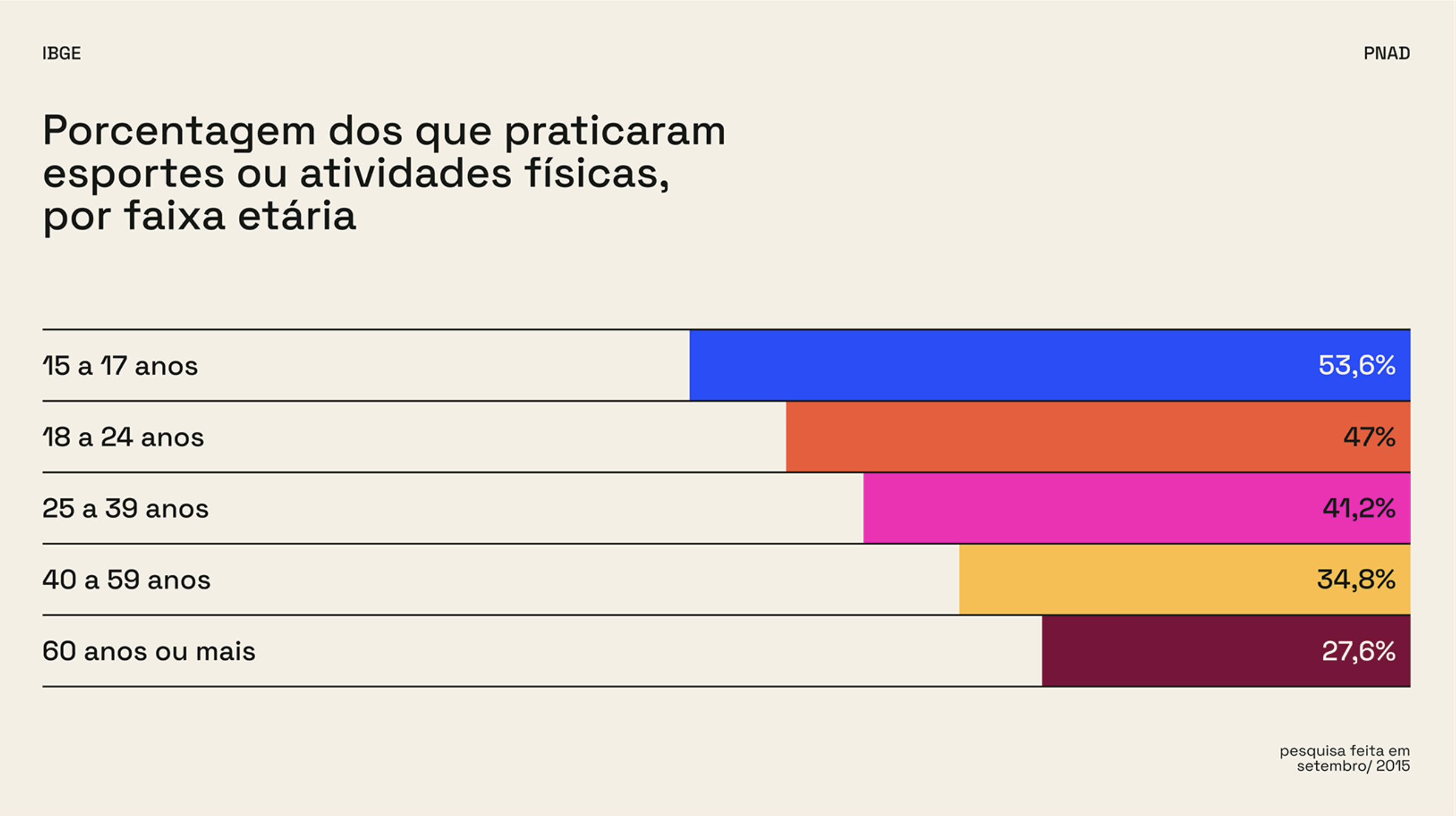
The image is a clear, data-driven bar chart visualization presenting the percentage of people who practice sports or physical activities categorized by age group. The design is clean, minimalist, and highly functional, prioritizing readability of the statistical information.
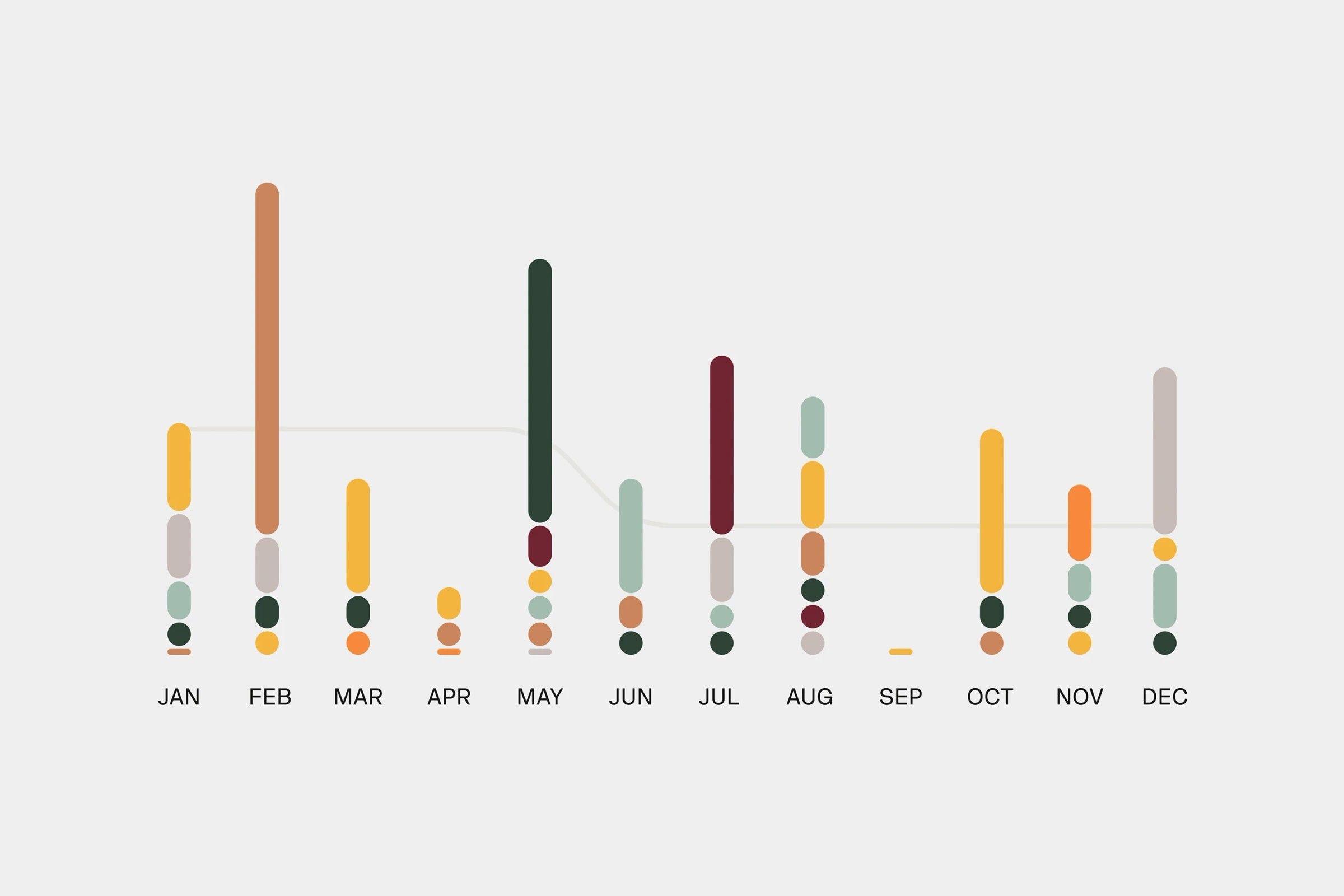
This is a minimalist, data-driven visualization using vertical bar charts to display monthly data points. The design relies heavily on color variation within a muted, neutral background to convey quantitative information clearly and cleanly.
The image is a data visualization or infographic presenting various statistics in a segmented, block-based layout. It uses strong color blocking and large numbers to convey quantitative information quickly.
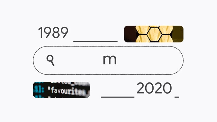
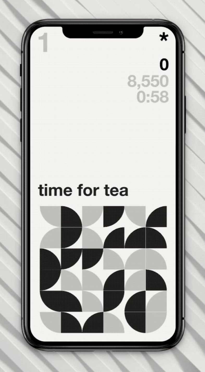
The image presents a minimalist, interface-like composition featuring numerical and textual elements separated by horizontal lines, suggesting data entry or a timeline. The design is clean and functional, relying on negative space to structure the information.
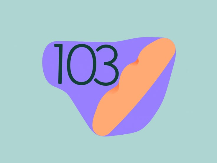
This is a clean, modern graphic design featuring a large number set against a soft, muted background. The design uses bold color blocking and rounded shapes to create a friendly yet professional visual identity.
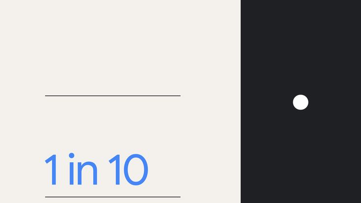
The image presents a minimalist, clean interface design characterized by a stark contrast between light gray and black. The layout is simple, focusing attention on a fractional statistic presented in a clean, modern typeface.
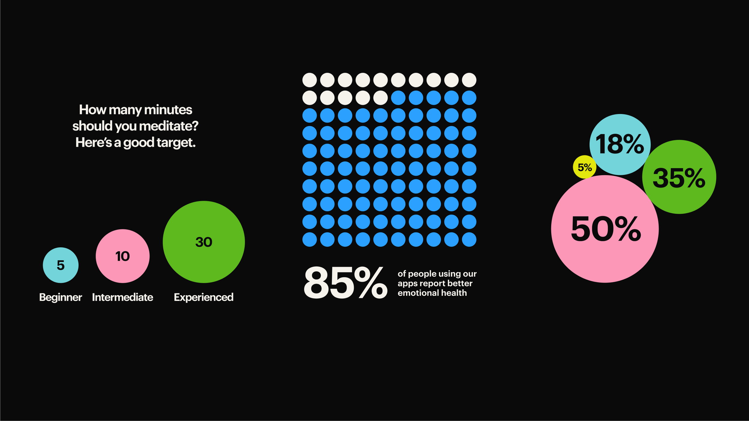
The image uses a clean, minimalist design with a dark background to present statistical data visually. It employs a grid pattern of colored dots to represent percentages, creating a modern and data-driven aesthetic.
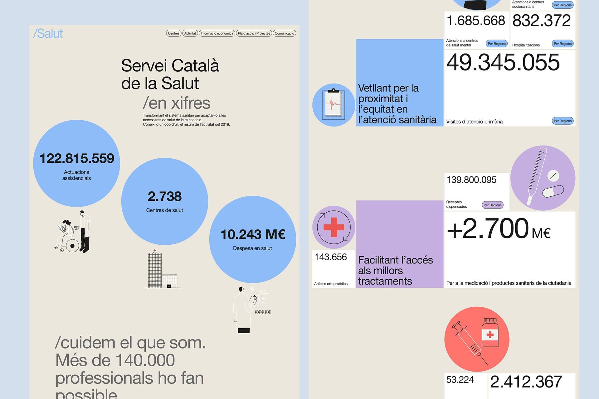
The design is clean, professional, and information-dense, utilizing a light, muted color palette with clear iconography to present statistical data about healthcare services. The layout is structured using distinct blocks and circular elements to guide the user through key metrics.
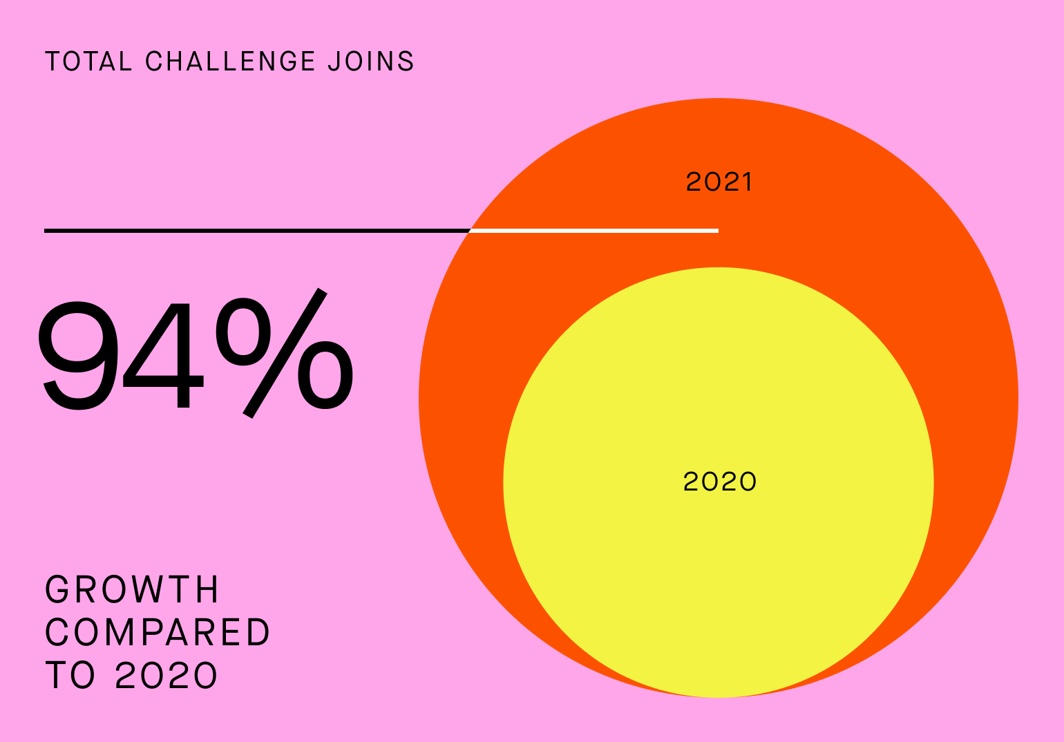
The image uses a bold, circular graphic to visually represent a high percentage growth, employing a clean, modern aesthetic with a limited, warm color palette. The design is direct and focuses entirely on conveying a strong statistical achievement.
This is a minimalist, clean user interface design featuring a stark white background contrasted with black elements. The layout is highly structured, presenting numerical data and an abstract pattern in a modern, high-contrast aesthetic.
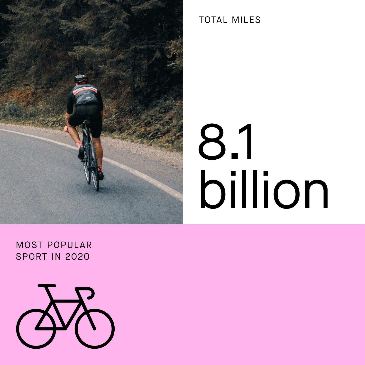
The image employs a minimalist, high-contrast design using a split layout to present statistical data alongside an evocative photographic element. The visual language is clean and modern, relying on negative space to emphasize the large numerical figure.
The design is clean, modern, and professional, utilizing a strong monochromatic green palette to present statistical data clearly. The layout is balanced, using circular charts and clear typography to guide the viewer through the information effectively.
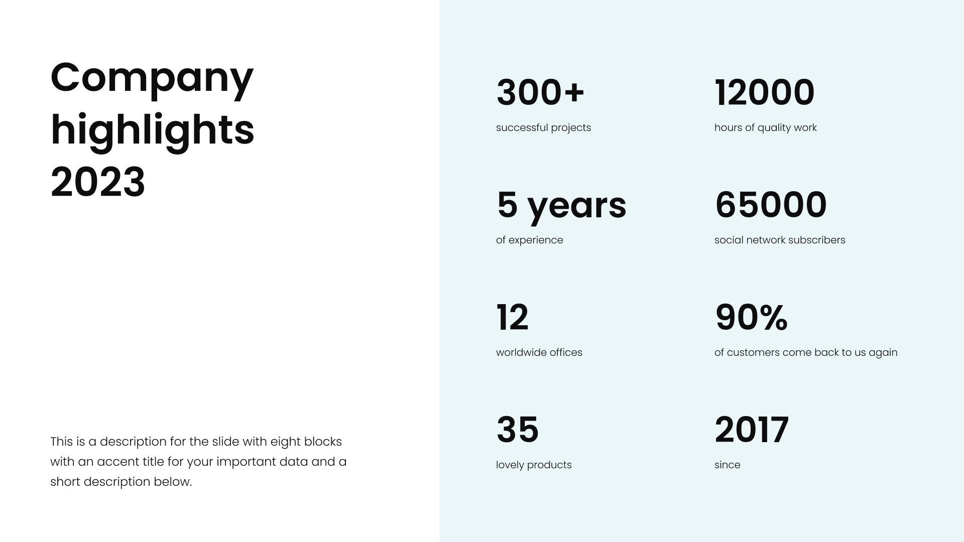
The design is clean, minimalist, and professional, utilizing ample white space to present key statistics in a straightforward manner. The visual language relies on simple typography and clear segmentation to convey achievements effectively.
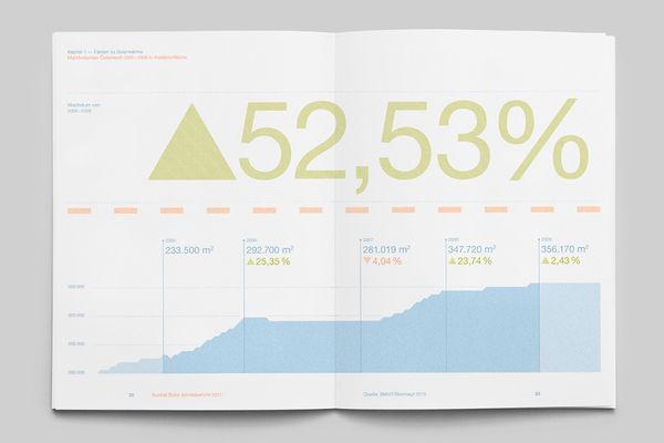
The image presents a clean, data-driven infographic style, utilizing a light background and a prominent upward trend visualization. The design is minimalist yet effective in conveying statistical growth or performance metrics.
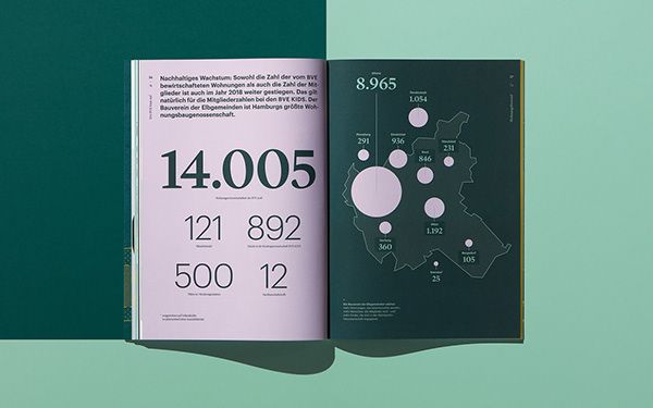
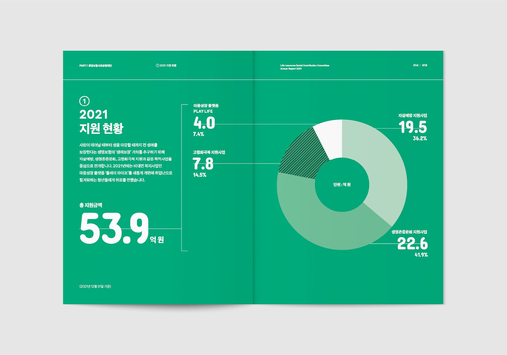
The image displays a clean, modern, and data-heavy publication layout, utilizing a muted color palette dominated by deep greens and soft pinks/mauves. The design emphasizes clear typography and infographic elements to present statistical information in a sophisticated manner.
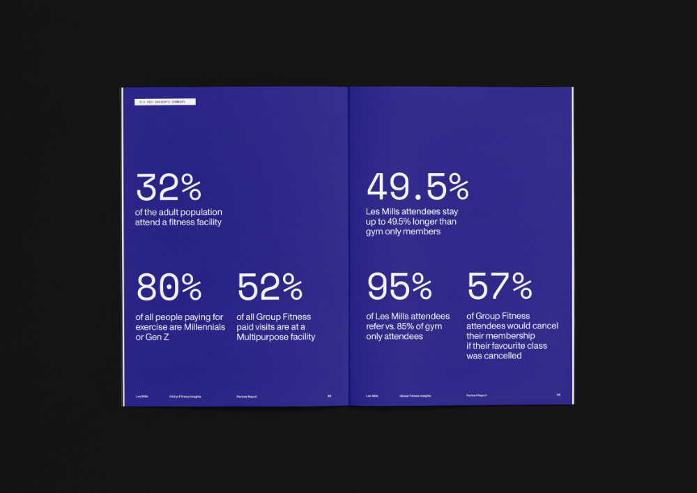
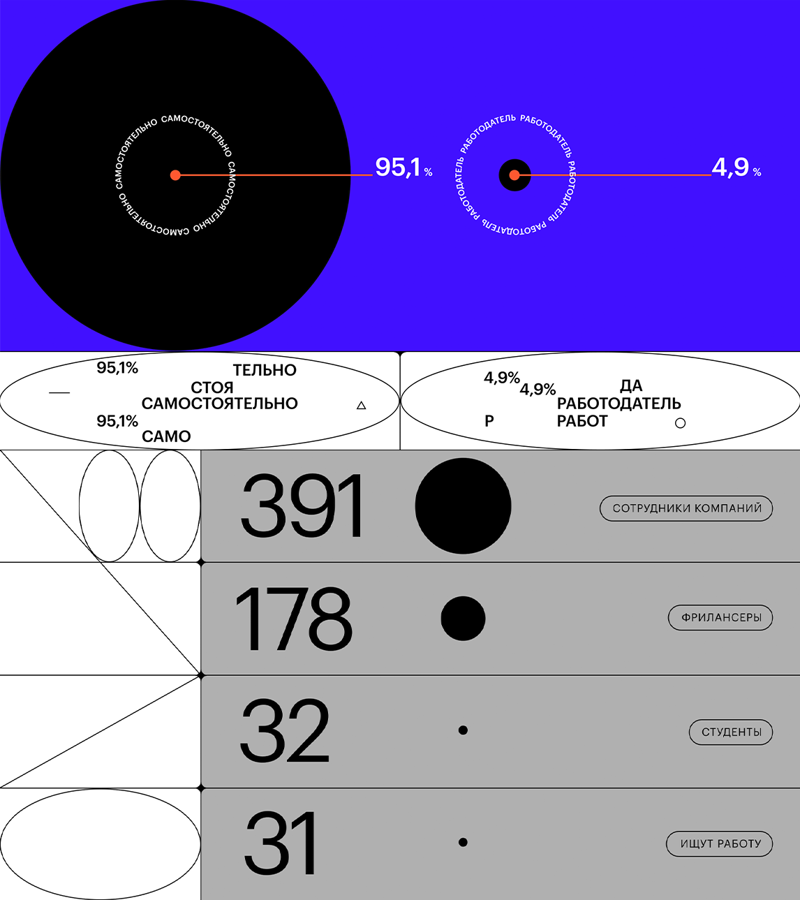
This is a clean, modern data visualization presented in a two-panel format, utilizing strong color blocking and large percentage typography to convey statistics clearly. The design is minimalist yet impactful, relying on high contrast between the dark background and the bright purple elements.