sports statistics
5 designs
Showing 5 of 5 (5 total)

The image presents a clean, minimalist infographic style using a muted, earthy color palette contrasted with stark white and soft pink accents. The design is highly structured, focusing on presenting large numerical data points related to sports participation in a clear, modern way.
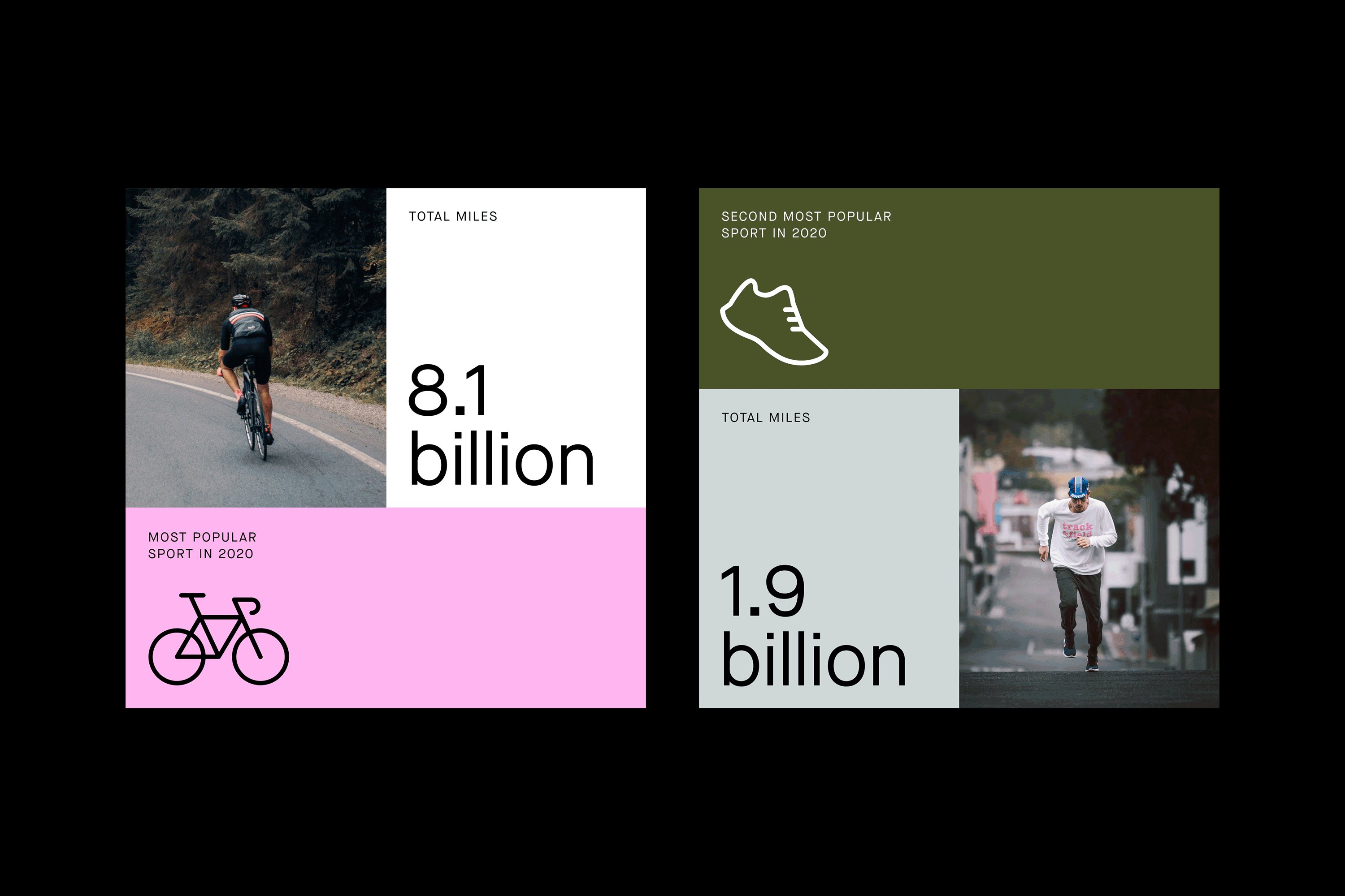
The image presents a clean, minimalist infographic style comparing large numerical data points related to sports participation. It uses a stark contrast between white space and muted, earthy tones to emphasize the statistics.
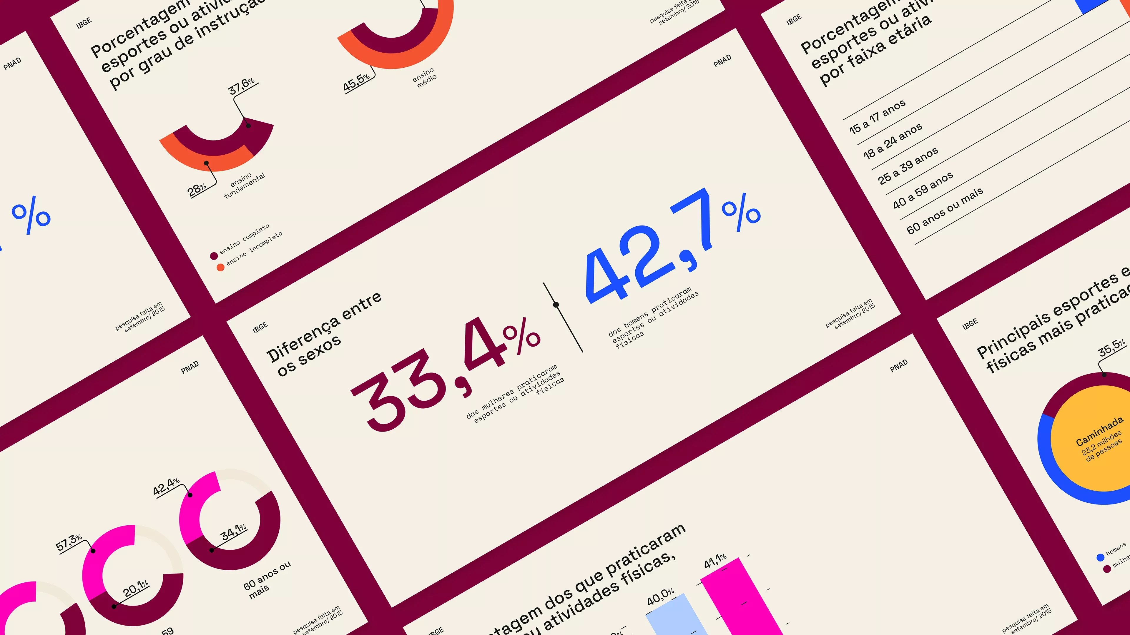
This infographic uses a clean, professional design to present complex statistical data clearly. The visual language relies on strong color segmentation and structured charts to make comparative information easily digestible for the viewer.

This interface features a clean, modern aesthetic utilizing high contrast between deep backgrounds and vibrant green accents to present detailed statistical data. The design emphasizes clarity and readability, organizing complex information into digestible list cards.
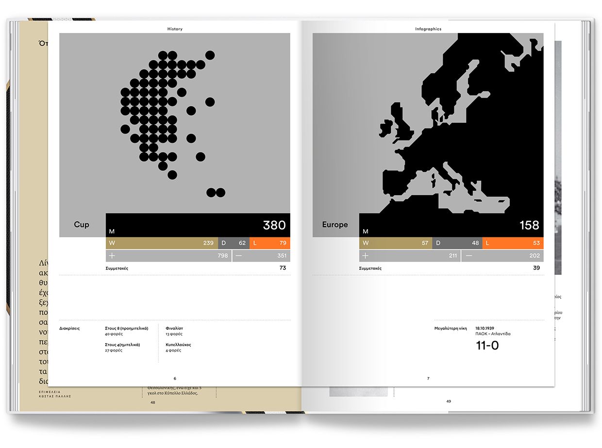
This design utilizes a stark, high-contrast monochromatic palette to present complex statistical and geographical data in a clean, academic format. The visual language is highly minimalist, relying on simple geometric shapes and clear typography to prioritize readability and information hierarchy. The overall feel is professional, objective, and highly analytical.