sports analytics
10 designs
Showing 10 of 10 (10 total)
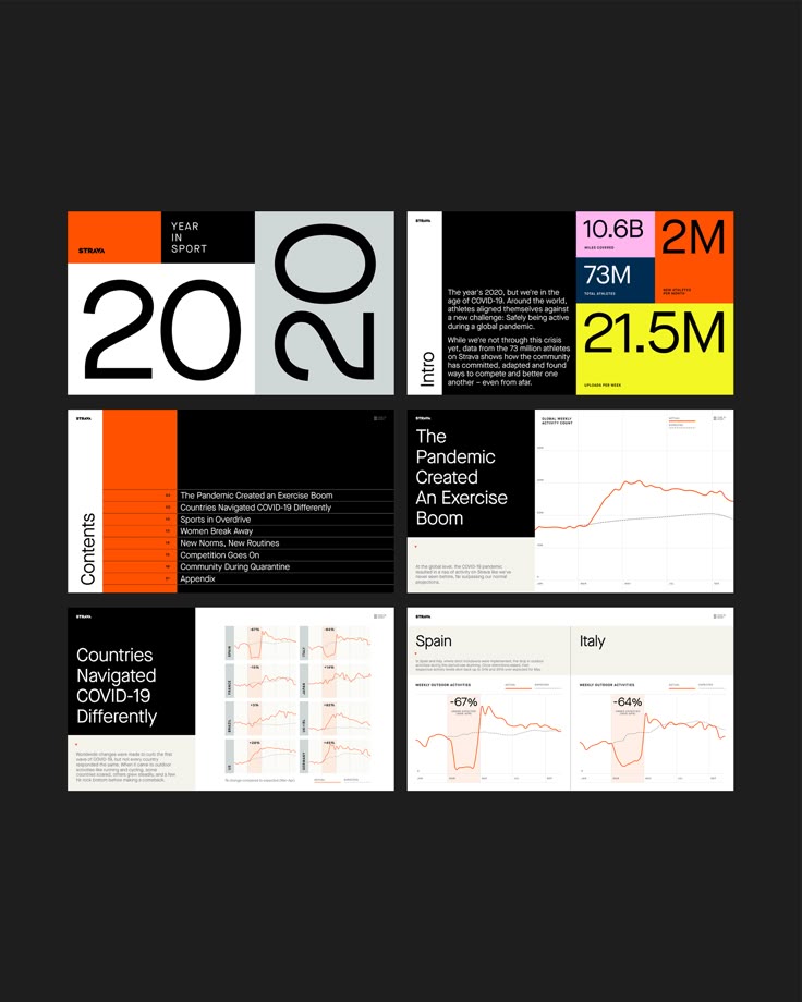
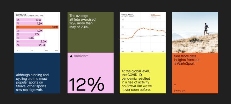
This presentation utilizes a stark, high-contrast design characterized by ample negative space and clear segmentation. The visual language is highly functional, prioritizing the immediate readability of statistical data through bold typography and strategic use of accent colors.
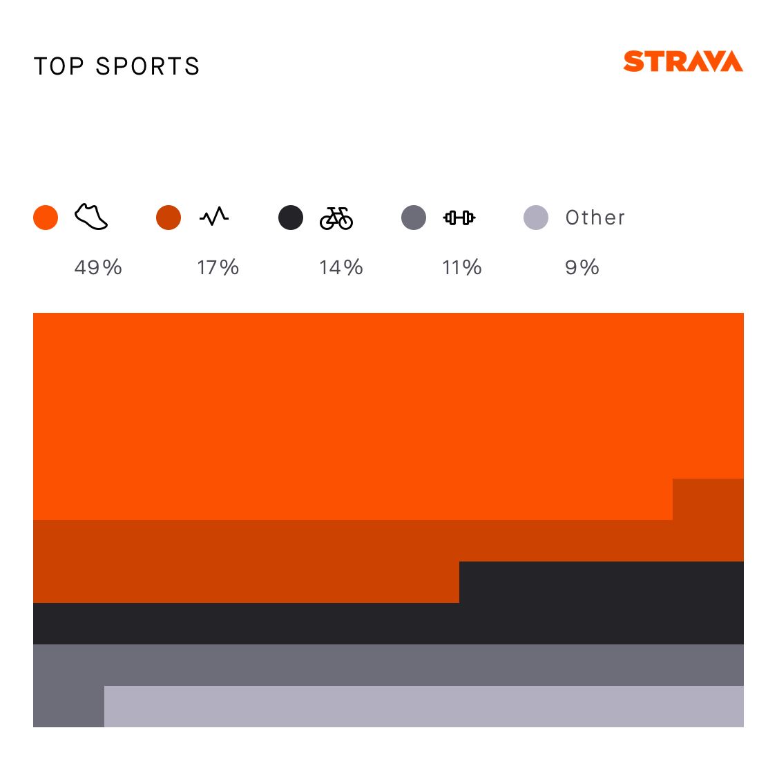
A clean, data-driven infographic displaying sports participation statistics with a bold, modern aesthetic. The design uses a horizontal stacked bar chart with icon-based category labels and percentage breakdowns, employing Strava's signature orange branding alongside a neutral grayscale palette.
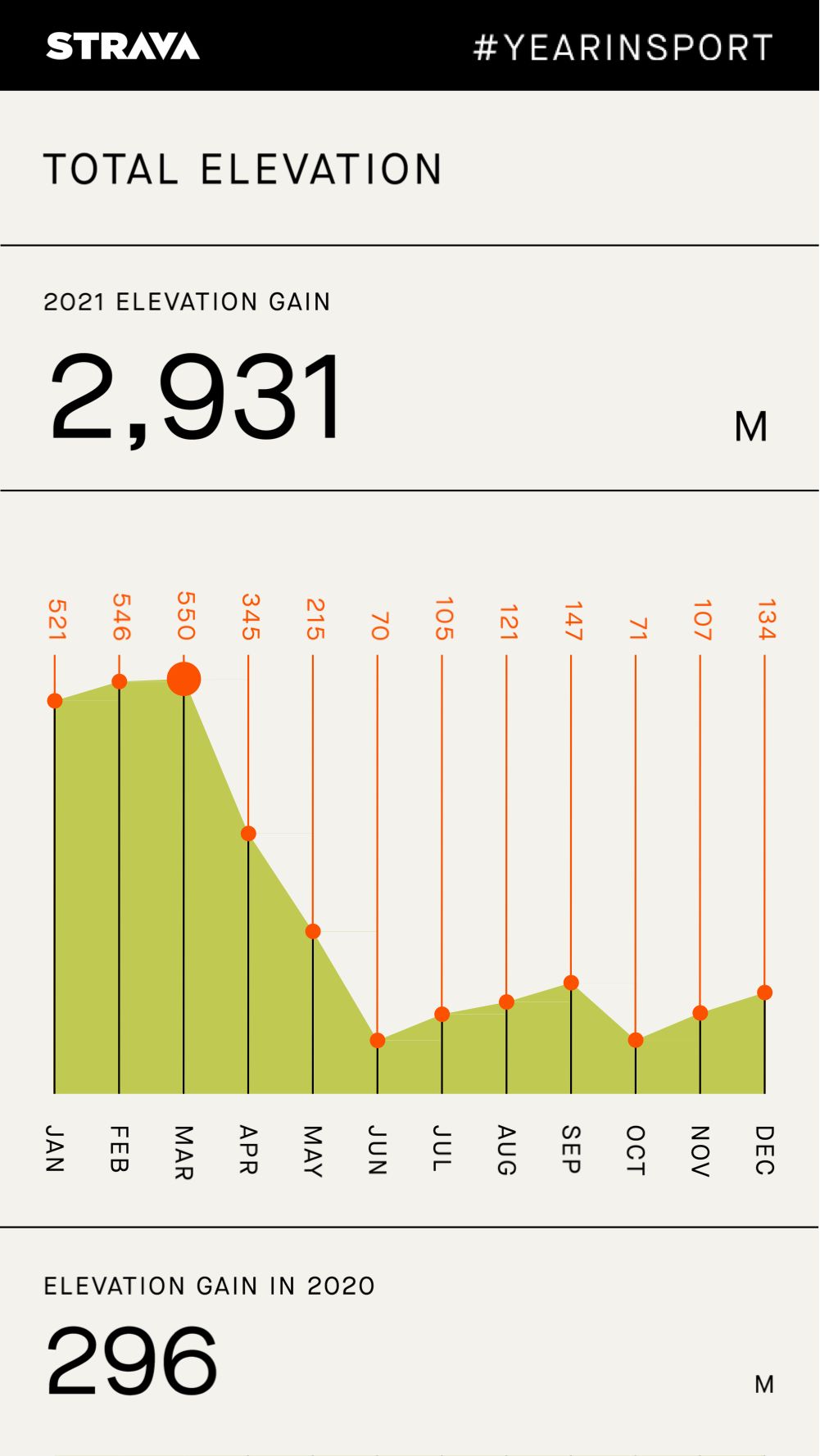
This is a clean, data-driven interface design typical of a sports tracking application. It uses a minimalist approach with clear segmentation to present elevation gain statistics effectively.
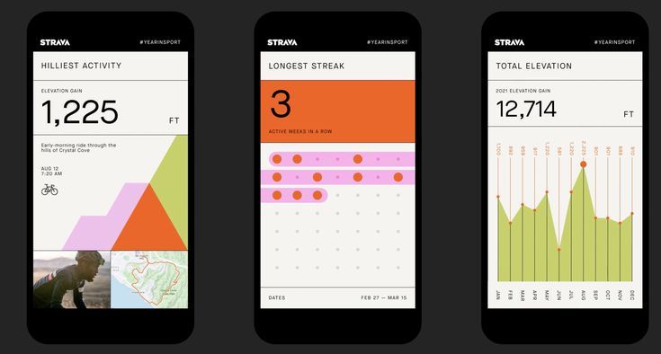
The interface presents a clean, modern, and data-focused design typical of fitness tracking applications. It utilizes ample white space and a limited, high-contrast color palette to ensure readability and emphasize key metrics.
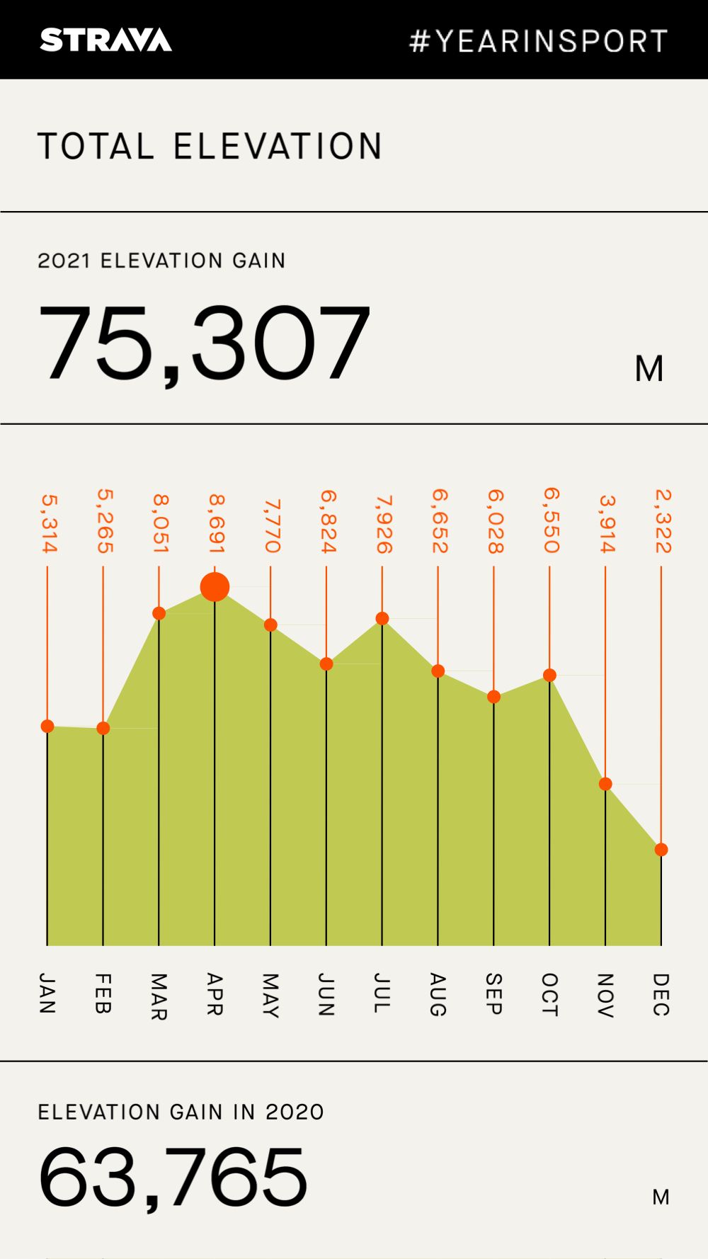
This is a data visualization screen, likely from a fitness tracking app, presenting elevation gain over the course of a year. The design is clean, minimalist, and functional, relying heavily on a simple bar chart to convey performance metrics clearly.

This image utilizes a clean, minimalist aesthetic built around subtle topographical lines and geometric shapes. The visual language is precise and diagrammatic, relying on line work to suggest movement or measurement within a controlled space. The overall feel is analytical, serene, and highly structured.
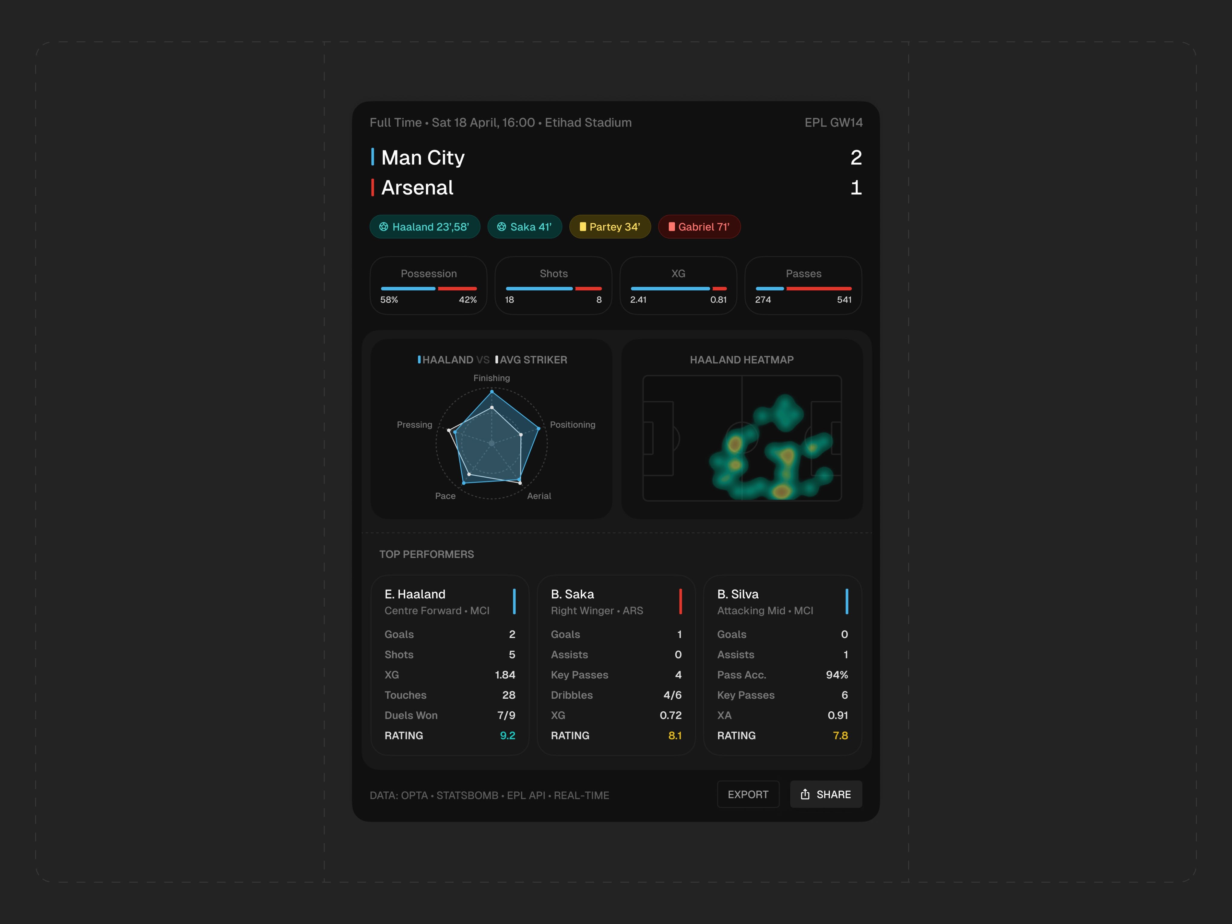
This design utilizes a dark mode aesthetic to present complex sports statistics clearly and professionally. The visual language is clean, utilizing high contrast between dark backgrounds and vibrant accent colors to prioritize data readability. The overall feel is modern, analytical, and focused on performance tracking.
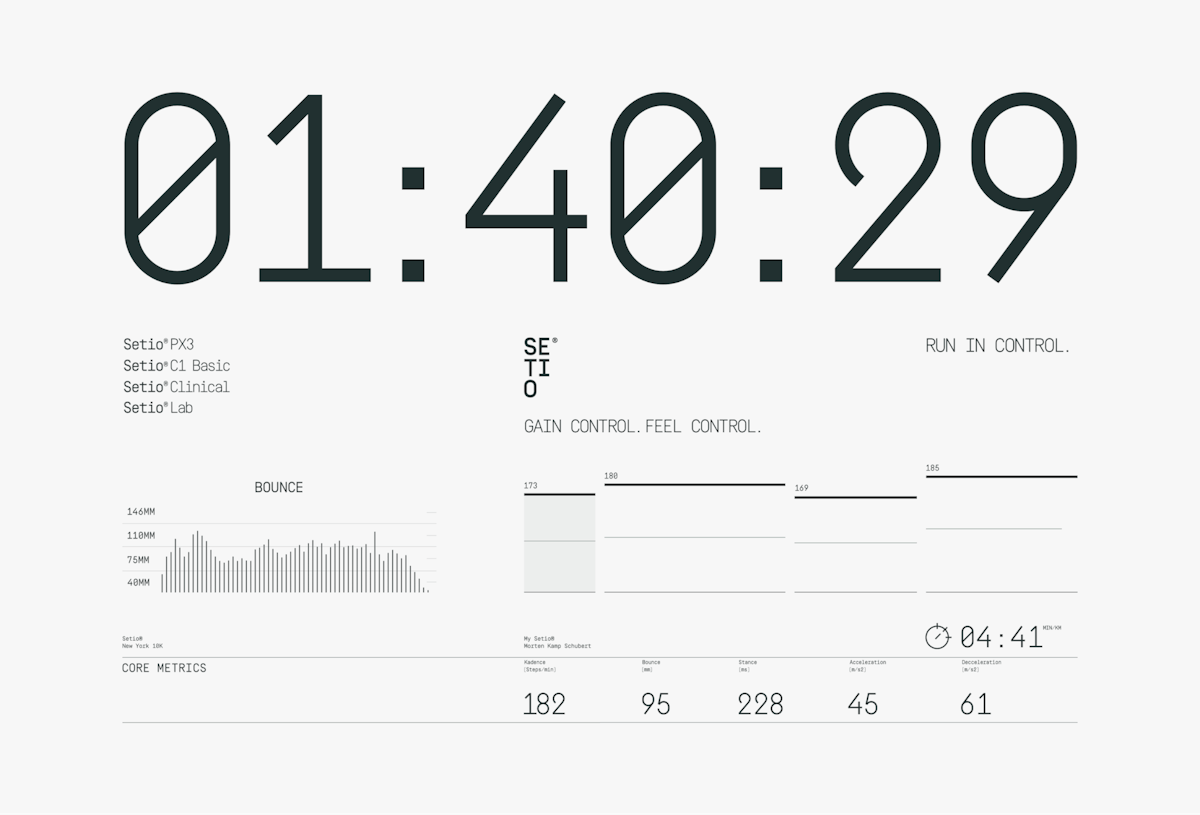
This design utilizes a clean, high-contrast aesthetic typical of technical dashboards, emphasizing data clarity and precision. The visual language is strictly functional, relying on clear typography and minimalist lines to present complex metrics efficiently. The overall feel is highly analytical and performance-focused.
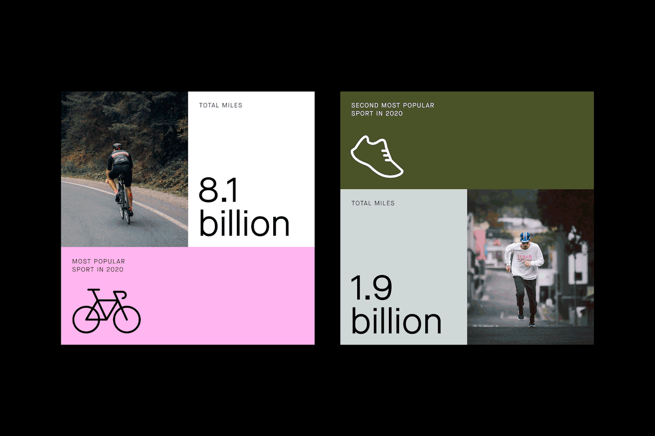
This is a clean, modern infographic design utilizing strong color blocking and large numerical typography to present comparative statistics effectively. The visual language is direct and analytical, relying on simple icons and high contrast to ensure the data points stand out.
The design utilizes a clean, modular grid layout to present multiple data visualizations in an infographic style. It employs strong color blocking and contrasting accents (orange, green, blue) to clearly differentiate metrics and highlight key findings. The visual language is professional, analytical, and highly focused on conveying statistical information.