report generation
3 designs
Showing 3 of 3 (3 total)
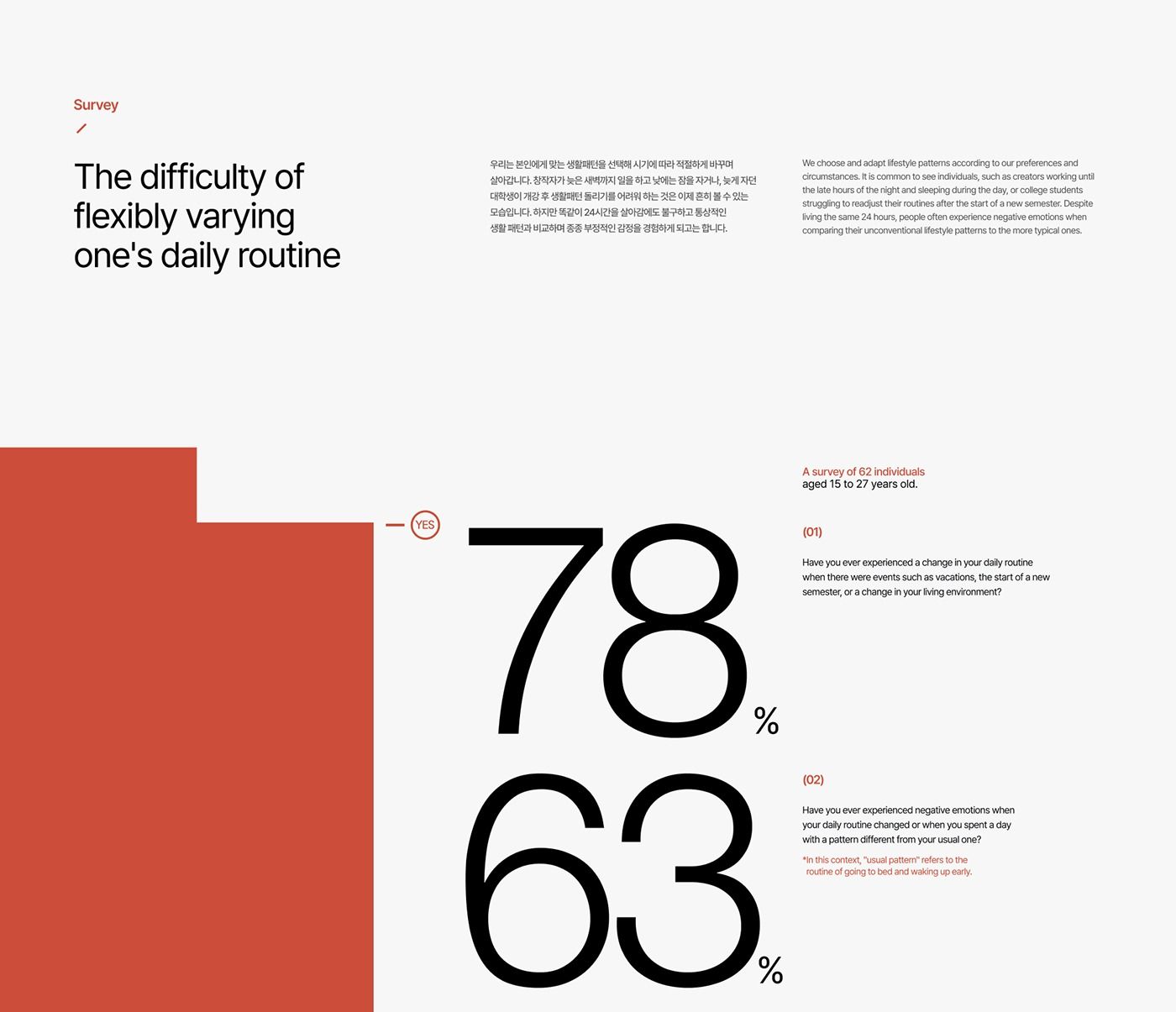
The design is minimalist and clean, utilizing a high-contrast black and white layout with a single accent color (red/terracotta) to present survey results. The visual language is direct and data-focused, prioritizing readability and stark presentation of quantitative information.
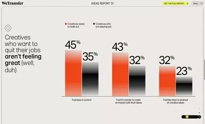
The image presents a data visualization report with a clean, minimalist design typical of modern web analytics or research tools. It uses stark contrasts between orange and dark gray bars to convey percentages, resulting in a professional yet somewhat stark feel.
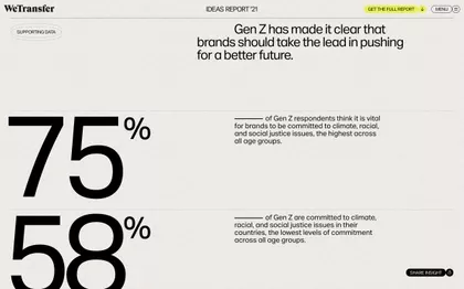
The design is clean, minimalist, and professional, utilizing ample white space to emphasize key statistics. The visual language relies on large, bold numbers juxtaposed with concise text to deliver impactful data points clearly.