public service
11 designs
Showing 11 of 11 (11 total)
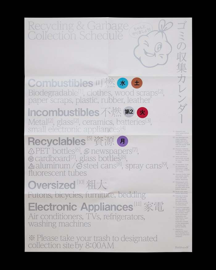
This image is a dense, highly functional informational document, likely a public guide or sorting instruction. The design prioritizes clear categorization and textual density over aesthetic appeal, resulting in a purely utilitarian visual language.
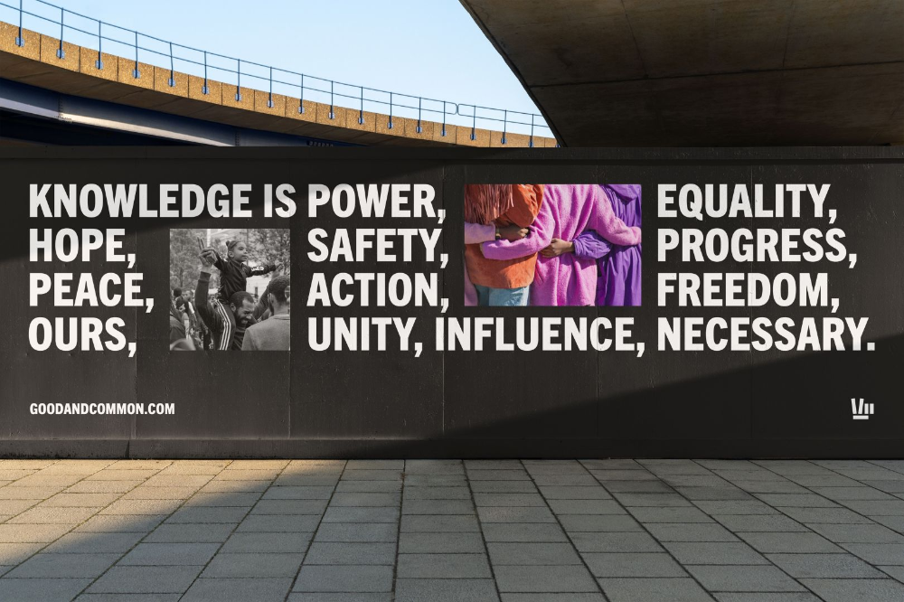
This design utilizes high-contrast typography and photographic inserts against a monolithic dark wall to convey a powerful message of social justice and unity. The visual language is assertive and serious, balancing large-scale text with intimate human elements to create a compelling call to action.
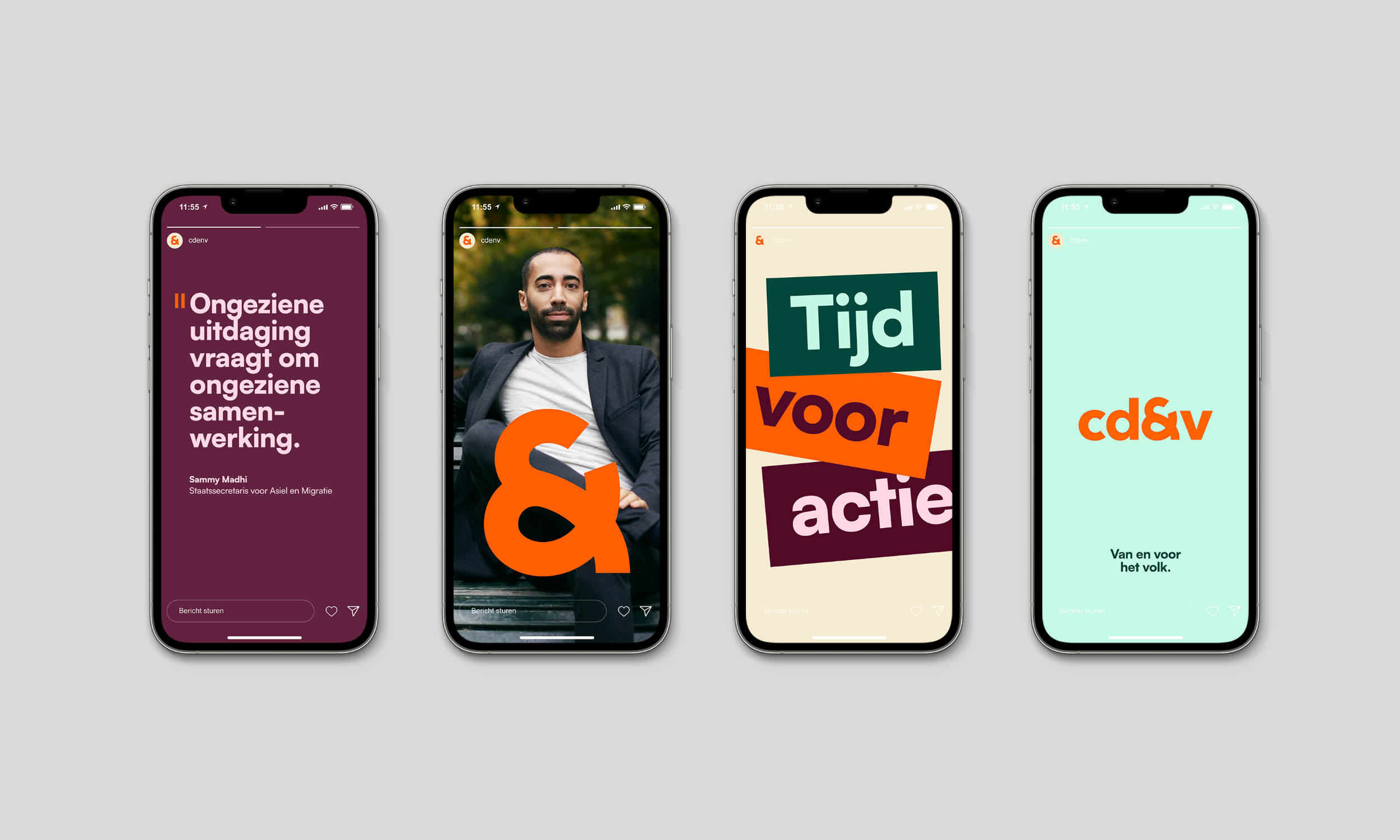
The image displays a set of four mobile app screens, characterized by clean, modern design with strong use of negative space and bold color blocking. The visual language is professional and direct, utilizing a limited palette to focus attention on the core message.
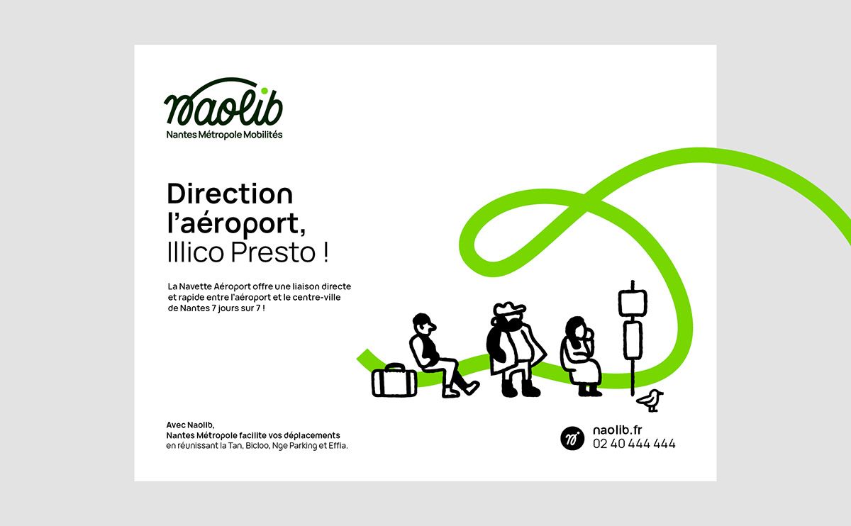
The design is clean, modern, and professional, utilizing a simple, light background with a vibrant lime green accent to convey movement and connectivity. The layout is balanced, featuring clear hierarchy between the logo, the main message, and illustrative icons.
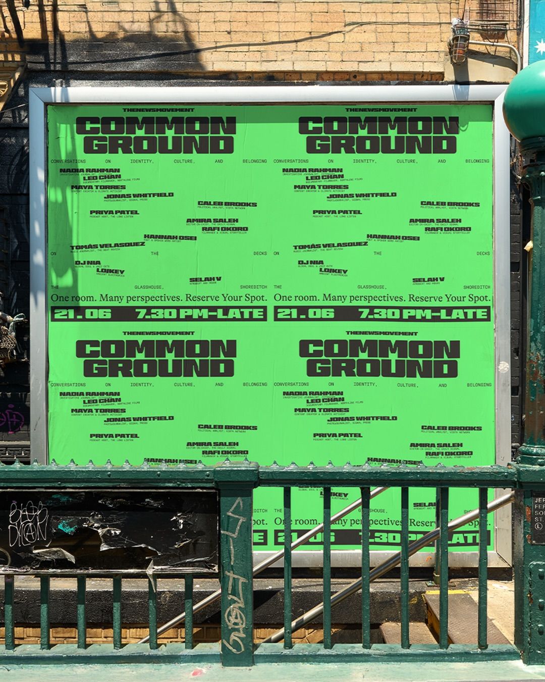
This image features a large, institutional-style sign with a grid layout listing numerous names under the heading 'COMMON GROUND'. The design is functional and text-heavy, utilizing a high-contrast, monochromatic palette typical of public or organizational signage.
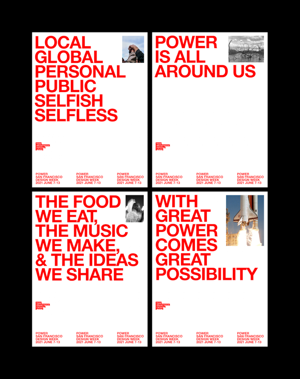
A bold, modernist poster series featuring large red sans-serif typography paired with documentary-style photography. The design employs a minimalist grid layout with high contrast between white space and vibrant red text, creating a striking visual hierarchy that emphasizes messaging over imagery.
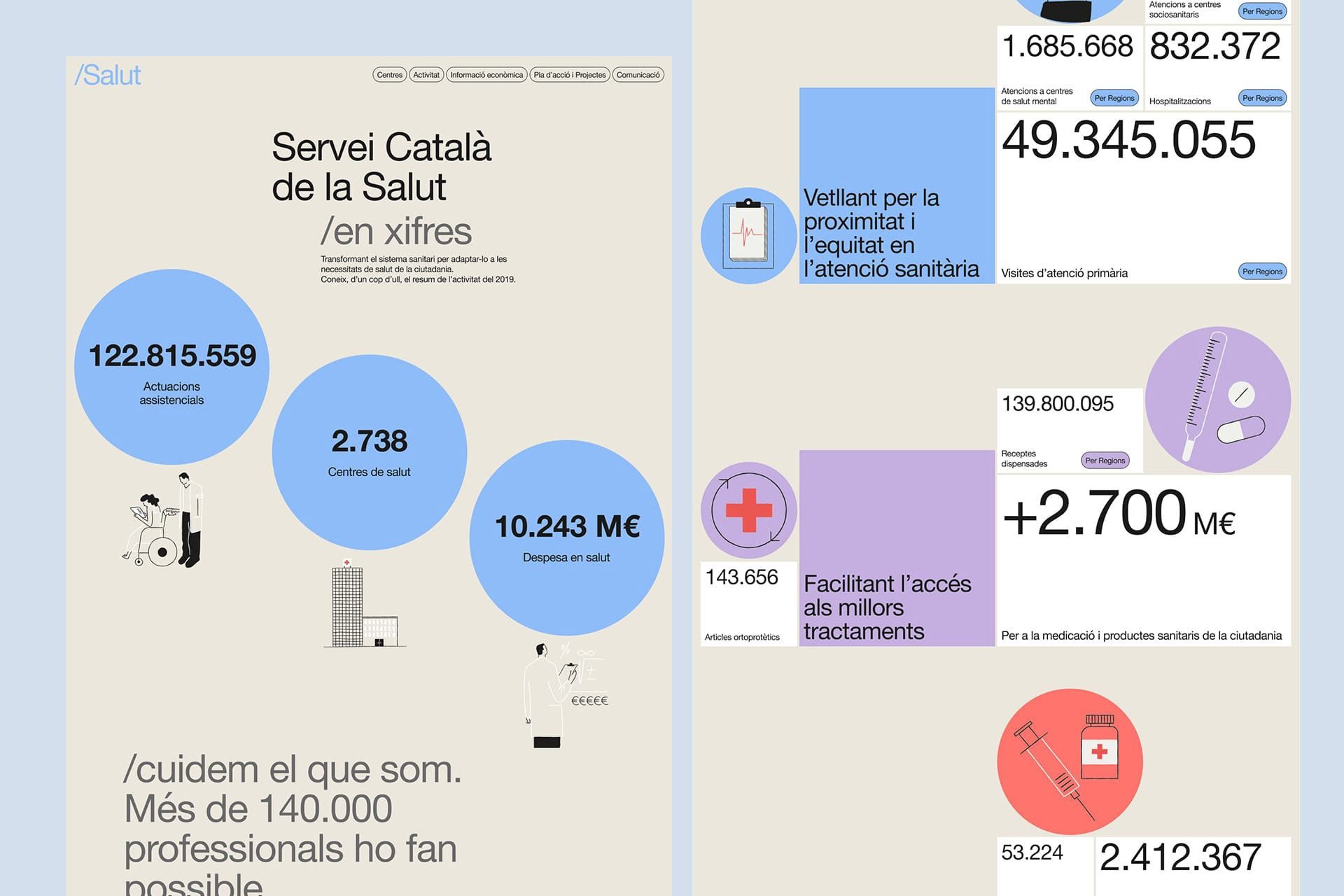
The design is clean, professional, and information-dense, utilizing a light, muted color palette with clear iconography to present statistical data about healthcare services. The layout is structured using distinct blocks and circular elements to guide the user through key metrics.
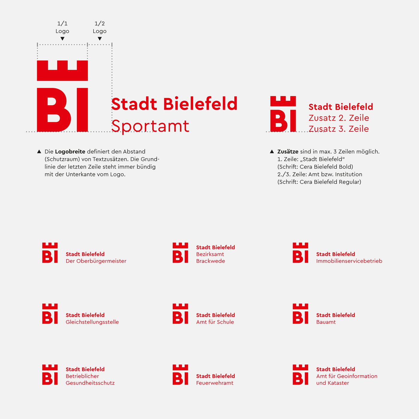
The design is highly structured, minimalist, and corporate, utilizing a strong, bold red color against a white background. It employs a clean grid system to present a list of entities, suggesting official documentation or branding for various municipal services.
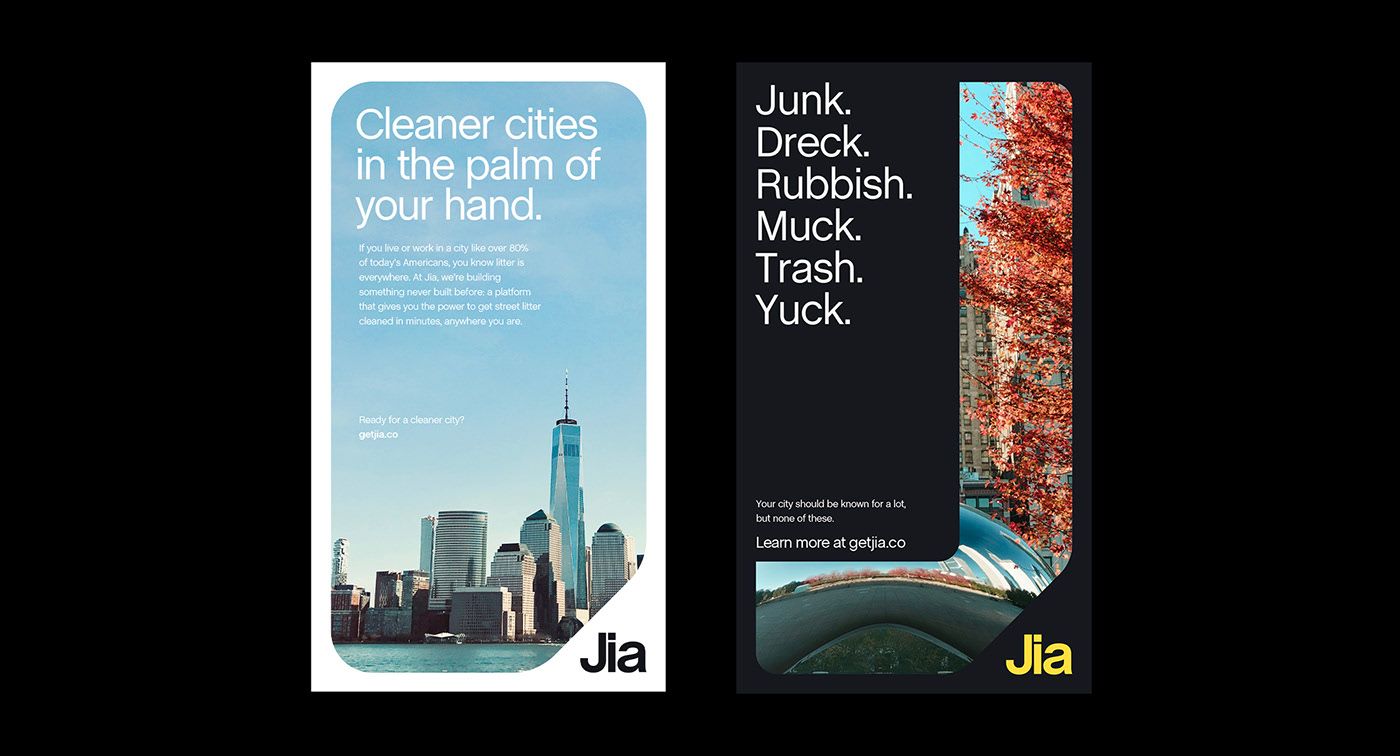
The image presents a stark, minimalist design contrasting two distinct concepts—cleanliness versus junk—using strong typography and negative space. The layout is divided vertically, employing a clean white background for the first concept and a dark, textured background for the second, creating a clear visual dichotomy.
The design is minimalist and typographic, using a clean, sans-serif typeface to present the name 'national museum australia' in bold, capitalized text. The composition is stark and relies entirely on negative space to achieve a sense of official authority and clarity.
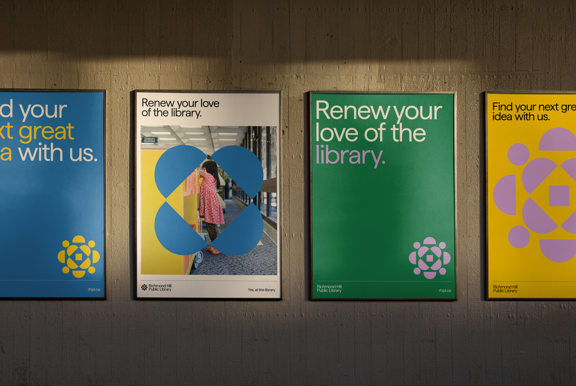
This set of display panels utilizes a clean, modern design approach with bold color blocking and high contrast to deliver informational messages. The visual language is friendly yet professional, combining photographic elements with abstract geometric shapes to communicate community engagement and renewal.