policy
14 designs
Showing 14 of 14 (14 total)
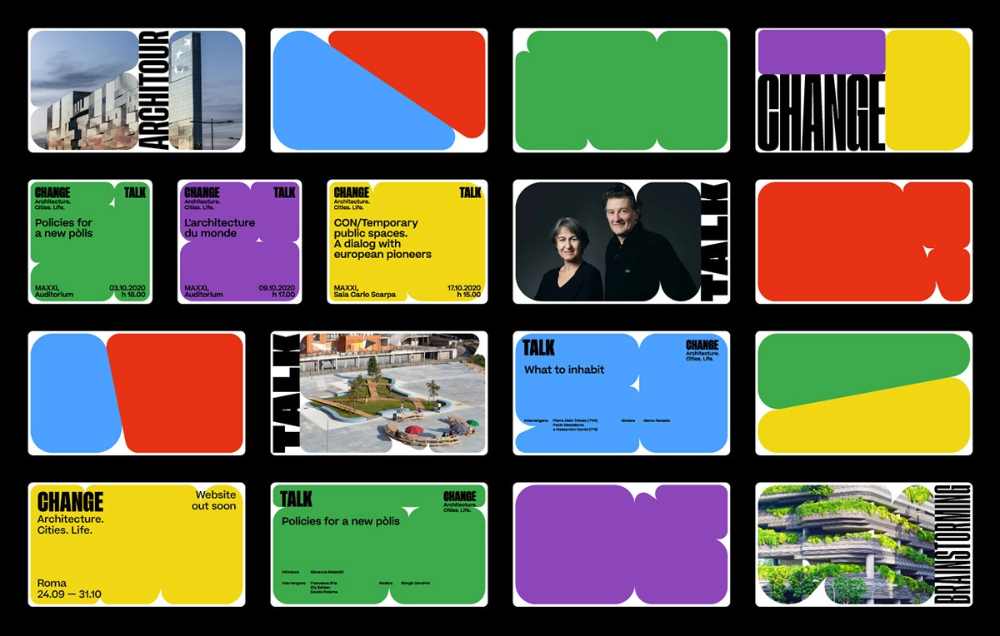
This image presents a highly structured grid of promotional graphics, utilizing bold color blocking and clean typography to convey information about architectural and policy discussions. The visual language is modern, utilizing strong geometric shapes and high contrast to create a dynamic and professional feel.
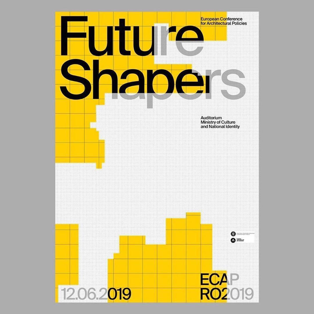
This design employs a clean, geometric layout dominated by high-contrast yellow and white, utilizing a subtle grid pattern to provide structure. The visual language is modern and academic, relying on strong typography to establish a professional and forward-thinking tone for the conference.
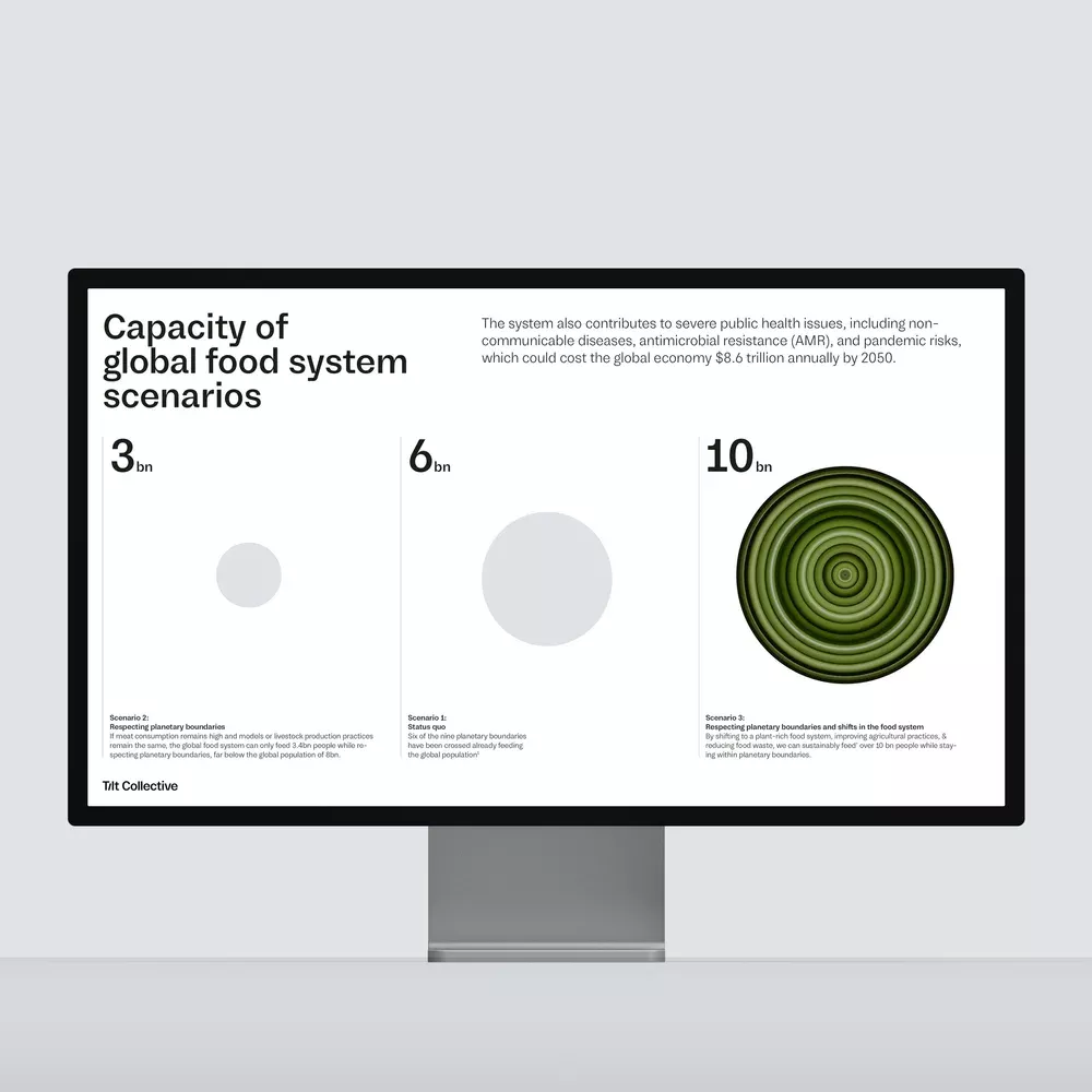
This is a clean, professional data visualization slide utilizing a minimalist design approach to present comparative scenarios. The visual language relies on stark contrast and simple geometric shapes to clearly communicate large numerical data points.
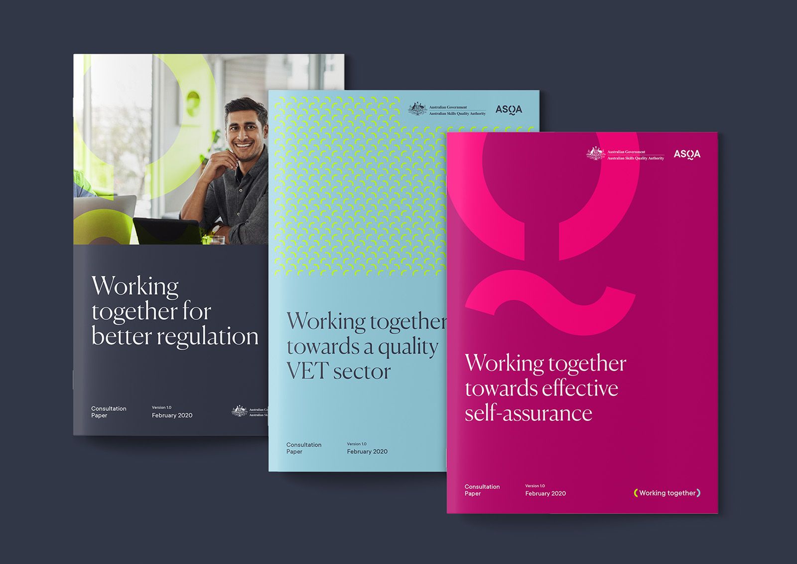
This visual presentation uses a clean, modern design language characterized by strong color blocking and clear typography to present three related reports. The design effectively uses contrasting hues—dark, cool tones against vibrant pinks and mint greens—to differentiate the topics while maintaining a cohesive professional feel.

The design features a clean, minimalist layout dominated by muted greens and grays, suggesting a formal, governmental, or academic report. The visual language is structured and text-heavy, relying on clear section breaks to organize dense information.
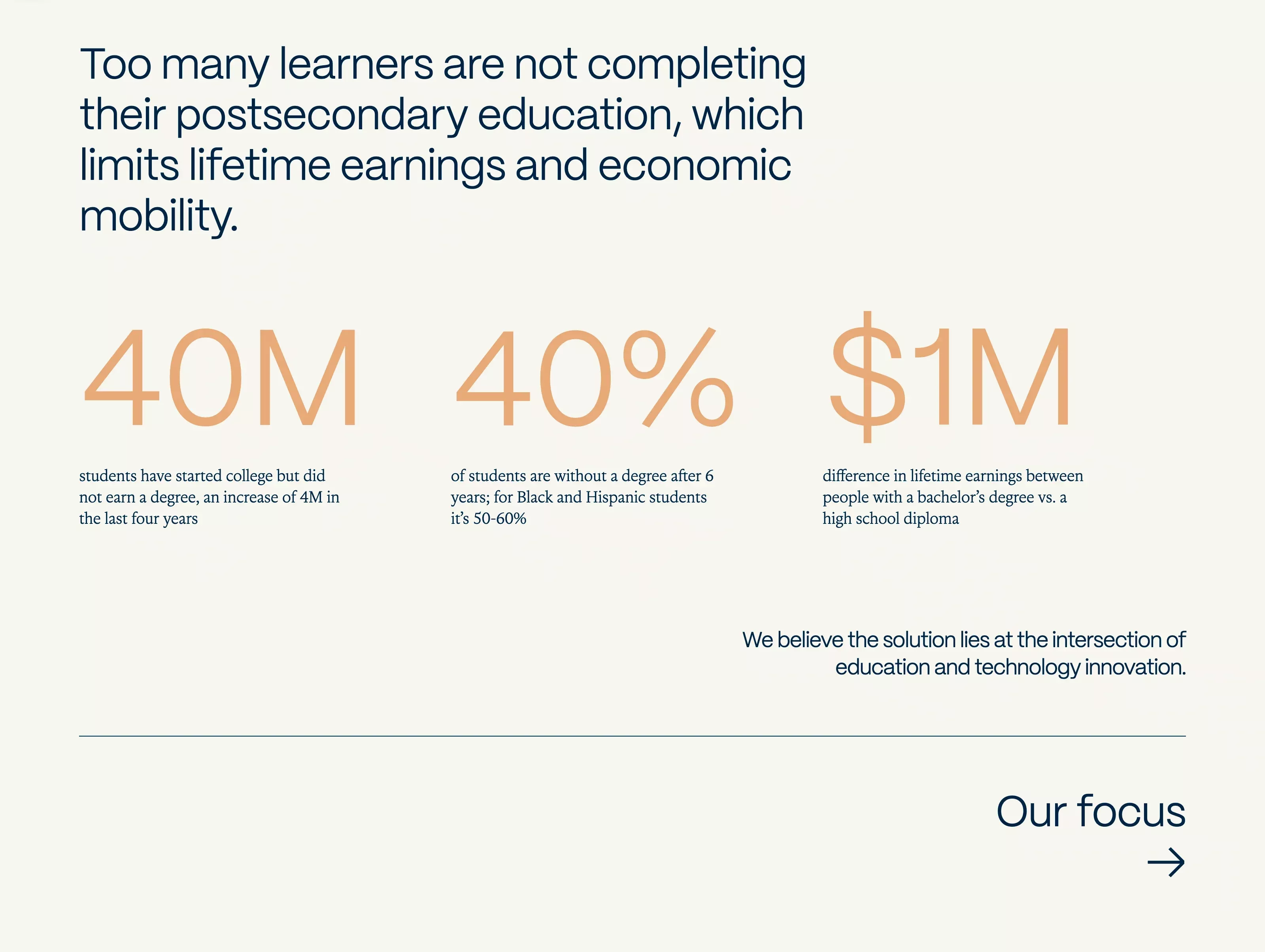
The image is a minimalist, text-heavy presentation slide using a light neutral background to convey serious statistical information. The design relies on large, bold numbers and clear typography to present a problem statement related to education and economic mobility.
The design is clean, modern, and professional, utilizing a restrained color palette with strong geometric shapes to convey seriousness and focus. The layout is balanced, using negative space effectively to separate distinct informational blocks.
The design is clean, minimalist, and academic, utilizing ample white space to present research findings in a structured, professional manner. The visual language relies heavily on typography and subtle graphic elements to convey seriousness and credibility.
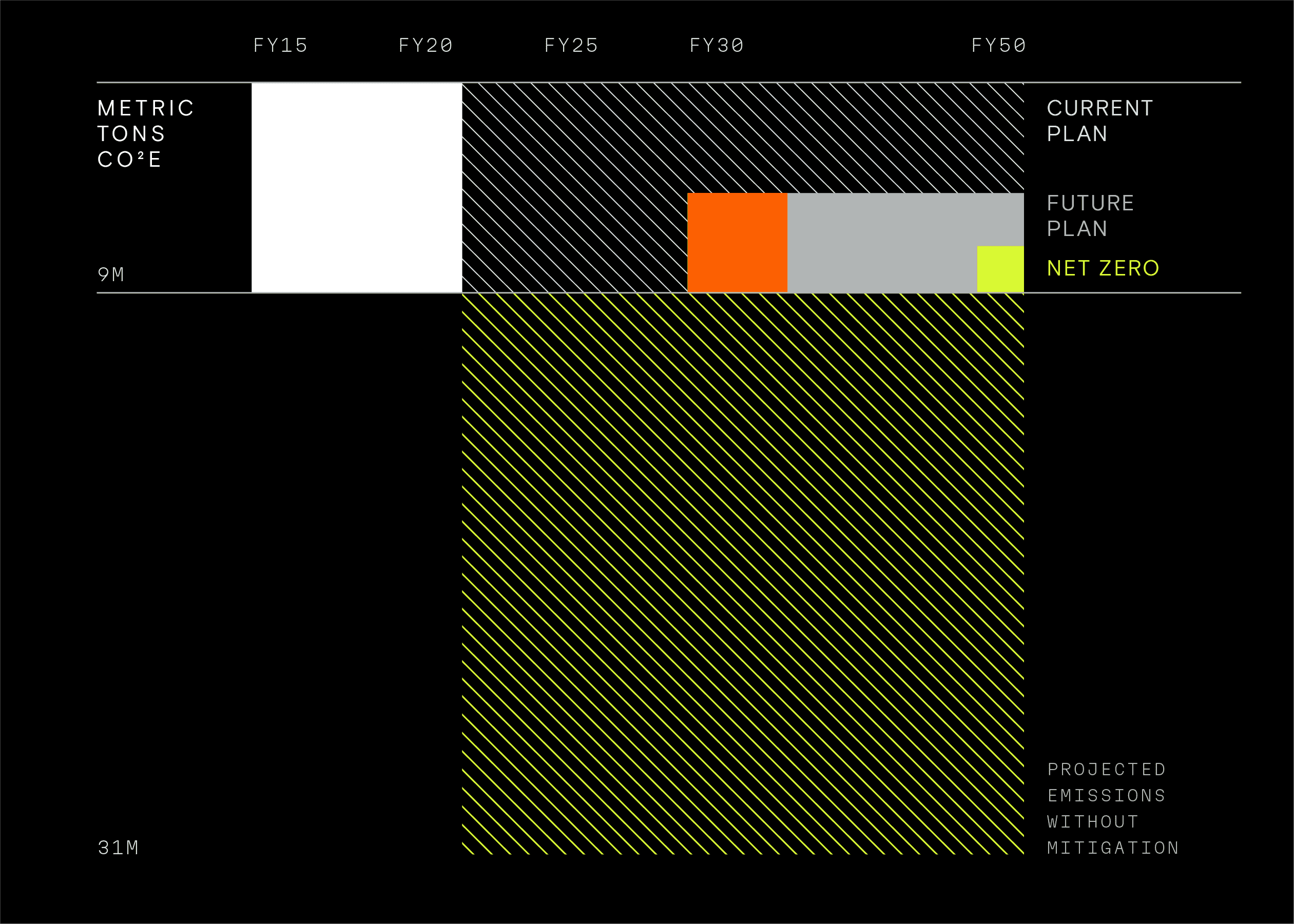
This is a highly structured, data-driven visualization, likely a projection or plan chart, using stark blocks of color and texture to represent different scenarios over time. The design is functional and analytical, prioritizing clear demarcation between current plans, future plans, and baseline projections.
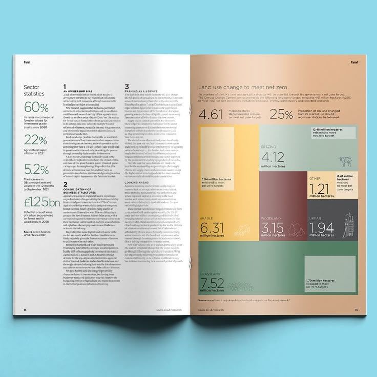
The image displays a professional, data-heavy report or publication layout characterized by a clean, modern, and organized grid structure. It uses ample white space to separate distinct sections of statistics and text, conveying a sense of authority and detailed information.
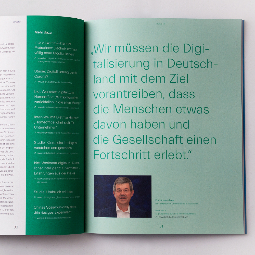
The design is clean, professional, and academic, utilizing a strong contrast between white space and deep green tones. The layout is structured with clear text blocks and a prominent pull quote, suggesting an informational or research publication.
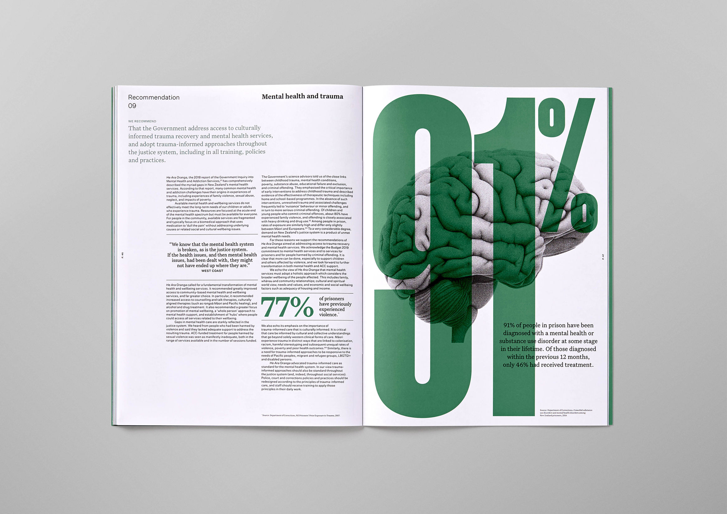
The design employs a clean, modern layout with strong typographic hierarchy and an impactful use of color to highlight key data. It balances dense textual information with large, abstract graphic elements, creating a professional yet serious visual narrative.
The design is highly functional and academic, employing a clean, minimalist layout dominated by black text on a white background. The visual language is serious and informative, prioritizing readability and clear hierarchical organization of complex textual content.
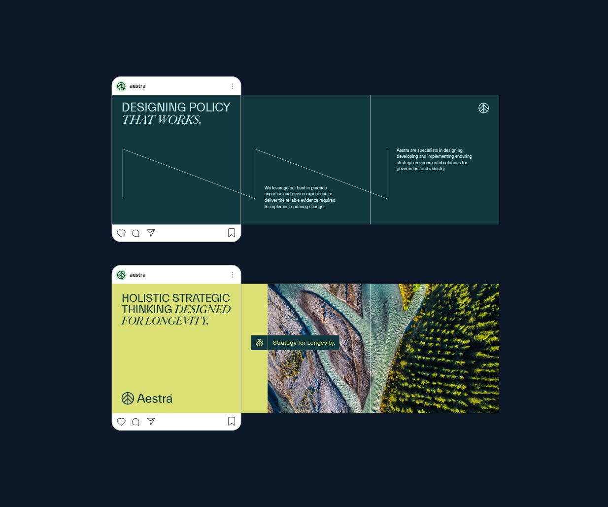
This design presents a highly professional and modern aesthetic characterized by clean lines, strong geometric divisions, and sophisticated color blocking. The visual language is minimalist yet structured, effectively communicating complex strategic concepts with clarity and authority.