market research
140 designs
Showing 24 of 140 (140 total)
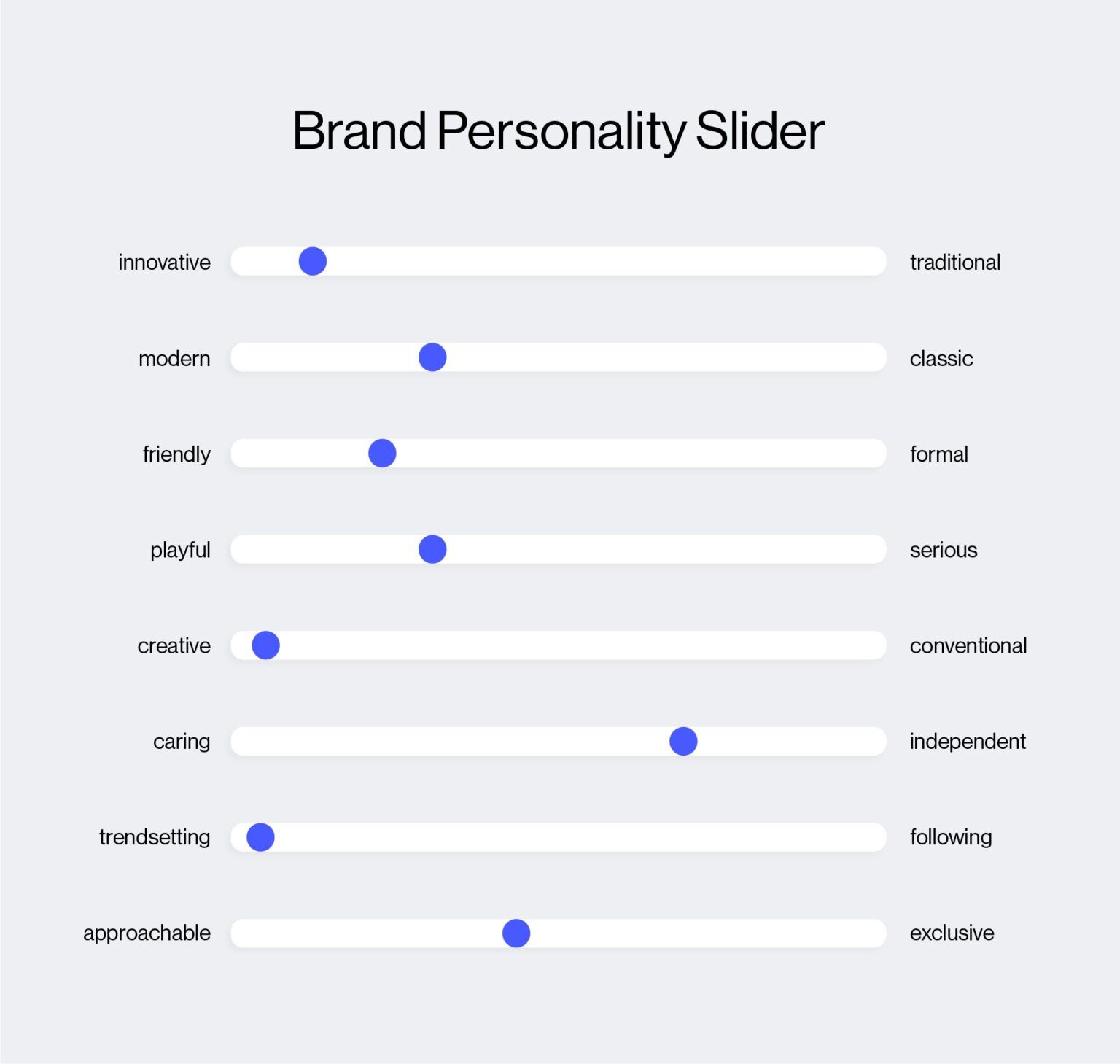
This is a clean, minimalist data visualization tool presenting brand personality traits through a linear slider format. The design uses simple horizontal lines and distinct blue markers to clearly map subjective attributes onto a spectrum, offering an objective way to assess brand positioning.
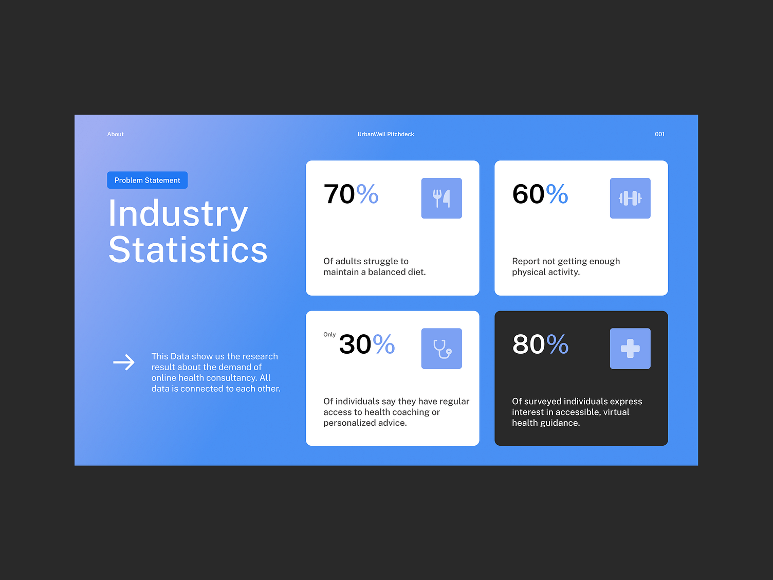
This is a clean, professional infographic designed to present industry statistics using clear percentage callouts and associated text blocks. The visual language relies on strong segmentation and a cool color palette to facilitate easy data comprehension.
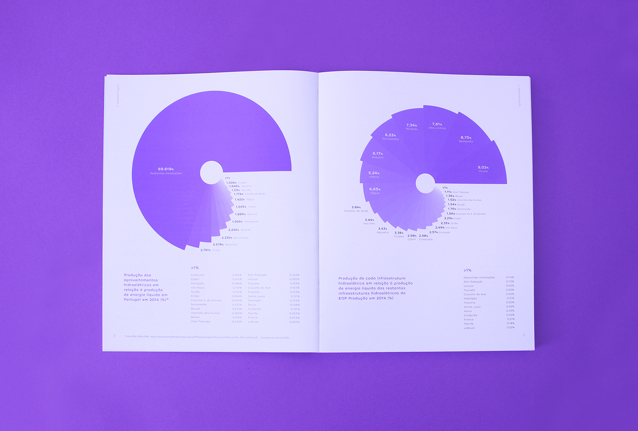
This spread features a clean, professional presentation of quantitative data using large circular charts against a stark white background. The design emphasizes clarity and readability, utilizing a monochromatic palette of purples and whites to create a modern and analytical feel.
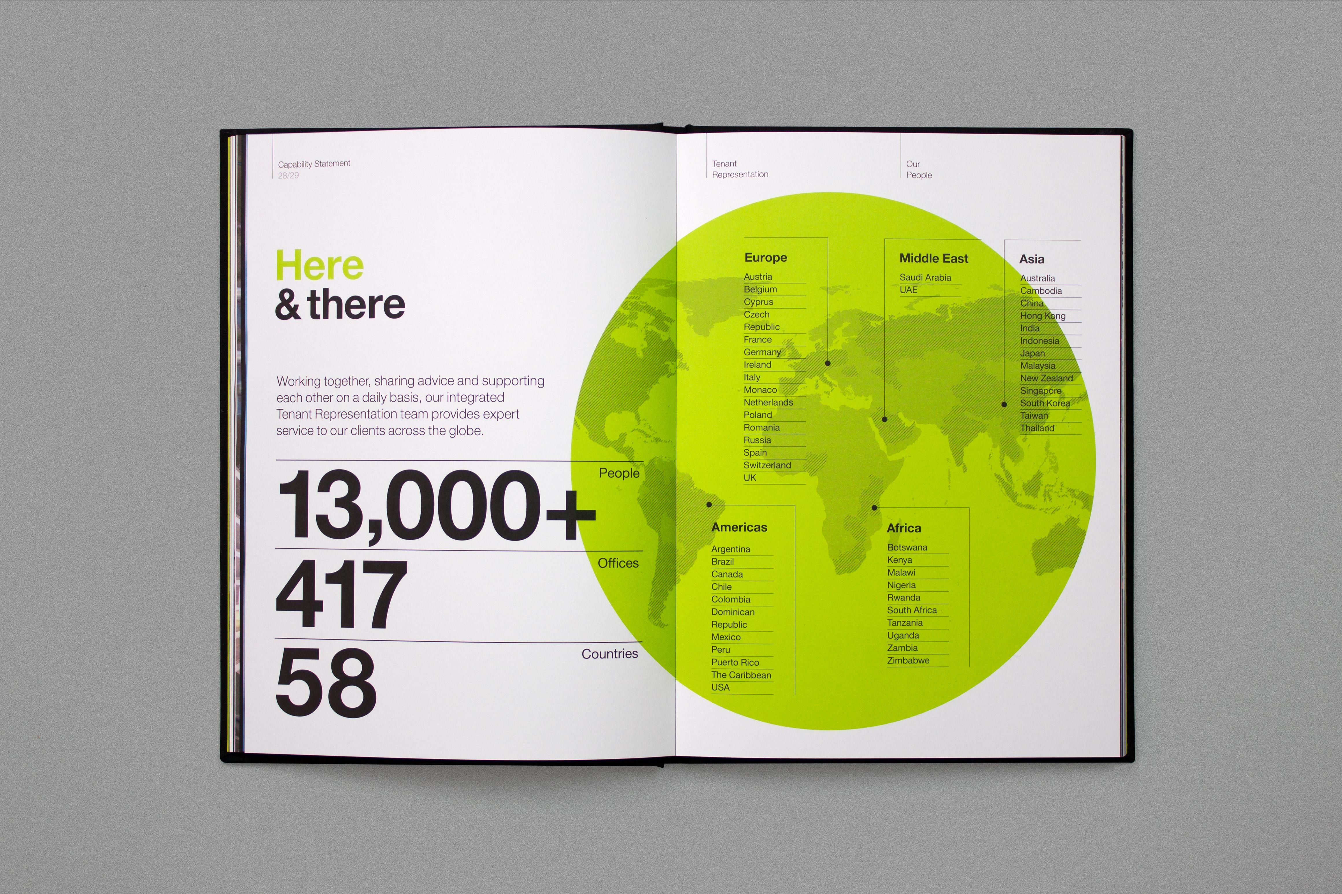
This design utilizes a clean, professional layout to present quantitative data regarding global reach. The visual language is modern and corporate, relying on clear typography and a prominent, color-coded world map to effectively communicate scale and scope.
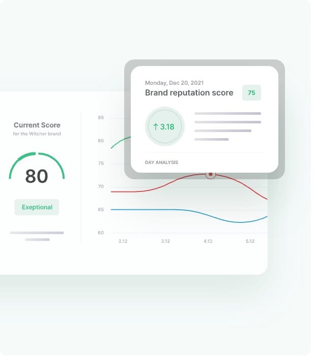
This design features a clean, modern dashboard style focused on presenting quantitative data through clear visualizations like gauges and line graphs. The visual language is minimalist, relying heavily on whitespace and subtle color accents to ensure the data remains the primary focus.
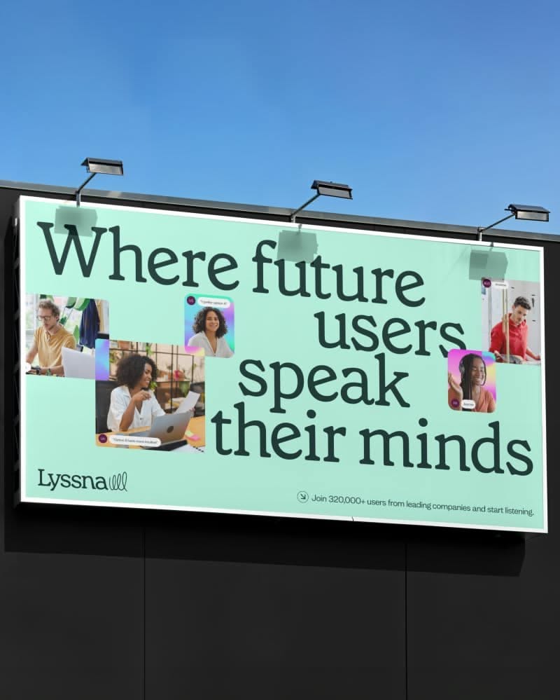
This design utilizes a clean, modern aesthetic with a calming color palette to promote a concept centered around user voice and insight. The visual language is professional and inviting, effectively pairing clear typography with subtle human elements to convey a message of deep understanding.
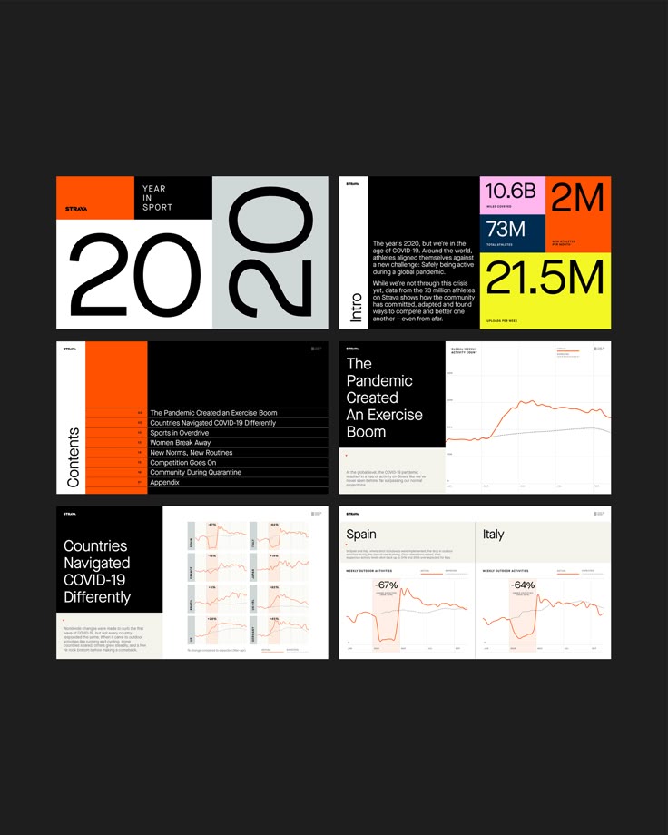
This presentation utilizes a stark, high-contrast design characterized by ample negative space and clear segmentation. The visual language is highly functional, prioritizing the immediate readability of statistical data through bold typography and strategic use of accent colors.
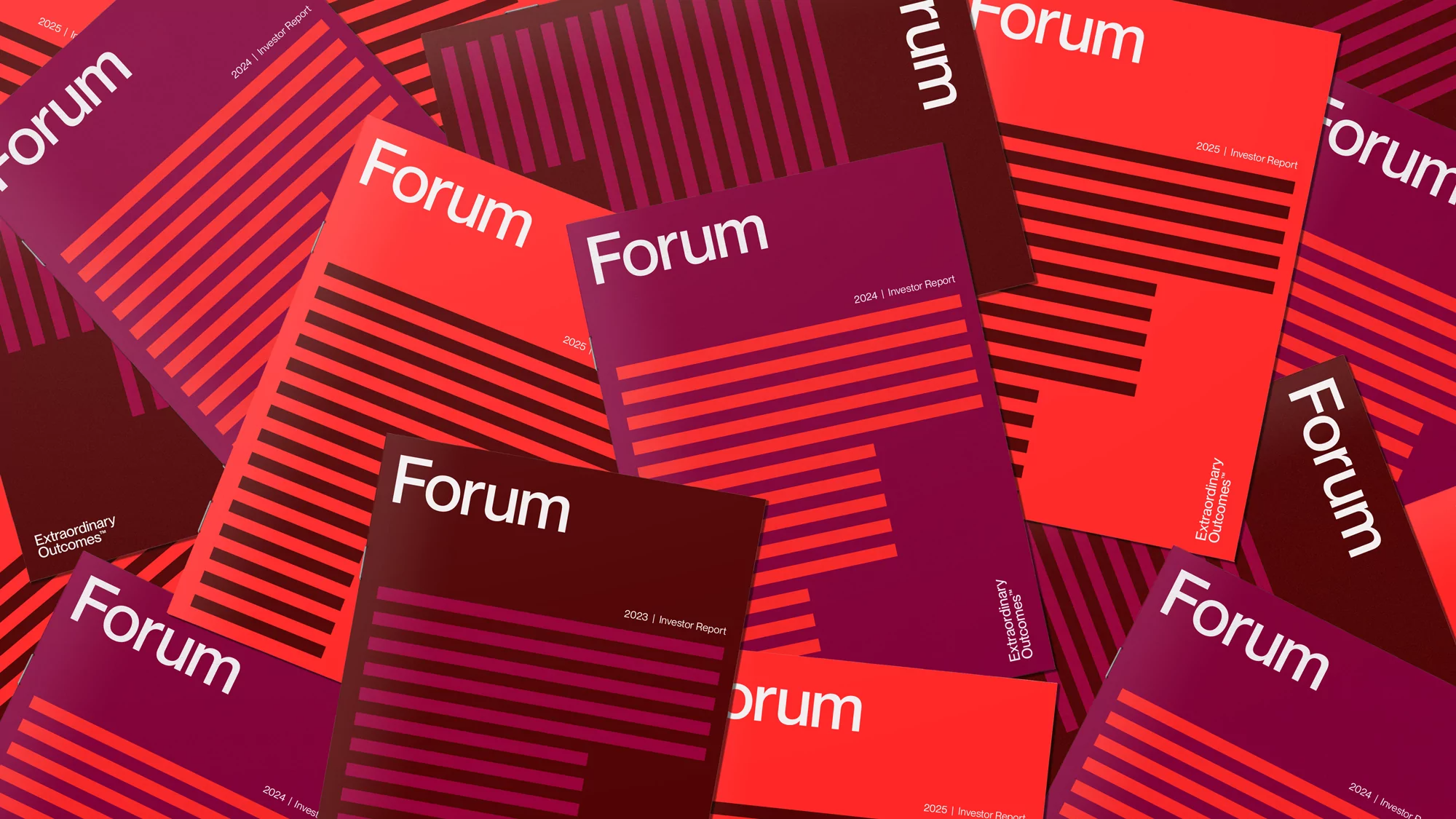
This design utilizes a high-contrast, layered composition featuring bold diagonal stripes and deep jewel tones to create a dynamic and structured visual identity. The repeated elements establish a strong pattern that conveys professionalism and energetic movement across the frame.
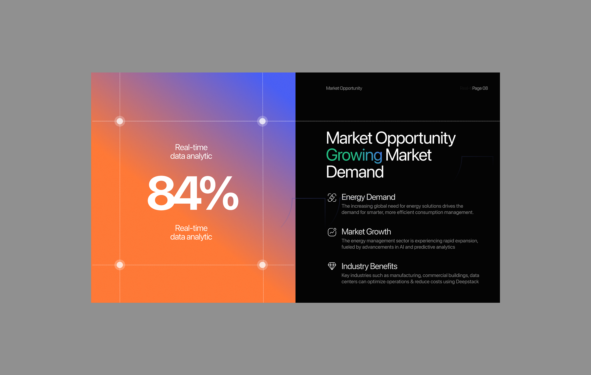
The design uses a split-screen layout with a vibrant gradient background on the left contrasting with a dark, professional section on the right. It employs clean typography and clear visual hierarchy to present data-driven market opportunity information.
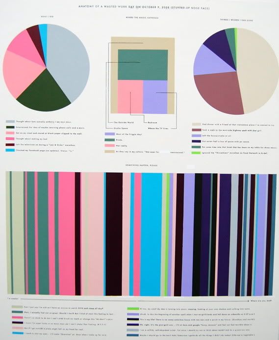
The image presents a complex, data-driven visualization combining a large pie chart with numerous bar graphs and segmented charts. The design is highly structured, utilizing a limited yet varied color palette to convey detailed statistical information in a dense layout.
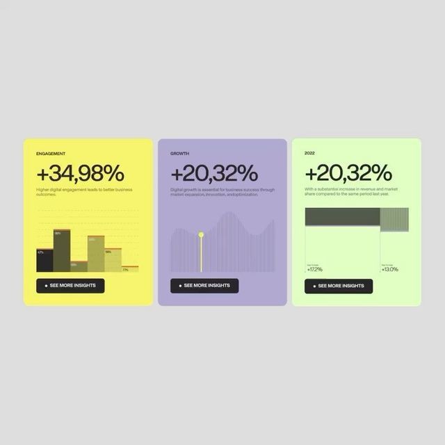
The image presents three distinct, card-like data visualizations using a clean, modern aesthetic. The design relies heavily on color blocking and simple bar/line charts to convey growth metrics effectively. The overall feel is professional, data-driven, and optimistic.
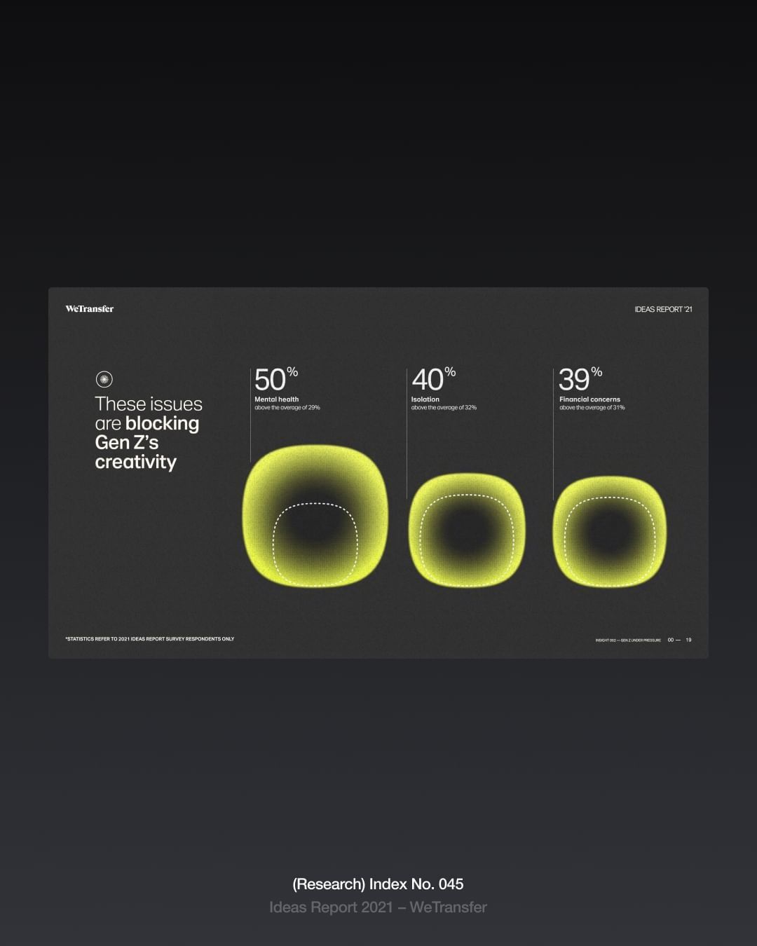
The design is minimalist and modern, utilizing a dark background to highlight glowing, circular elements representing data points. The visual language is clean and focused, employing subtle gradients to create a sense of depth and focus on the percentage metrics.
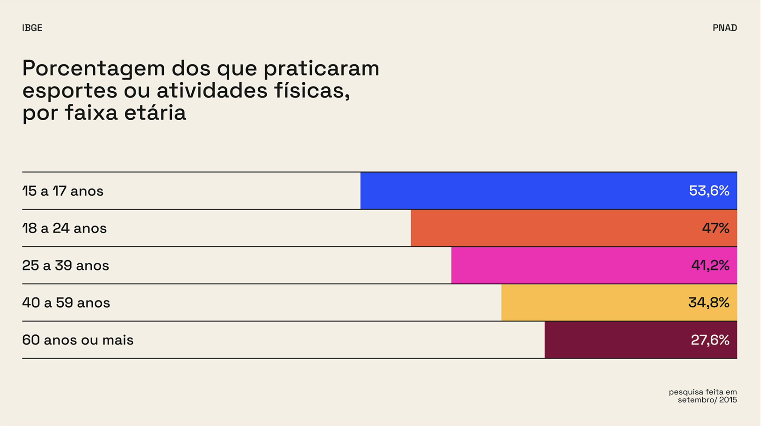
The image is a clear, data-driven bar chart visualization presenting the percentage of people who practice sports or physical activities categorized by age group. The design is clean, minimalist, and highly functional, prioritizing readability of the statistical information.
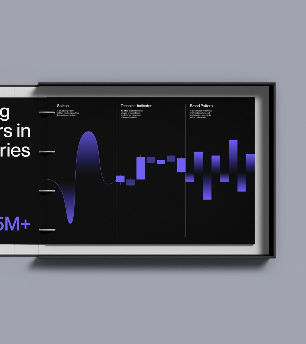
The image presents a dark-themed data visualization dashboard with a clean, modern, and professional aesthetic. It uses high contrast between dark backgrounds and vibrant blue data lines to convey technical information clearly.
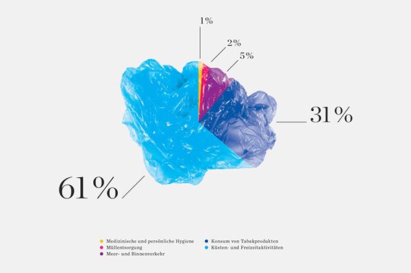
The image is a stylized, abstract representation of a pie chart or segmented area, using translucent, fluid shapes to denote proportions. The design uses vibrant blues and purples to create a dynamic yet somewhat opaque visual hierarchy.
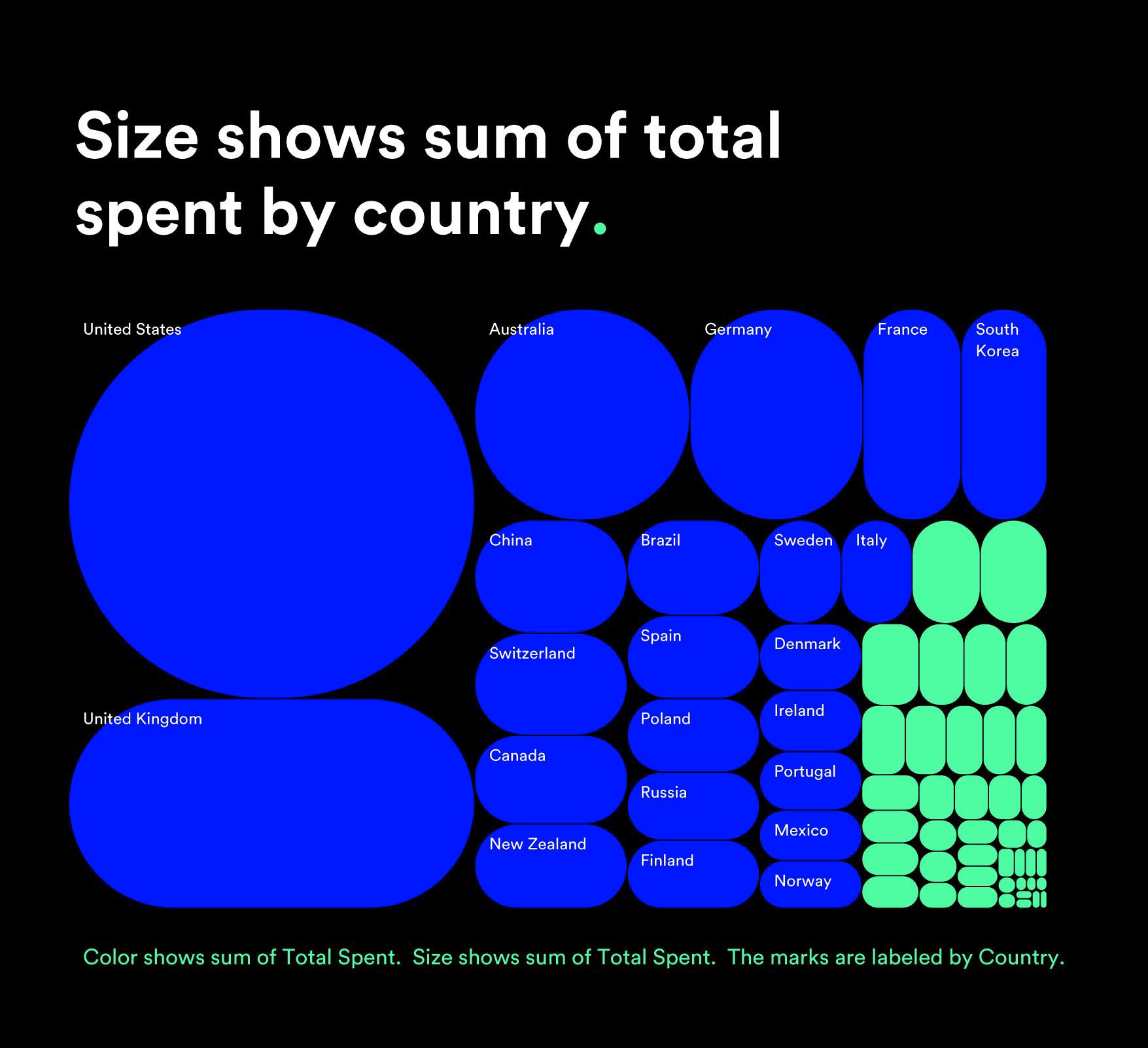
This is a data visualization using proportional circle sizes to represent monetary amounts spent by different countries. The design is clean, modern, and relies heavily on color variation to convey magnitude, creating a clear comparative chart.
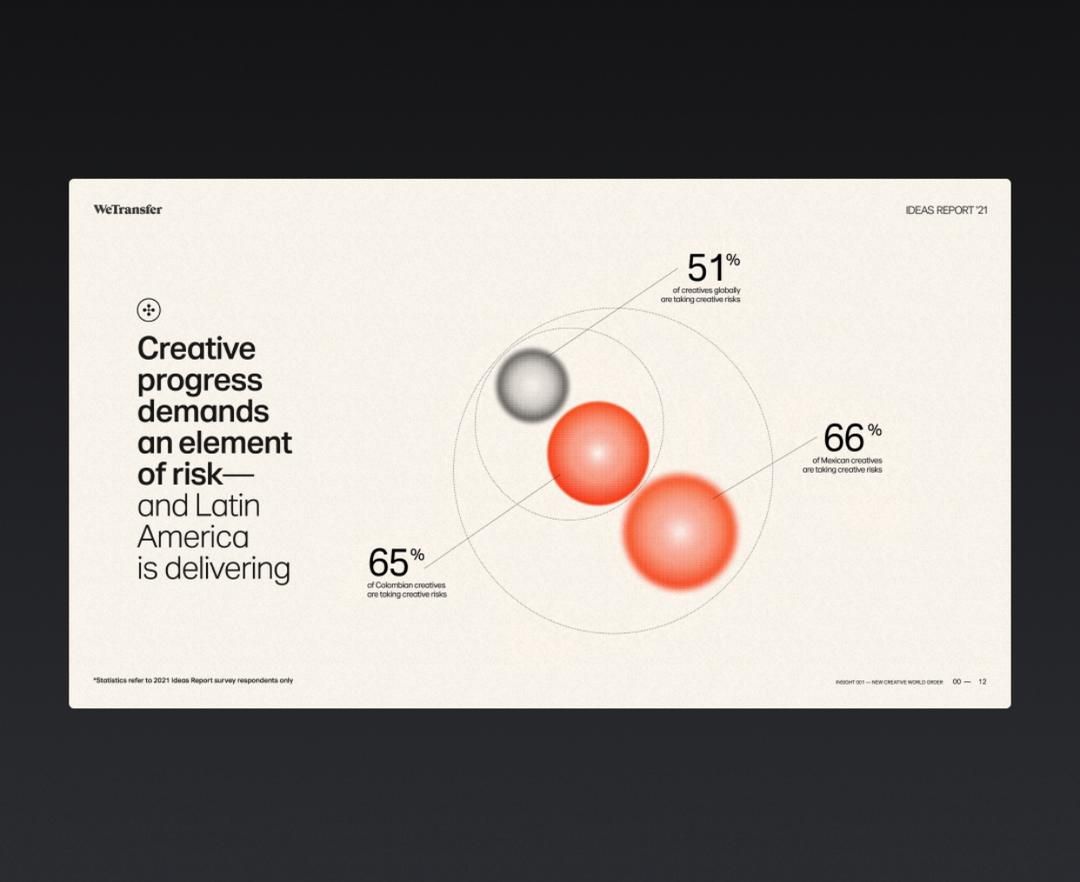
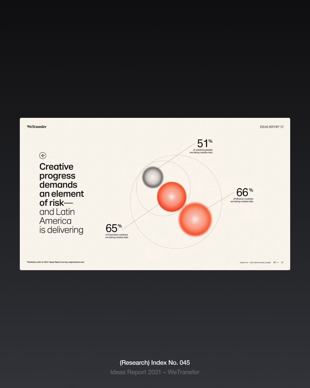
The image is a clean, minimalist infographic presenting data points related to creative progress and risk-taking. It uses soft gradients and circular elements to visually connect statistics, creating a modern and professional feel.
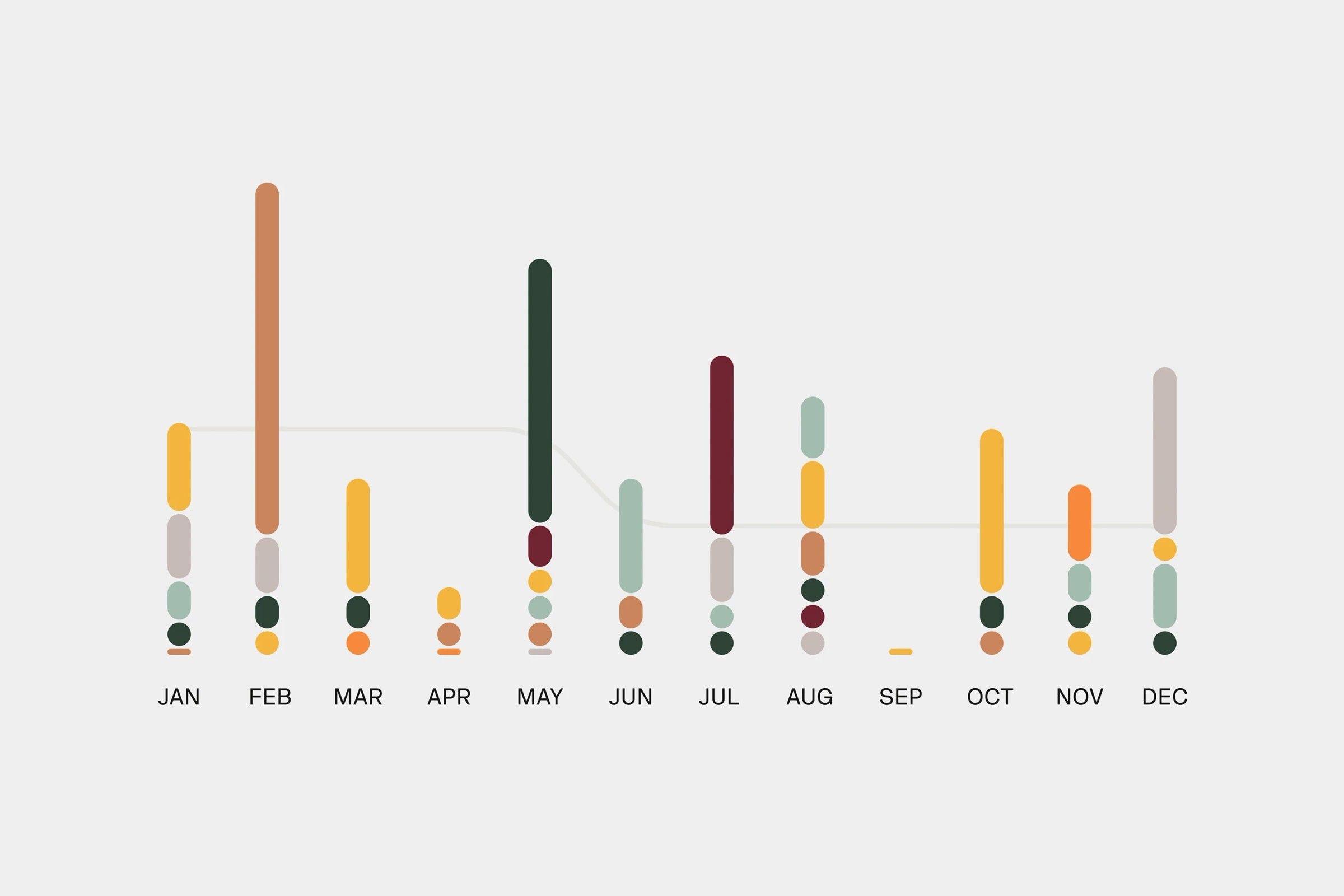
This is a minimalist, data-driven visualization using vertical bar charts to display monthly data points. The design relies heavily on color variation within a muted, neutral background to convey quantitative information clearly and cleanly.
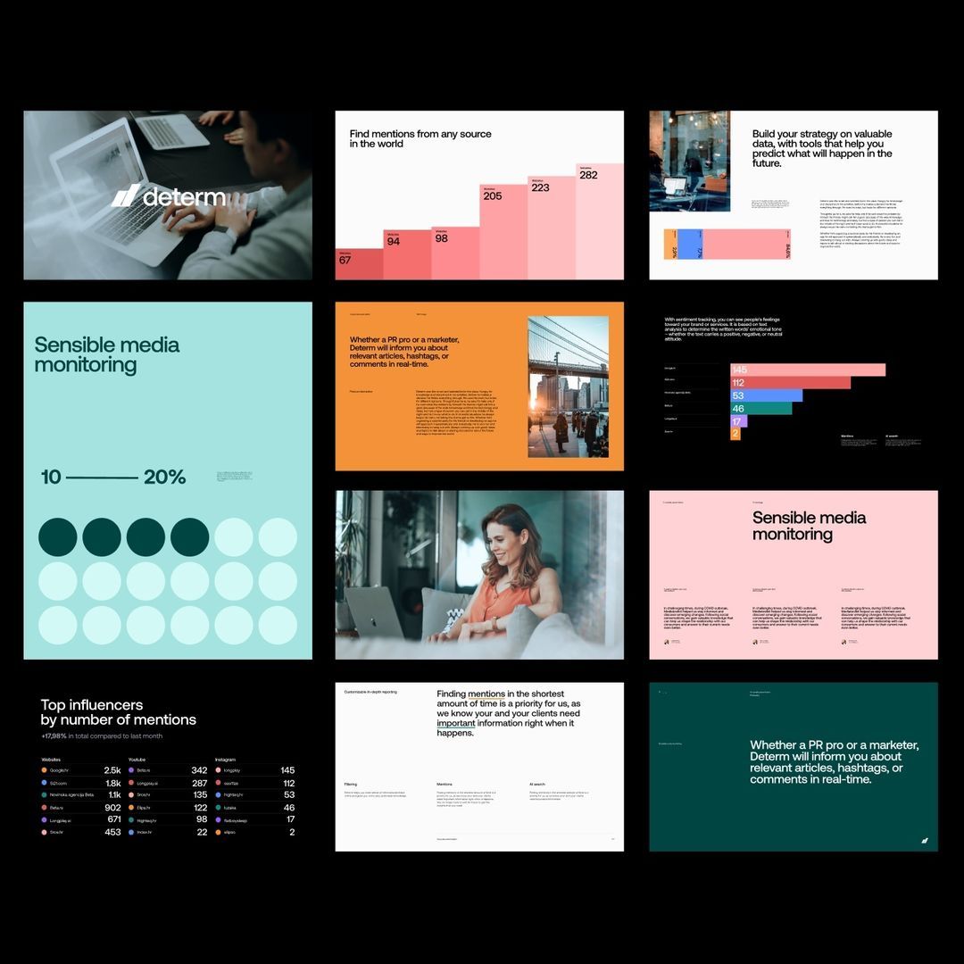
The image presents a collection of mockups or data visualizations, likely related to market research or media monitoring services. The design is clean, professional, and data-driven, utilizing a limited color palette to emphasize information hierarchy.
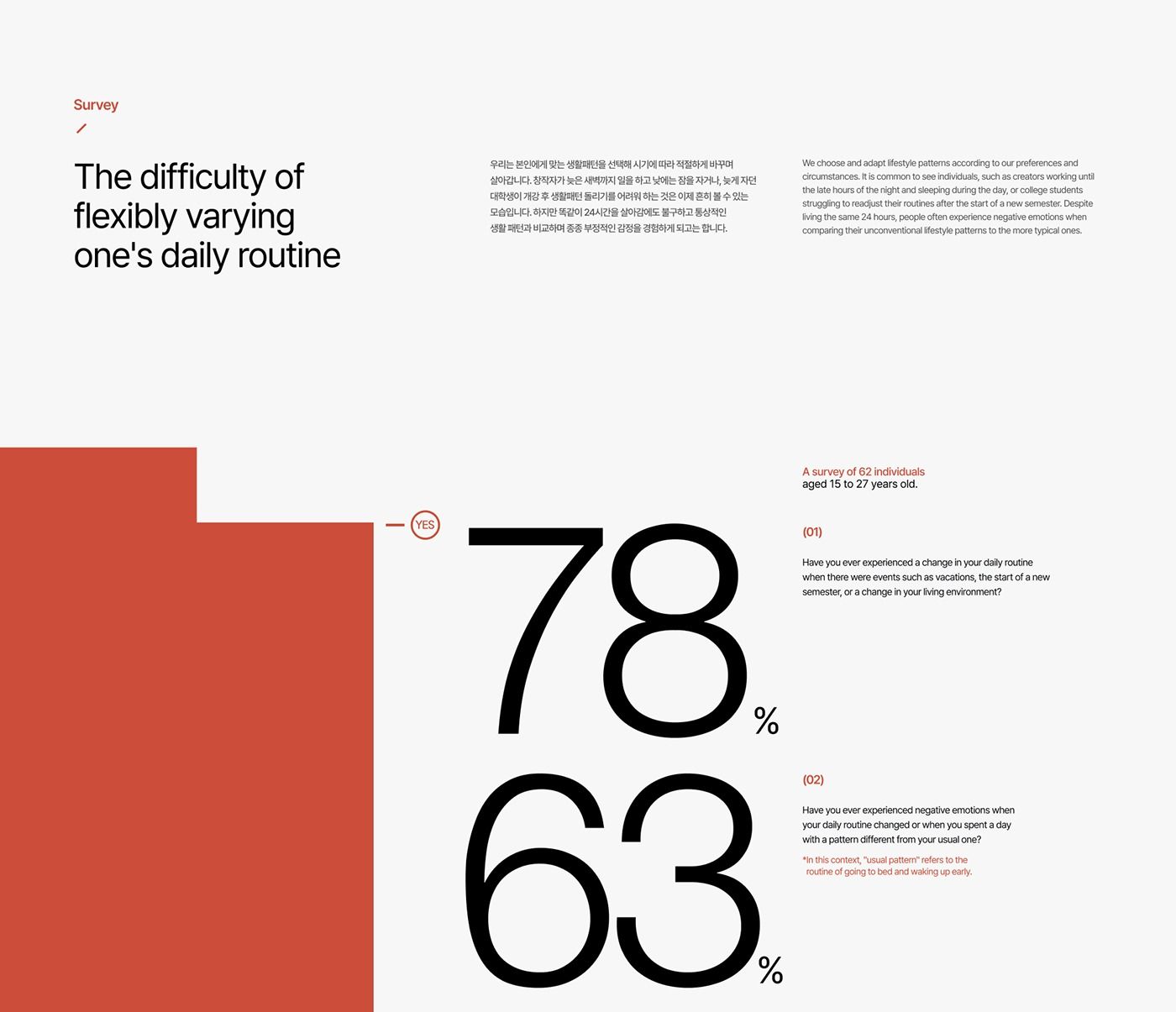
The design is minimalist and clean, utilizing a high-contrast black and white layout with a single accent color (red/terracotta) to present survey results. The visual language is direct and data-focused, prioritizing readability and stark presentation of quantitative information.
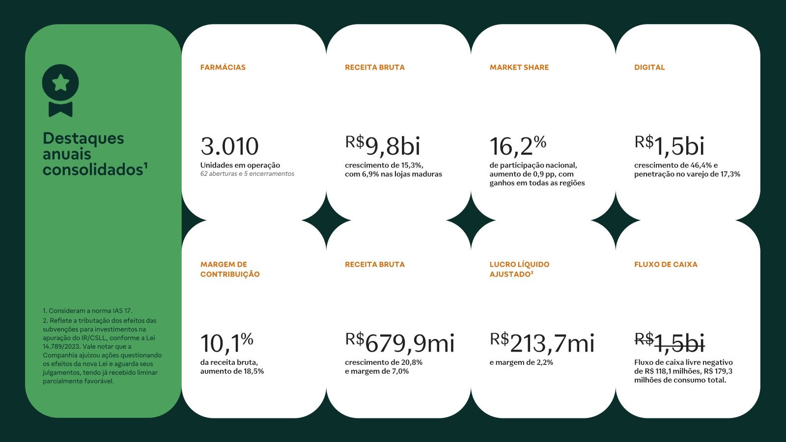
The design is clean, modern, and professional, utilizing a minimalist layout with ample white space to present key performance indicators clearly. The use of distinct blocks and strong typography creates a structured and data-driven visual experience.
The design is clean, minimalist, and professional, utilizing a muted color palette and clear data visualization to present key statistics. It employs ample white space to ensure readability and focuses the viewer's attention directly on the reported progress metrics.
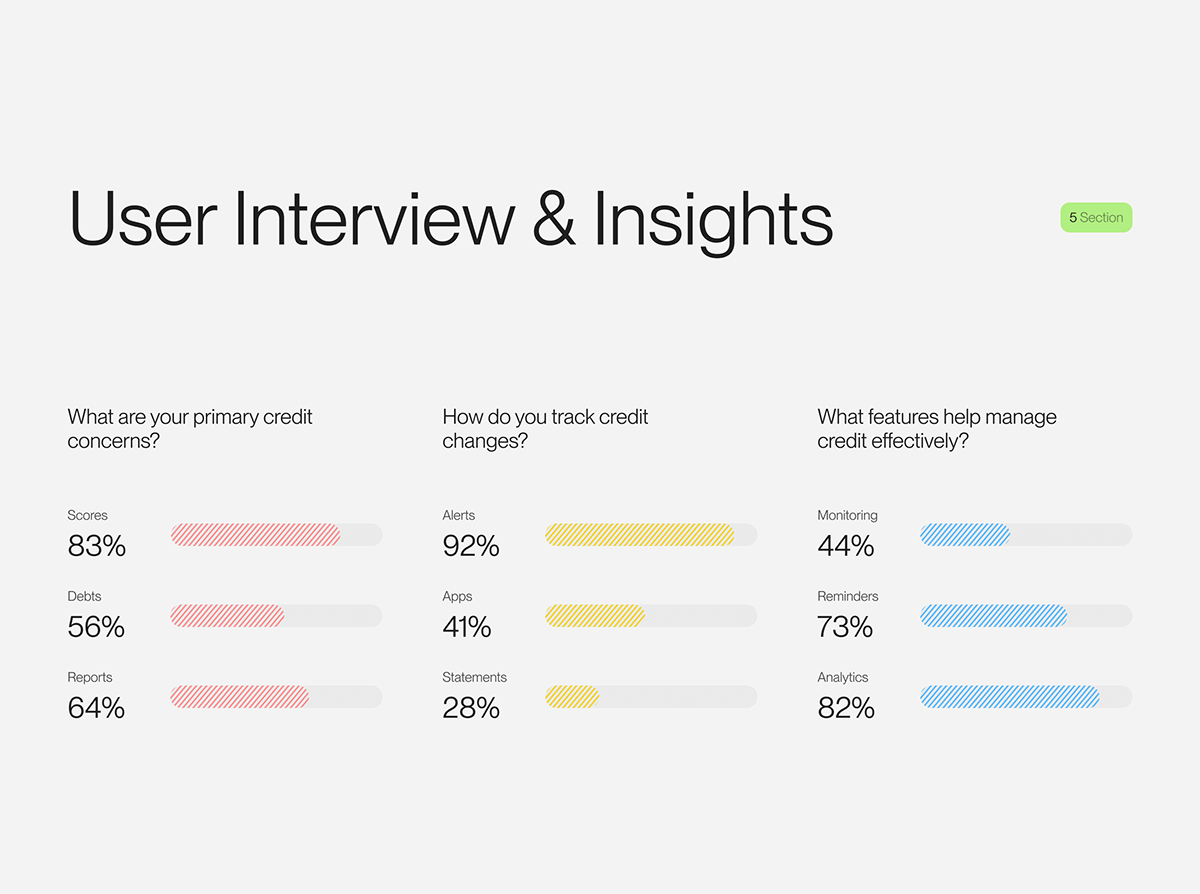
The image presents a clean, minimalist layout typical of a report or presentation slide, using simple horizontal bar charts to display survey results. The design is functional and data-focused, relying heavily on whitespace to separate the various metrics.
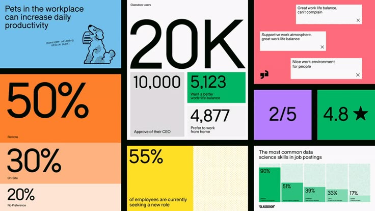
The image is a data visualization or infographic presenting various statistics in a segmented, block-based layout. It uses strong color blocking and large numbers to convey quantitative information quickly.