literary
5 designs
Showing 5 of 5 (5 total)
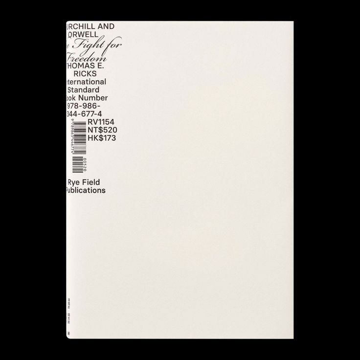
This design exemplifies clean, functional minimalism typical of academic or literary publishing. The visual language relies heavily on high contrast between black text and a white background to ensure maximum readability and professionalism. The overall feel is serious, organized, and highly objective.
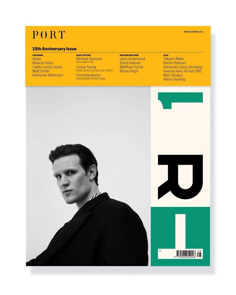
This cover employs a clean, minimalist editorial design using stark contrast between black photography and crisp white space. The visual language is sophisticated, relying on precise typography and a single accent color to create a structured yet artistic presentation.
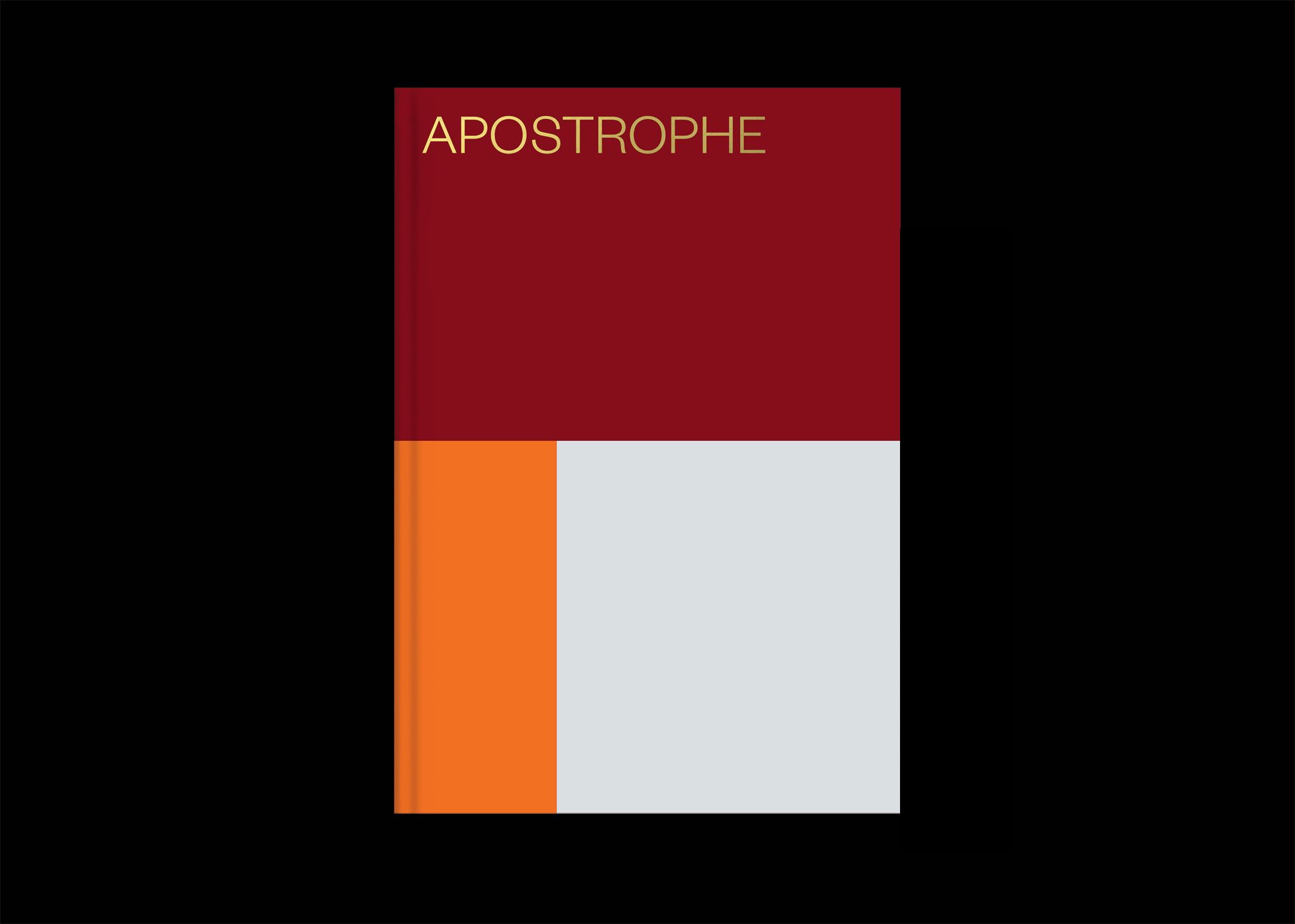
This design employs a striking, high-contrast color blocking technique against a stark black background to create a modern and academic feel. The vertical division of warm tones suggests duality or thematic separation, resulting in a strong, minimalist visual statement.
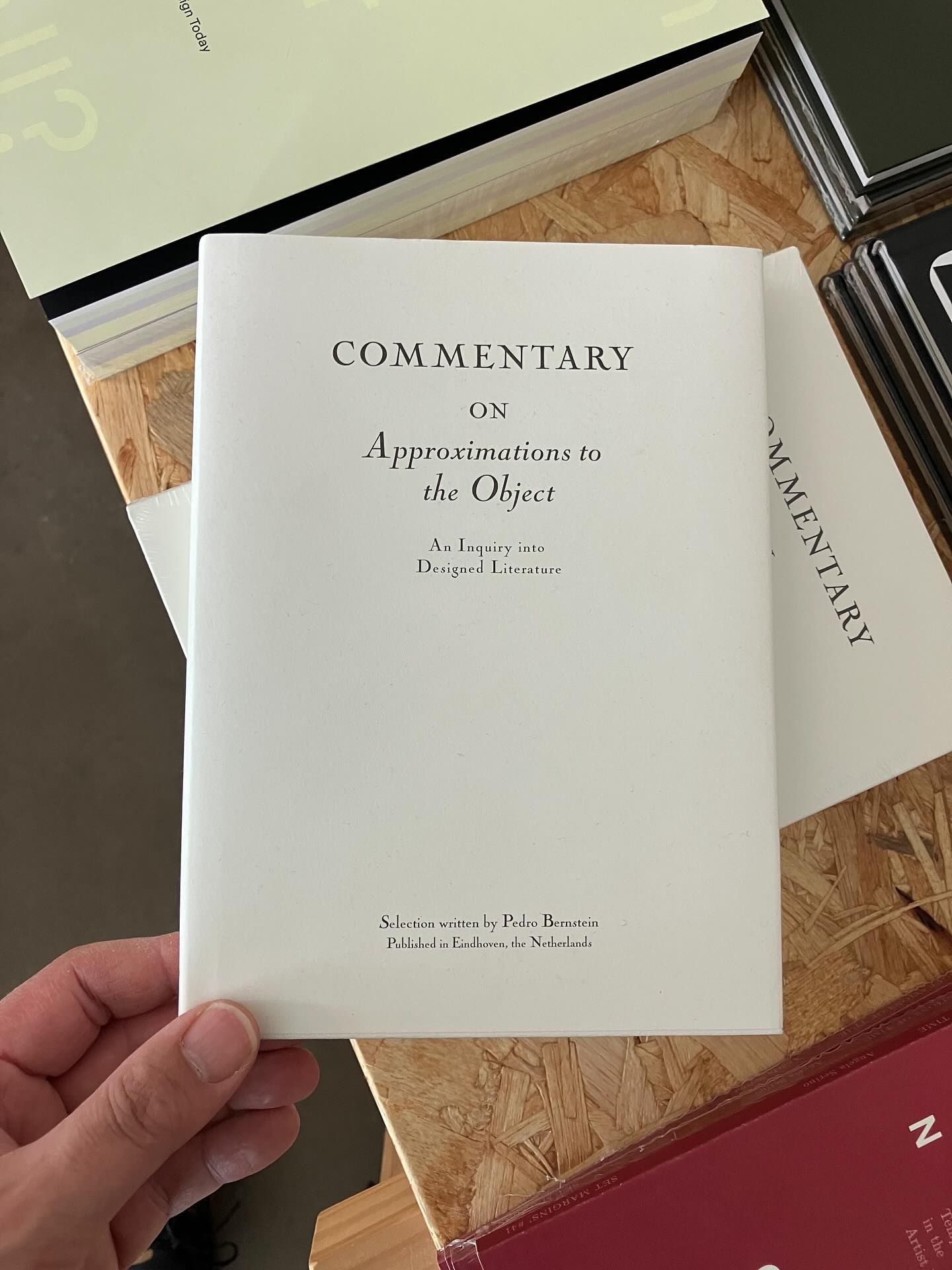
This is a highly restrained and elegant design characterized by generous use of negative space and classic typographic hierarchy. The visual language is clean, academic, and minimalist, emphasizing the content through simple, well-spaced text.
This is a clean, highly minimalist presentation of branding elements, focusing on clear typographic hierarchy and simple monochrome forms. The design uses generous negative space to convey a sense of established professionalism and literary heritage.