ict
3 designs
Showing 3 of 3 (3 total)
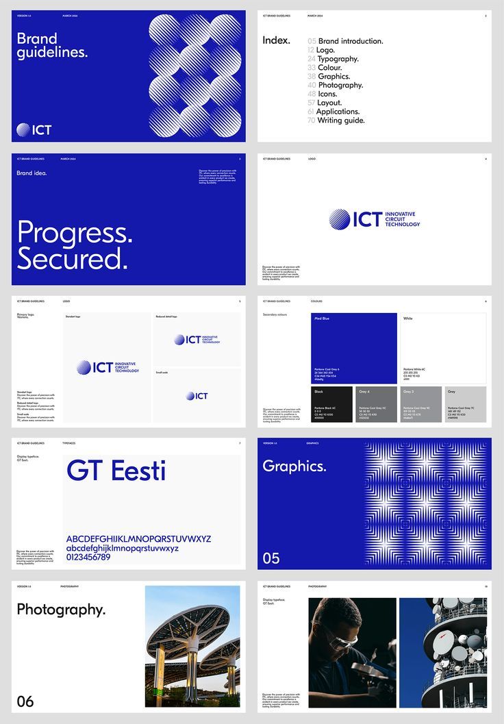
This presentation utilizes a clean, corporate visual language dominated by cool blues and stark white space to convey professionalism and innovation. The design relies heavily on geometric patterns and strong color blocking to organize information clearly across various topics.
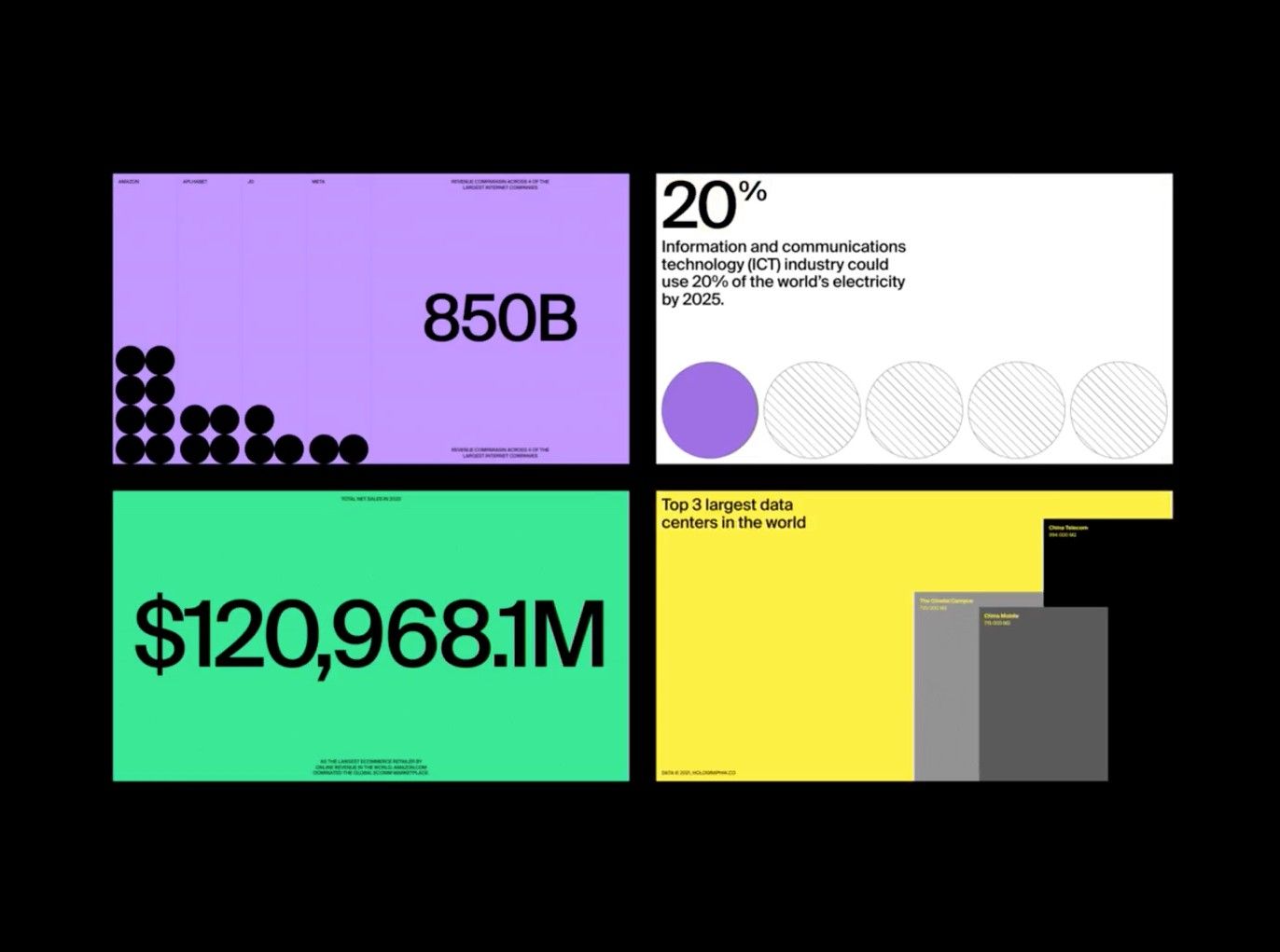
This is a clean, data-driven infographic design utilizing distinct color blocks to present statistics about technological consumption and infrastructure. The visual language is highly structured, relying on simple geometric shapes and contrasting colors to clearly separate key metrics.
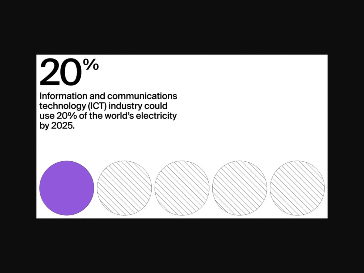
This is a clean, minimalist infographic designed for presenting statistical data. The design uses high contrast and simple geometric shapes to clearly communicate information, establishing a modern and professional tone.