geospatial
5 designs
Showing 5 of 5 (5 total)
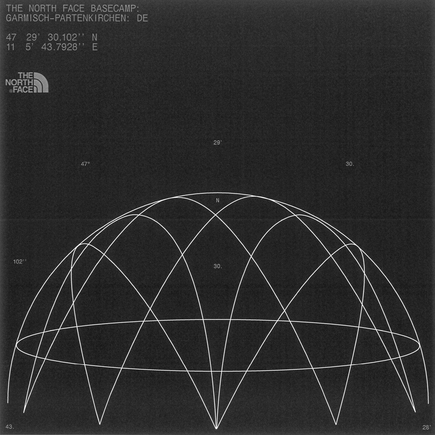
This image is a technical diagram, likely related to geographic or astronomical positioning, featuring a network of intersecting lines overlaid on a partial spherical projection. The visual language is stark, precise, and analytical, emphasizing geometric relationships over aesthetic embellishment.
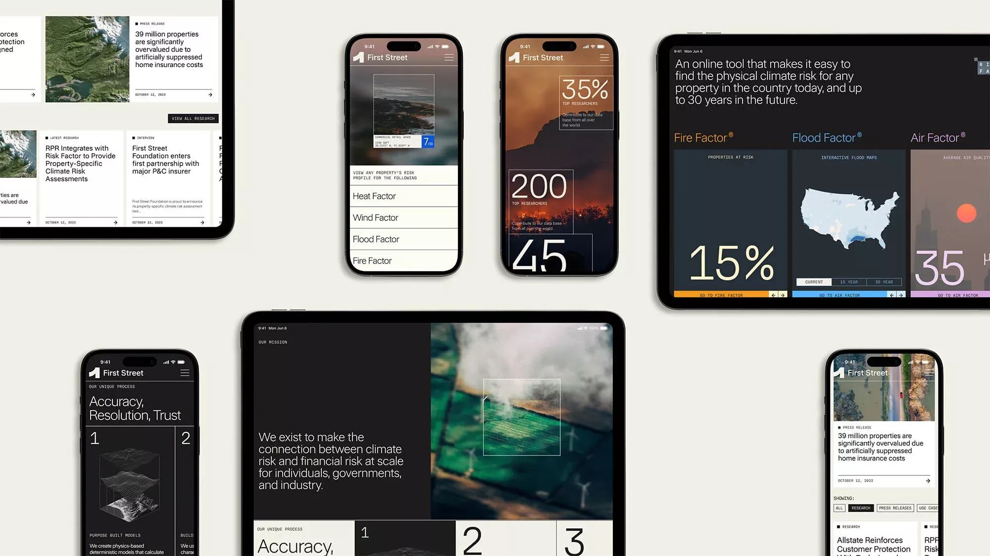
The design utilizes a clean, high-contrast aesthetic common in data visualization dashboards, focusing heavily on conveying complex risk metrics and quantitative results. The visual language is serious, professional, and trustworthy, relying on clear graphical elements to make technical information accessible.
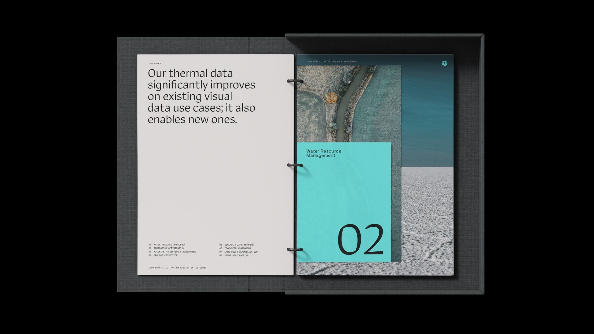
This presentation design employs a clean, minimalist aesthetic suitable for technical or corporate contexts, using strong typography and clear visual hierarchy to present complex data concepts. The split layout effectively balances explanatory text with impactful visual examples, creating a professional and trustworthy feel.
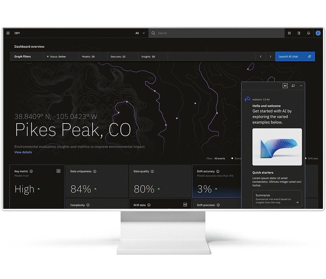
This dashboard features a clean, dark-mode interface optimized for displaying complex geospatial and environmental metrics. The design utilizes clear hierarchy, combining a topographical map with distinct metric cards to provide immediate analytical insights into the selected location. The visual language is professional, sparse, and highly focused on data readability.
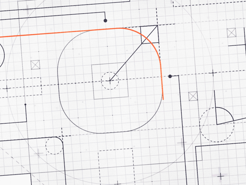
This image is a highly technical schematic featuring a precise grid layout used for mapping or planning. The visual language relies on fine lines and geometric shapes to define spatial relationships and boundaries with an emphasis on accuracy. The overall feel is analytical, structured, and purely informational.