food branding
5 designs
Showing 5 of 5 (5 total)
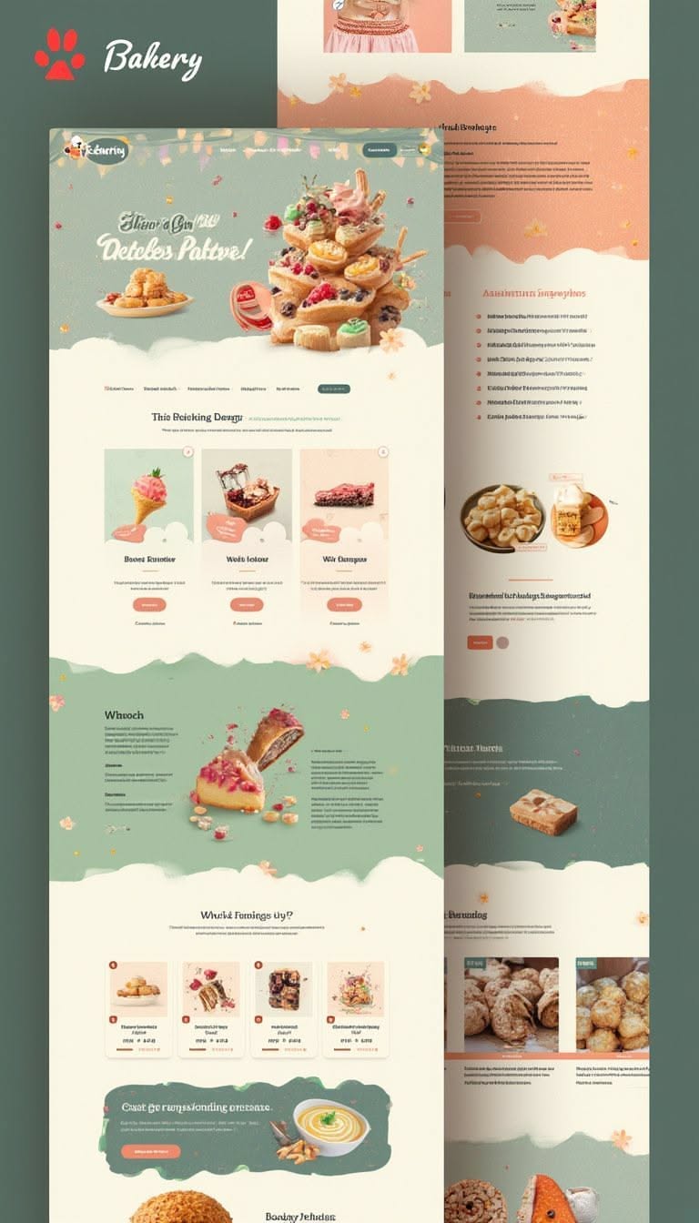
This is a clean, elegant, and appetizing food-focused design, likely for a bakery or gourmet food brand. It uses soft pastel tones and ample white space to create a light, airy, and sophisticated feel.
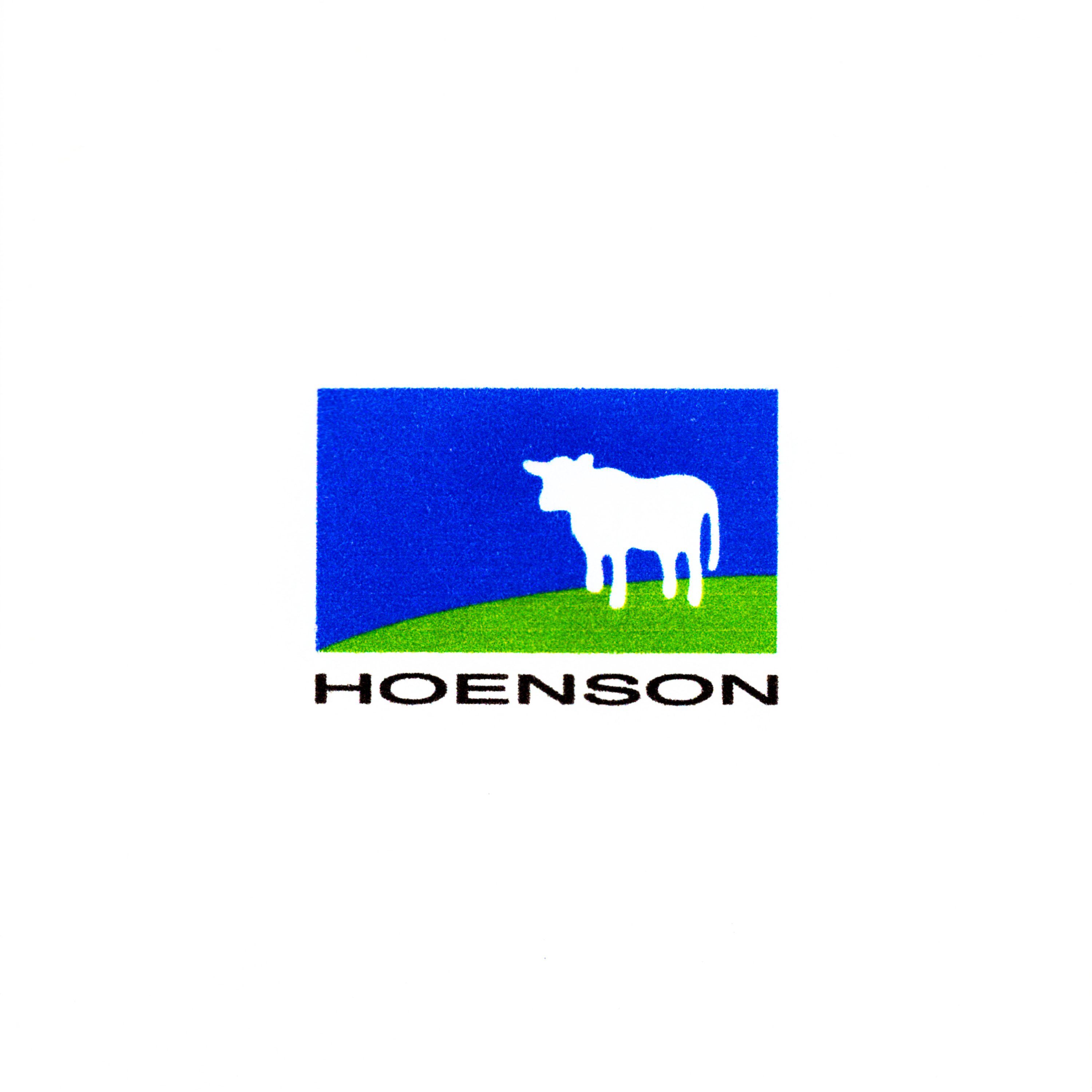
This logo utilizes a clean, flat design approach to create an iconic brand mark centered around nature and agriculture. The composition uses a simple color block split between blue and green to create depth, paired with a stark white silhouette. The overall visual language is minimalist and strongly associates the brand with natural elements.
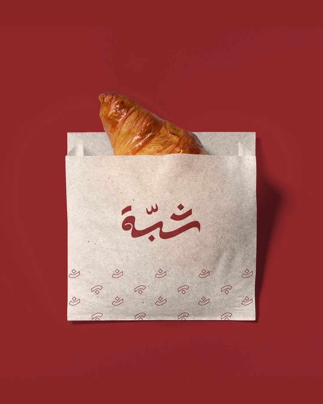
This is a warm and rustic product photograph featuring a golden croissant packaged in natural brown paper. The composition relies on simple staging, deep color contrast, and elegant Arabic typography to convey artisanal quality.
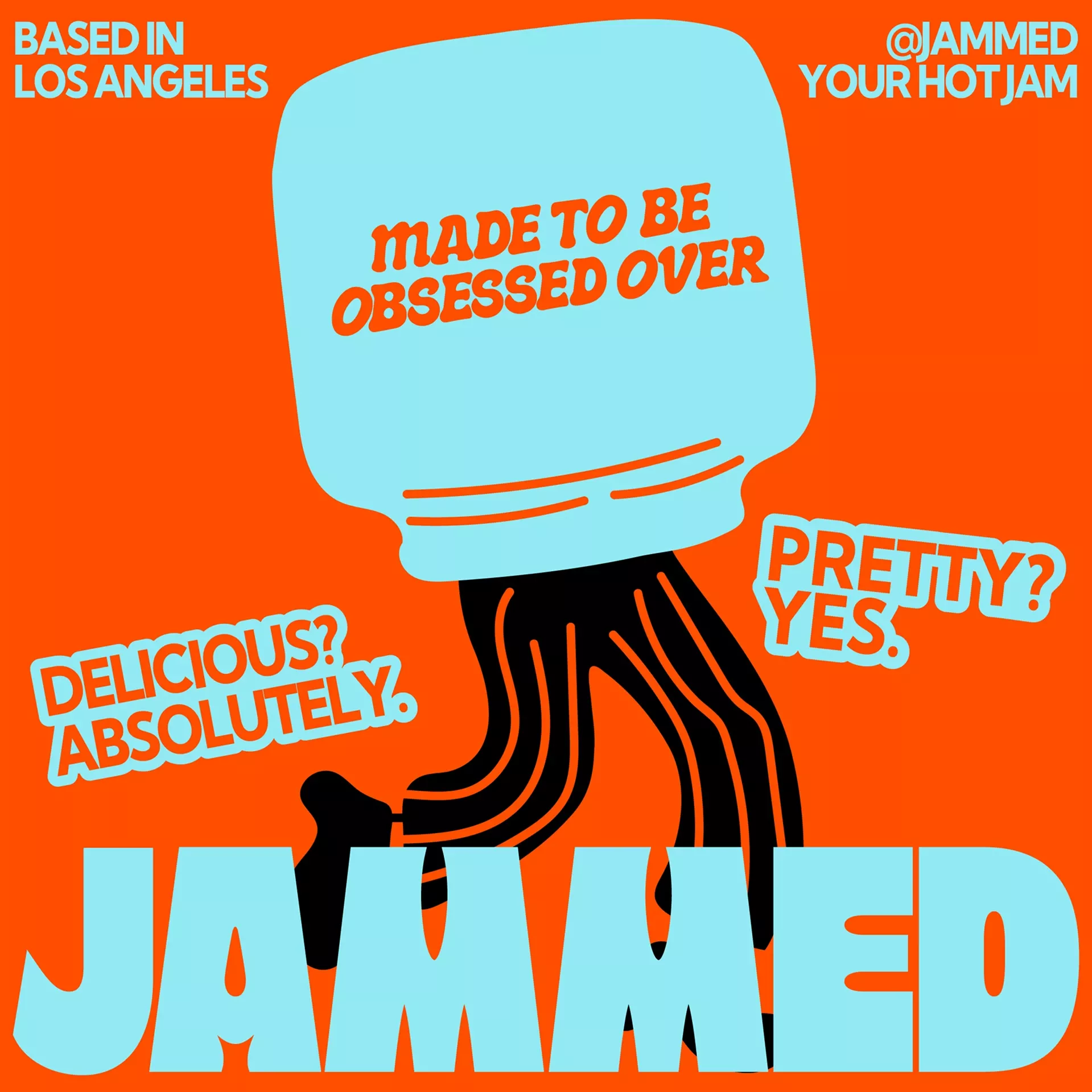
This is a vibrant and high-contrast graphic design utilizing simplified shapes and bold typography to create an engaging and playful brand identity. The visual language is assertive, using a central figure motif combined with direct text to convey confidence and appeal. The overall feel is energetic, appetizing, and overtly promotional.
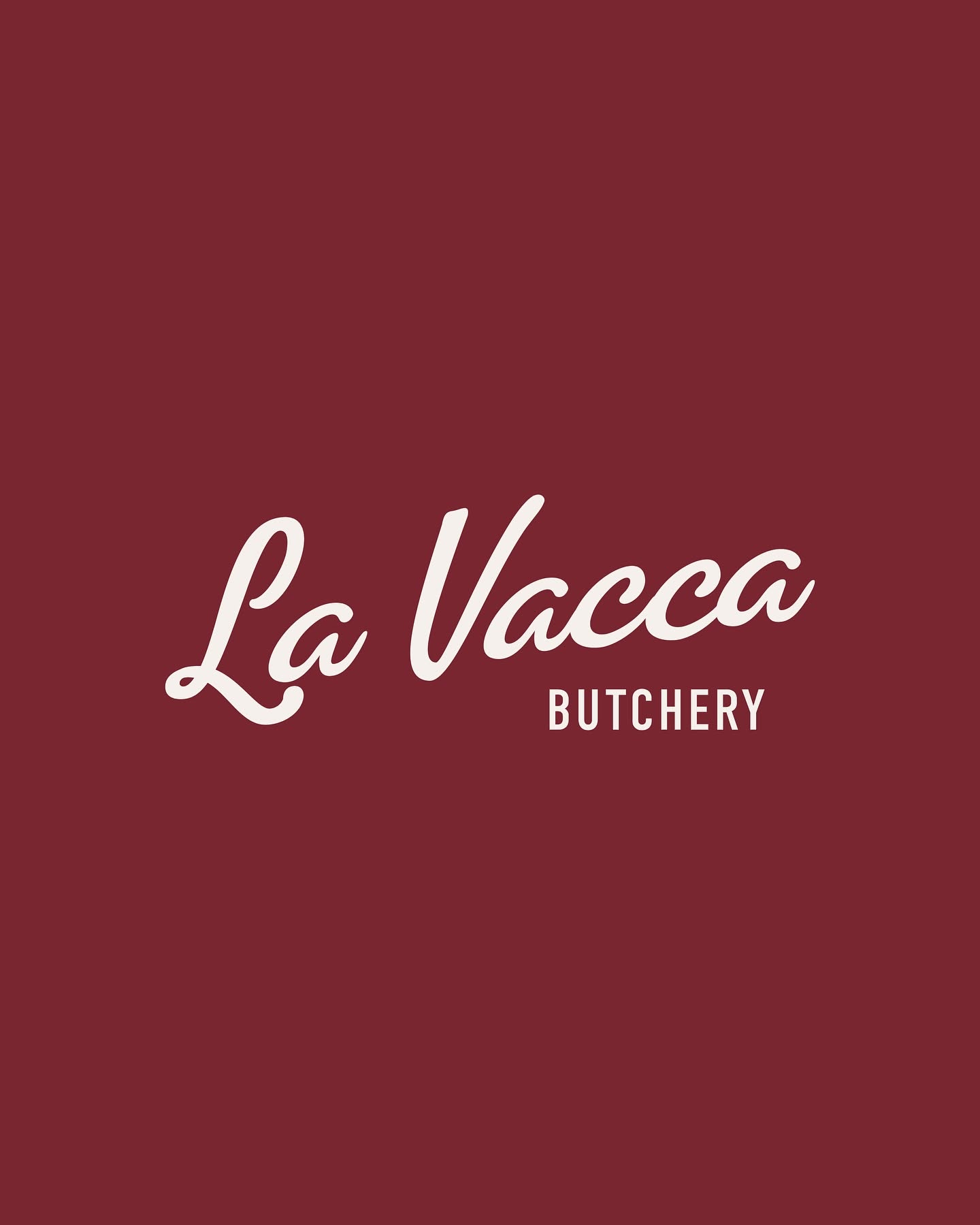
This design utilizes a bold, monochromatic palette of deep maroon and cream to convey a sense of tradition and quality. The flowing script typeface for the main name contrasts effectively with the clean, capitalized secondary text, establishing an elegant yet rustic and artisanal brand identity.