fitness apps
5 designs
Showing 5 of 5 (5 total)
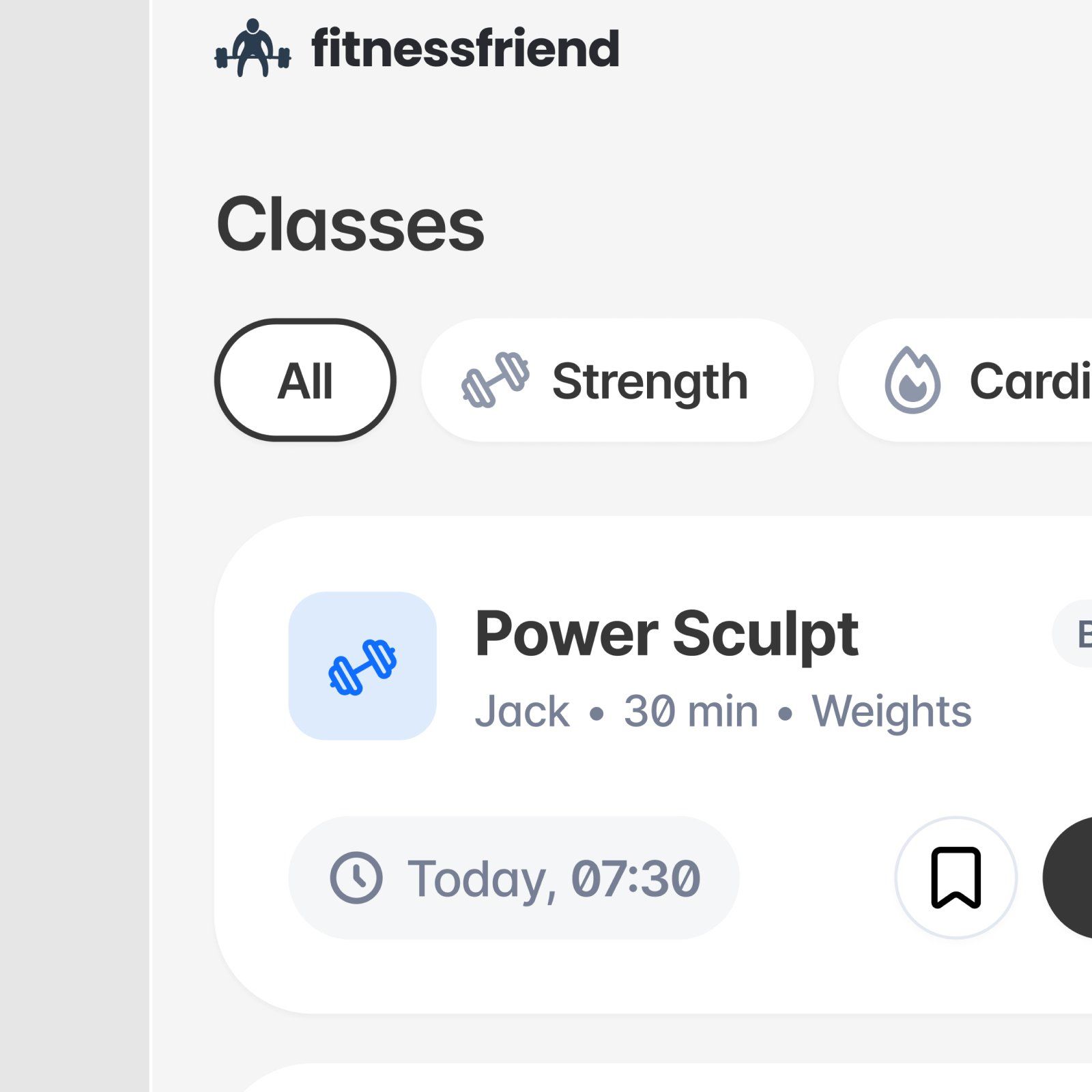
This is a clean, functional user interface design characterized by ample whitespace and clear information hierarchy. The visual language is modern and relies on simple iconography and subtle grays to present fitness class details in an organized manner.
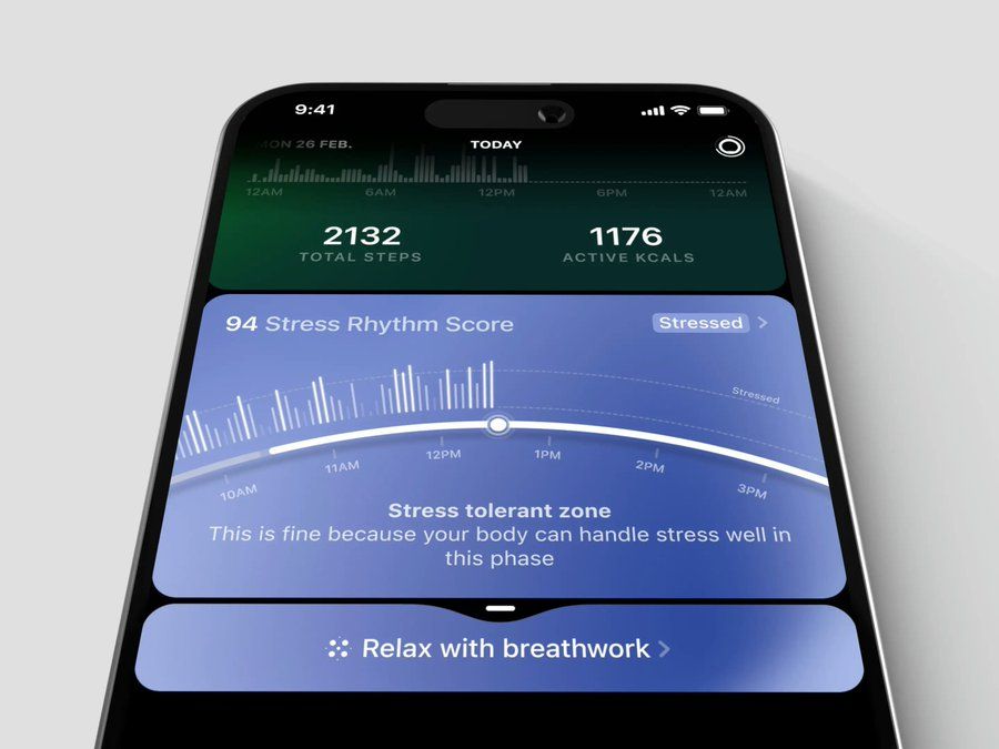
This interface showcases a clean, dark-mode design focused on presenting complex physiological data in an easily digestible format. The visual language is modern and clinical, utilizing subtle gradients and contrasting accent colors to draw attention to key metrics and actionable advice. The overall feel is supportive yet analytical, creating a trustworthy environment for health tracking.
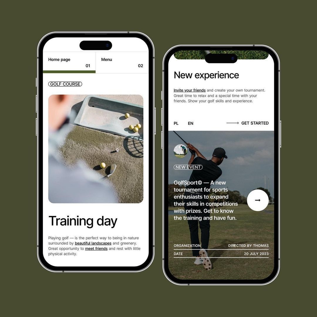
This design uses a clean, modern aesthetic blending high-quality, earthy photography with clear, functional user interface elements. The visual language is sophisticated and grounded, successfully conveying a sense of natural elegance while maintaining intuitive navigation.
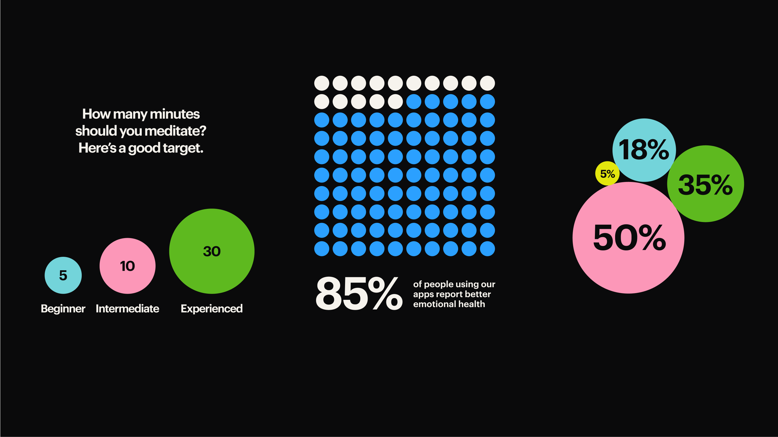
This is a clean, data-heavy infographic utilizing high contrast between dark and bright colors to present clear metrics. The design employs a combination of circular graphics, dot patterns, and segmented charts to effectively visualize quantitative data. The visual language is professional and focused entirely on statistical communication.
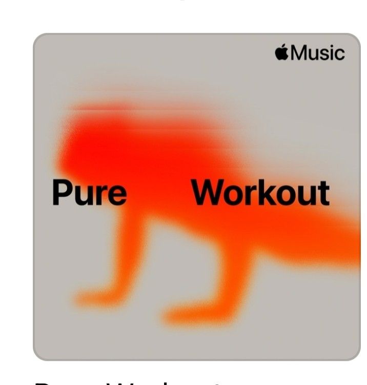
This design utilizes a high-contrast palette featuring vibrant orange and warm gray tones to create an energetic visual. The graphic element, a stylized animal silhouette, is cleanly overlaid with strong, legible typography to convey a clear fitness theme. The overall feel is bold and focused, effectively blending nature imagery with functional application text.