data analytics
97 designs
Showing 24 of 97 (97 total)
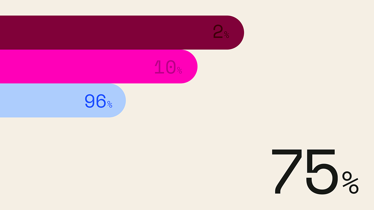
This is a clean, minimalist data visualization utilizing horizontal bars of varying saturation and length to represent percentages. The design relies on strong color contrast against a neutral background to clearly communicate quantitative information.
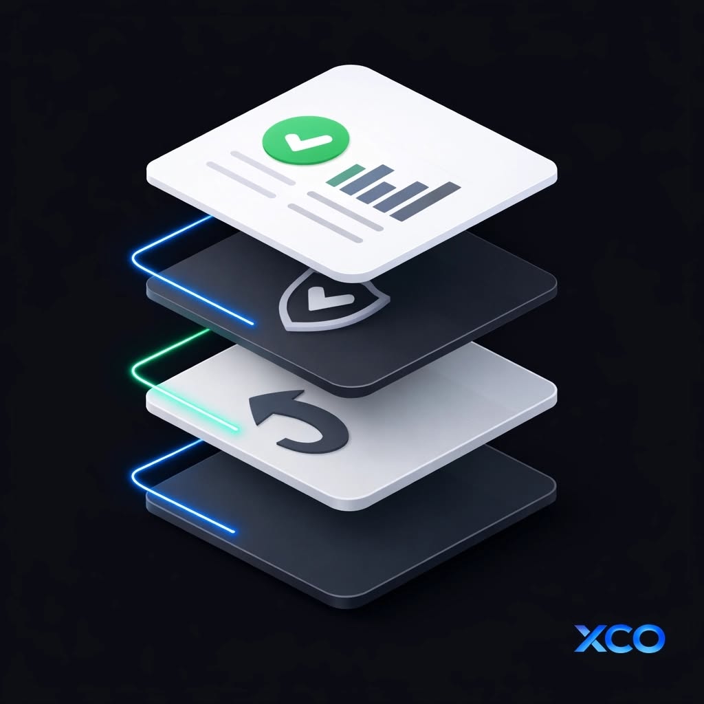
This design utilizes a clean, modern aesthetic with strong contrast between bright white elements and deep dark grays, accented by vibrant neon blue lines. The composition effectively uses layering to present distinct concepts—success, security, and renewal—in a sophisticated digital interface style.
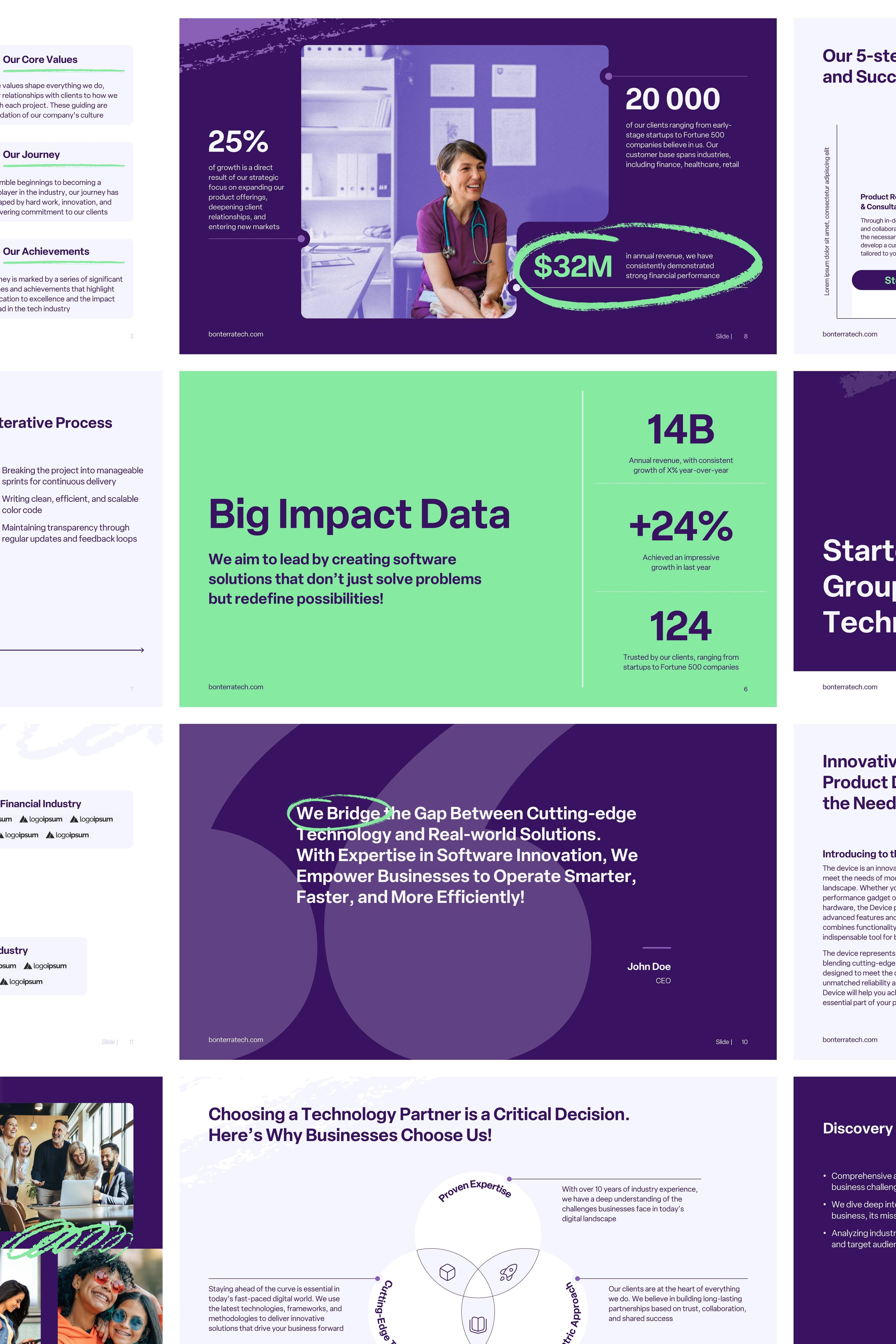
The design employs a clean, modern corporate aesthetic characterized by strong visual hierarchy and ample white space. It effectively uses large numbers and clear sectioning to present complex data in an easily digestible, professional manner. The visual language is highly structured and emphasizes credibility through precise information delivery.
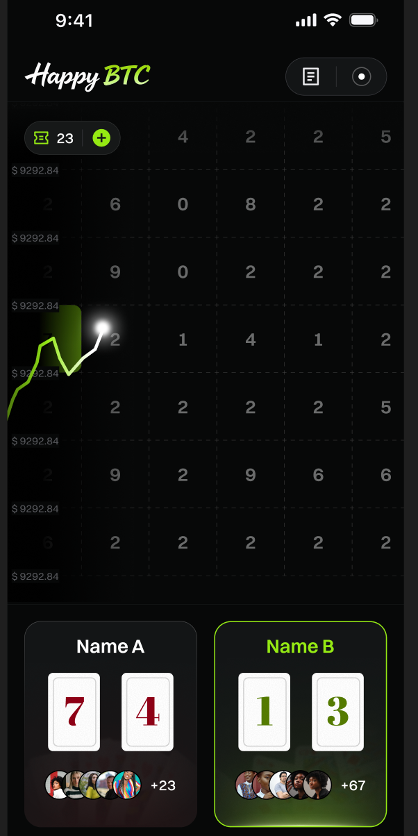
This interface features a dark mode design optimized for data visualization, presenting financial or cryptocurrency metrics in a structured grid format. The visual language is clean and functional, relying heavily on high contrast between dark backgrounds and bright accent colors to highlight key data points.
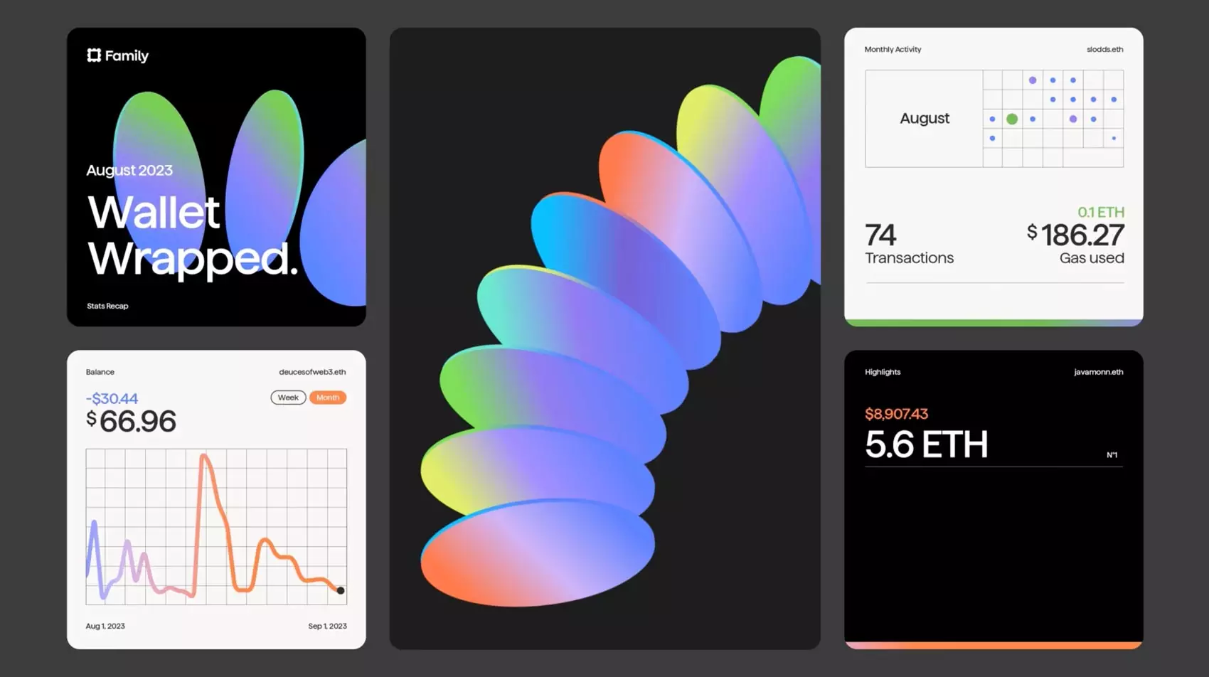
This collection of screens showcases a modern, data-intensive user interface characterized by clean lines and sophisticated gradient usage. The design effectively blends abstract visual elements with clear data presentation, creating a professional and trustworthy aesthetic suitable for financial technology.

This graphic utilizes a deep, saturated blue palette to convey a high-tech and professional atmosphere. It effectively combines clear textual information with abstract, metallic 3D rendering to symbolize innovation and data processing.
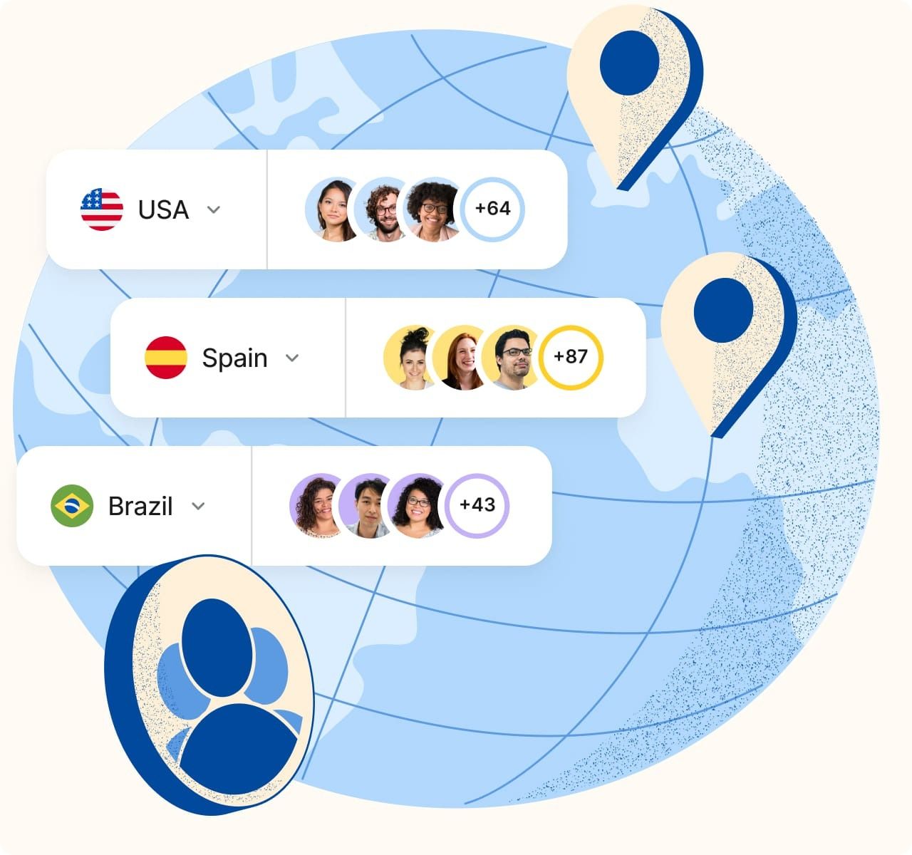
This design utilizes a clean, modern flat design aesthetic to visualize international data and location services. The visual language relies on soft blues and white space to create a sense of global connectivity and organized information. The composition effectively uses layered elements, including map graphics and distinct data cards, to guide the user's eye.
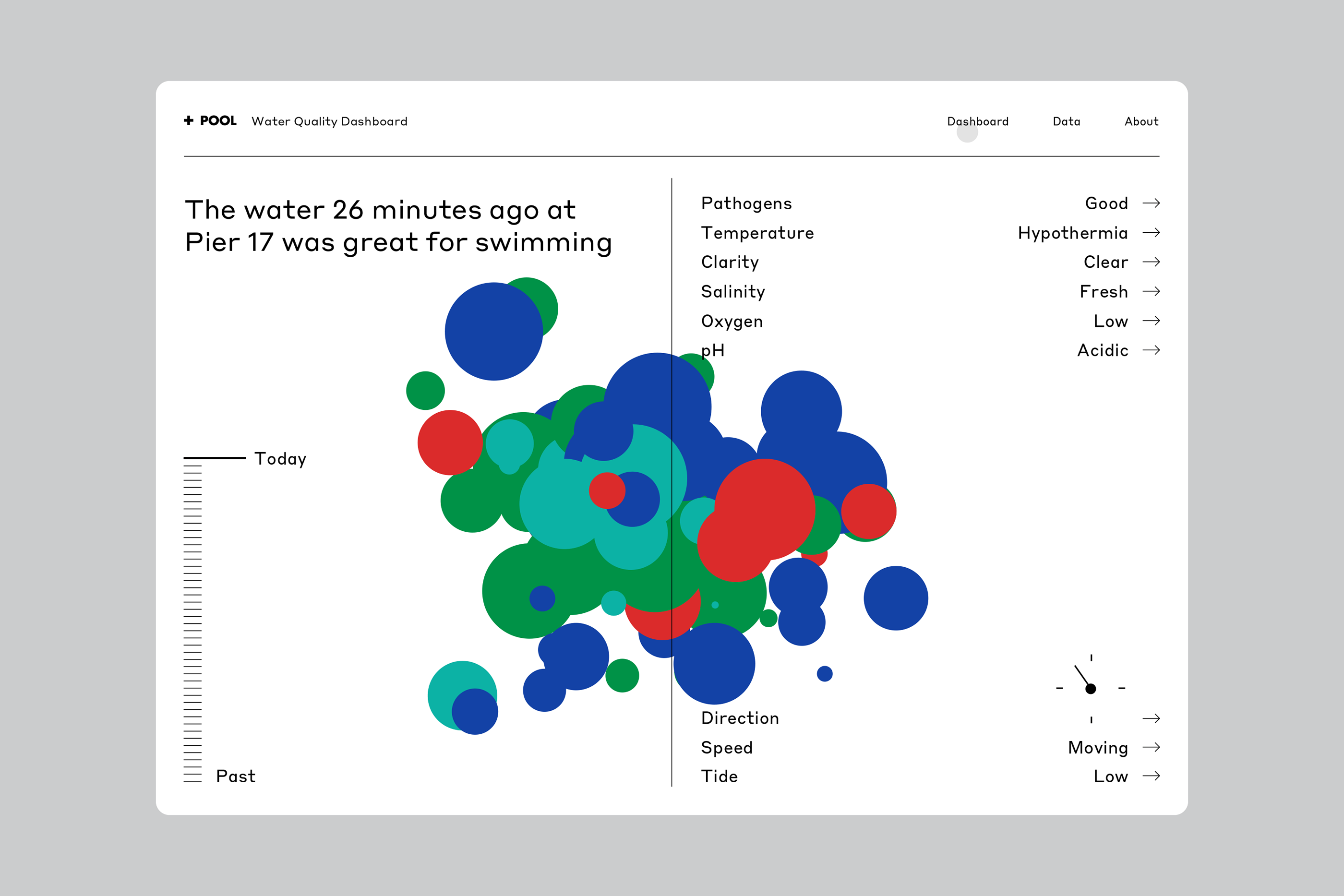
This is a data visualization dashboard presenting water quality metrics using a scatter plot or bubble chart format. The design is clean, functional, and uses color coding effectively to represent different parameters for a specific event (water quality).

The image features a split design, contrasting dark text on the left with a professional portrait and interface mockup on the right. The overall feel is modern, corporate, and focused on data-driven customer experience solutions.
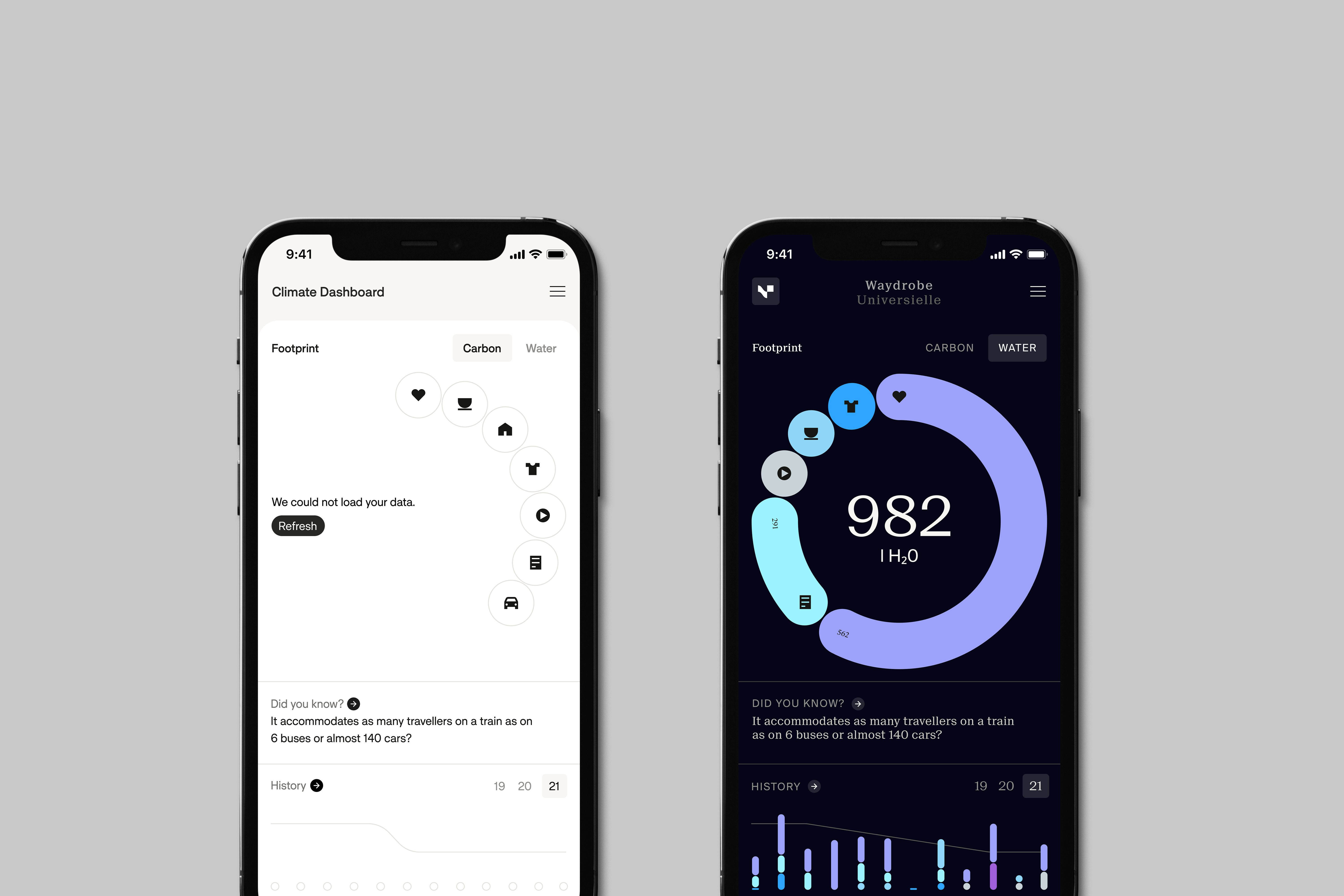
The interface presents a clean, modern mobile application design with a dark mode aesthetic, utilizing vibrant circular graphics to display data. The layout is organized and information-dense yet visually appealing through the use of negative space and color gradients.
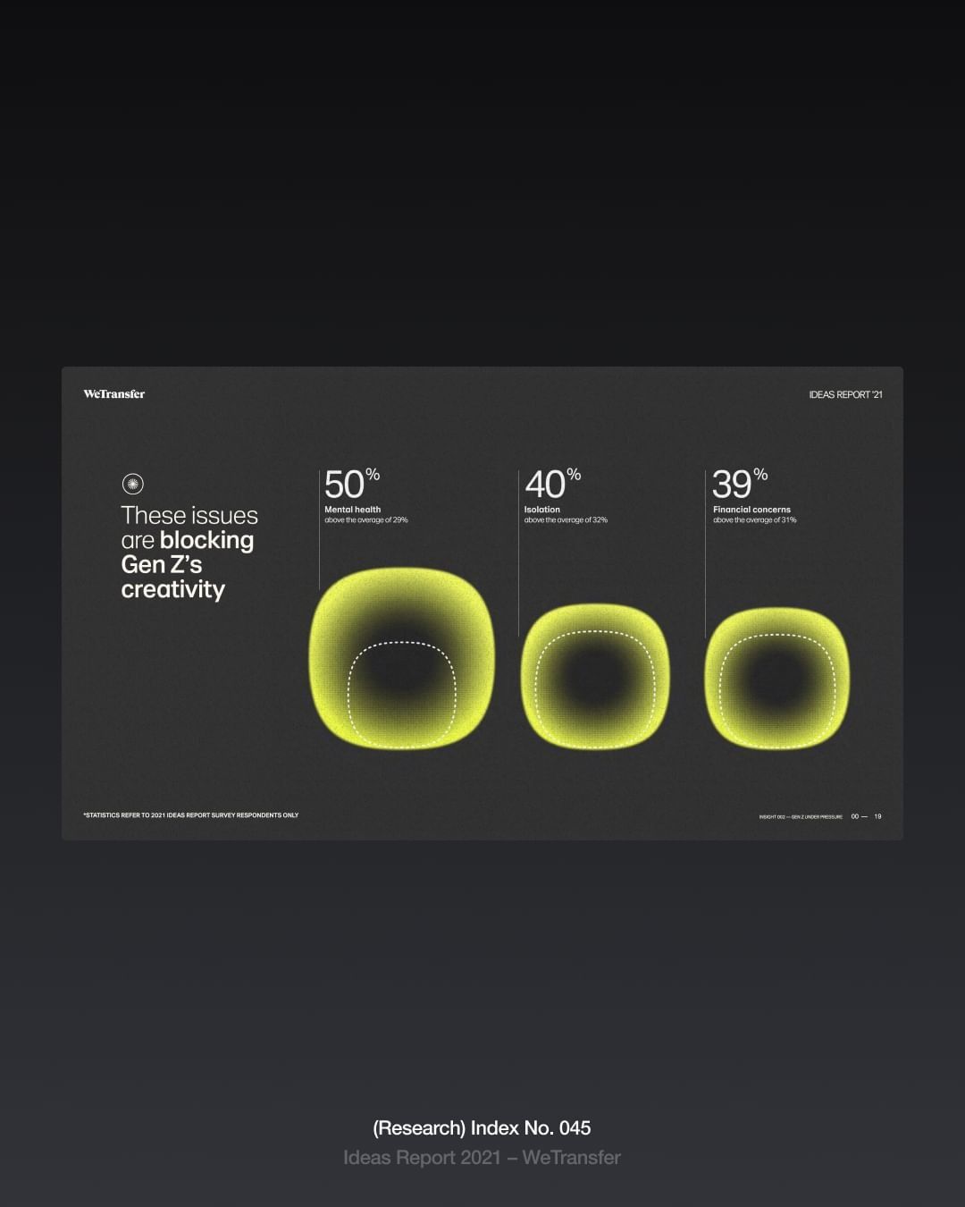
The design is minimalist and modern, utilizing a dark background to highlight glowing, circular elements representing data points. The visual language is clean and focused, employing subtle gradients to create a sense of depth and focus on the percentage metrics.
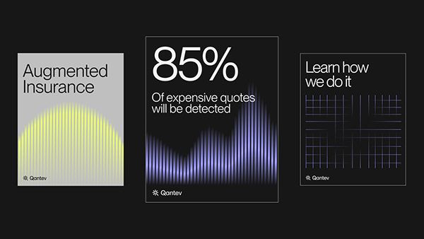
The design uses a dark, high-contrast aesthetic with subtle gradients and line patterns to convey data and security. The visual language is clean, modern, and technical, relying on light lines against a deep background to draw attention to the key statistic.
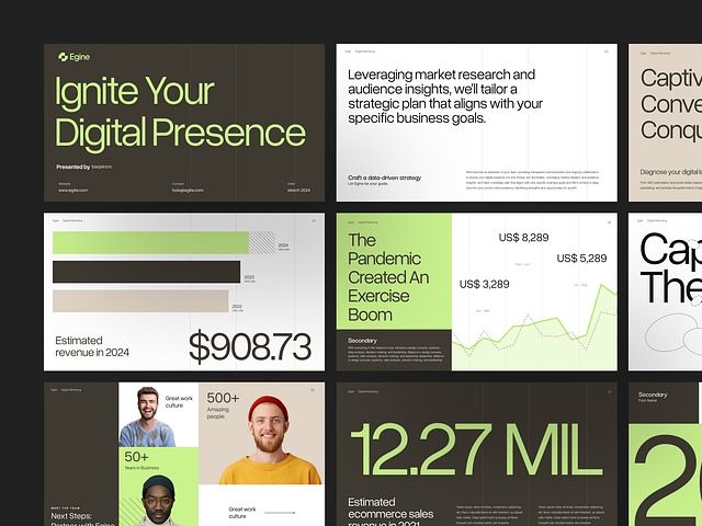
A modern, multi-panel digital marketing presentation showcasing data-driven insights and business metrics through a cohesive design system. The layout combines bold typography, strategic use of lime green accents, and clean information hierarchy across various content cards. The visual language emphasizes contemporary digital marketing practices with a professional yet approachable aesthetic.
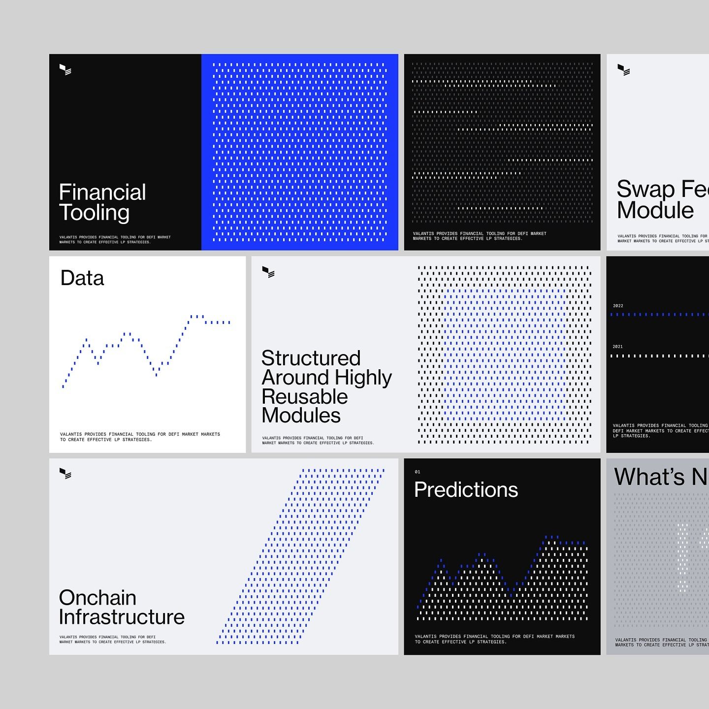
A sophisticated modular design system featuring a grid-based layout with alternating black, white, and electric blue panels. The composition demonstrates contemporary data visualization aesthetics with geometric patterns, minimal typography, and a strong emphasis on structured information hierarchy. The overall feel is professional, tech-forward, and corporate.
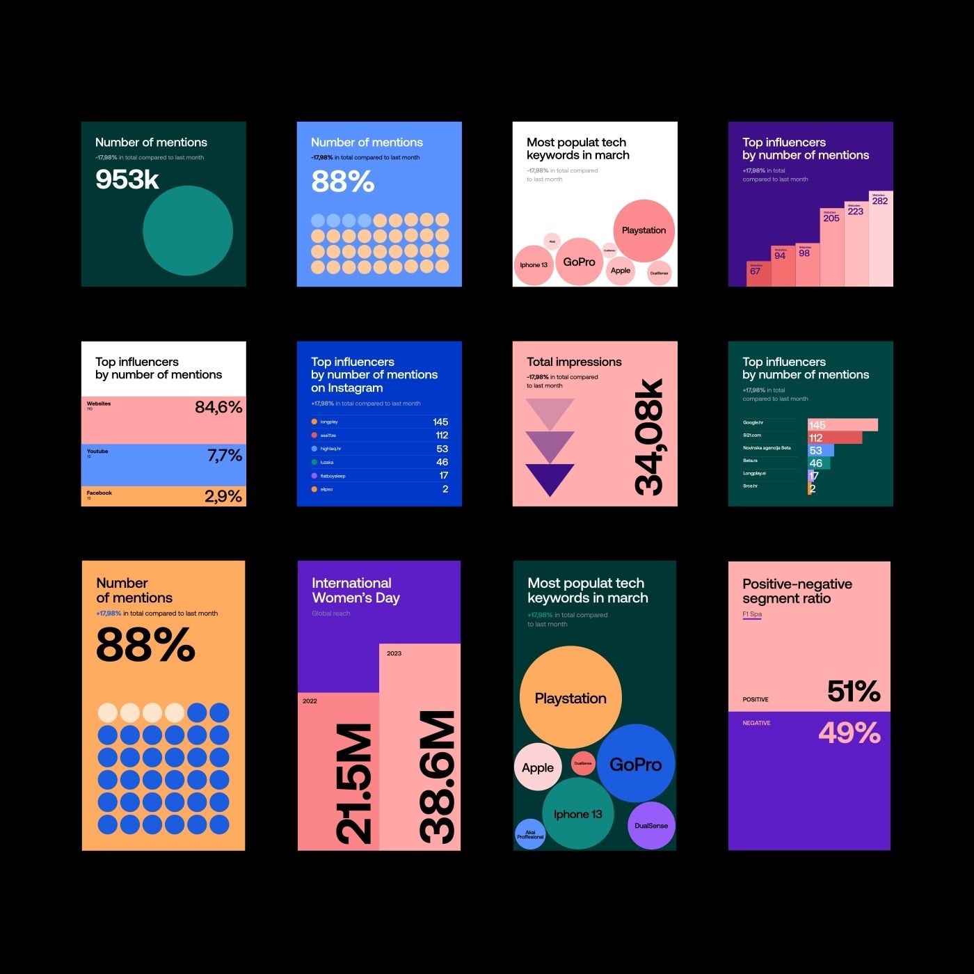
A vibrant collection of data visualization dashboards and infographic cards featuring bold, contrasting color blocks and geometric shapes. The design employs a modern, playful aesthetic with large typography, circular elements, and stacked bar charts to communicate statistical information. The overall visual language is contemporary and tech-forward, emphasizing clarity and visual impact through color-coding and minimalist composition.
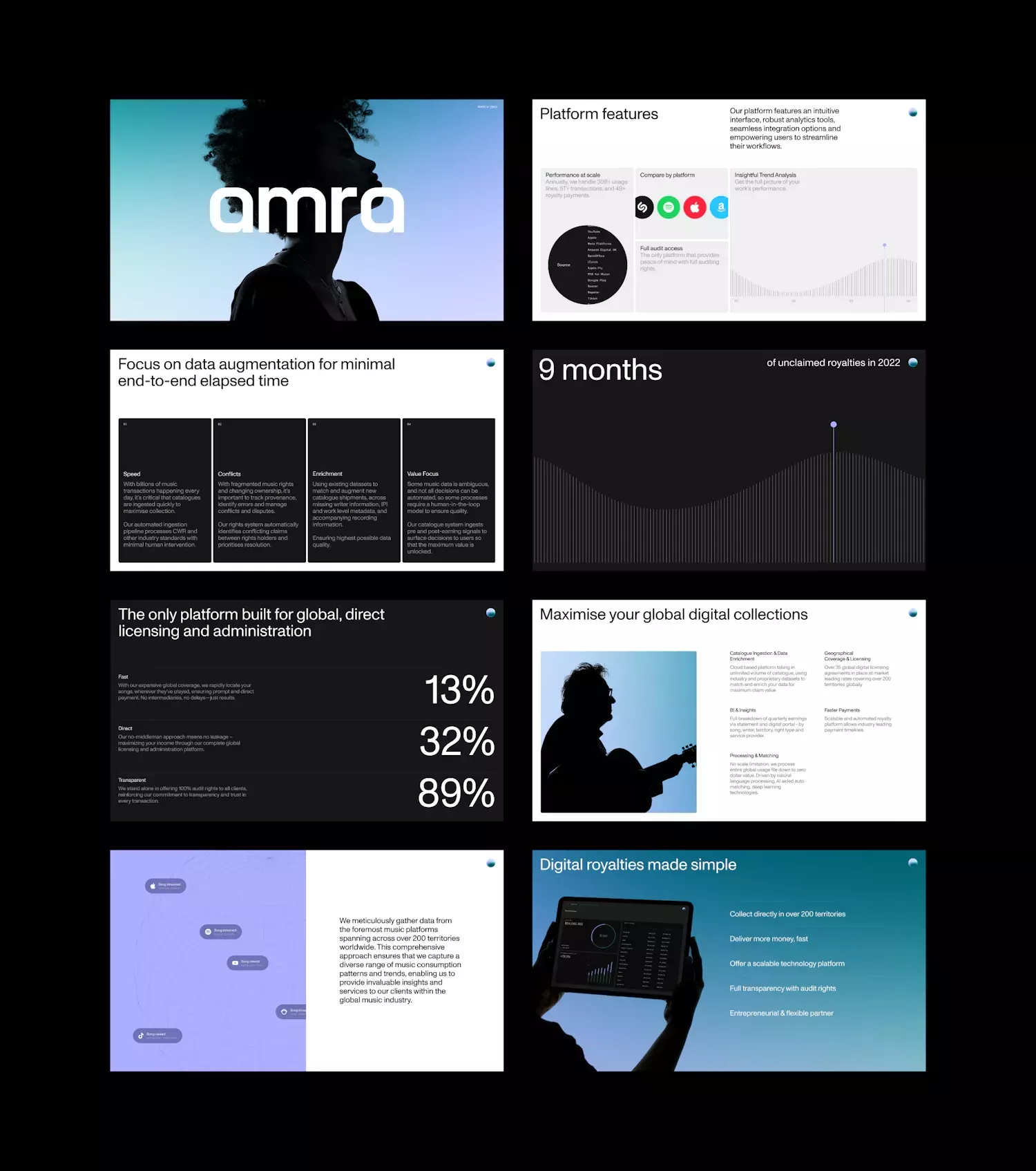
A modern digital product presentation showcasing multiple interface screens and data visualizations with a contemporary, tech-forward aesthetic. The design employs a sophisticated mix of dark and light backgrounds, bold typography, and minimalist layouts that emphasize clarity and functionality. The overall feel is professional, innovative, and user-centric with strong emphasis on data storytelling and visual hierarchy.
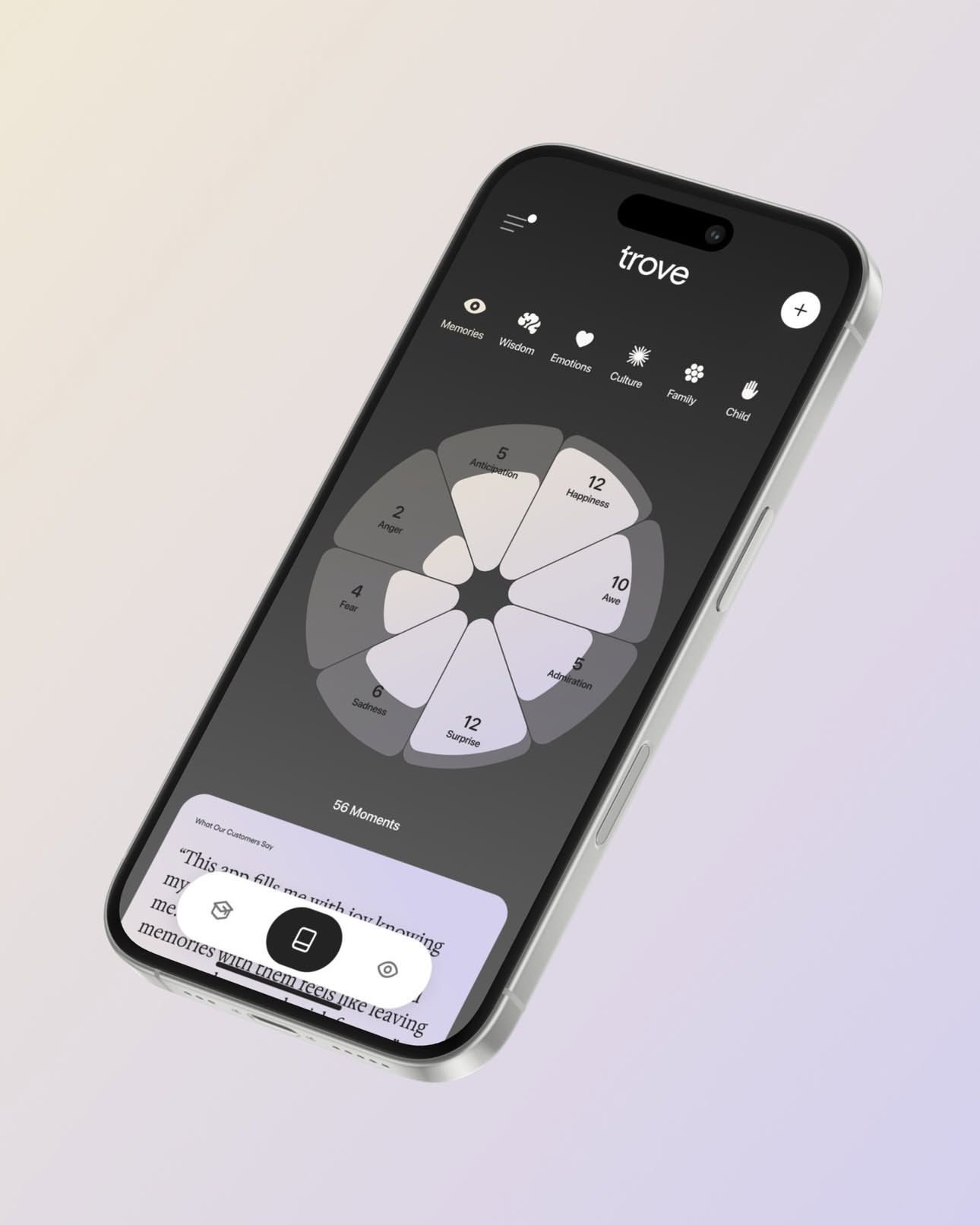
A modern mobile app interface for a music or audio application called 'trove', featuring a minimalist design with a circular pie-chart visualization at its center. The design employs a sophisticated dark theme with clean typography and intuitive icon-based navigation, creating a premium and contemporary digital experience.
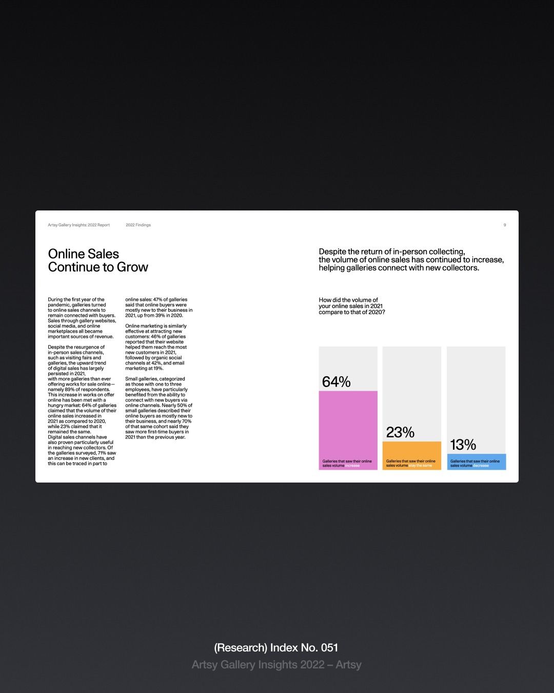
A clean, minimalist infographic presenting online sales data with a professional editorial layout. The design combines dense body text on the left with colorful data visualization on the right, using a stark white background against dark surroundings to create visual hierarchy and focus.
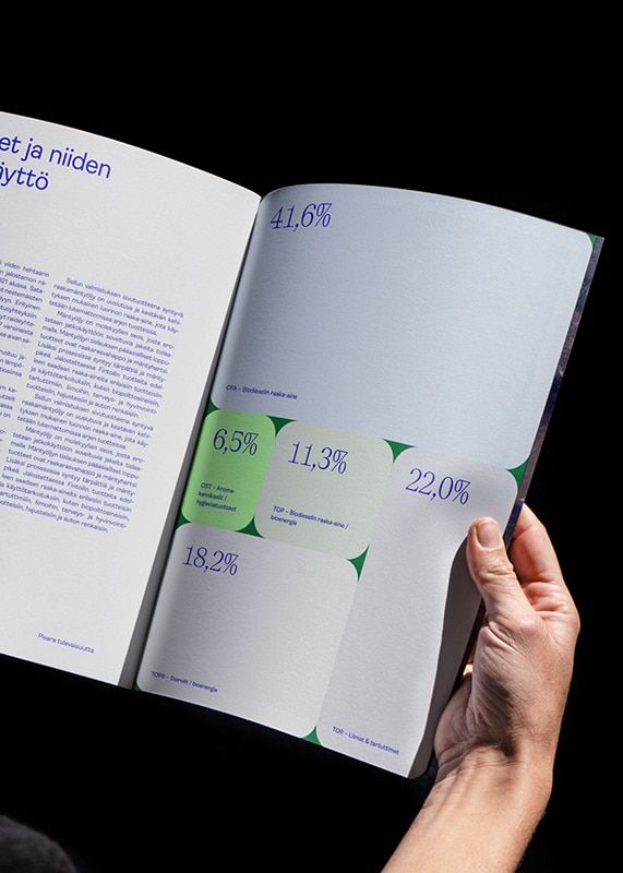
A minimalist data visualization publication featuring statistical infographics with percentage metrics displayed across an open spread. The design employs a clean, modern aesthetic with strategic use of color-coded data points and geometric shapes to communicate quantitative information. The composition balances dense text on the left with visual data representation on the right, creating an accessible editorial layout.
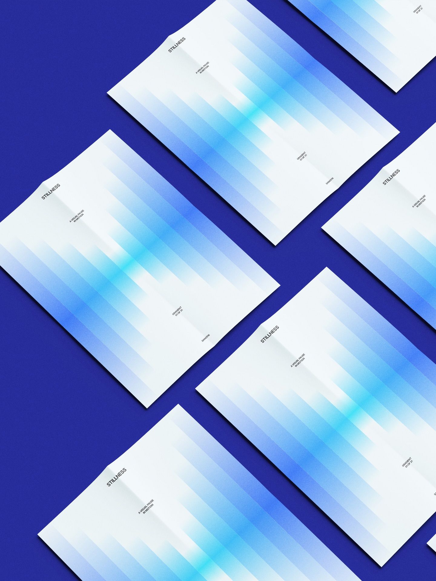
A modern, minimalist design mockup featuring white cards arranged diagonally against a deep blue background, each displaying a gradient blue wave or data visualization pattern. The composition demonstrates a clean, professional aesthetic with subtle typography and a strong emphasis on geometric arrangement and color harmony.
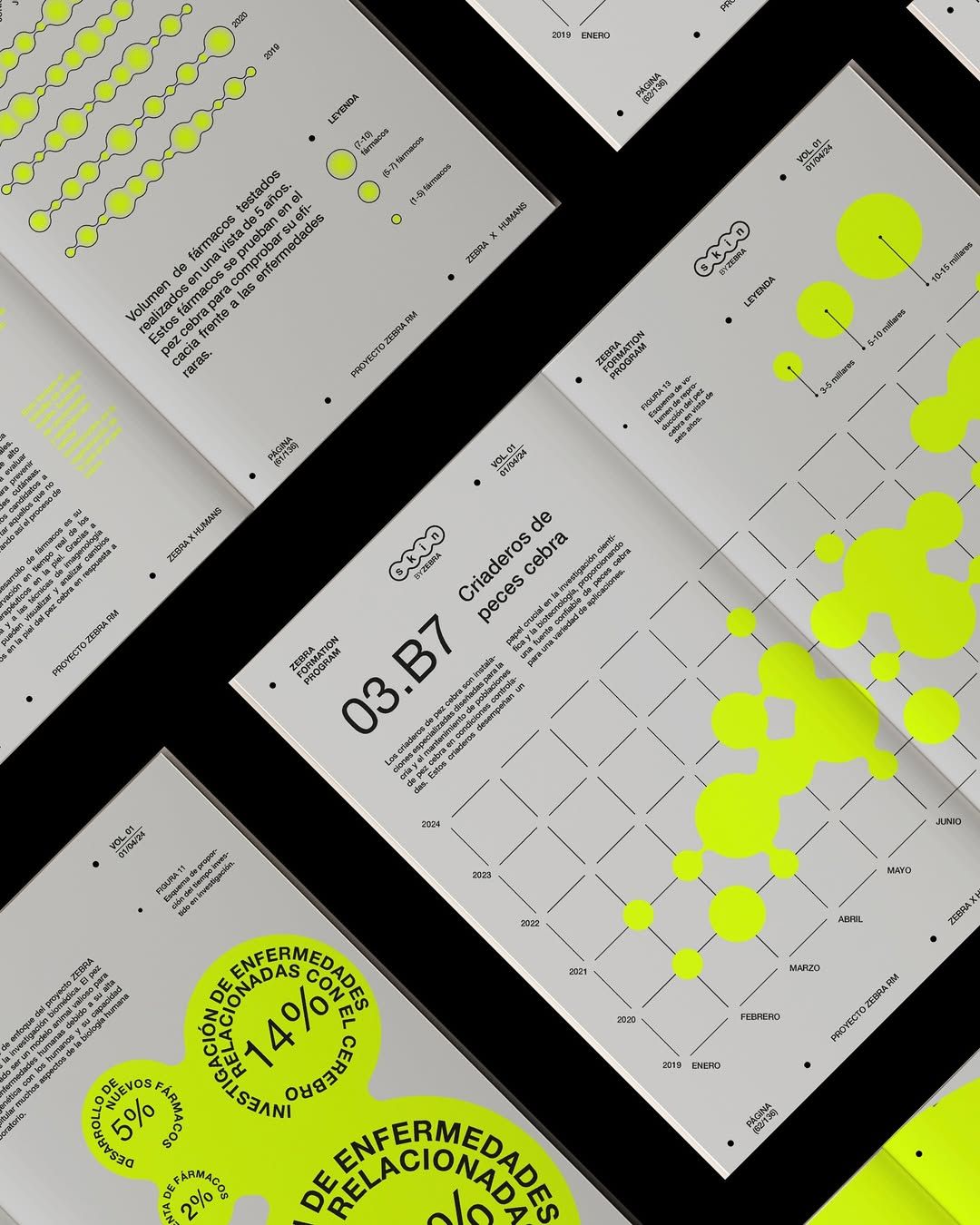
A modern, data-driven design system featuring minimalist layouts with striking neon yellow accents against neutral grays and blacks. The composition showcases multiple printed collateral pieces arranged at dynamic angles, emphasizing a contemporary, tech-forward aesthetic with emphasis on information hierarchy and visual rhythm.
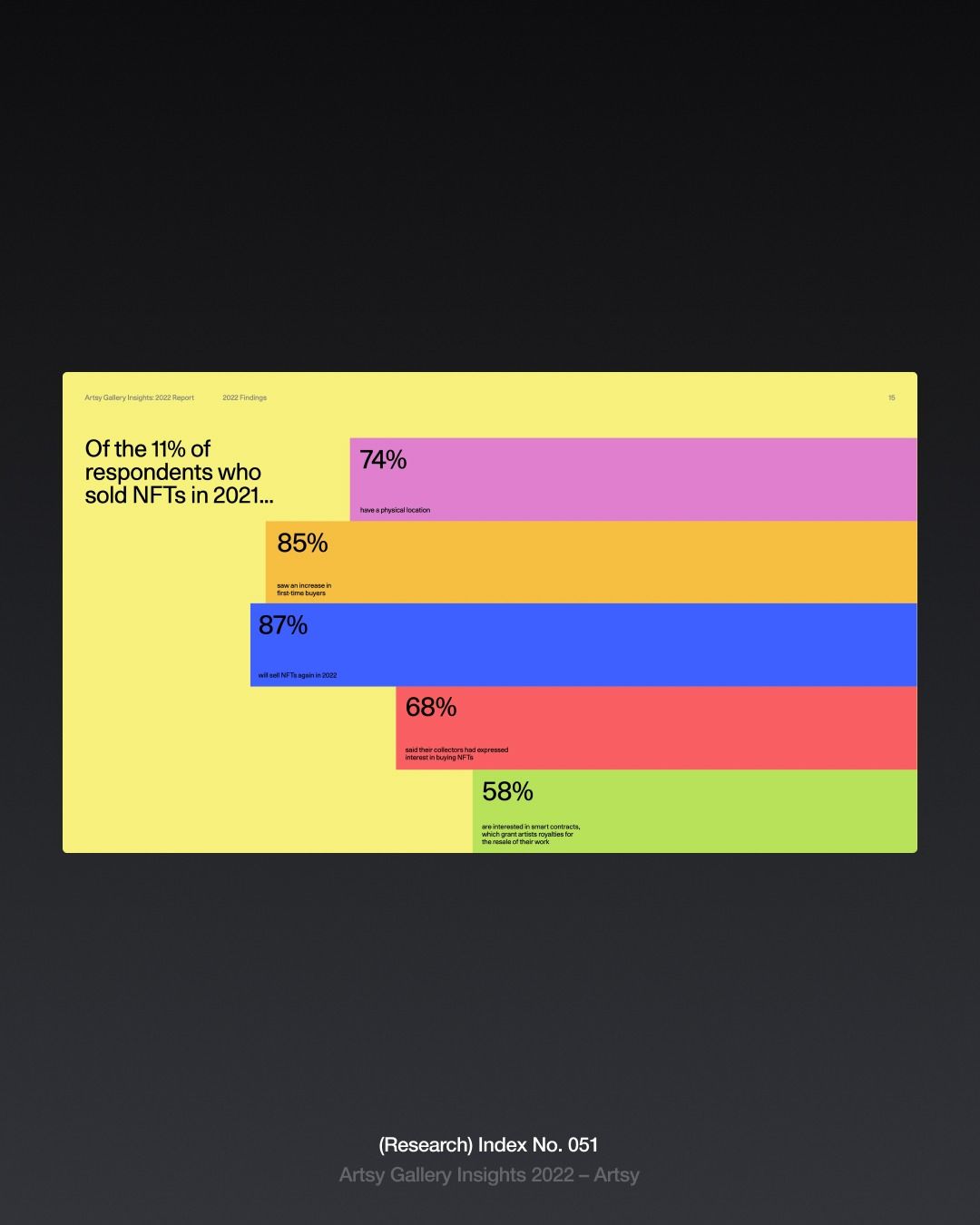
A bold, data-driven infographic using a horizontal stacked bar chart with vibrant, contrasting colors to display NFT sales statistics from 2021. The design employs a minimalist layout with clear typography and percentage labels, set against a dark background that emphasizes the colorful data visualization.
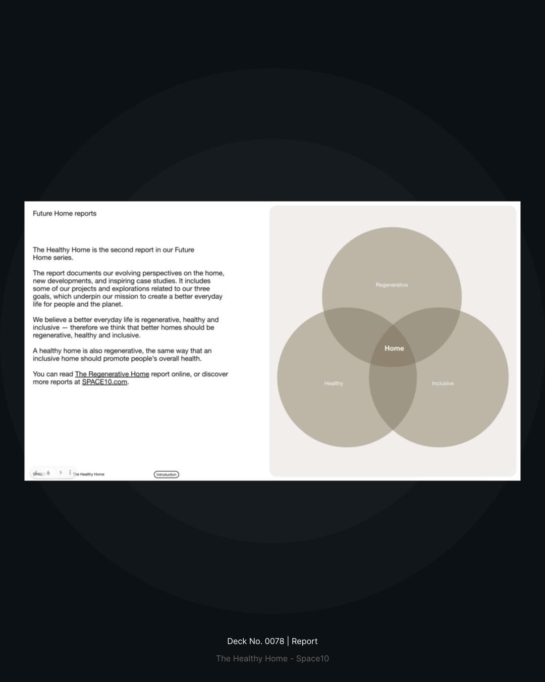
A minimalist report layout featuring a Venn diagram visualization with overlapping circles in muted earth tones. The design combines clean typography on the left with a sophisticated data visualization on the right, creating a balanced and professional presentation of interconnected concepts.
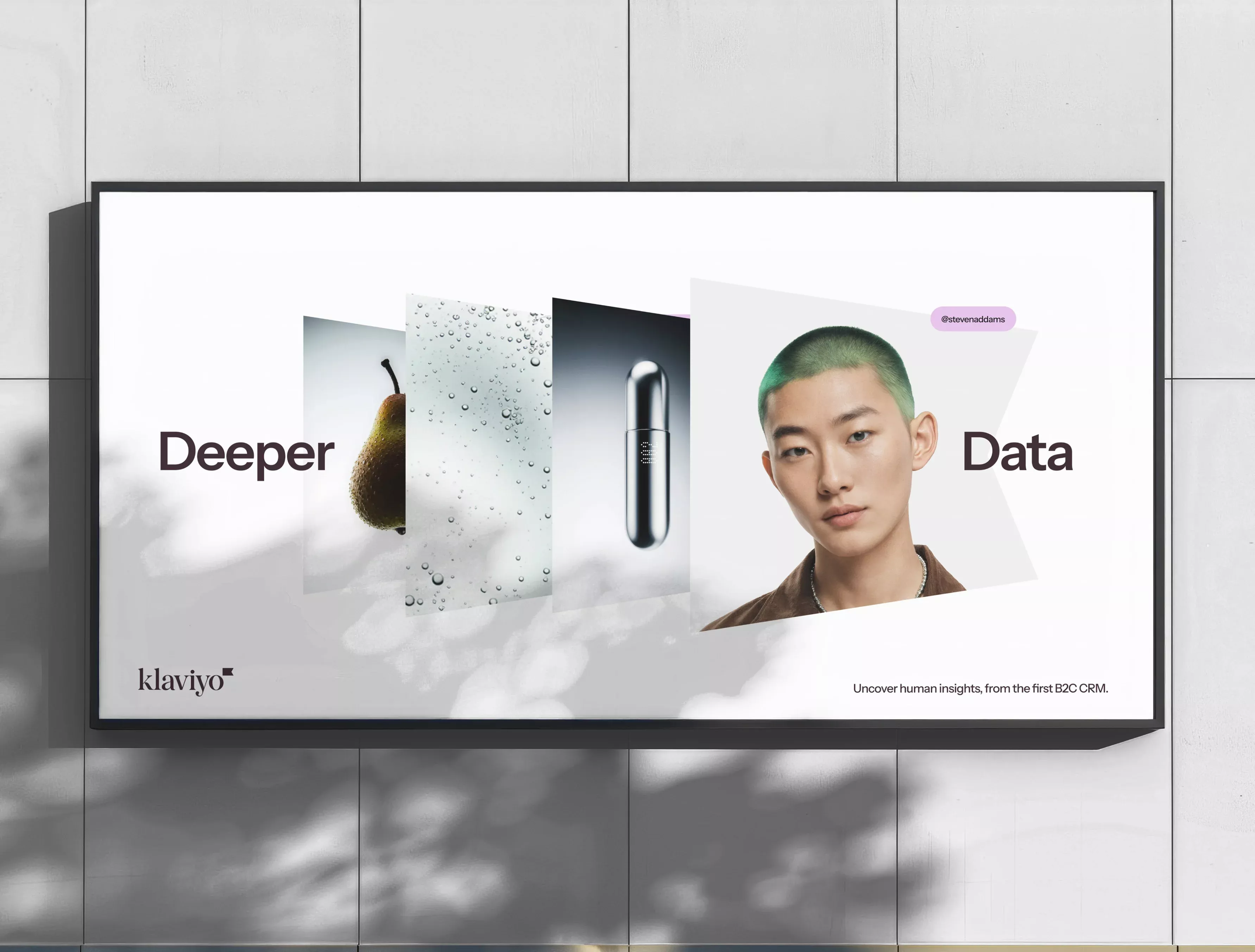
A contemporary digital billboard featuring a minimalist layout with layered imagery combining organic and technological elements. The design balances human portraiture with abstract visual metaphors, creating a sophisticated narrative around data and technology with clean, modern aesthetics.