data presentation
10 designs
Showing 10 of 10 (10 total)
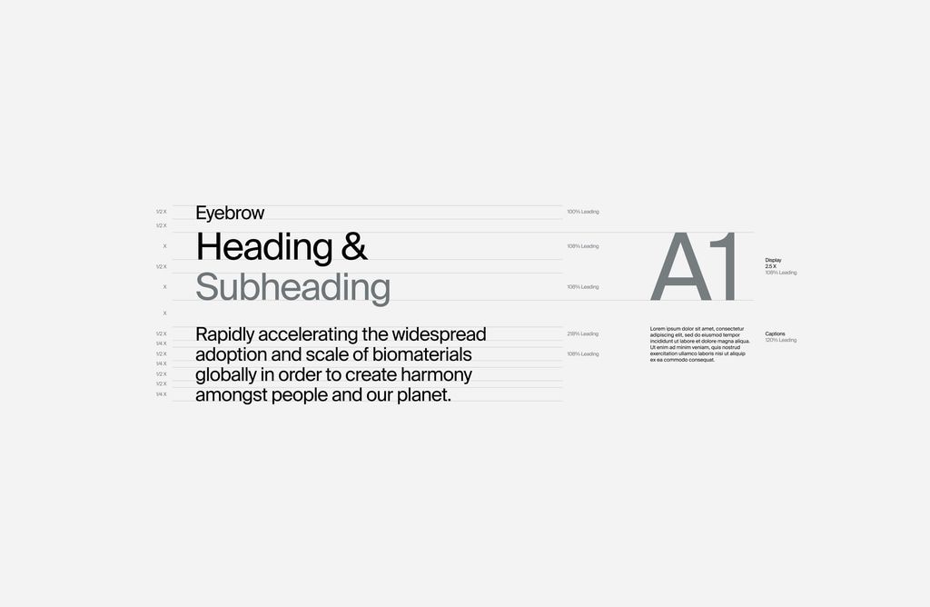
This design exhibits a highly minimalist and structured approach, relying on clean lines and ample negative space to prioritize readability. The visual language is functional and professional, emphasizing clear hierarchy through simple text treatments.
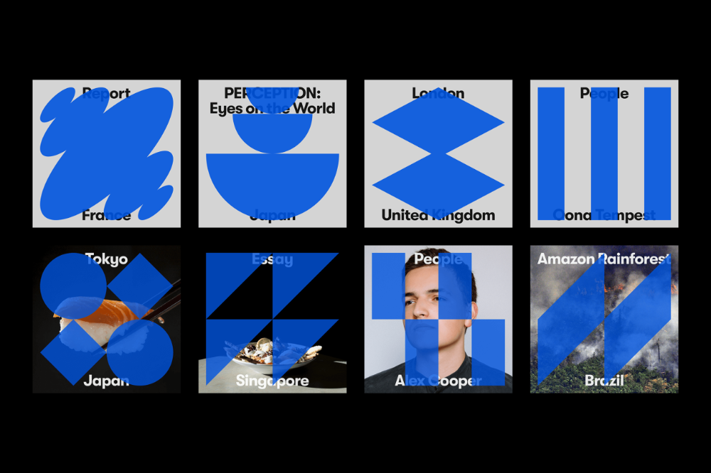
The image presents a grid of abstract, geometric icons or logos, characterized by bold blue shapes set against a stark white background. The design relies heavily on simple, solid forms and negative space to convey geographic or conceptual identity in a modern, minimalist manner.
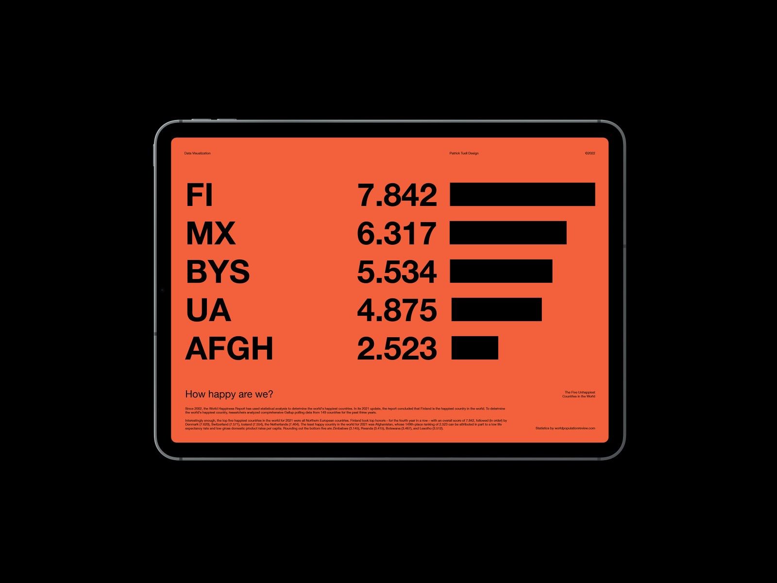
This is a minimalist, data-focused visualization presented in a clean, modern interface style. The design relies heavily on strong contrast between the dark background and the vibrant orange data bars to clearly present comparative statistics.
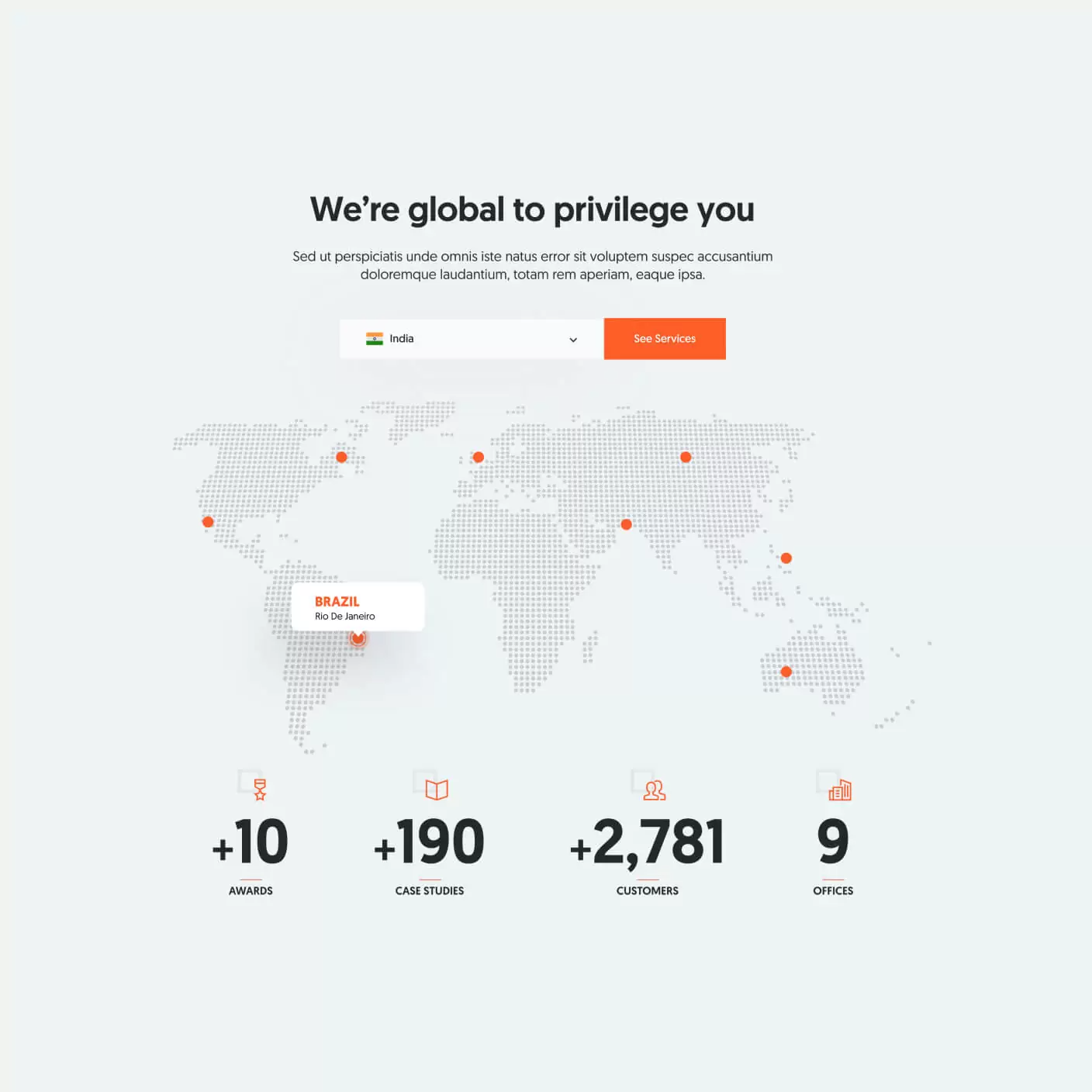
The design is clean, minimalist, and professional, utilizing a light gray background with subtle, scattered dots to represent a world map. The layout is centered and balanced, focusing attention on the main text and the statistical icons.
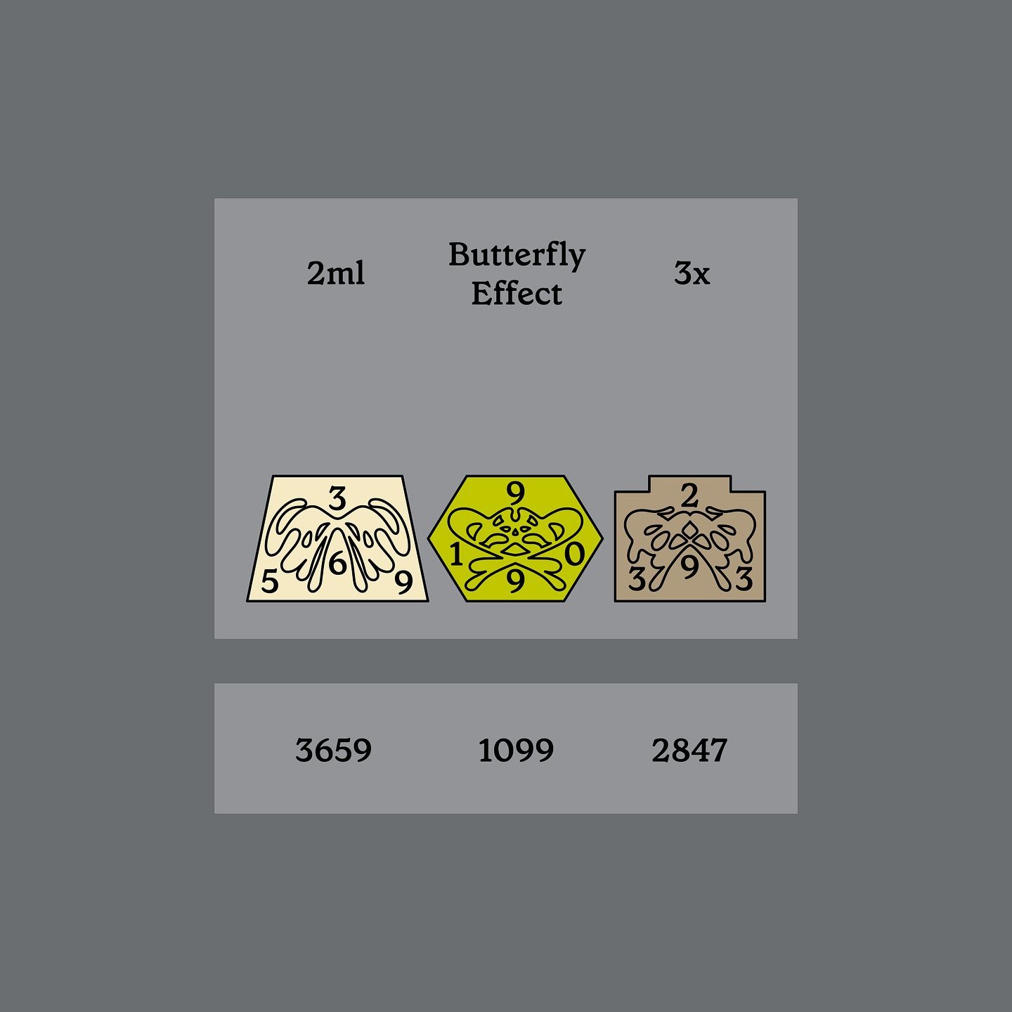
The image presents a minimalist, functional design layout typical of a dosage or product information sheet. It uses simple geometric shapes and clear numerical data to convey specific information efficiently.
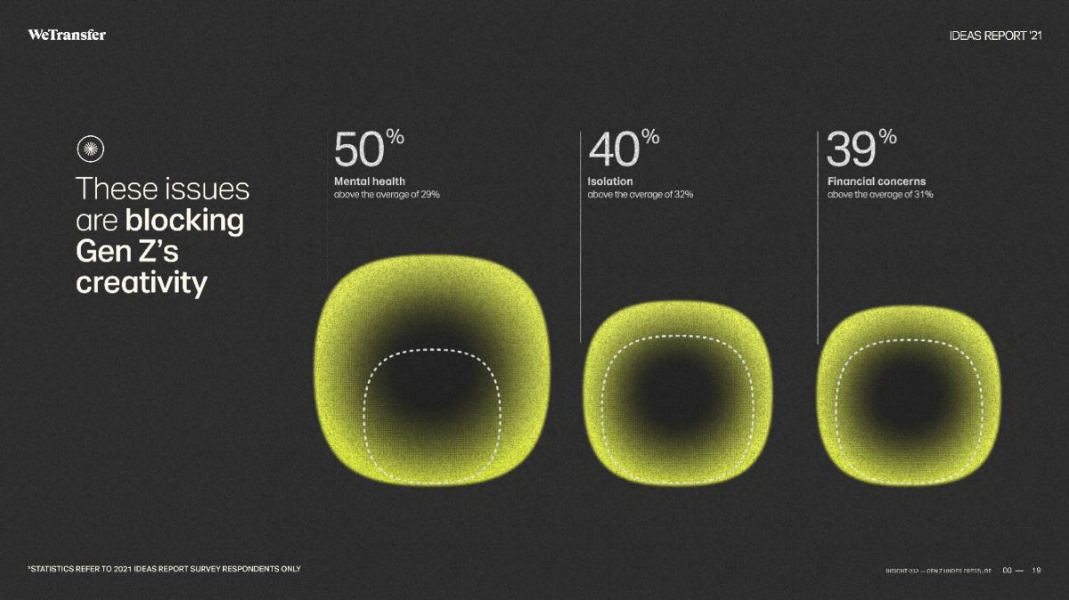
The design uses a dark, minimalist aesthetic with soft, glowing gradients to present statistical data in an engaging and modern way. The visual language relies heavily on subtle luminosity and negative space to draw attention to the key percentages.
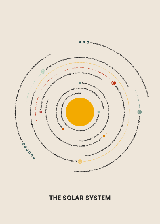
This is a clean, minimalist scientific infographic utilizing a radial layout to display the structure and relationships within the solar system. The design relies on subtle color progression and precise labeling to convey complex astronomical information in an accessible and highly organized manner.
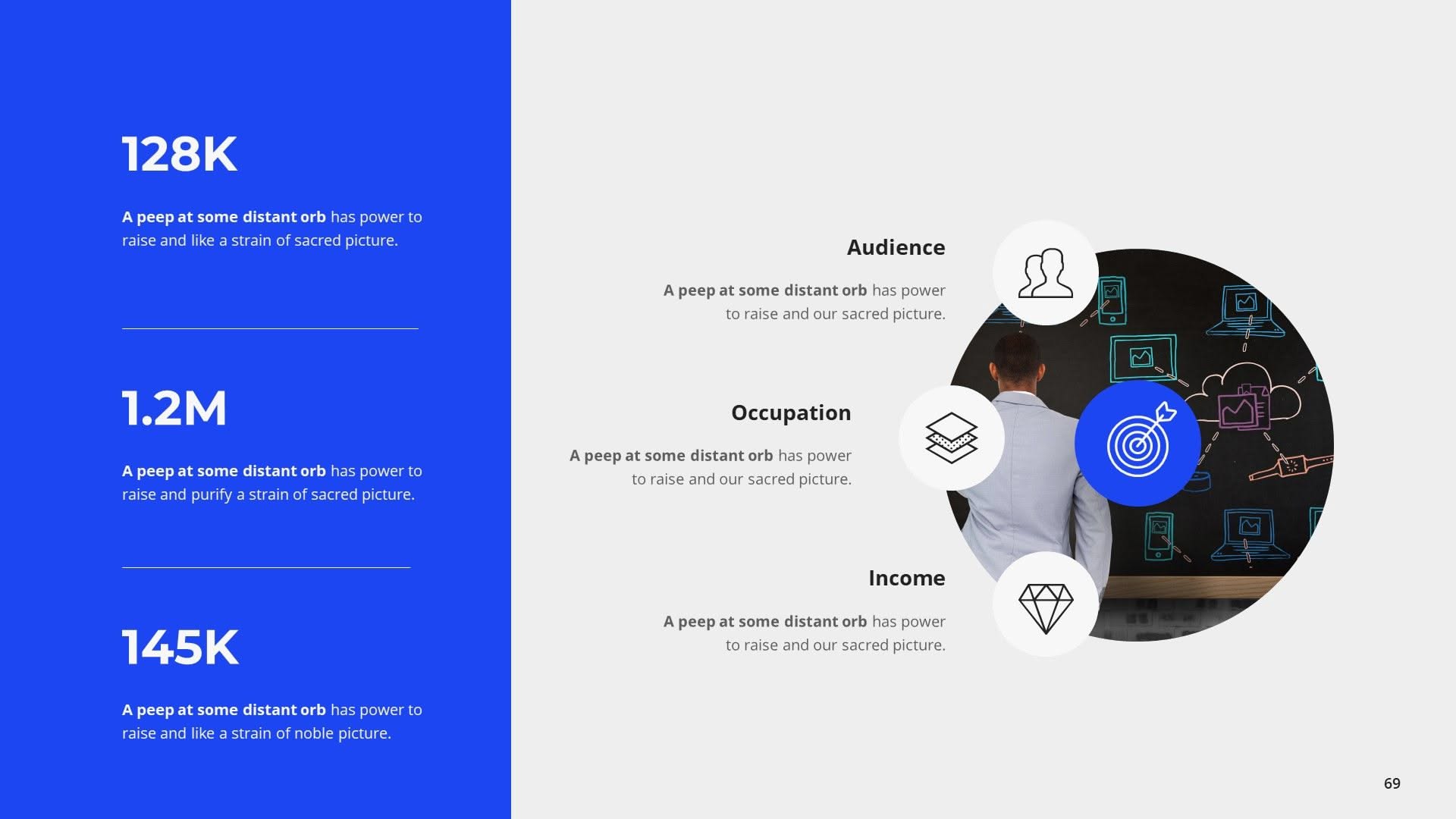
This design employs a clean, professional aesthetic utilizing ample negative space and strong vertical alignment to present statistical data effectively. The visual language is minimalist, relying on clear typography and simple geometric shapes for data representation.
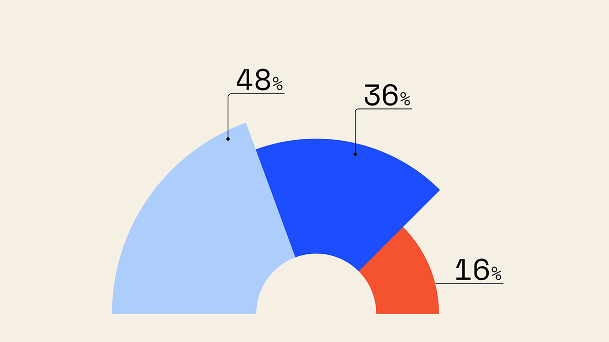
This is a clean, straightforward data visualization using a segmented circle chart to display proportional relationships between three distinct categories. The design relies on clear color separation and simple typography to ensure the data is immediately legible and easy to interpret.
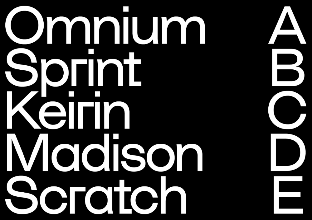
This is a high-contrast, minimalist typographic display utilizing clean sans-serif typography to map words vertically to corresponding alphabetical letters. The design emphasizes clarity, structure, and precise alignment through stark black and white elements.