community management
5 designs
Showing 5 of 5 (5 total)
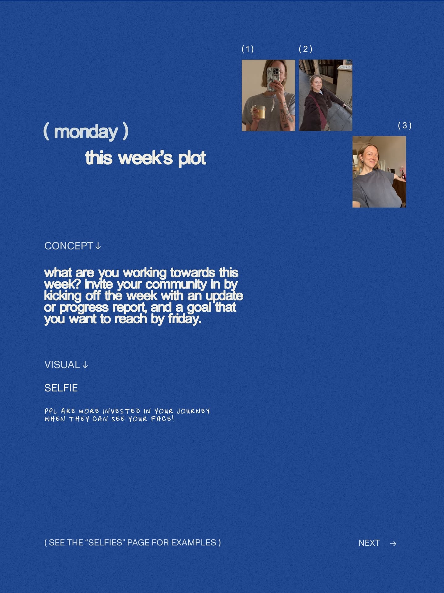
This design features a clean, professional aesthetic utilizing a deep blue background to create a focused and calm environment. The layout is highly structured, balancing clear instructional text with small photographic examples to guide the user through a weekly planning concept.
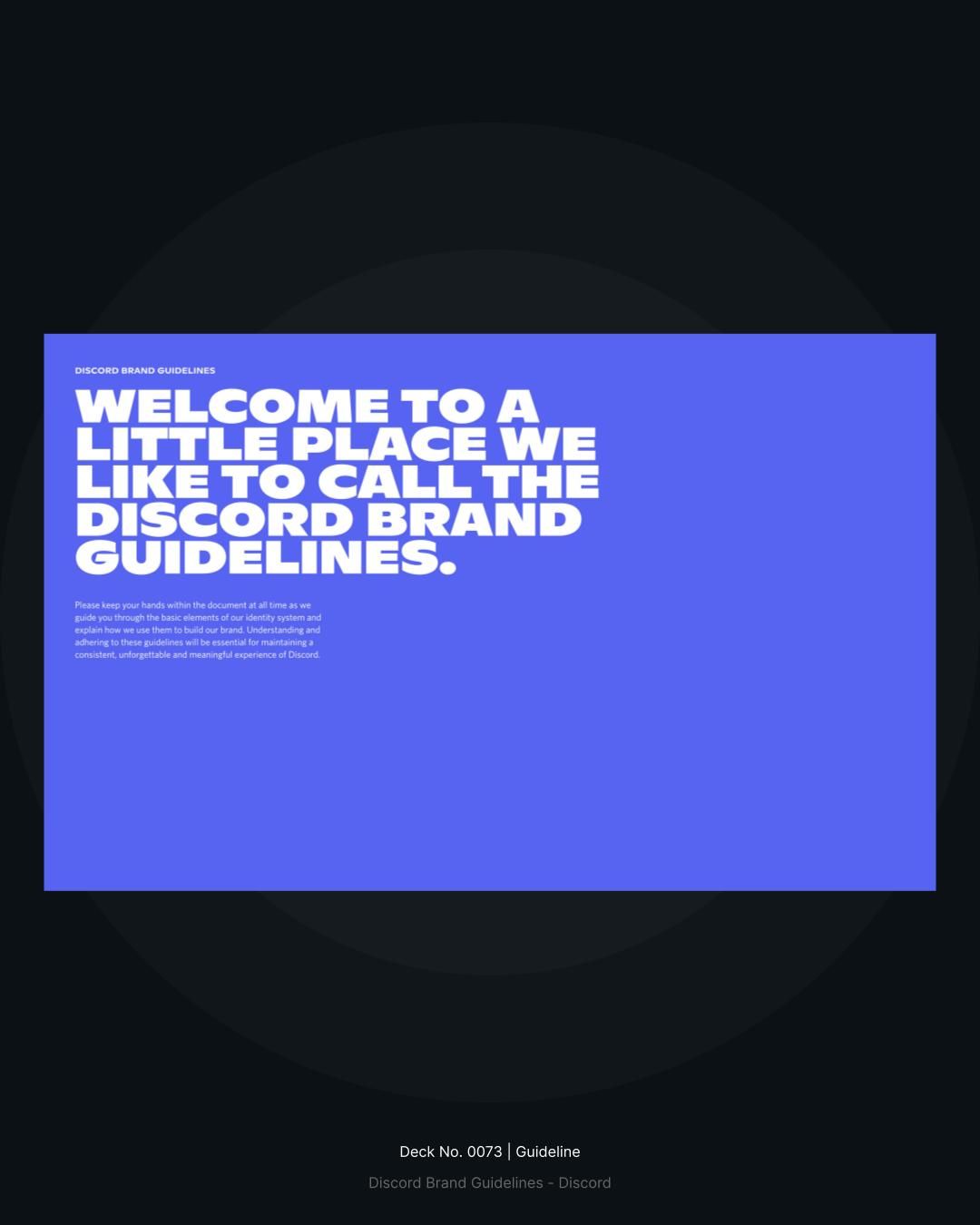
The design is clean, modern, and professional, utilizing a strong block of vibrant blue against a dark background. The typography is clear and direct, conveying an official yet welcoming tone suitable for guidelines.
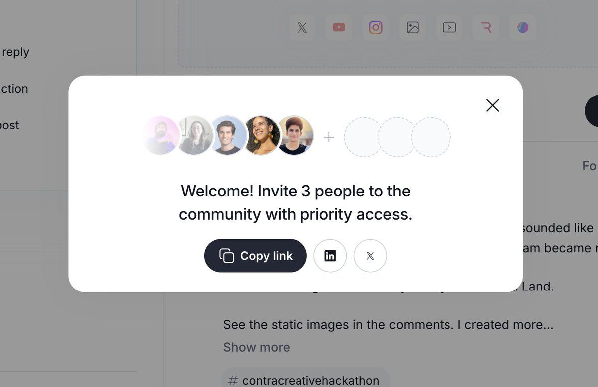
This design features a clean, minimalist interface focused on delivering a clear call to action within a prominent card. The visual language is modern and professional, utilizing ample negative space to ensure high readability and functional clarity.
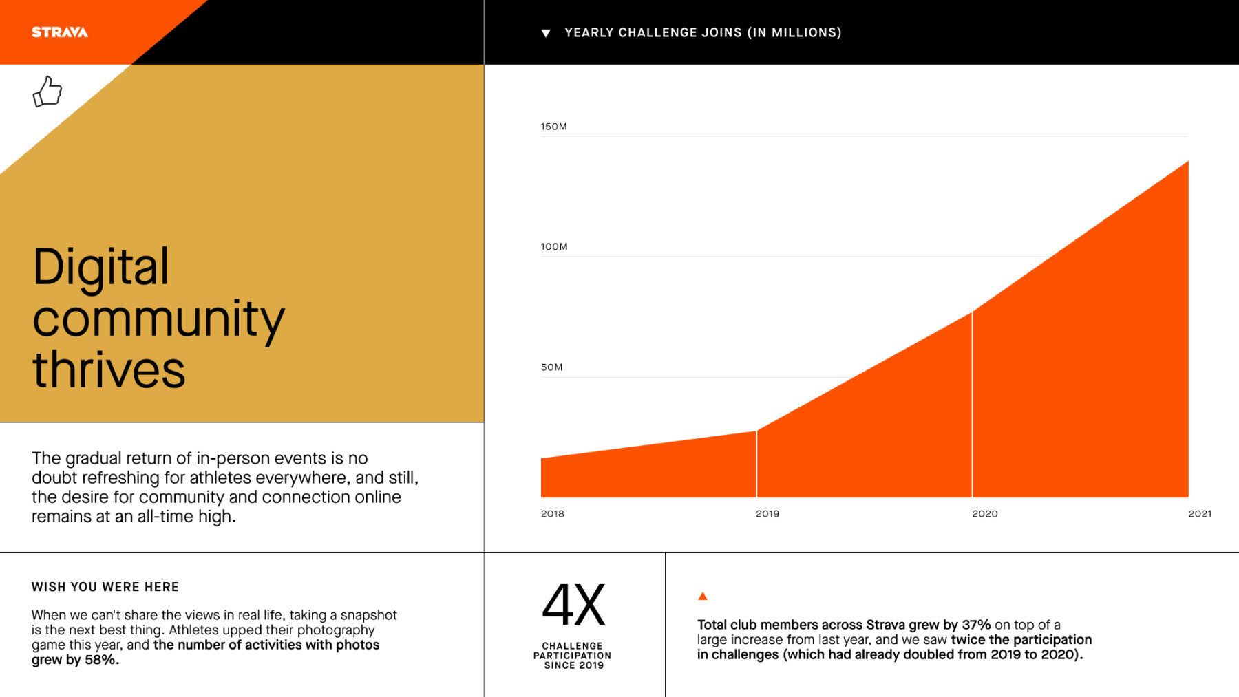
This is a clean, professional data visualization using an area chart to illustrate positive growth in community engagement metrics over time. The design effectively uses a limited, warm color palette and clear typography to convey information rapidly and credibly.
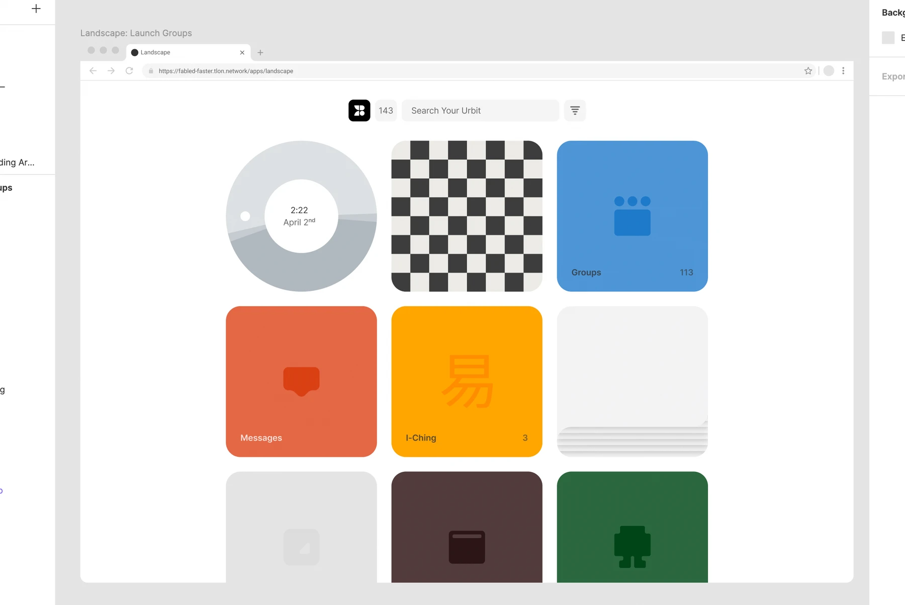
This interface features a clean, organized card-based layout typical of modern web applications, prioritizing clarity and easy navigation. The visual language relies on subtle color contrasts and ample negative space to ensure high readability and a professional feel.