club branding
6 designs
Showing 6 of 6 (6 total)
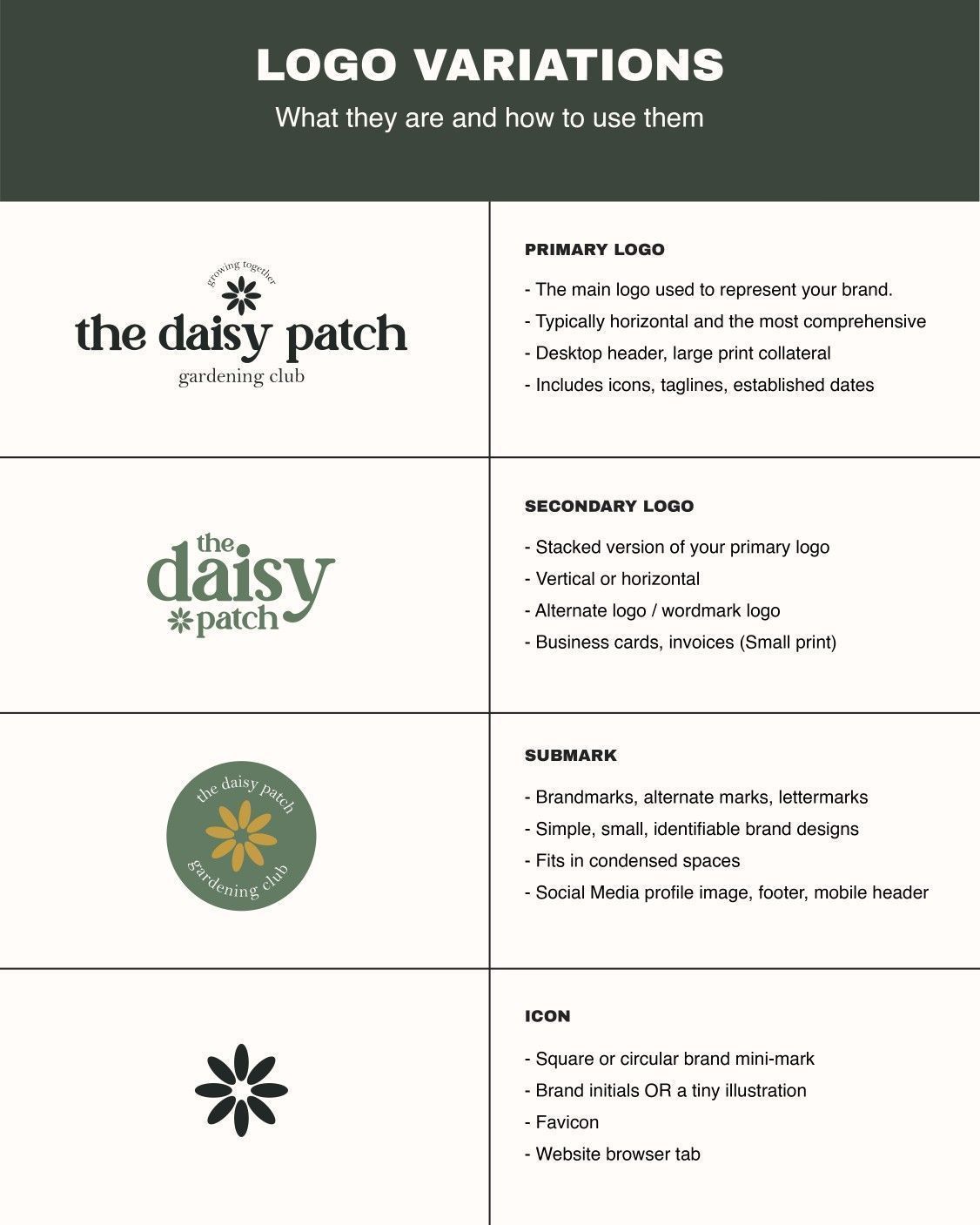
This image presents a highly structured and clean guide detailing various logo variations for a gardening club. The visual language relies on simple line art and clear hierarchy to explain the functional differences between primary logos, secondary marks, and icons. The overall feel is professional, trustworthy, and rooted in natural simplicity.

This design utilizes bold, rounded typography in a vibrant pink against a soft, warm beige background to create an energetic and inviting atmosphere. The visual language is playful and contemporary, effectively communicating a sense of community and fun.
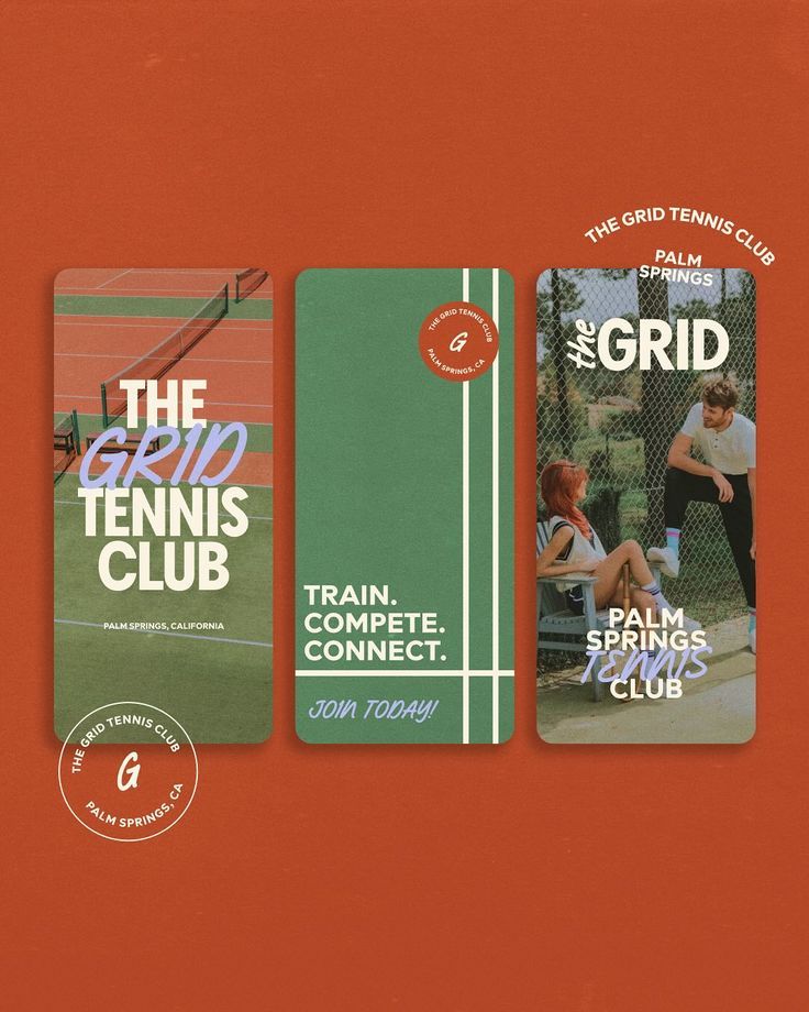
This design utilizes a bold, high-contrast color scheme of burnt orange and deep green to create an energetic yet established feel. The visual language is clean and structured, effectively using strong blocks of color to segment promotional information for the tennis club.
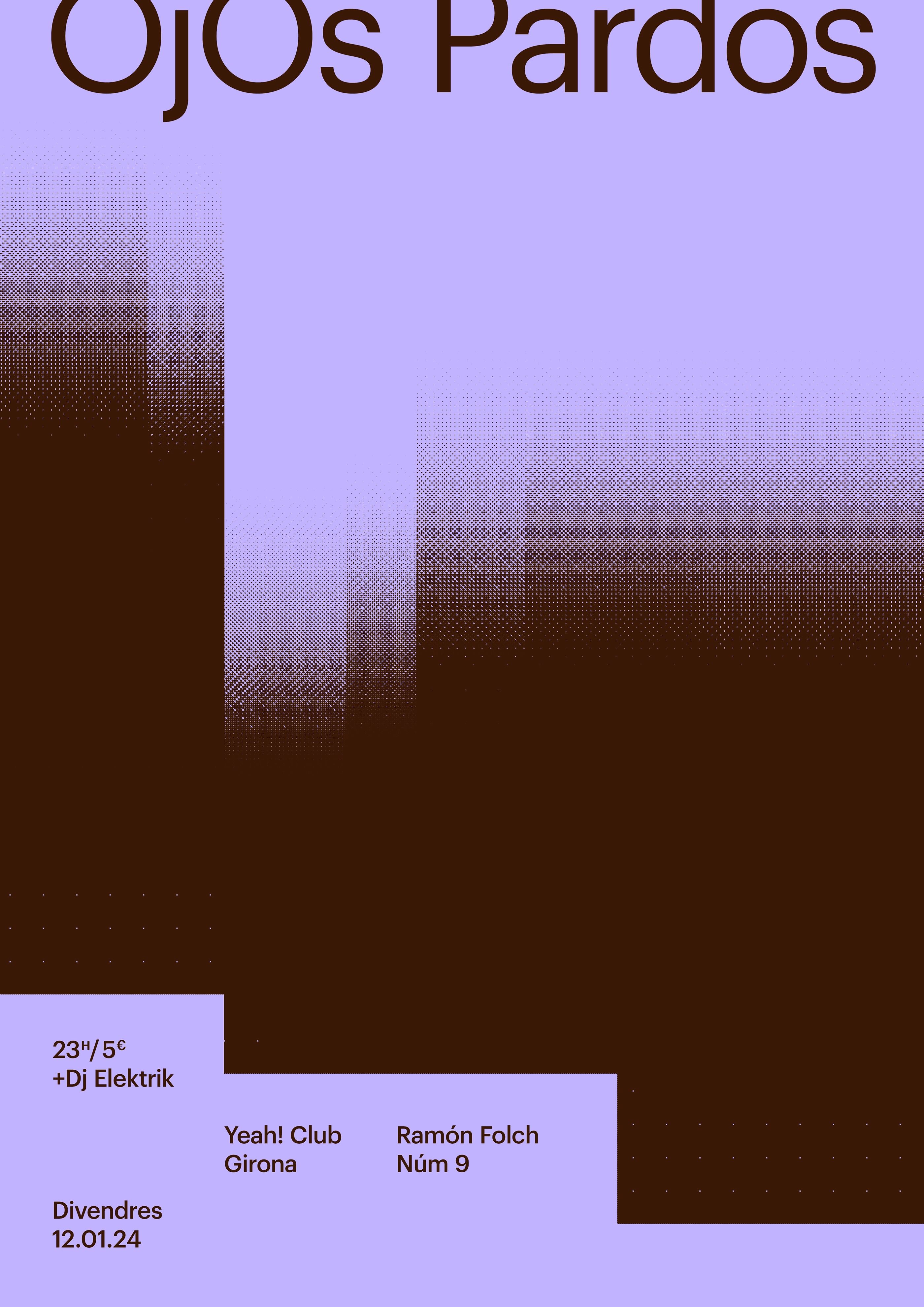
This poster utilizes a sophisticated, moody visual language centered around a vertical gradient that draws the eye. The design employs deep tones and subtle texture to create an atmospheric backdrop for the text, achieving a modern yet dramatic feel.
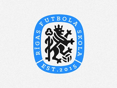
This is a clean, classic emblem design utilizing a circular badge format to convey official status and tradition. The visual language relies on strong contrasts between deep blue, black, and white to create a robust and established brand identity. The design effectively merges heraldic elements with clear textual information.
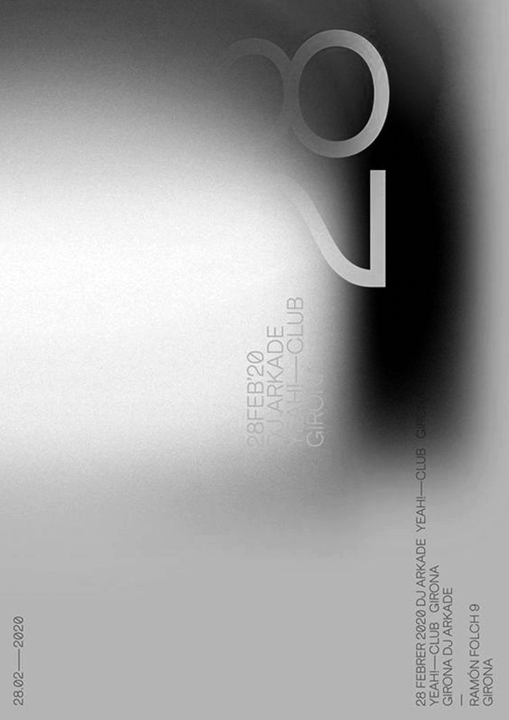
This design utilizes a stark monochrome palette to create a sophisticated and minimalist aesthetic, relying heavily on negative space and subtle tonal gradients. The visual language is clean and modern, establishing an elegant yet mysterious atmosphere suitable for high-end promotion.