business intelligence
75 designs
Showing 24 of 75 (75 total)
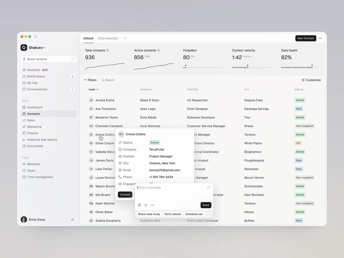
This interface showcases a highly functional and clean modern design, prioritizing data readability through ample whitespace and clear hierarchy. The visual language is professional and minimalist, relying on subtle color accents to highlight key metrics and status indicators effectively. The overall feel is organized, efficient, and trustworthy.
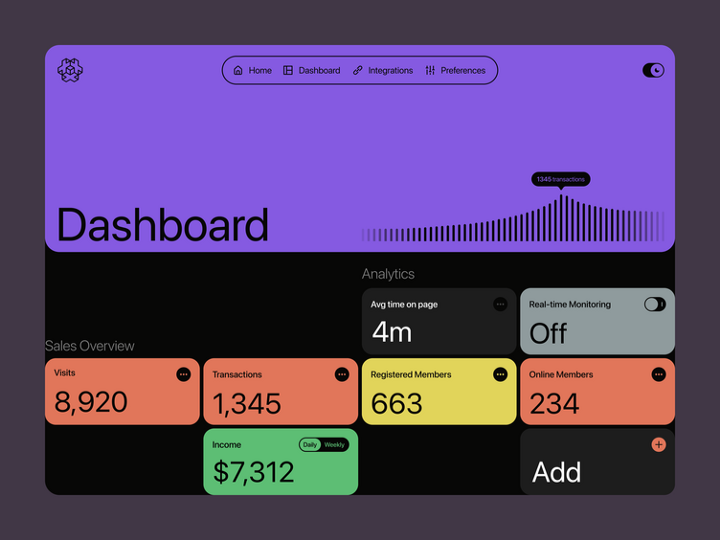
This dashboard features a clean, modern dark mode interface designed for clear data presentation. The design utilizes strong visual hierarchy through distinct color blocks and simple typography to make key metrics immediately accessible. The overall feel is professional, organized, and data-focused.
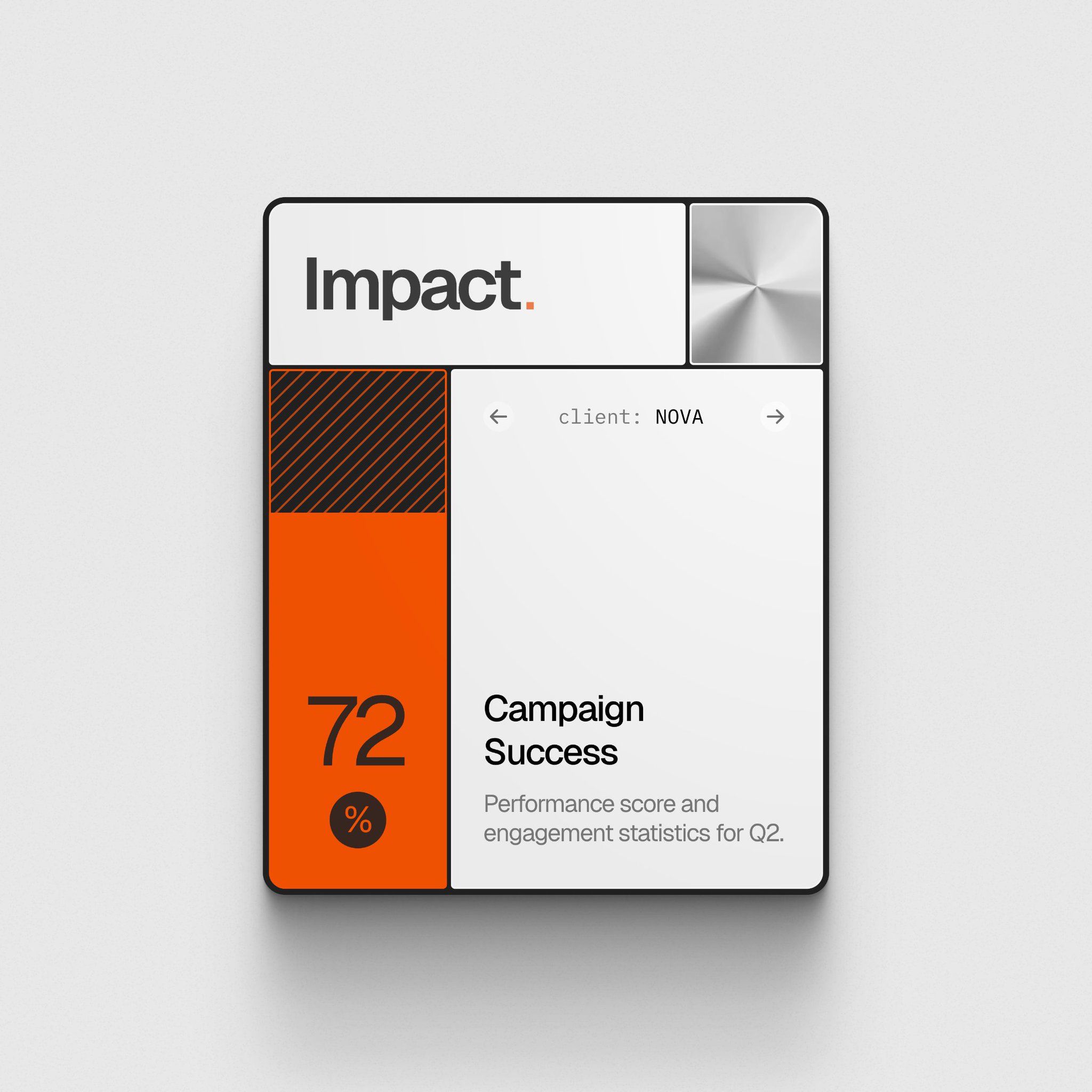
This design features a clean, modern user interface focused on presenting performance data through clear visual hierarchy and strong color blocking. The layout is minimalist, utilizing negative space effectively to draw attention to key metrics like the 72% success score.
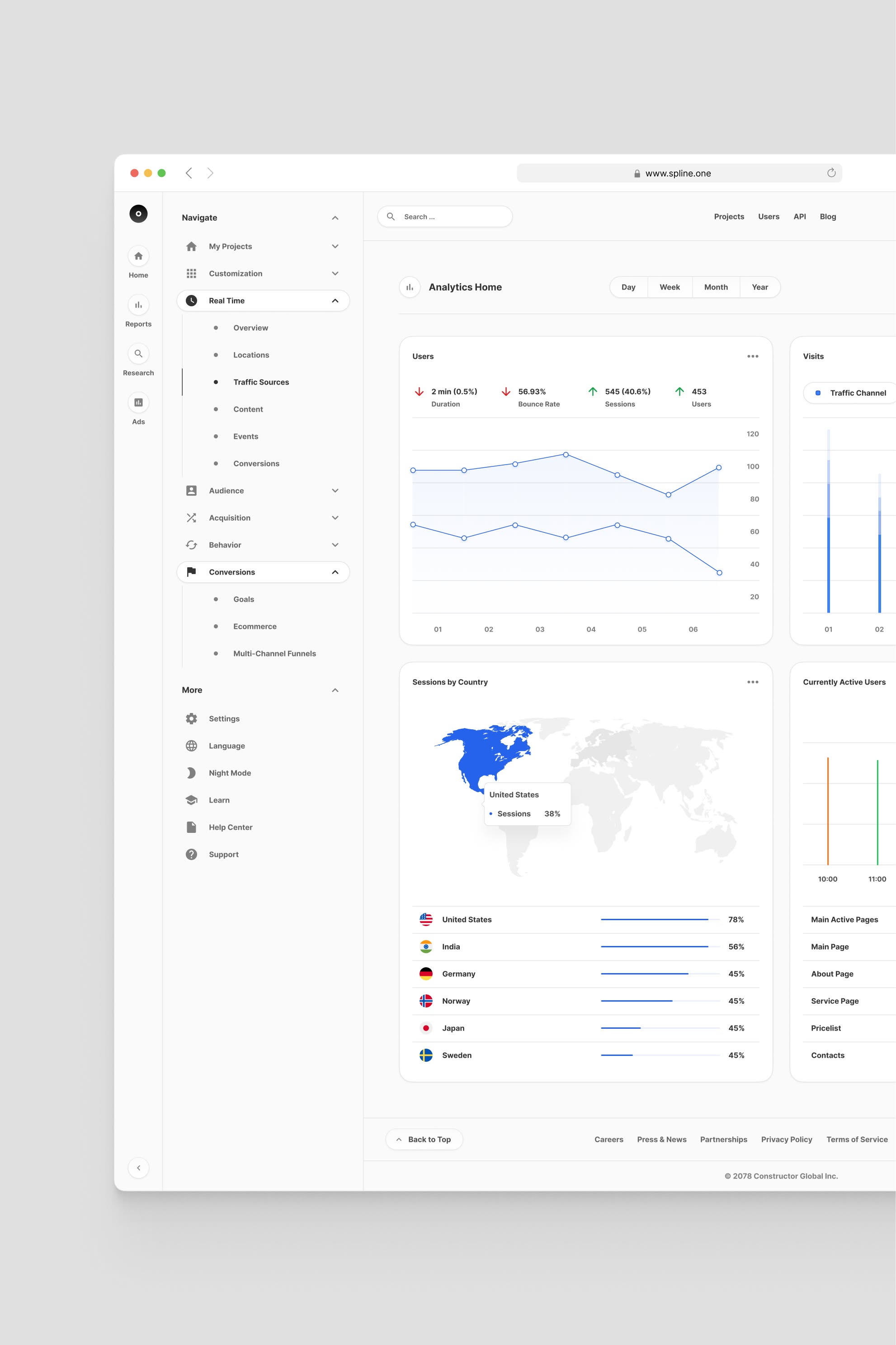
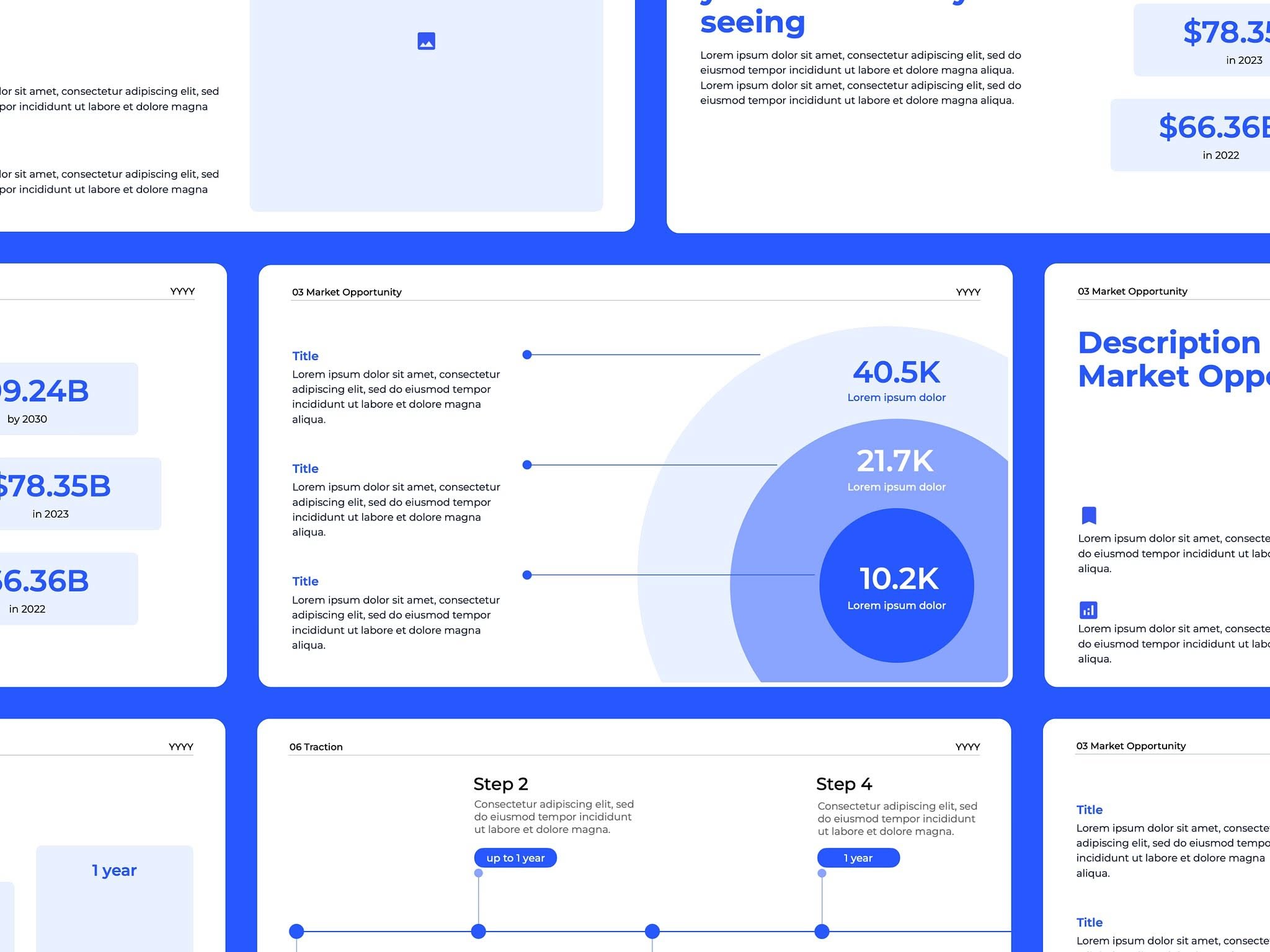
This interface presents a clean, professional, and highly functional data dashboard utilizing a minimalist design approach. The visual language relies heavily on ample white space and clear segmentation to ensure data readability and intuitive navigation. The overall feel is modern, organized, and focused purely on analytical performance.
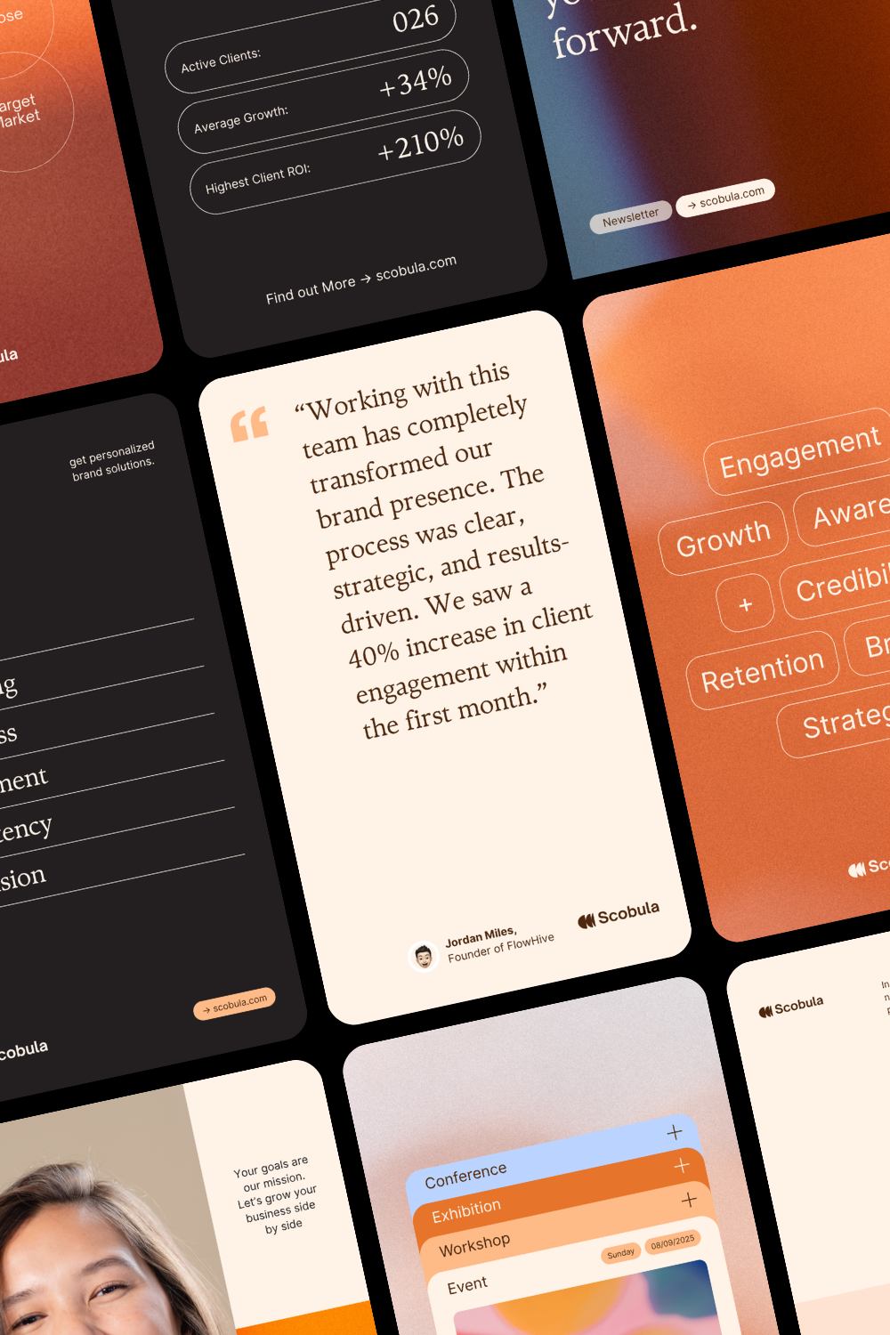
This image showcases a modern, data-driven interface design utilizing a dark mode aesthetic with warm orange accents. The visual language is clean, professional, and highly focused on presenting metrics and insights through modular card layouts.
This collection showcases a clean, modern user interface focused heavily on data visualization and metric display. The design utilizes clear segmentation and circular charts to present complex information in an easily digestible format, emphasizing clarity and professionalism.
This interface features a clean, modern design emphasizing data insight through strong typographic hierarchy and ample negative space. The visual language is professional and analytical, using bold typography to immediately draw attention to key metrics and core concepts.
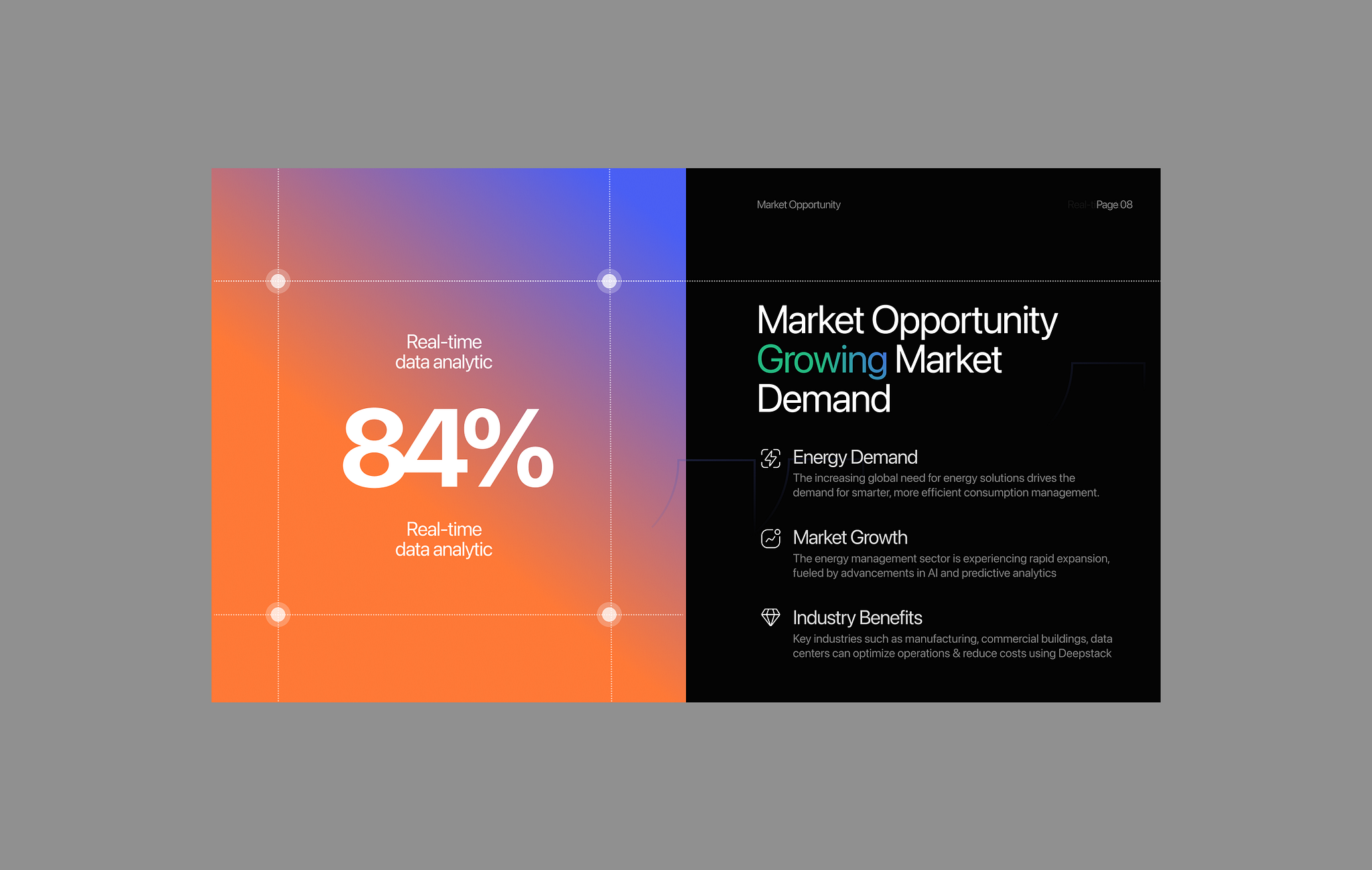
The design uses a split-screen layout with a vibrant gradient background on the left contrasting with a dark, professional section on the right. It employs clean typography and clear visual hierarchy to present data-driven market opportunity information.
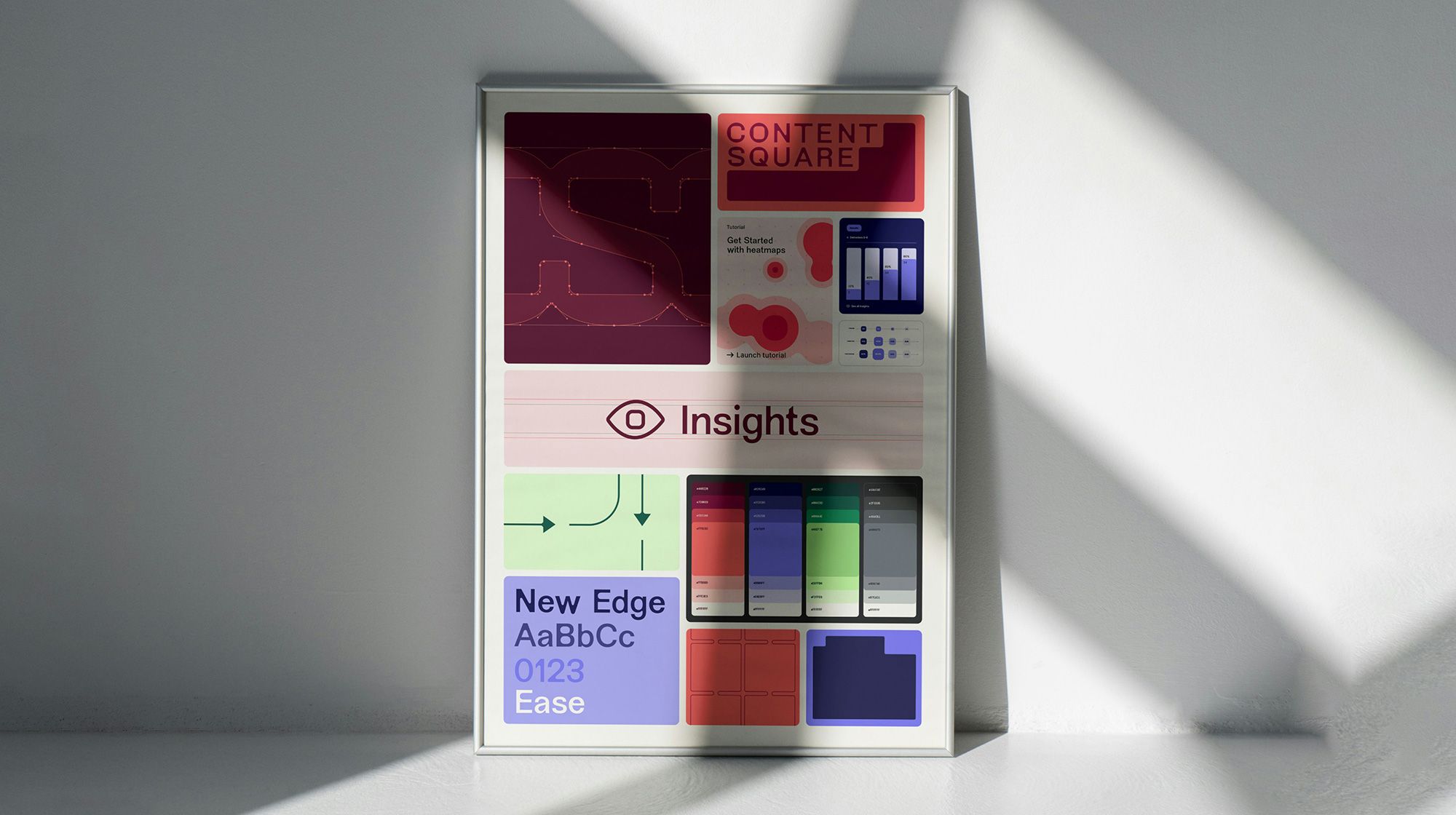
This interface design utilizes a clean, modern aesthetic with a muted color palette dominated by soft pinks, grays, and white. The layout is structured with distinct rectangular modules, suggesting a data-driven or analytical dashboard experience.
The image presents a minimalist, data-driven infographic style using muted tones and simple geometric shapes to convey statistical information. The design is clean, modern, and focuses heavily on clear visual hierarchy for presenting comparative data points.
The design is minimalist and modern, utilizing a dark background to highlight glowing, circular elements representing data points. The visual language is clean and focused, employing subtle gradients to create a sense of depth and focus on the percentage metrics.
The image presents a stark, minimalist data visualization using high-contrast elements against a black background. It employs large, bold typography and simple geometric shapes to convey quantitative information quickly and directly.
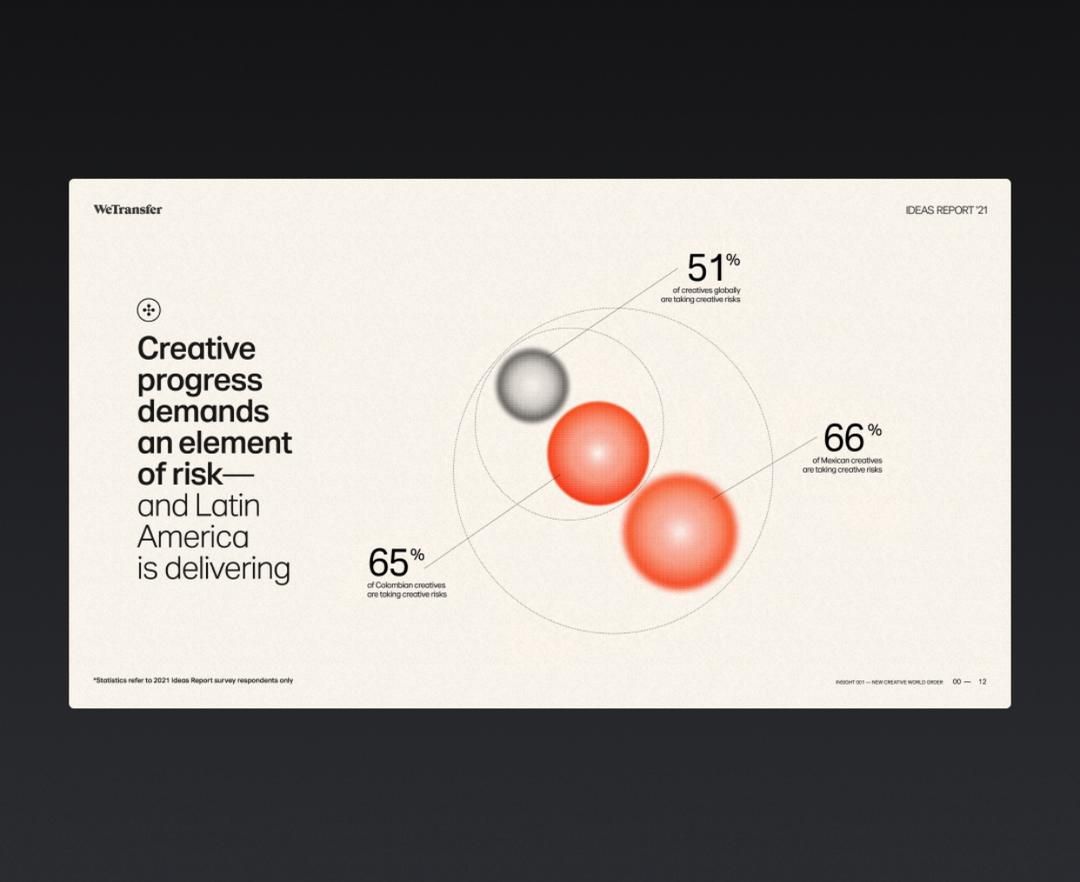
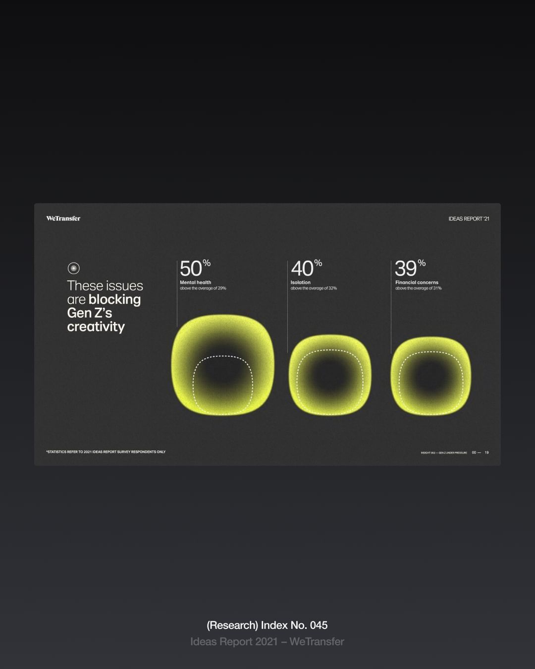
The image is a clean, minimalist infographic presenting data points related to creative progress and risk-taking. It uses soft gradients and circular elements to visually connect statistics, creating a modern and professional feel.
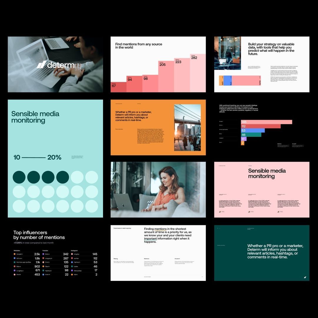
The image presents a collection of mockups or data visualizations, likely related to market research or media monitoring services. The design is clean, professional, and data-driven, utilizing a limited color palette to emphasize information hierarchy.
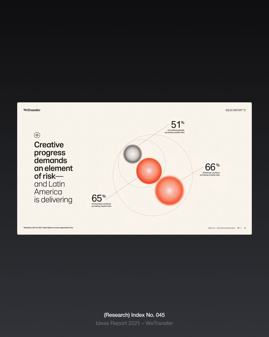
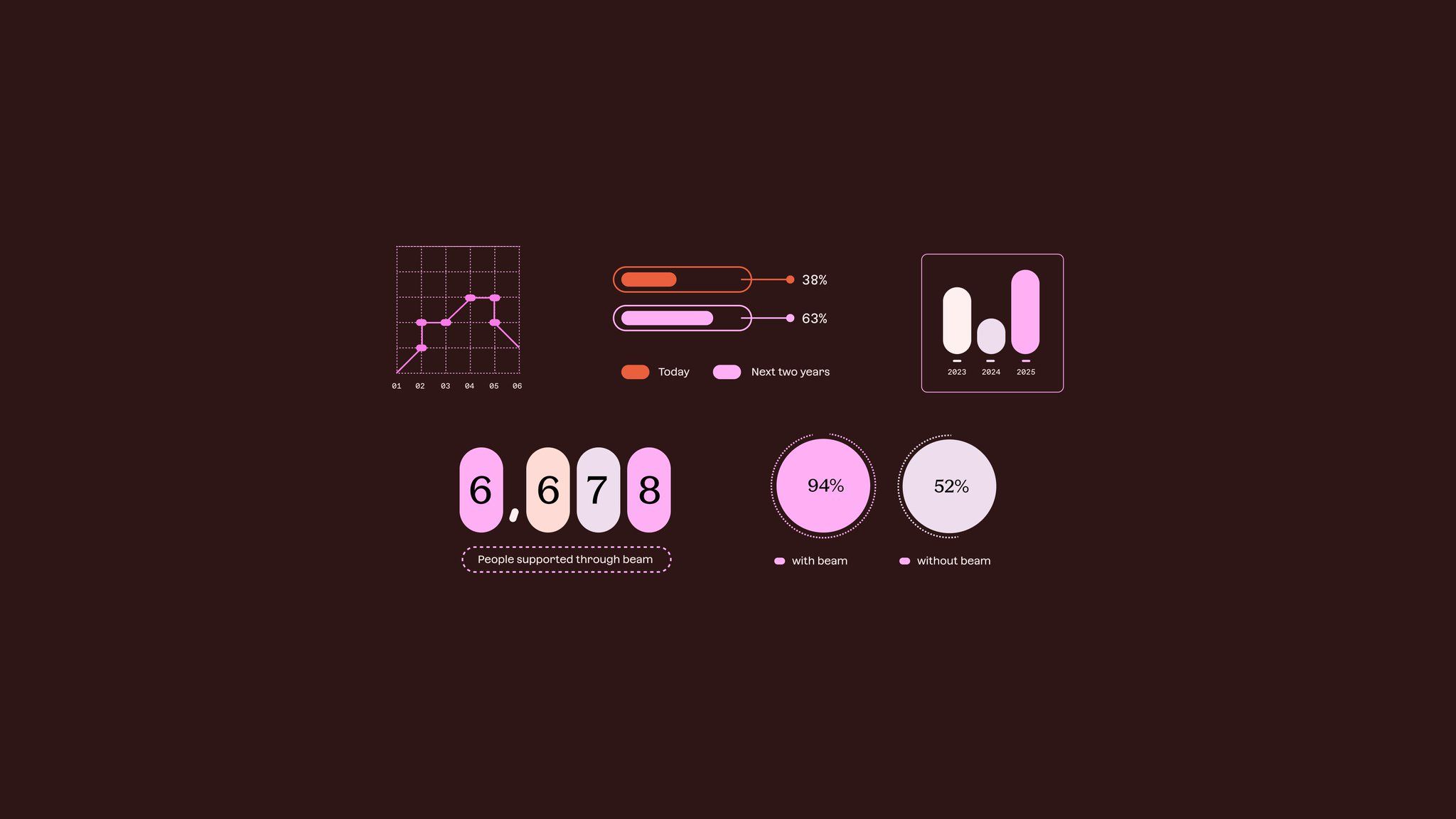
The design is clean, minimalist, and professional, utilizing a muted color palette and clear data visualization to present key statistics. It employs ample white space to ensure readability and focuses the viewer's attention directly on the reported progress metrics.
The image displays a clean, modern user interface design characterized by a light gray background and distinct blocks of color for data visualization. The layout is structured with clear sections, suggesting a professional dashboard or analytical tool.
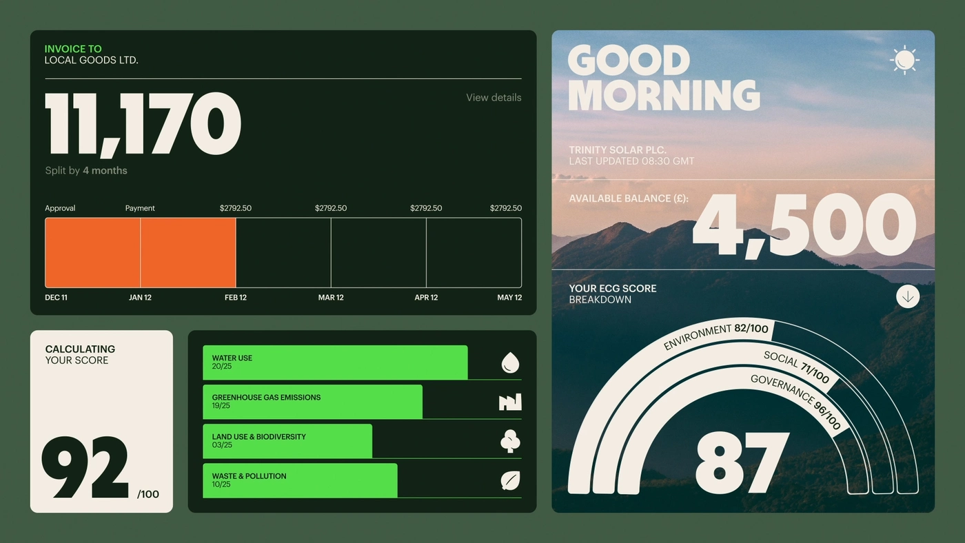
A modern dashboard design featuring a dark green background with a clean, modular layout combining data visualization, typography, and landscape photography. The interface uses a contemporary flat design approach with bold typography, vibrant accent colors, and organized information hierarchy across multiple card-based sections.
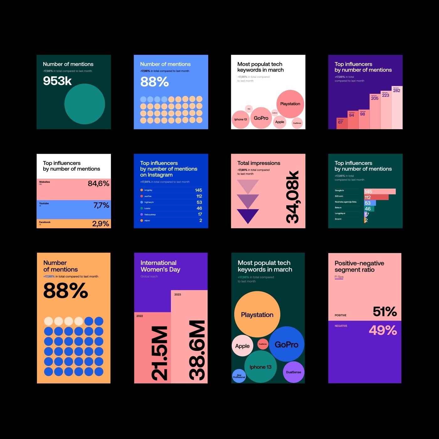
A vibrant collection of data visualization dashboards and infographic cards featuring bold, contrasting color blocks and geometric shapes. The design employs a modern, playful aesthetic with large typography, circular elements, and stacked bar charts to communicate statistical information. The overall visual language is contemporary and tech-forward, emphasizing clarity and visual impact through color-coding and minimalist composition.
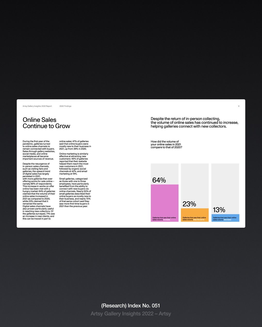
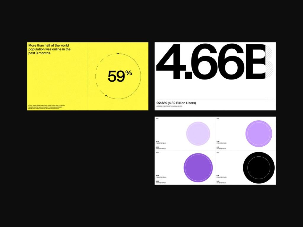
A clean, minimalist infographic presenting online sales data with a professional editorial layout. The design combines dense body text on the left with colorful data visualization on the right, using a stark white background against dark surroundings to create visual hierarchy and focus.
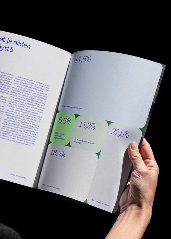
A minimalist data visualization publication featuring statistical infographics with percentage metrics displayed across an open spread. The design employs a clean, modern aesthetic with strategic use of color-coded data points and geometric shapes to communicate quantitative information. The composition balances dense text on the left with visual data representation on the right, creating an accessible editorial layout.
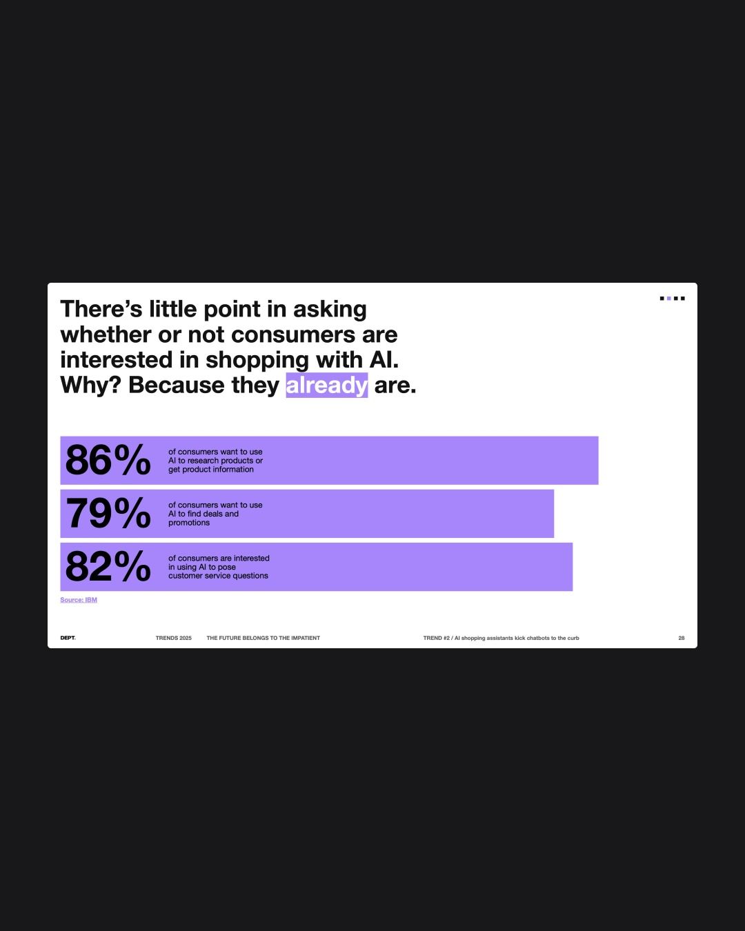
A modern data visualization slide presenting consumer statistics about AI shopping interest through bold percentage metrics and horizontal bar charts. The design employs a clean, minimalist layout with high contrast between dark background and bright purple accent bars, creating visual hierarchy and emphasis on key statistics.
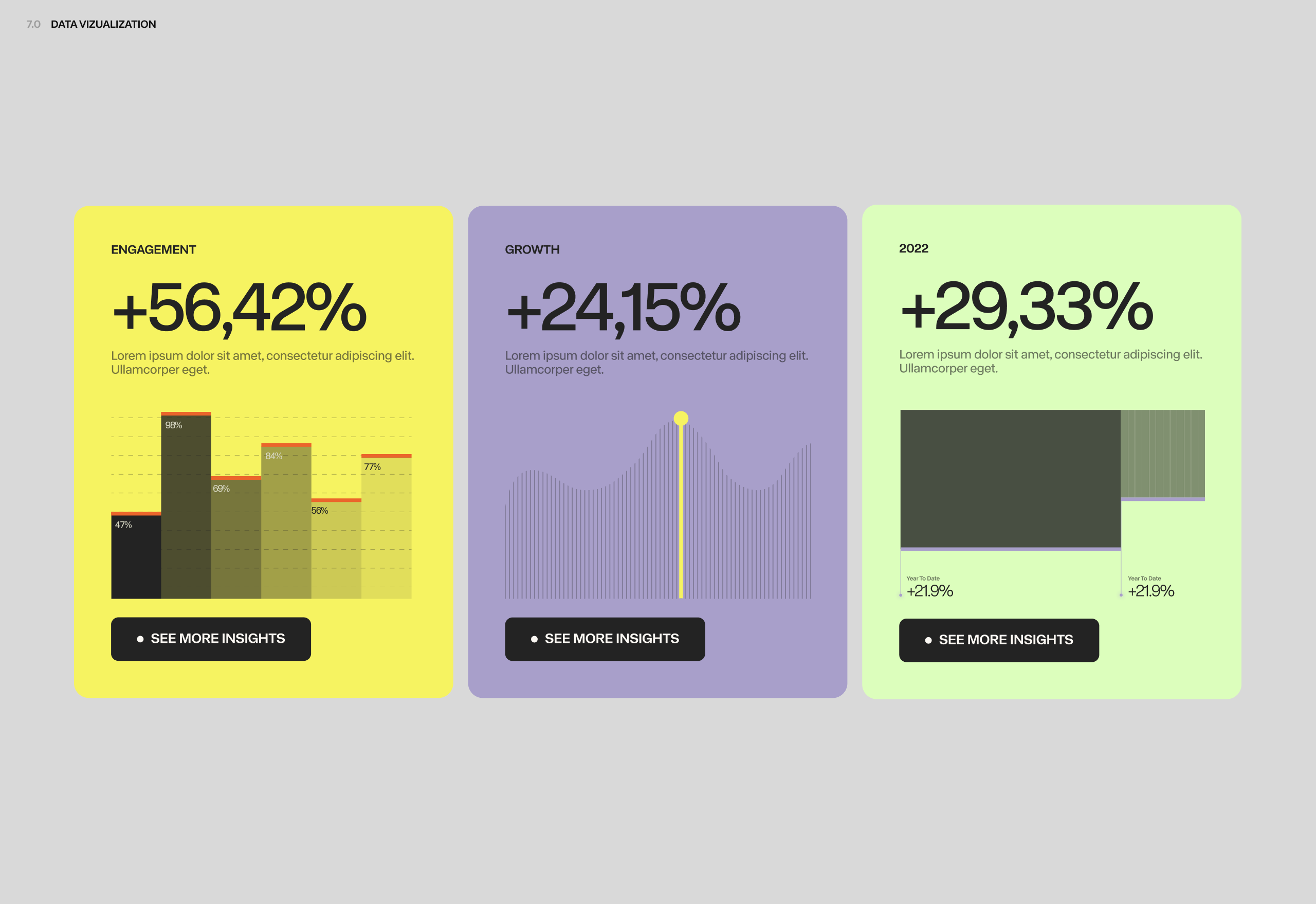
A modern data visualization dashboard featuring three metric cards with bold percentage increases displayed prominently. The design uses a vibrant, contrasting color palette with clean typography and minimalist chart graphics to communicate key performance indicators in an accessible, contemporary style.
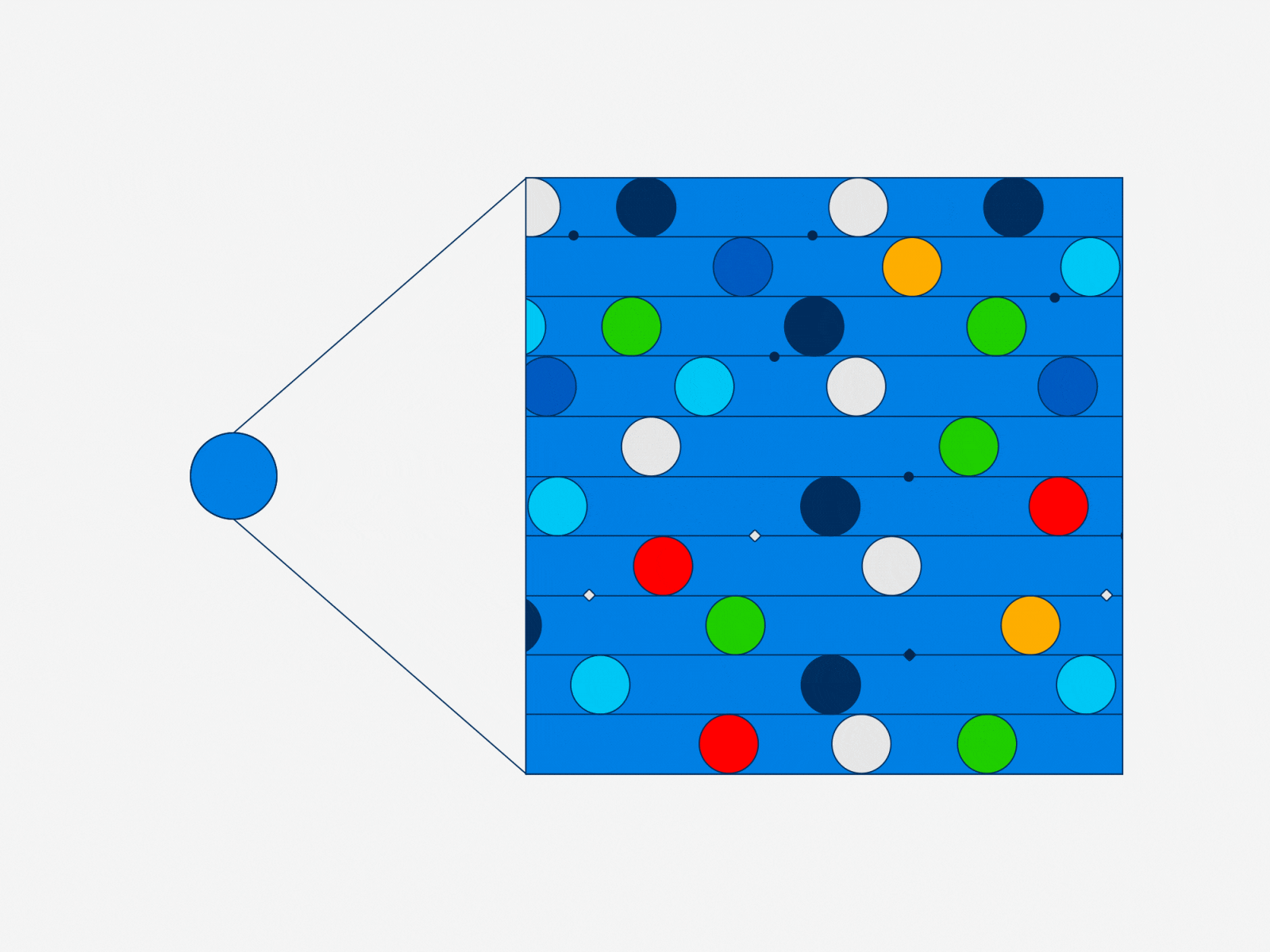
A minimalist infographic featuring a blue node-and-link diagram with a central blue circle connected by lines to a larger grid of colorful circles on a vibrant blue background. The design uses a clean, geometric approach with a modern data visualization aesthetic.
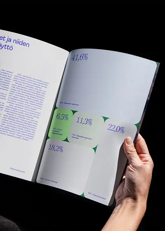
A modern data visualization publication spread featuring statistical infographics with percentage metrics and directional indicators. The design employs a clean, minimalist aesthetic with strategic use of color to highlight key data points against a predominantly white background. The composition demonstrates professional editorial design with emphasis on readability and visual hierarchy.