analytics
244 designs
Showing 24 of 244 (244 total)
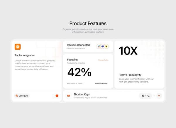
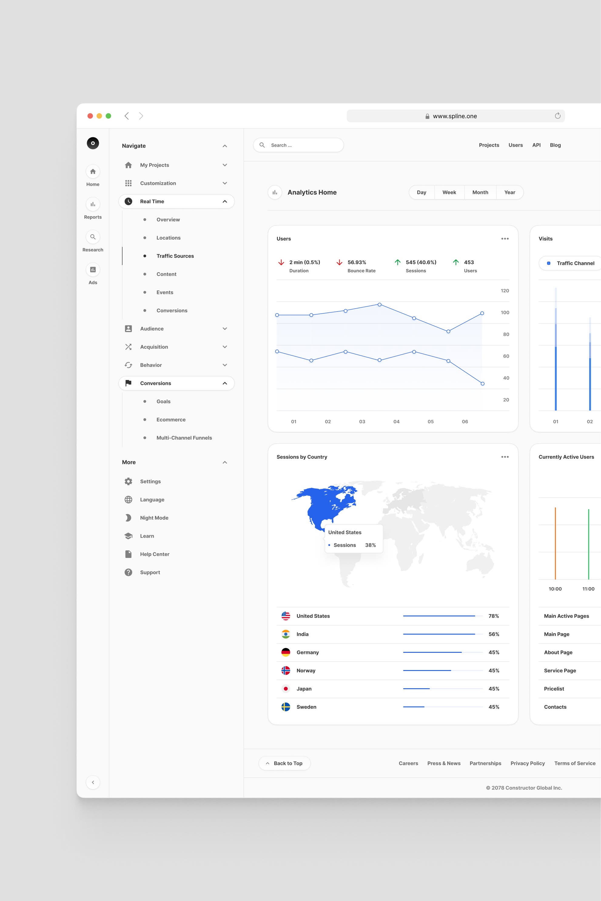
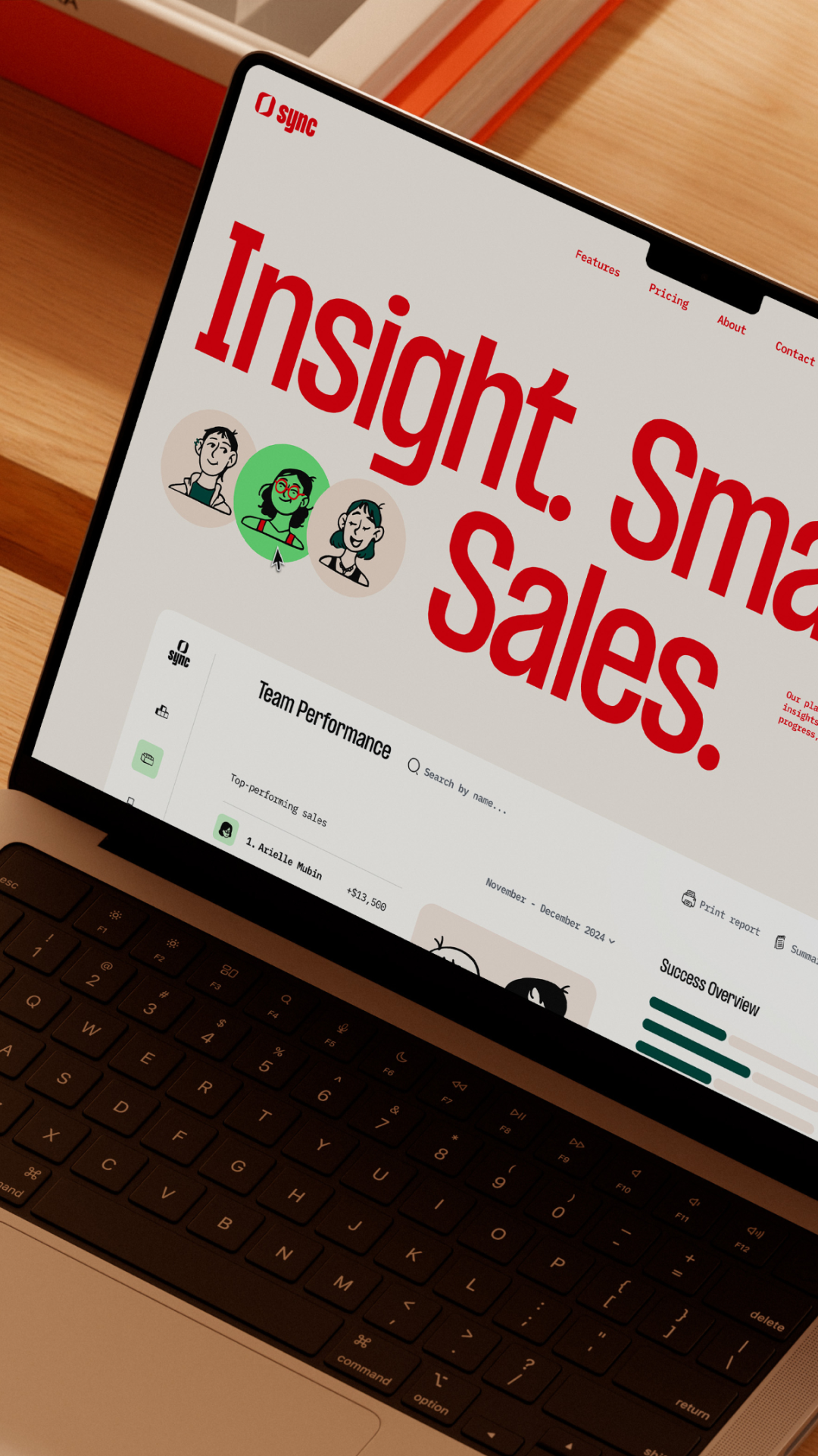
The design employs a clean, minimalist aesthetic characterized by ample white space and clear card-based segmentation for presenting product features. The visual language is professional and data-focused, relying on strong typography and subtle accent colors to guide the user experience.
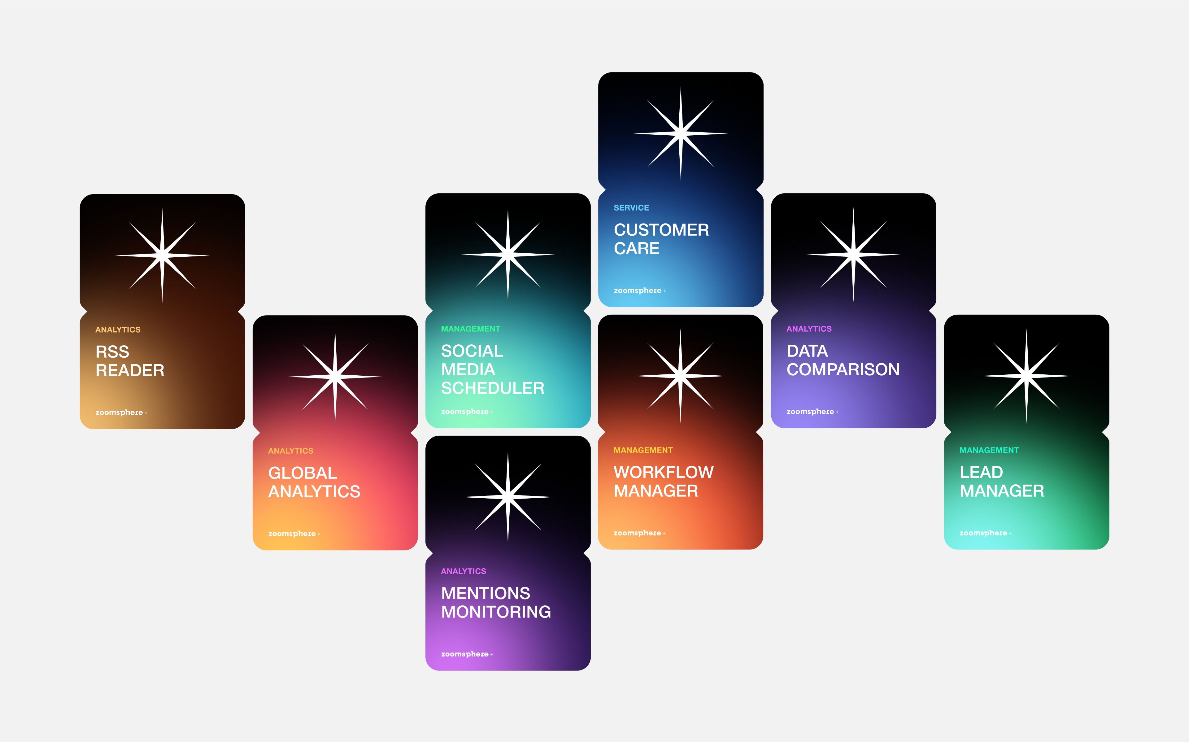
This design utilizes a dark, modular aesthetic to present various analytical tools or services. The visual language is clean and modern, relying on distinct blocks of color to differentiate functional modules while maintaining a consistent starburst icon motif.
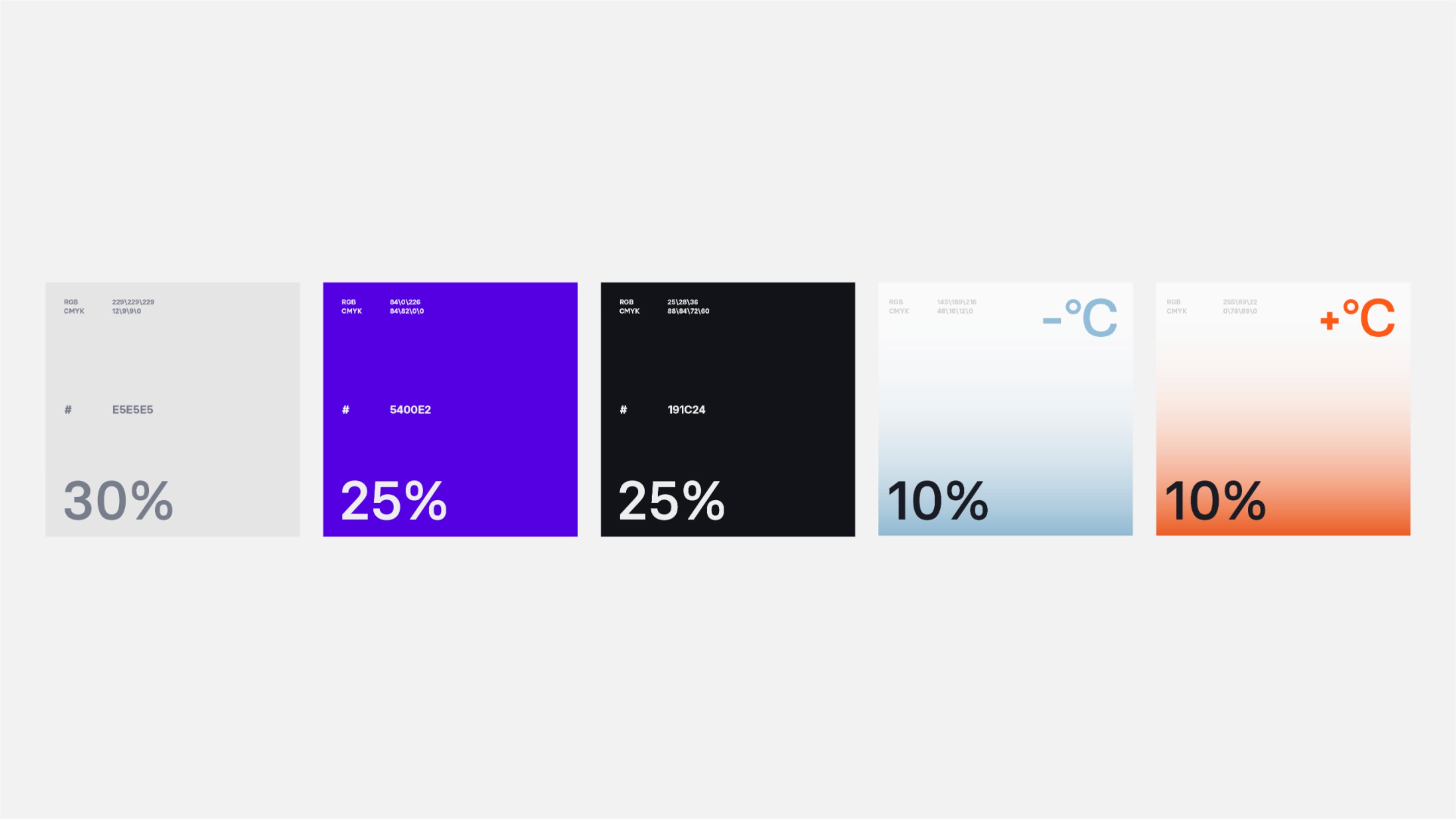
This image presents a clean, modern data visualization using five distinct panels arranged horizontally. The design relies heavily on color blocking—ranging from cool purples and blacks to warm oranges—to differentiate metrics effectively. The overall visual language is minimalist, precise, and highly structured for quick information consumption.
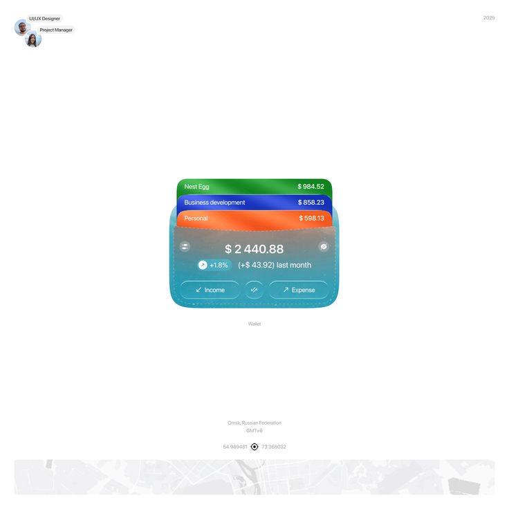
This interface presents a clean, modern data visualization style focused on financial tracking and budgeting. The design utilizes distinct color coding across segmented cards to clearly differentiate between various financial categories, resulting in a highly organized and accessible user experience.
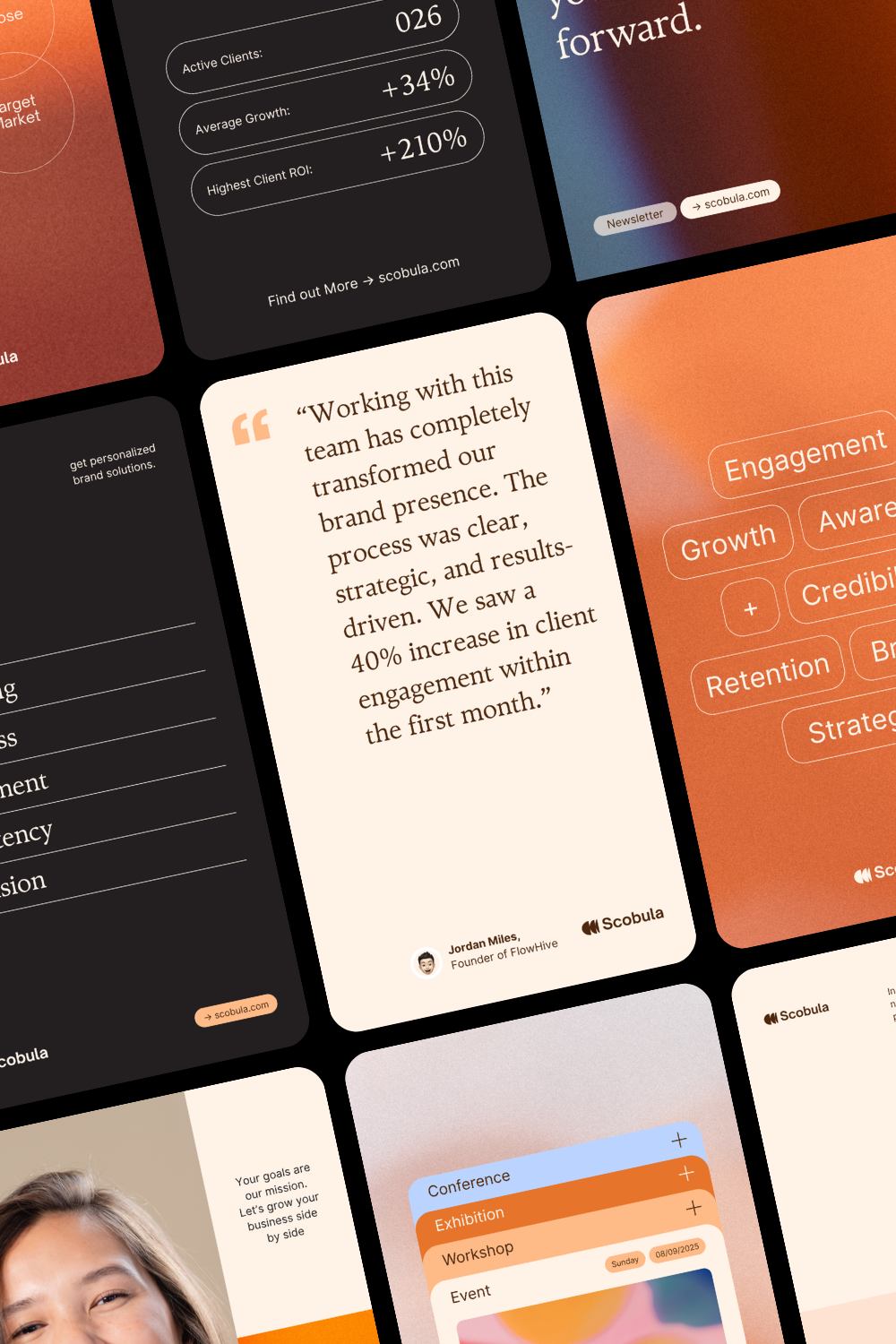
This image displays a series of mockups or screenshots, likely from a web or application interface, characterized by a clean, modern, and professional design aesthetic. The layout uses ample white space and a muted color palette punctuated by soft pastel circles for data visualization.

This illustration uses a clean, flat design aesthetic to depict the interaction between a human element and abstract data visualization. The visual language is modern and graphic, effectively symbolizing measurement, progress, or achievement through the upward trend of the chart. The overall feel is analytical and professional.
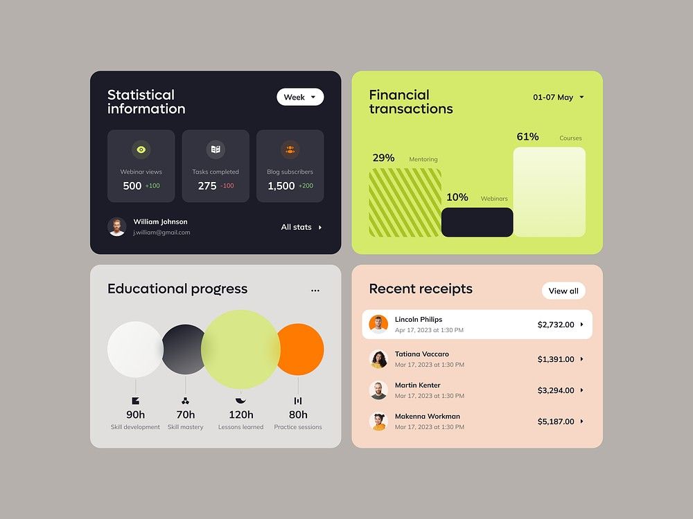
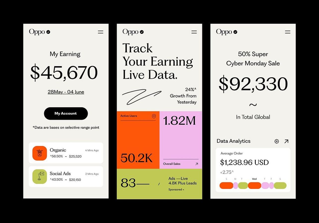
This image showcases a clean, modern dashboard design utilizing card-based layouts to present statistical and financial data. The visual language is minimalist, relying on clear typography and subtle color accents to ensure high readability and data hierarchy. The overall feel is professional, organized, and highly functional.
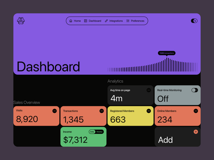
This dashboard features a clean, modern dark mode interface designed for clear data presentation. The design utilizes strong visual hierarchy through distinct color blocks and simple typography to make key metrics immediately accessible. The overall feel is professional, organized, and data-focused.
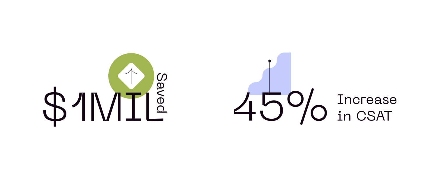
This design utilizes a clean, minimalist aesthetic to present key performance indicators (KPIs) clearly. The visual language relies on simple typography and a single, recognizable icon to convey financial savings and service improvement metrics effectively.

This design uses an abstract, fluid line graphic to symbolize complex data networks and connectivity. The visual language is clean and modern, employing soft gradients and interconnected nodes to convey themes of innovation and problem-solving. The composition is balanced, pairing clear textual information with dynamic visual metaphors.
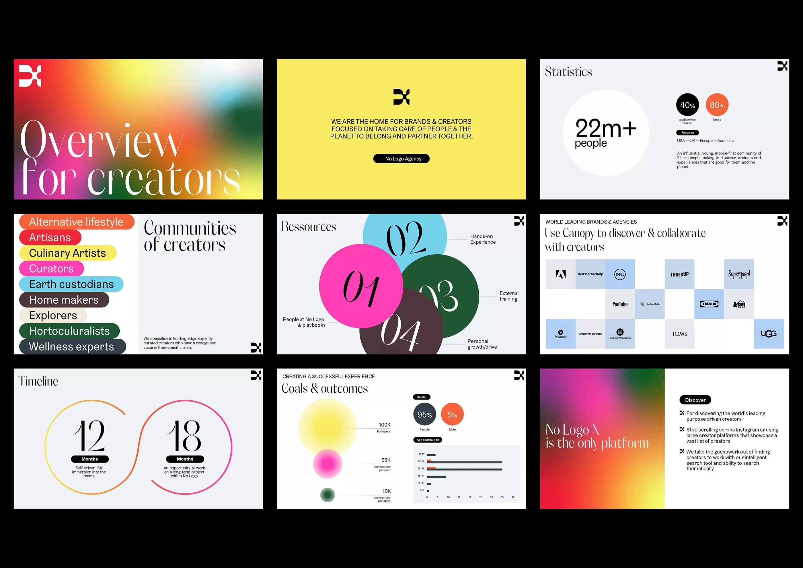
This collection of screens showcases a modern, clean user interface design characterized by vibrant yet balanced color accents and clear data visualization. The visual language is professional and organized, utilizing ample whitespace to ensure readability across various content types. The overall feel is energetic, trustworthy, and focused on creator-centric metrics.
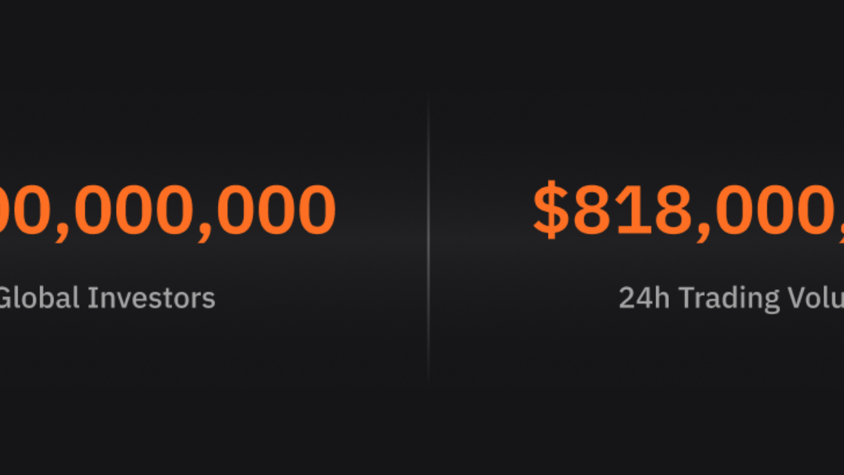
This design utilizes a high-contrast, dark theme to present key financial metrics clearly. The visual language is minimalist and direct, focusing entirely on large numerical data to convey scale and importance.
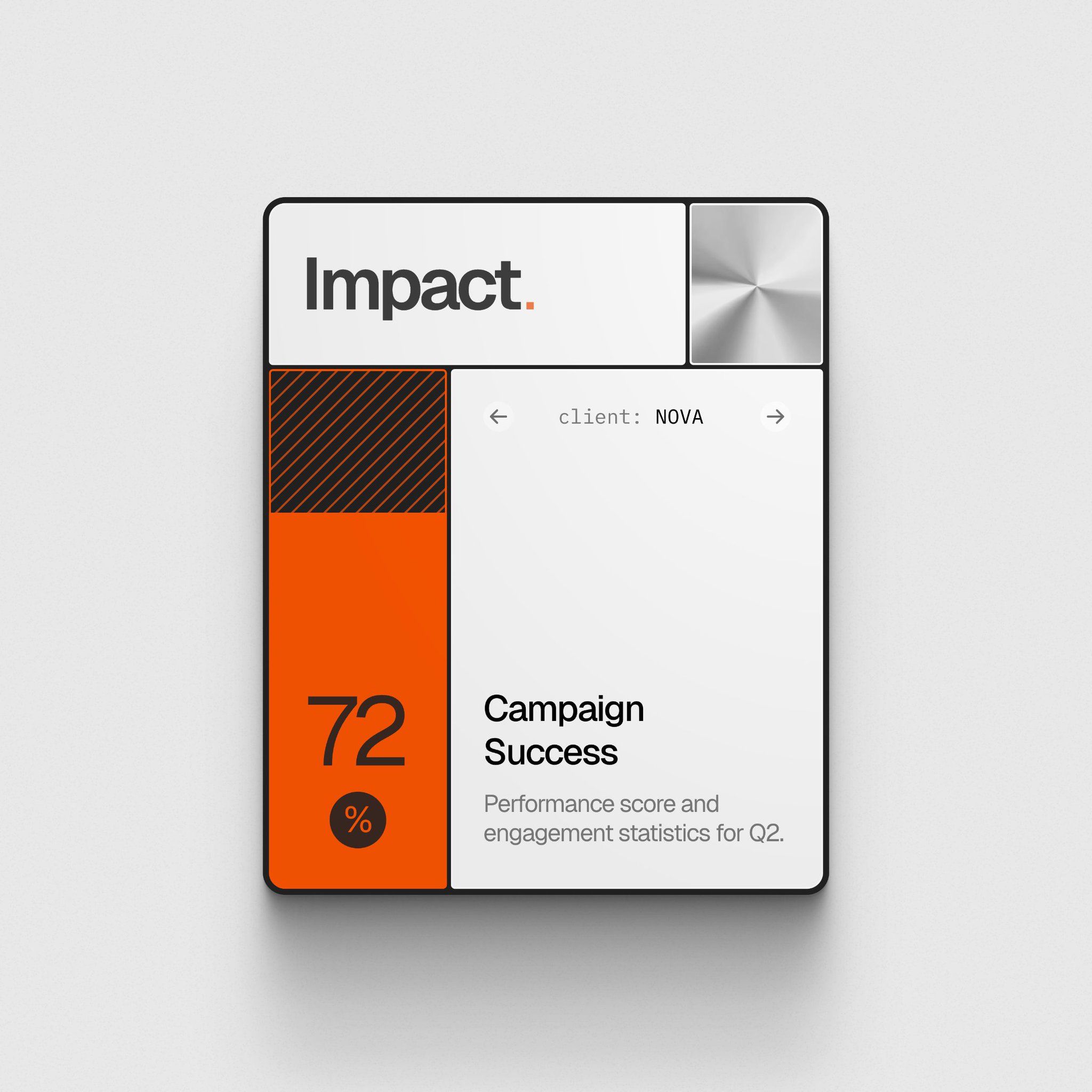
This design features a clean, modern user interface focused on presenting performance data through clear visual hierarchy and strong color blocking. The layout is minimalist, utilizing negative space effectively to draw attention to key metrics like the 72% success score.
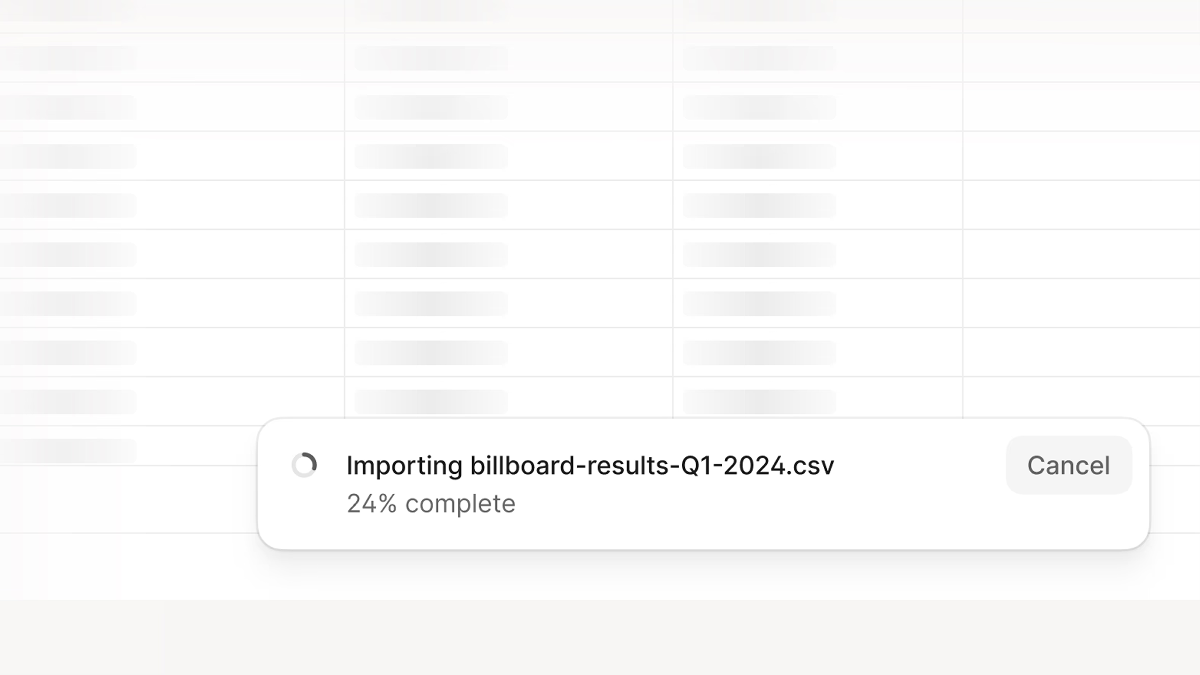
The design exhibits a clean, functional aesthetic typical of modern user interface design, prioritizing clarity and task feedback. The visual language relies heavily on negative space and subtle grid lines to provide structure without distraction.
This interface presents a clean, professional, and highly functional data dashboard utilizing a minimalist design approach. The visual language relies heavily on ample white space and clear segmentation to ensure data readability and intuitive navigation. The overall feel is modern, organized, and focused purely on analytical performance.
This image showcases a modern, data-driven interface design utilizing a dark mode aesthetic with warm orange accents. The visual language is clean, professional, and highly focused on presenting metrics and insights through modular card layouts.
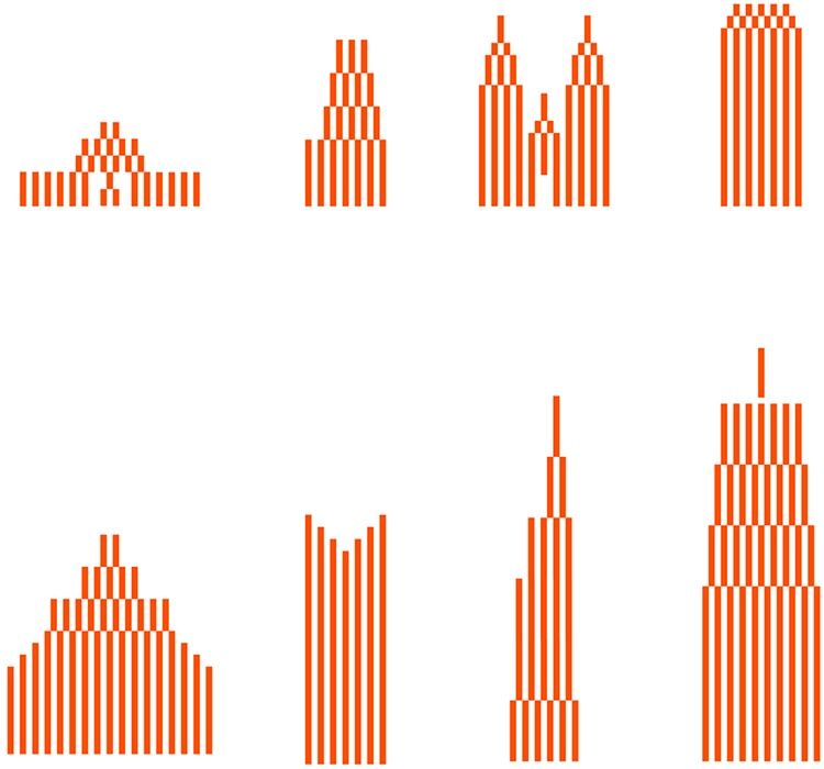
This image presents a series of minimalist vertical bar charts, utilizing a monochromatic palette to visualize data distribution or growth patterns. The design emphasizes structure and quantitative representation through the consistent use of orange lines against a stark white background.
This collection showcases a clean, modern user interface focused heavily on data visualization and metric display. The design utilizes clear segmentation and circular charts to present complex information in an easily digestible format, emphasizing clarity and professionalism.
This interface features a clean, modern design emphasizing data insight through strong typographic hierarchy and ample negative space. The visual language is professional and analytical, using bold typography to immediately draw attention to key metrics and core concepts.
This design utilizes a clean, card-based layout typical of modern analytics dashboards, prioritizing data clarity and hierarchy. The visual language is minimalist yet functional, using distinct color blocks to segment different metrics effectively. The overall feel is professional, analytical, and highly organized.
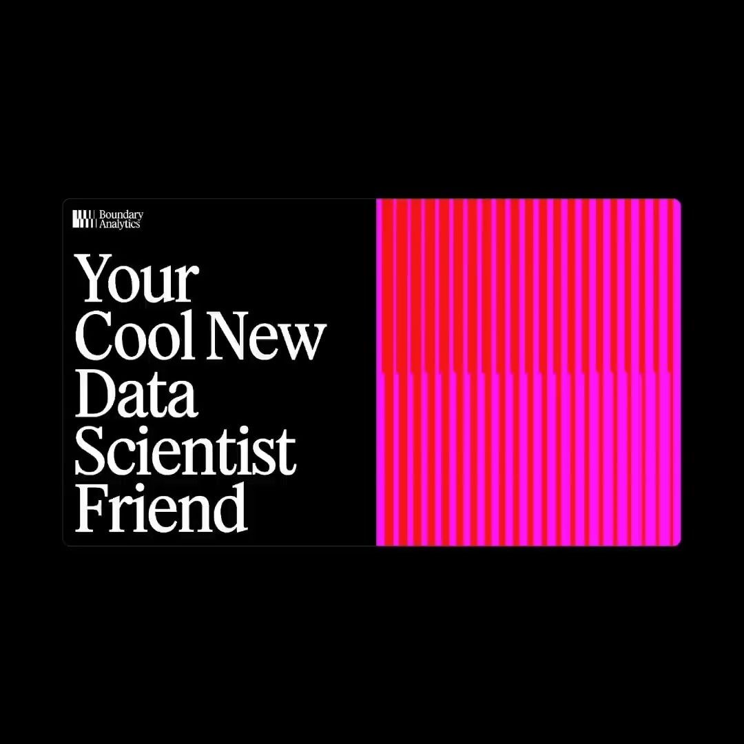
This design utilizes a strong split composition, contrasting clean white typography with a vibrant vertical block of magenta stripes against a dark background. The visual language is modern and energetic, effectively using color blocking to draw attention to the implied subject matter.
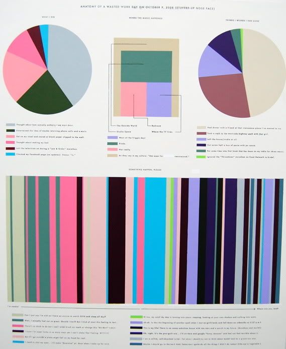
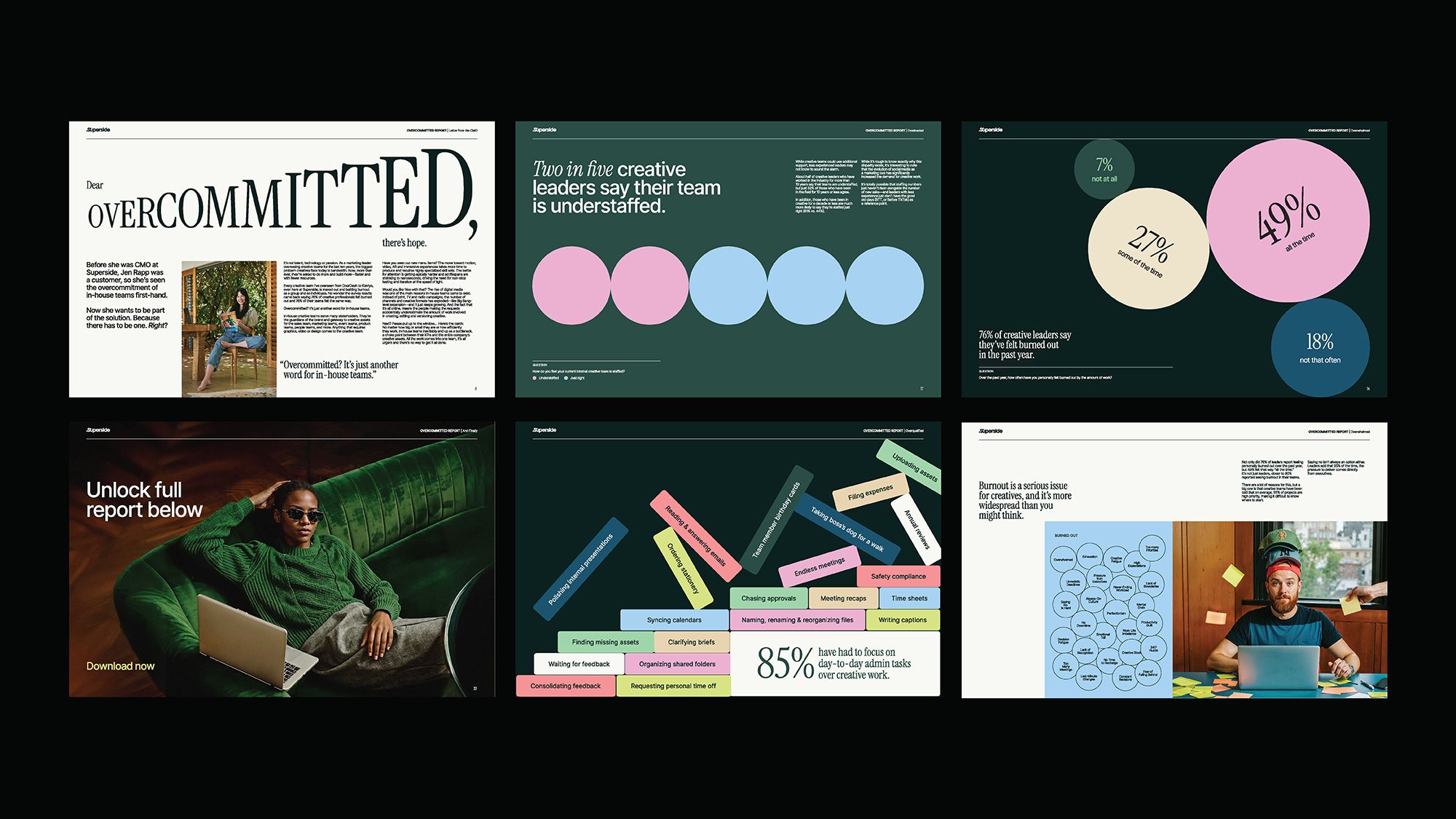
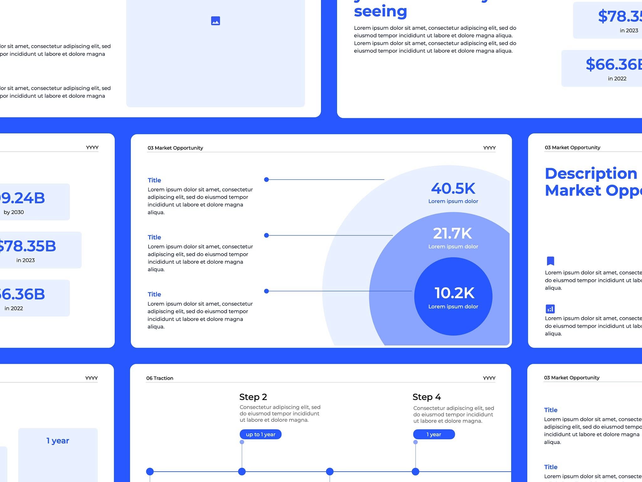
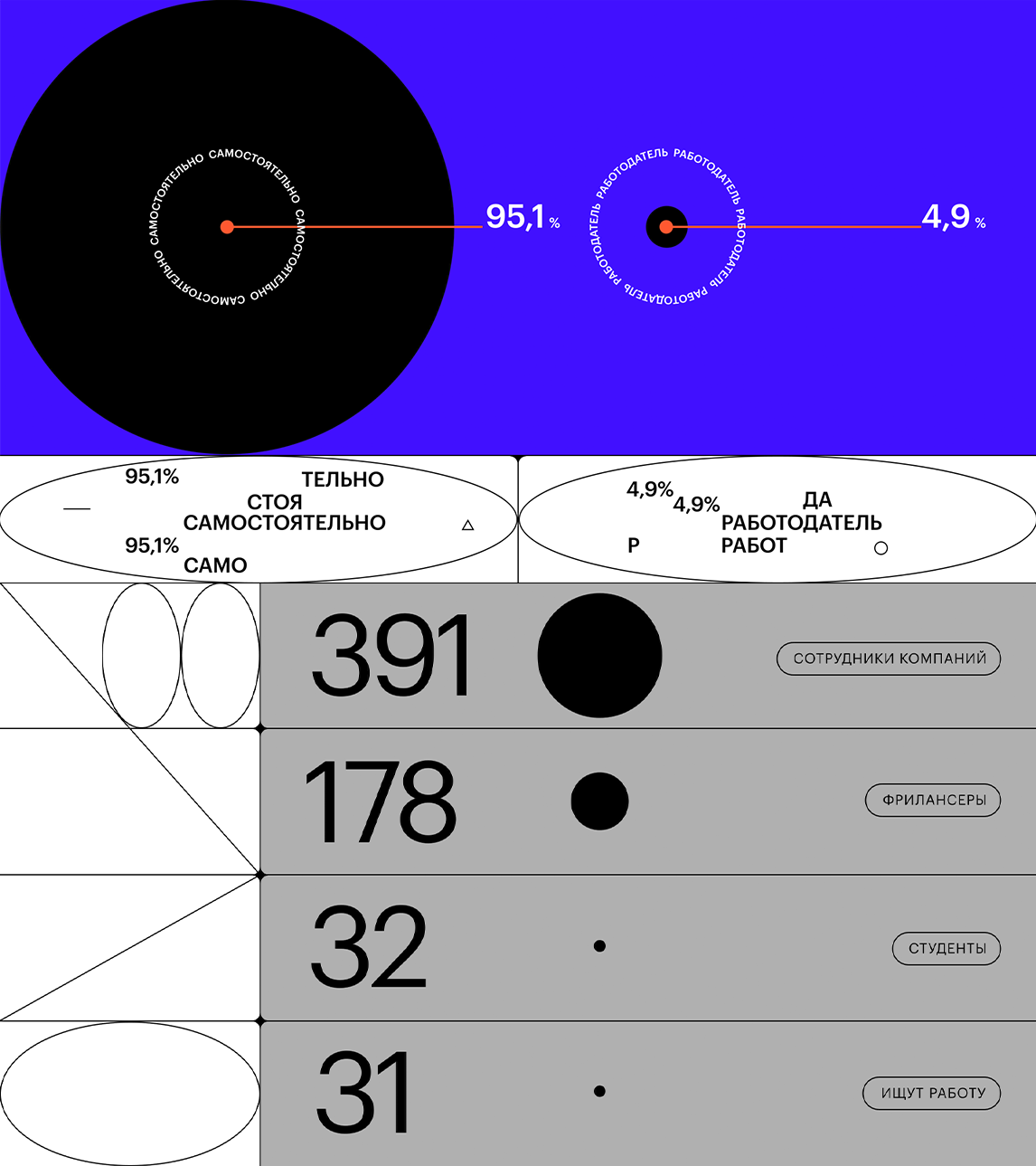
The image presents a complex, data-driven visualization combining a large pie chart with numerous bar graphs and segmented charts. The design is highly structured, utilizing a limited yet varied color palette to convey detailed statistical information in a dense layout.
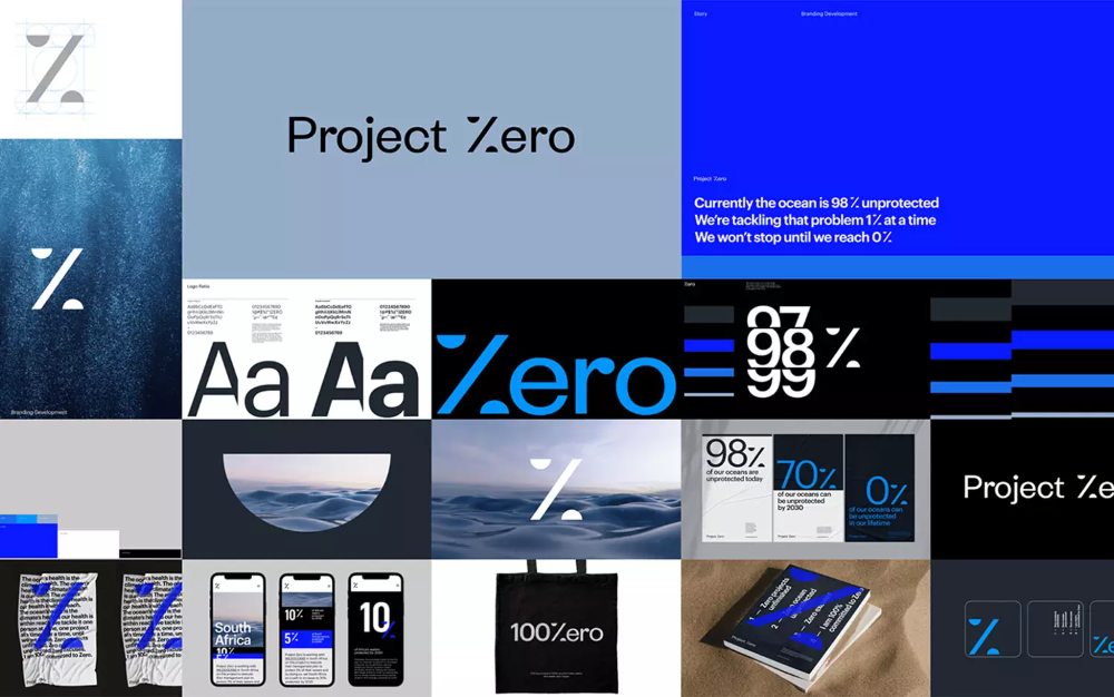
The design utilizes a stark, minimalist aesthetic dominated by shades of blue and black, employing large typography and geometric shapes to convey a sense of technical precision and focus. The visual language is clean, modern, and heavily reliant on percentage-based data visualization.
The image presents a stark, minimalist data visualization using a high-contrast color scheme against a deep blue background. It employs simple geometric shapes and clear percentage indicators to convey statistical information in a direct, analytical manner.