software
759 designs
Showing 24 of 759 (759 total)
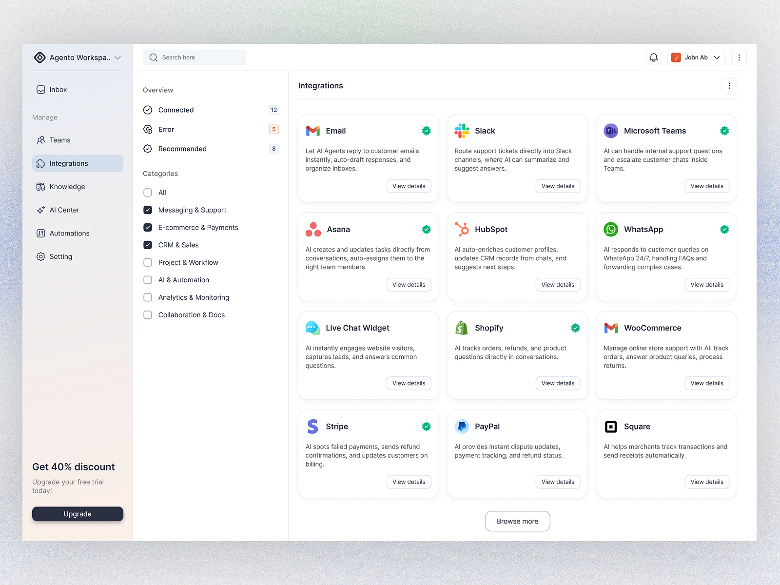
This interface presents a highly functional and organized dashboard typical of a Software as a Service (SaaS) application. The visual language is clean, minimalist, and relies on clear segmentation to manage complex settings and integrations effectively.
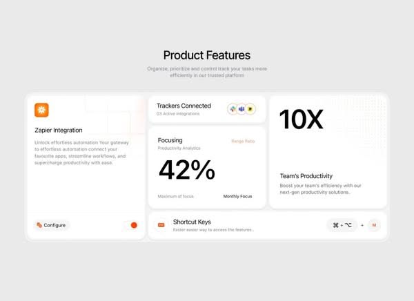
The design employs a clean, minimalist aesthetic characterized by ample white space and clear card-based segmentation for presenting product features. The visual language is professional and data-focused, relying on strong typography and subtle accent colors to guide the user experience.
This design exemplifies modern minimalism through stark, high-contrast typography. The visual language is clean and direct, relying on strong geometric forms to convey a sense of professionalism and technical clarity. The overall feel is sophisticated, precise, and highly functional.
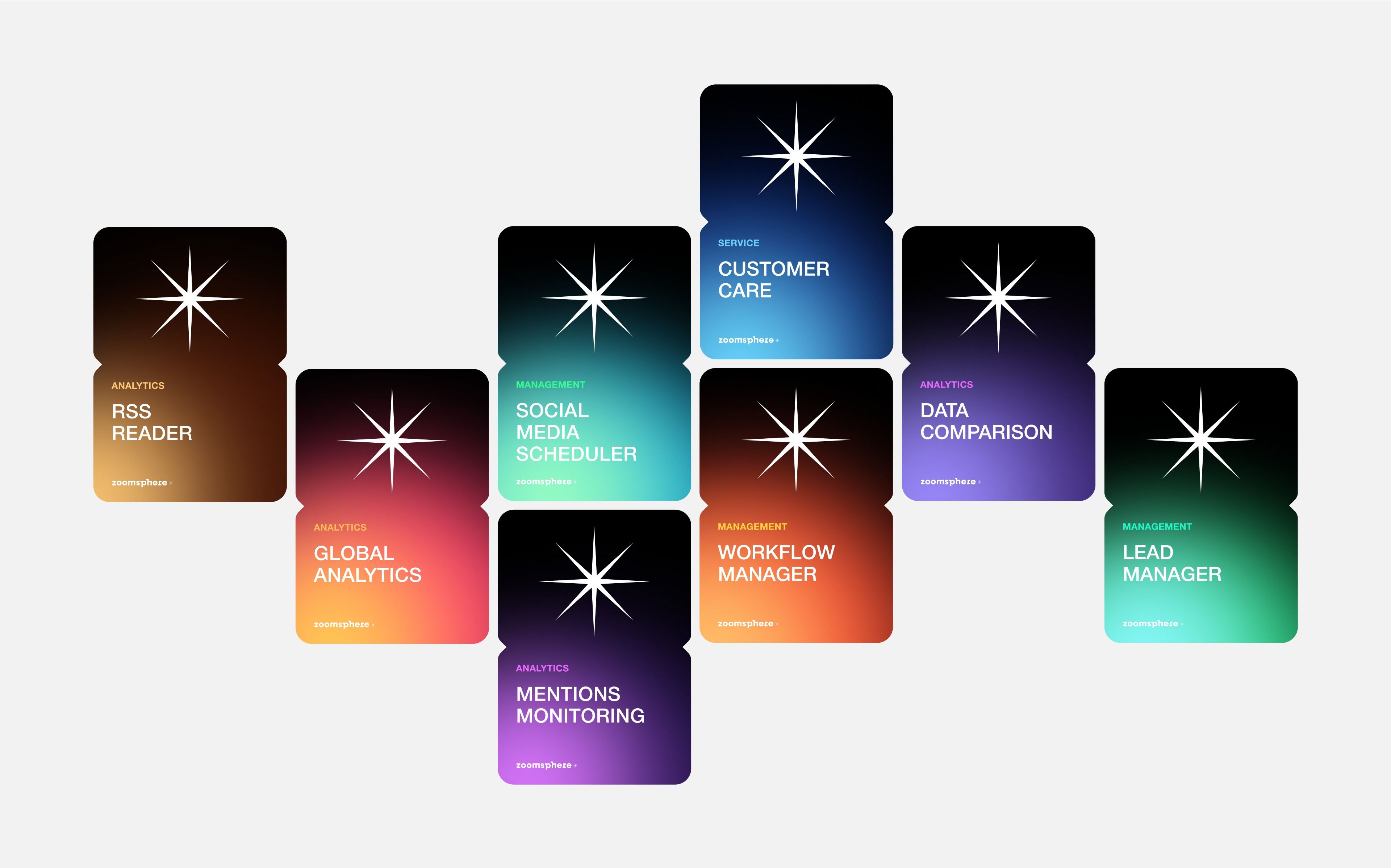
This design utilizes a dark, modular aesthetic to present various analytical tools or services. The visual language is clean and modern, relying on distinct blocks of color to differentiate functional modules while maintaining a consistent starburst icon motif.
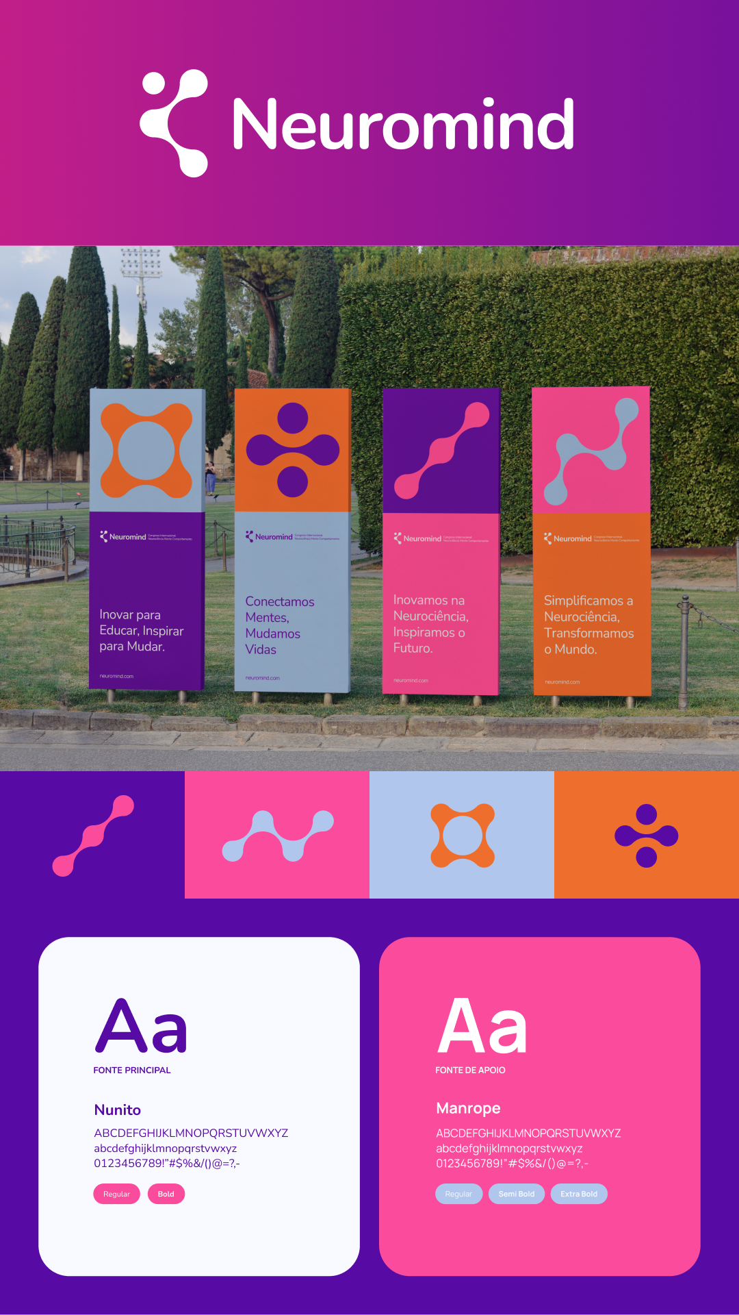
This design utilizes a vibrant yet sophisticated color palette and clean geometric shapes to convey a sense of innovation and connectivity. The layout is highly structured, employing vertical cards against a natural background to organize complex information clearly. The overall visual language is modern and professional, suggesting a focus on scientific or technological solutions.
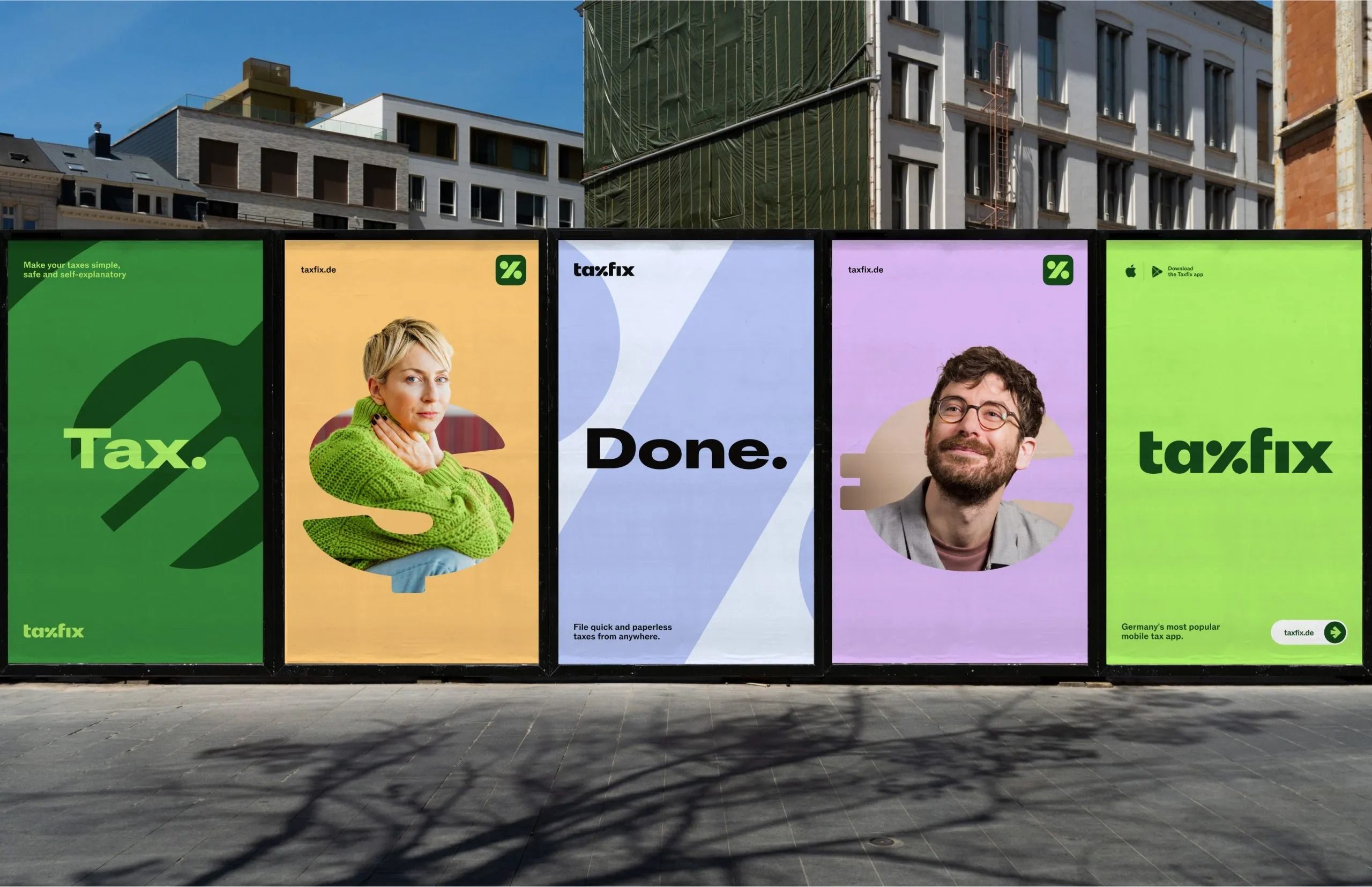
This visual presentation utilizes a clean, modern flat design aesthetic to showcase a service's progression. The design relies heavily on strong color blocking and clear typography to communicate efficiency and trust effectively. The overall feel is professional, organized, and highly contemporary.
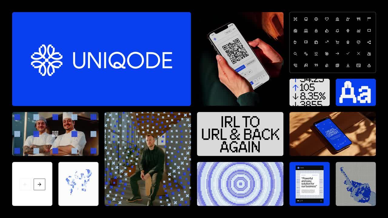
This visual presents a clean, modern digital aesthetic centered around connectivity and technology. The design uses a strong blue palette and geometric elements to convey innovation and precision, suitable for a tech-focused brand. The layout is organized, blending large branding elements with smaller functional icons in a structured grid.
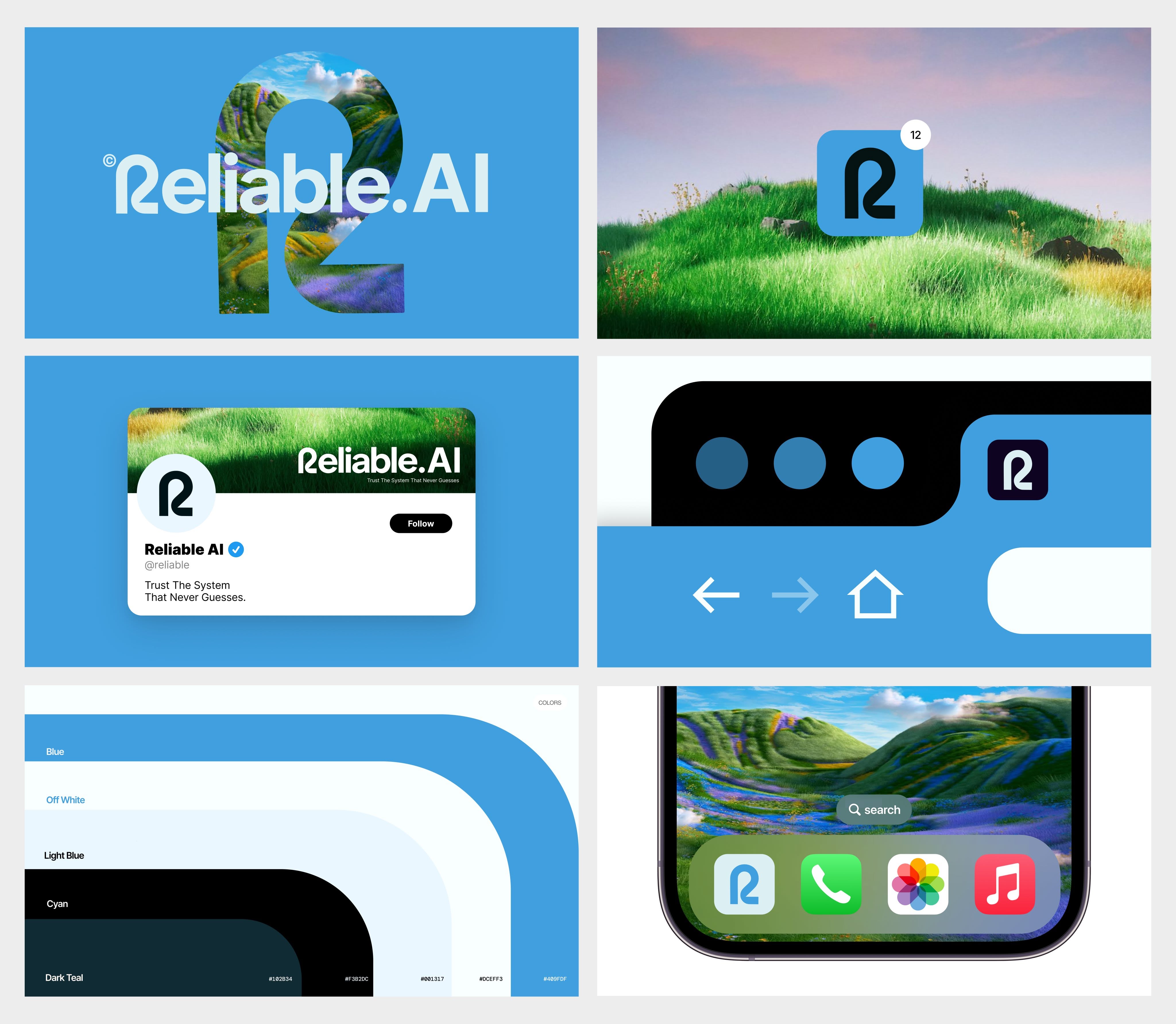
The design utilizes a clean, modern aesthetic blending cool blues and vibrant greens to convey trust and innovation. The visual language is crisp and professional, employing subtle gradients and clear iconography typical of contemporary software branding.

This design utilizes a clean, minimalist aesthetic characterized by bold typography set against a soft, monochromatic green background. The visual language is modern and straightforward, relying on simple shapes and high contrast between the text and the background color.
This is a clean, modern abstract logo mark utilizing geometric lines to suggest upward movement and progression. The design relies on negative space and sharp angles to convey a sense of innovation and stability.
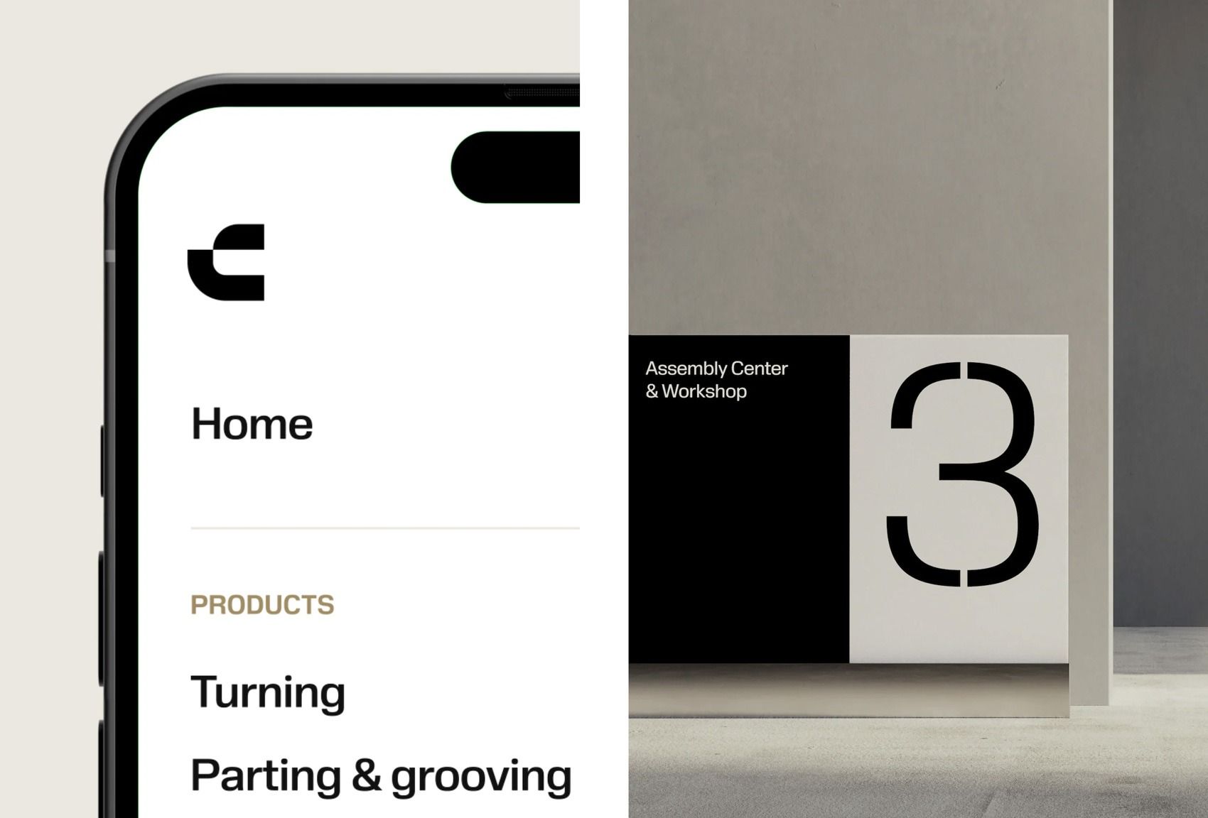
This image showcases a highly functional and minimalist user interface design, emphasizing clean lines and high contrast. The visual language is stark and professional, using negative space effectively to highlight key navigation elements and technical information.
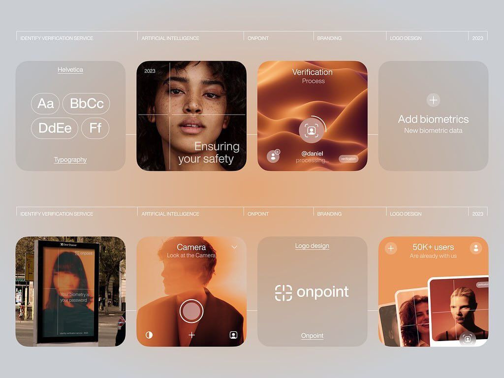
This design showcases a clean, modern UI aesthetic utilizing soft gradients and modular card layouts to present various service offerings. The visual language is professional and trustworthy, employing subtle color transitions and high-quality photographic elements to create an engaging yet sophisticated user experience.
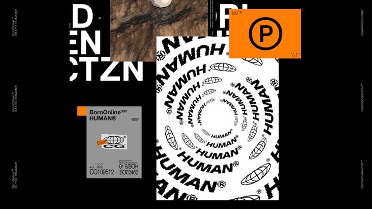
This design utilizes a stark, high-contrast visual language dominated by black and white elements punctuated by an assertive orange accent. The composition is clean and layered, combining bold typography with subtle circular patterns to convey a sense of technical precision and clinical branding.
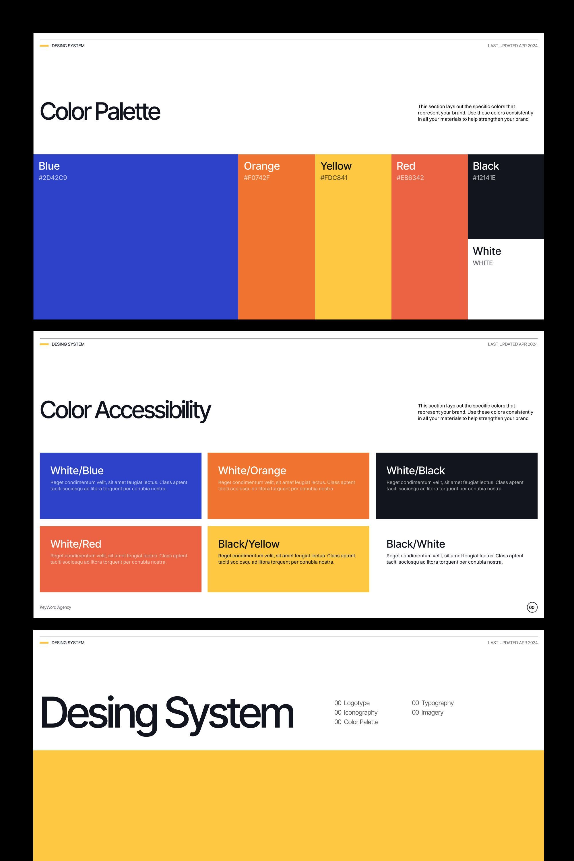
This design showcases a clean, structured approach to presenting color palettes and accessibility information using bold, distinct blocks of color. The visual language is highly organized, relying on strong contrast and clear segmentation to convey technical information effectively.
This design utilizes a clean, modern aesthetic dominated by deep blues and white to convey professionalism and technological expertise. The visual language is structured, relying on clear typography and subtle graphical elements to present data and conceptual ideas effectively. The overall feel is trustworthy, innovative, and corporate.
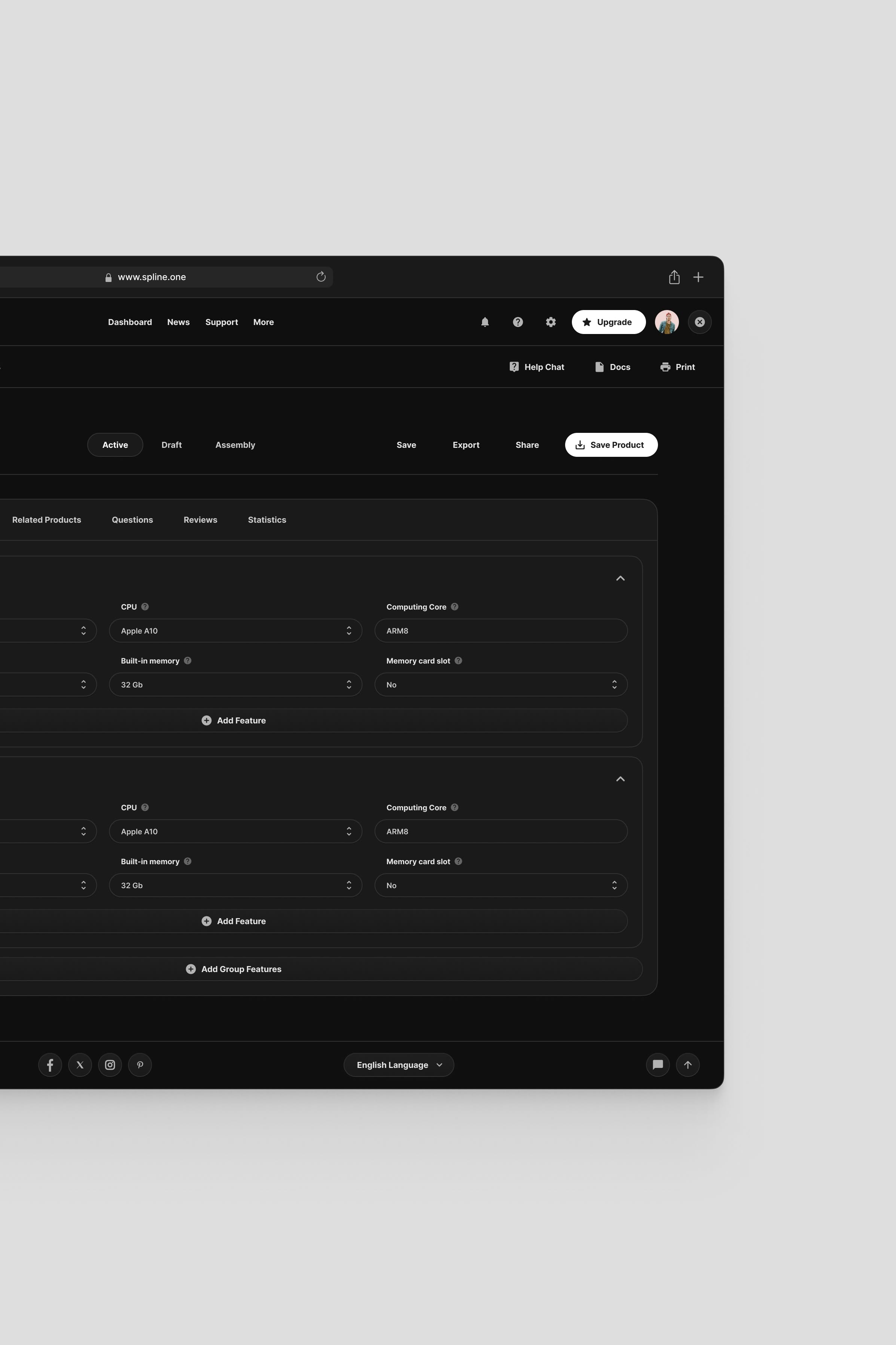
The image displays a dark-mode user interface characterized by a clean, minimalist aesthetic and high contrast. The design prioritizes functionality through structured lists and clear segmentation, creating a professional and focused experience.
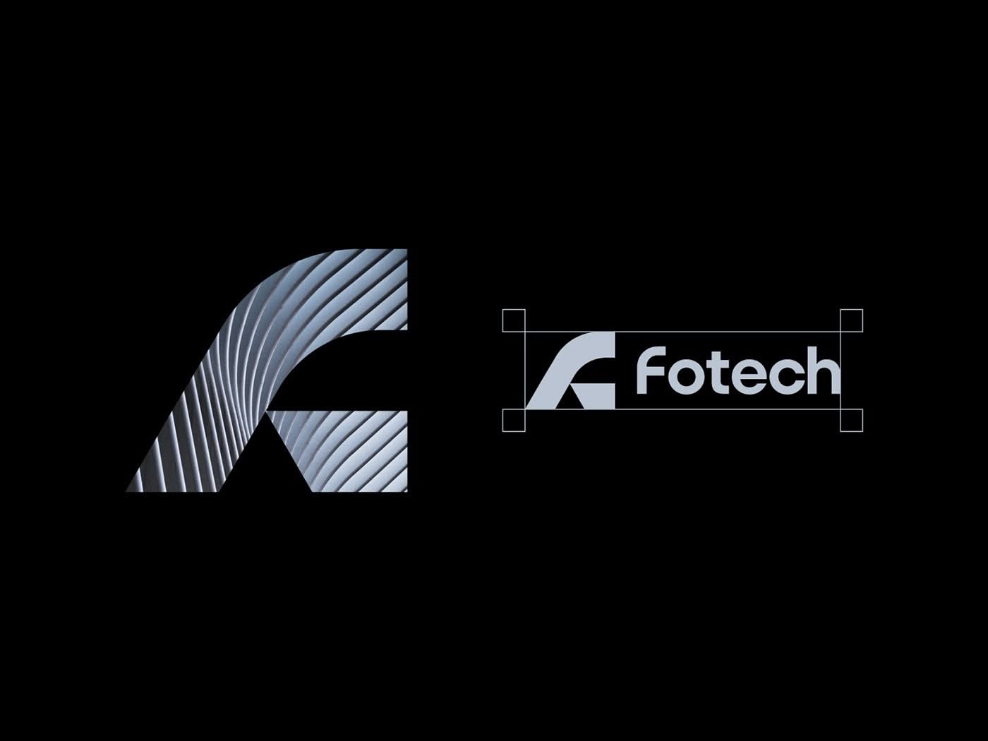
This design features a sophisticated, geometric abstract mark paired with clean, modern typography. The visual language relies on subtle linear patterns and negative space to convey a sense of precision and forward-thinking technology.
This is a minimalist and abstract logo utilizing soft, interconnected geometric shapes to create a cohesive, flowing form. The design relies heavily on negative space and high contrast between the vibrant accent color and the dark background.
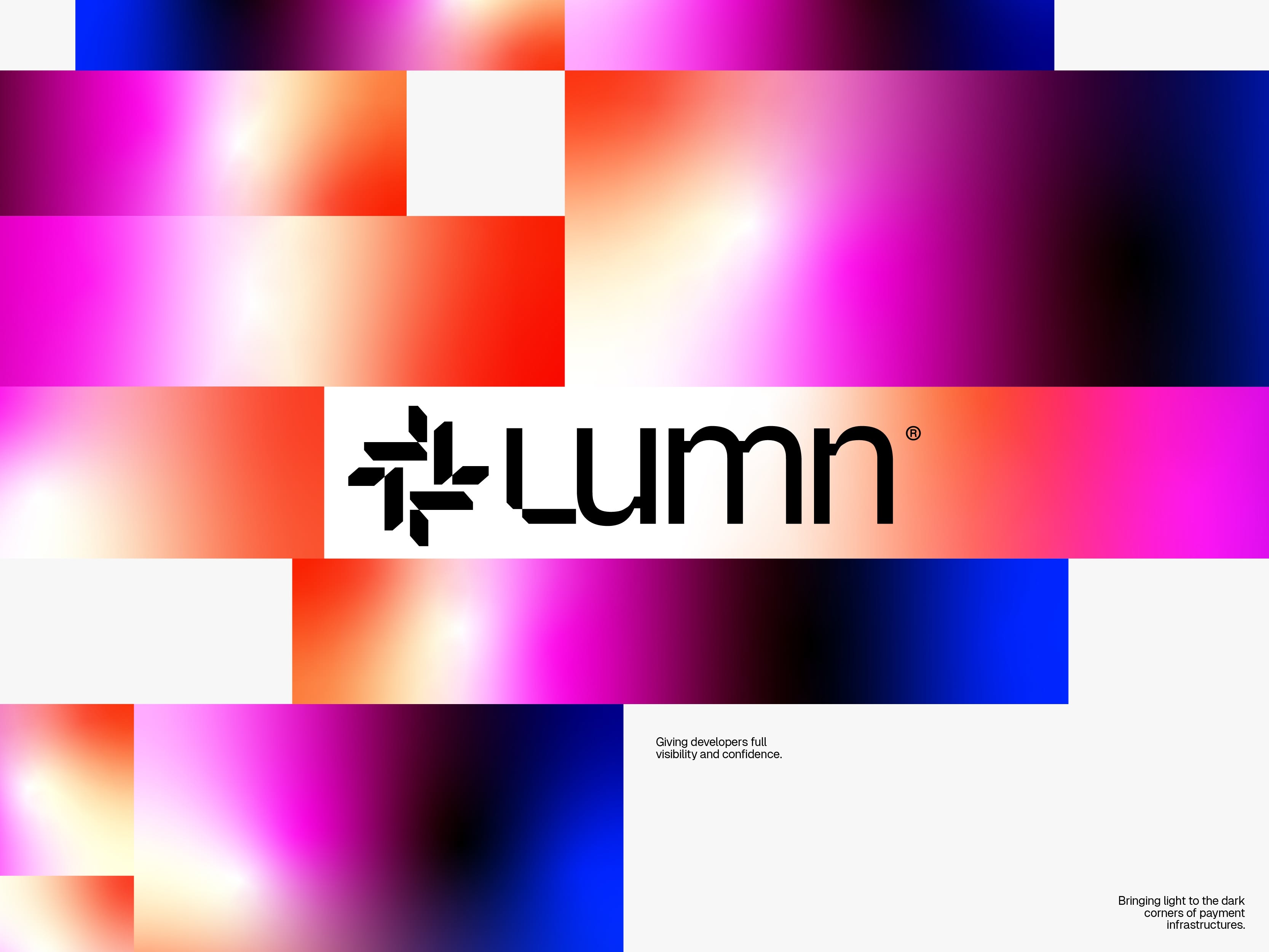
The image features a vibrant, abstract gradient design utilizing bold blocks of color and light effects. It conveys a modern, energetic, and professional feel, emphasizing luminosity and depth through smooth transitions.
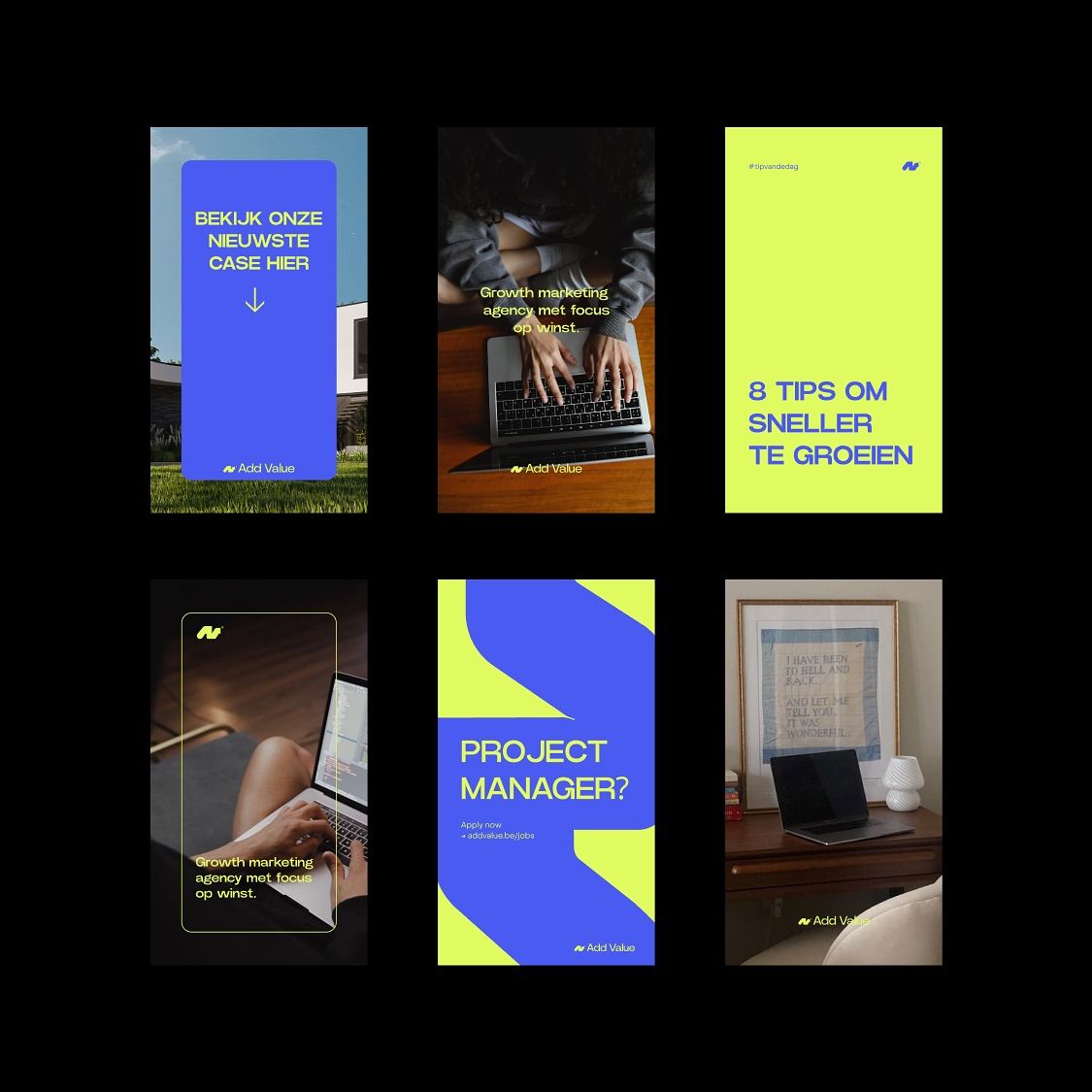
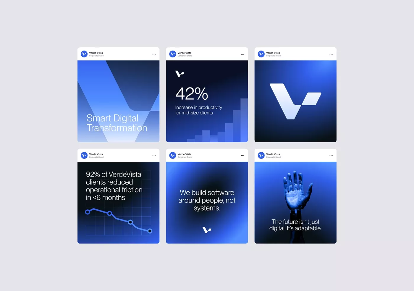
This image presents a series of clean, modern, and professional-looking digital mockups or promotional cards, characterized by strong use of negative space and a limited, vibrant color palette. The design language is minimalist yet informative, aiming for a contemporary business or consulting aesthetic.
The design presents a clean, highly functional interface typical of modern SaaS applications, emphasizing clarity and easy navigation. The visual language relies heavily on ample white space to focus the user's attention on the content.
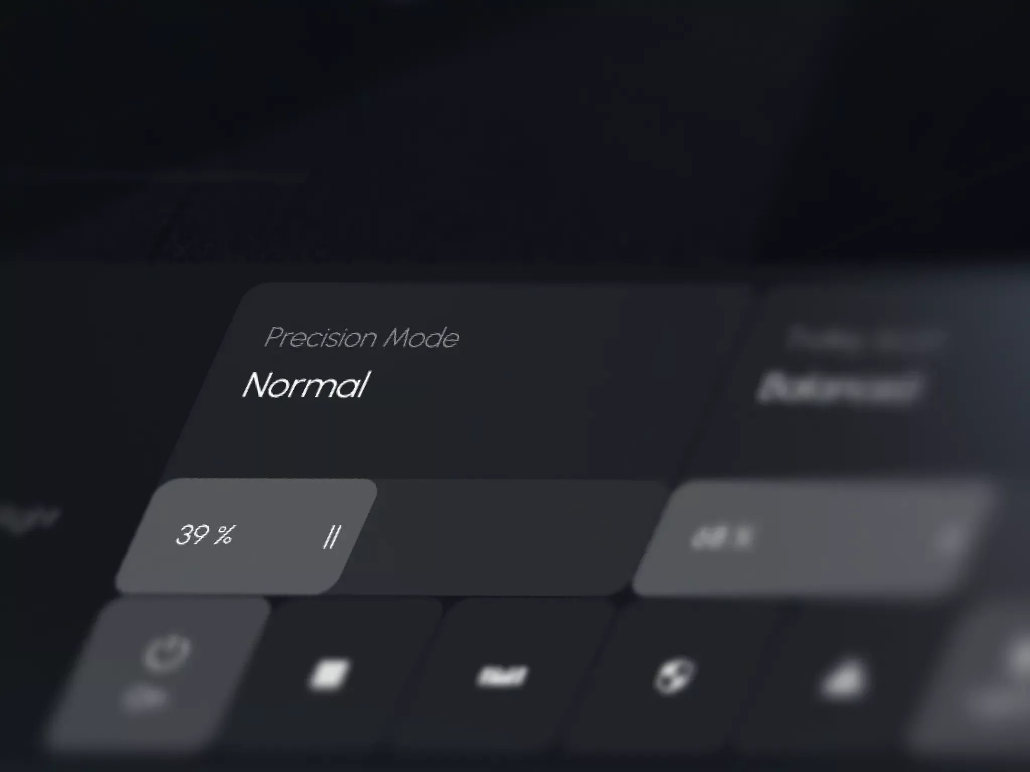
The image displays a dark-themed user interface focused on precision mode settings, characterized by clean lines and functional typography. The visual language is minimalist and technical, prioritizing clarity over ornamentation.
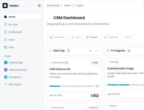
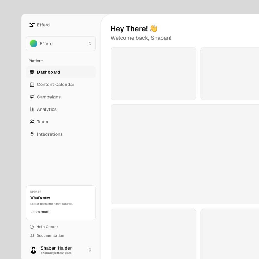
This image presents a clean, highly functional dashboard interface characterized by a standard two-column layout and clear information hierarchy. The visual language is minimalist, relying on ample white space to focus the user on task management and data.
This is a stark and modern wordmark characterized by heavy, geometric sans-serif typography. The design relies on strong negative space and high contrast to convey a sense of solidity and contemporary professionalism.