SaaS
369 designs
Showing 24 of 369 (369 total)
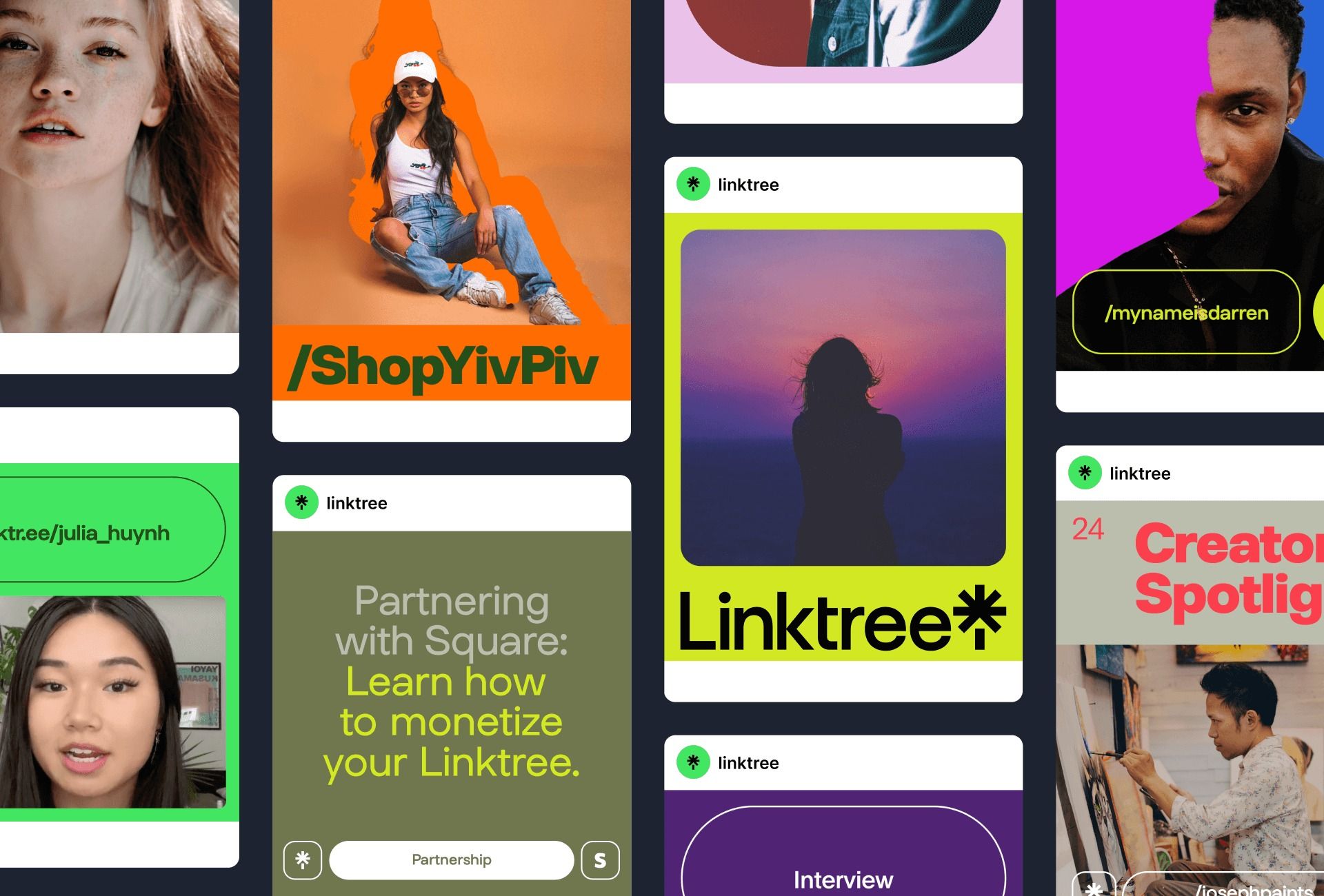
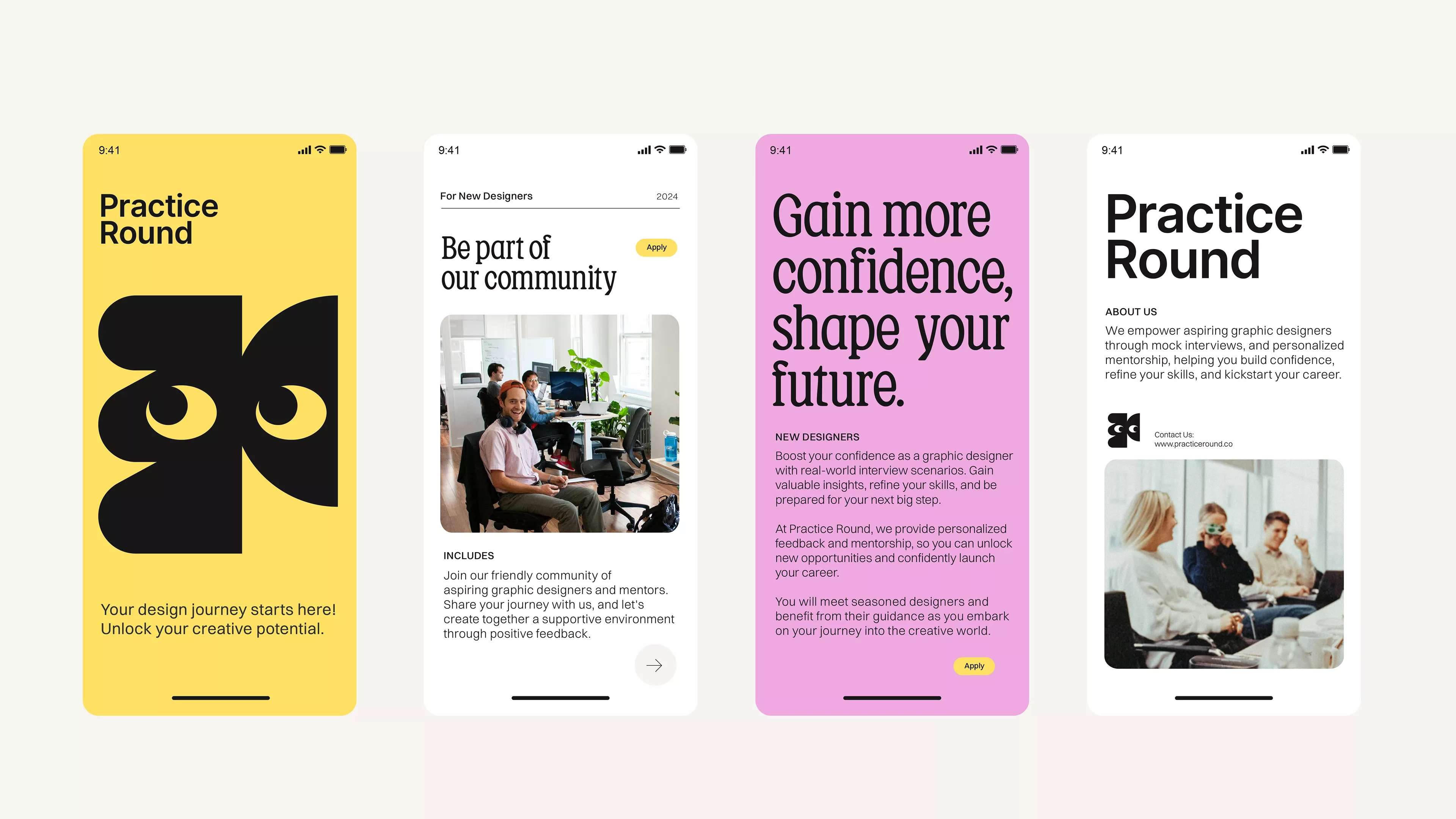
This visual collage showcases a highly modular and vibrant set of digital interfaces centered around personal branding and content monetization. The design utilizes bold color gradients and clean typography to create an energetic yet professional atmosphere suitable for creative professionals.
The design exhibits a clean, functional, and highly structured layout dominated by ample white space, which promotes readability. The visual language is straightforward and professional, focusing attention squarely on the textual content and interactive elements.
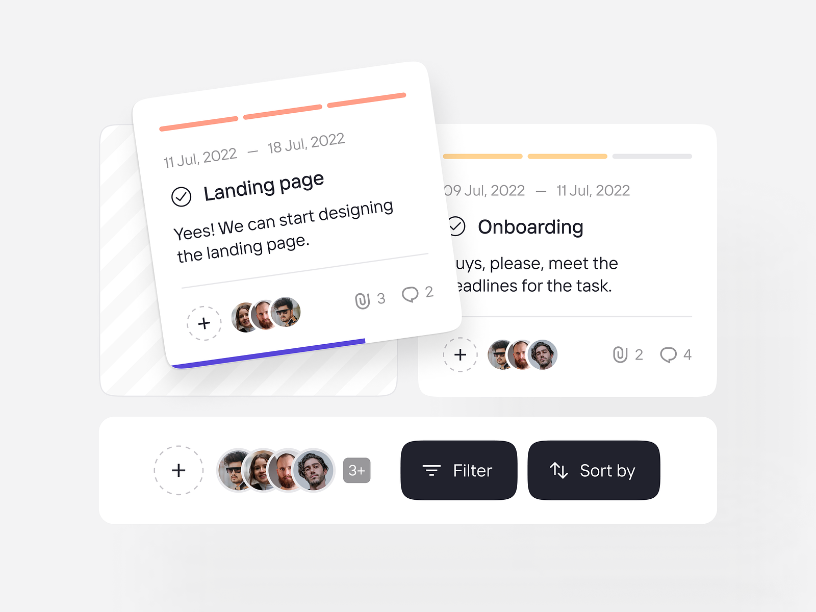
The image displays a clean, minimalist interface for managing user states or onboarding steps, characterized by ample white space and clear card separation. The visual language is highly functional, prioritizing readability and organization over elaborate decoration.
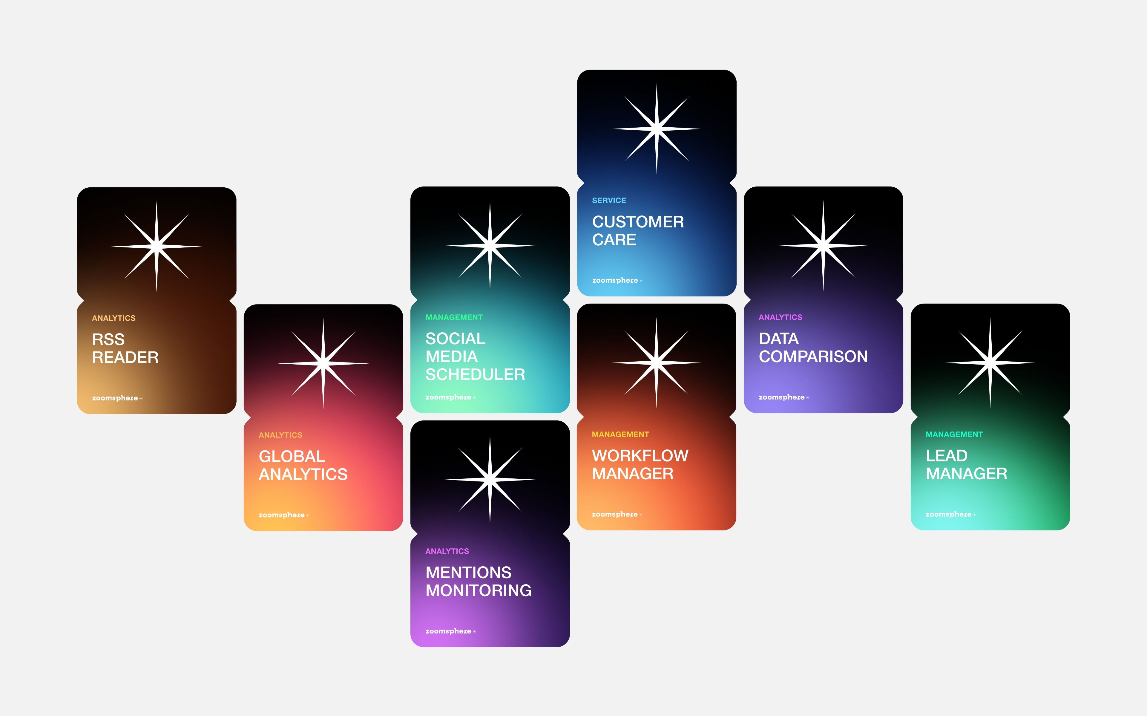
This design utilizes a dark, modular aesthetic to present various analytical tools or services. The visual language is clean and modern, relying on distinct blocks of color to differentiate functional modules while maintaining a consistent starburst icon motif.
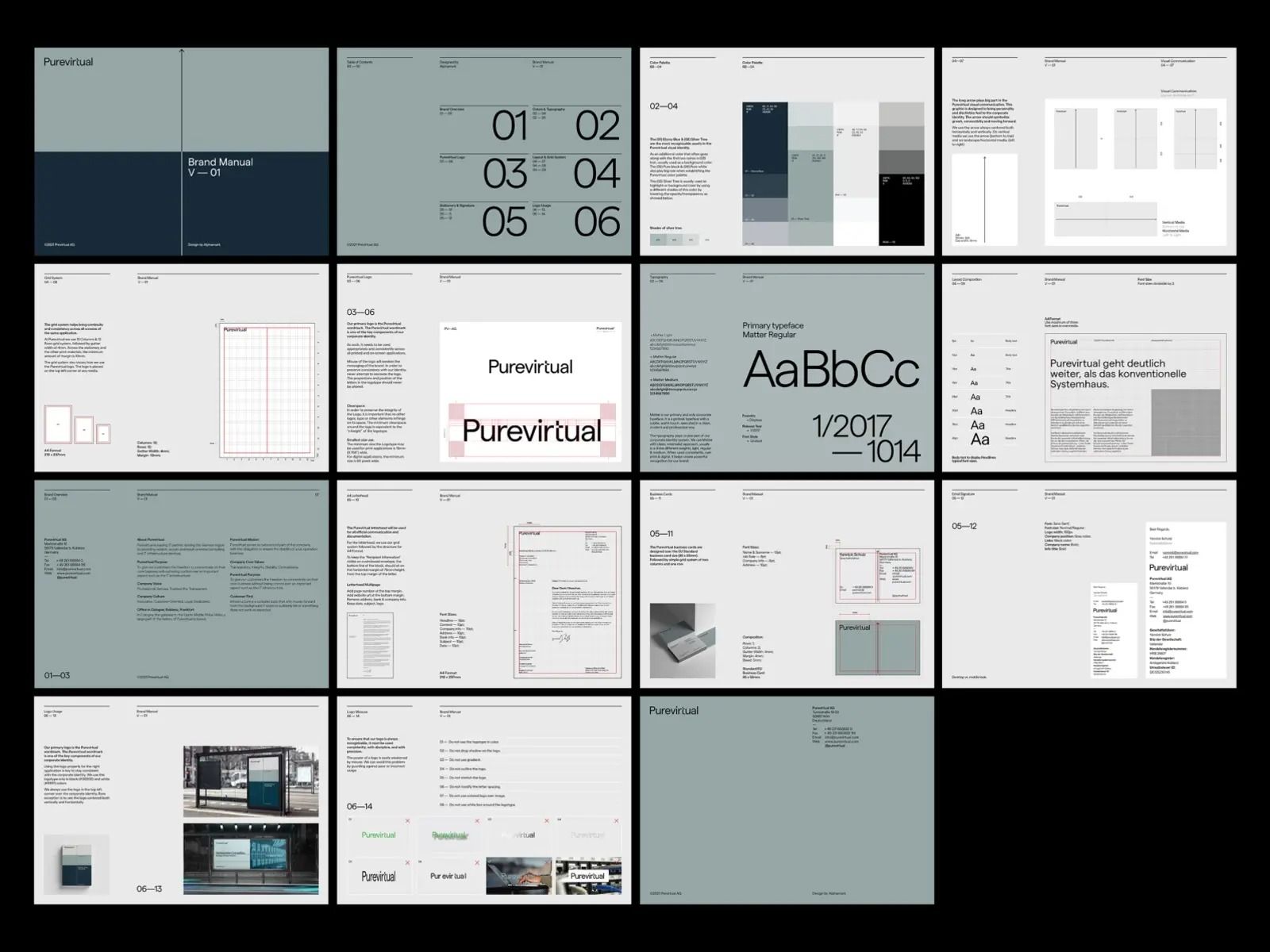
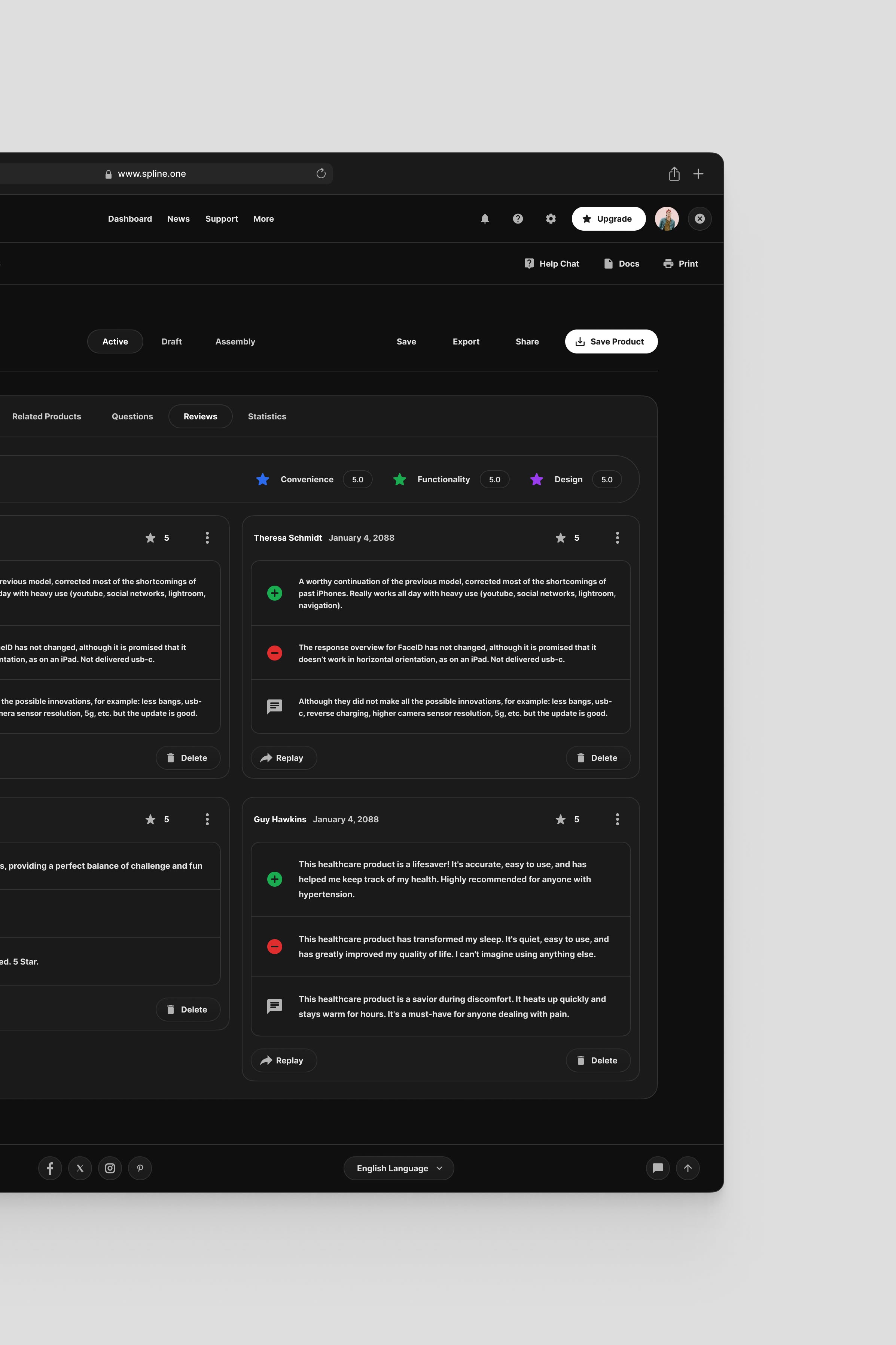
This collection of mockups demonstrates a highly structured and minimalist user interface design, emphasizing clarity and information hierarchy. The visual language relies heavily on ample whitespace and subtle grayscale tones to create a professional, organized, and modern feel.
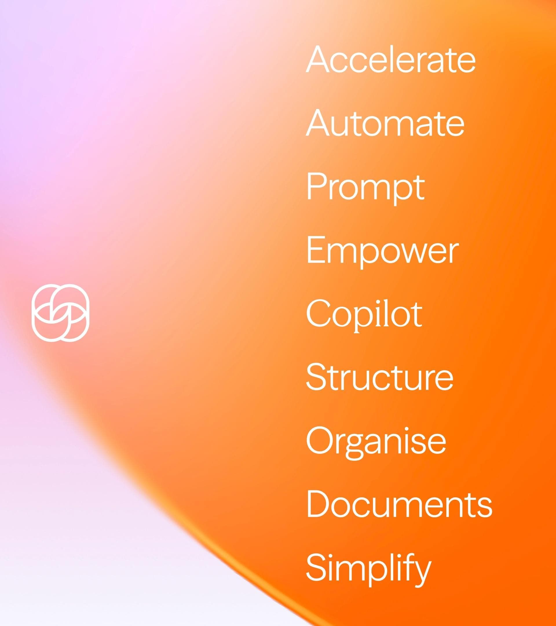
This design features a clean, modern aesthetic utilizing a vibrant diagonal gradient that transitions from soft pink to bright orange. The layout is minimalist, focusing entirely on a vertical list of action-oriented words, creating a sense of clarity and professional energy.
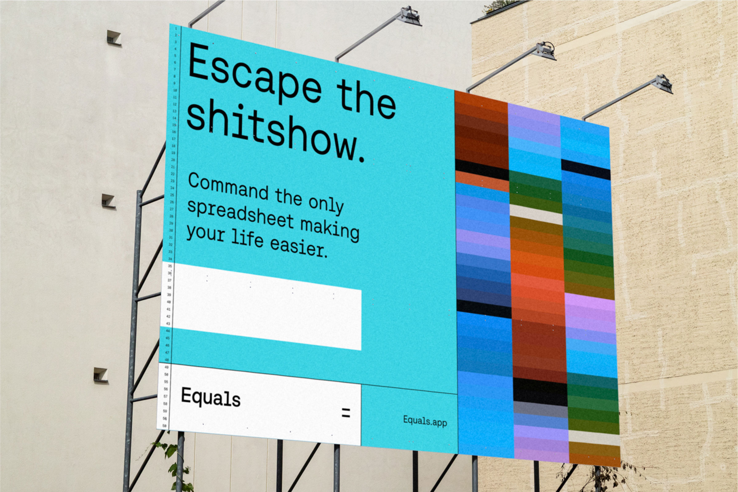
This design utilizes a clean, modern aesthetic with a strong contrast between cool blues and stark white space to convey professionalism. The visual language is direct and solution-oriented, using bold typography and structured blocks to promise efficiency and relief from complexity.
This image displays a series of mockups or screenshots, likely from a web or application interface, characterized by a clean, modern, and professional design aesthetic. The layout uses ample white space and a muted color palette punctuated by soft pastel circles for data visualization.
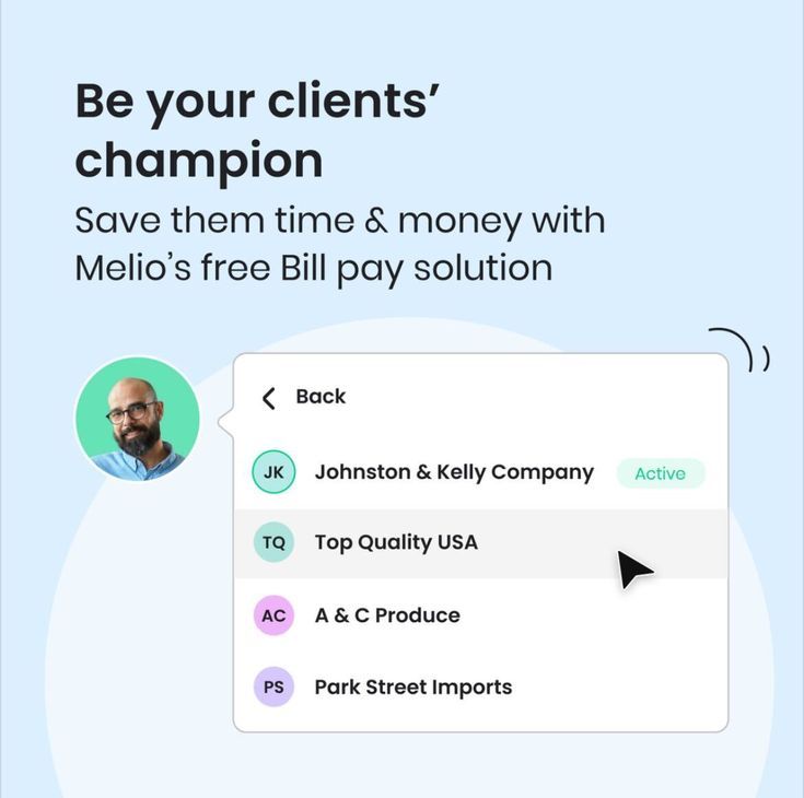
The image presents a clean, light-themed interface design promoting a business solution. It uses ample white space and soft pastel accents to convey a professional, approachable, and modern feel. The layout is simple, focusing on a clear headline followed by a list of client names.
The design employs a clean, minimalist aesthetic characterized by ample white space and subtle blue accents, creating a professional and trustworthy feel. The visual language is highly structured, relying on clear segmentation to present complex information effectively.
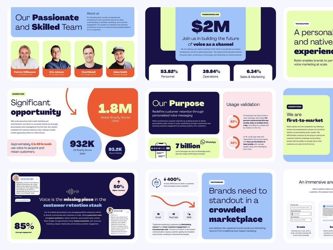
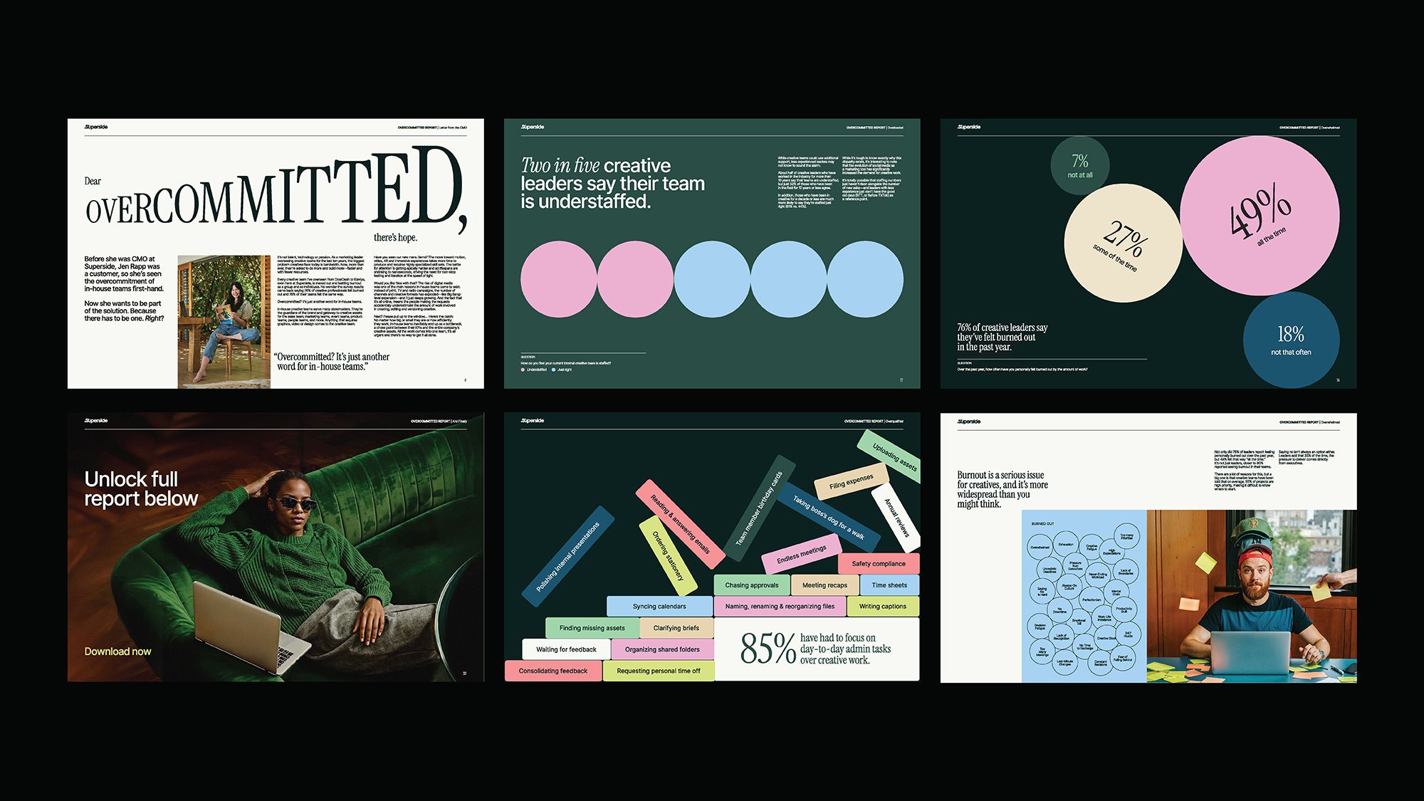
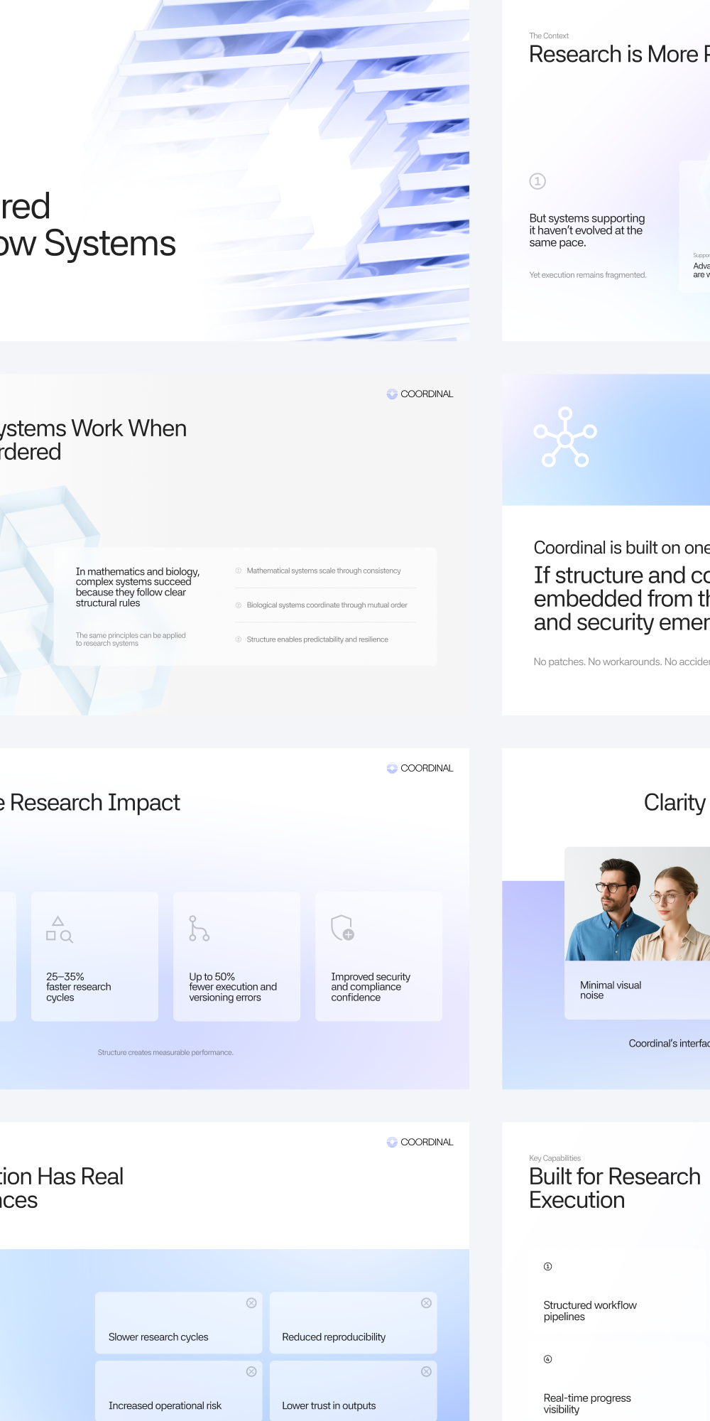
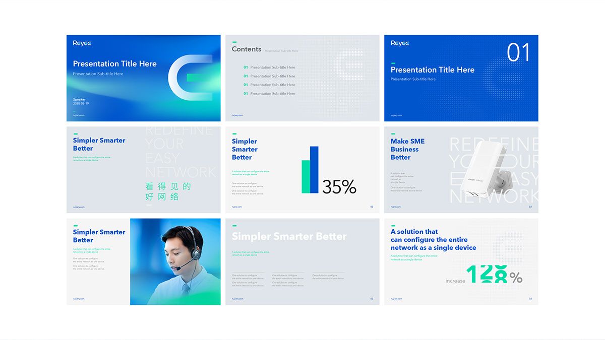
This image presents a collection of highly structured, modern business presentation slides characterized by strong geometric layouts and heavy use of corporate color palettes. The visual language emphasizes data visualization and clear hierarchical information to convey authority and opportunity.
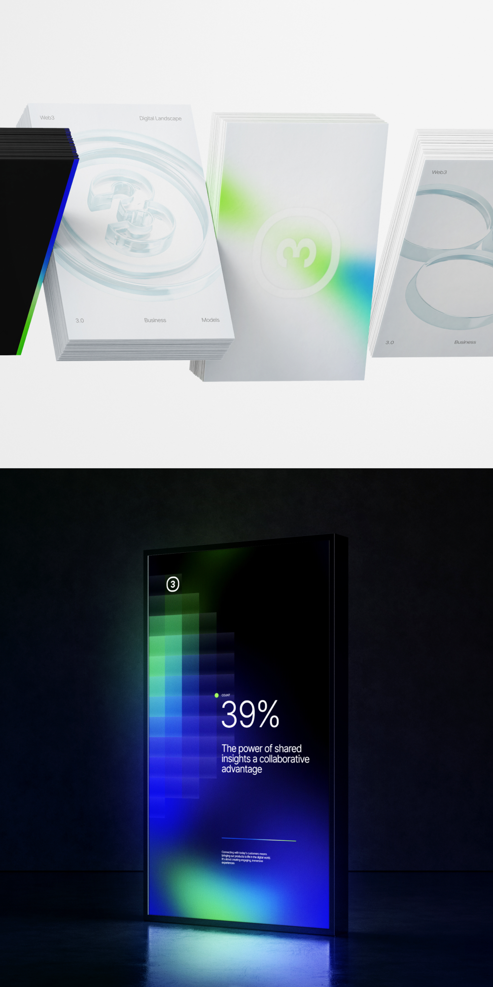
This visual features a juxtaposition of clean, bright informational cards against a deep, glowing digital display, establishing a modern and professional tone. The design effectively uses light and dark contrast to highlight key data points and concepts related to collaboration and insights.
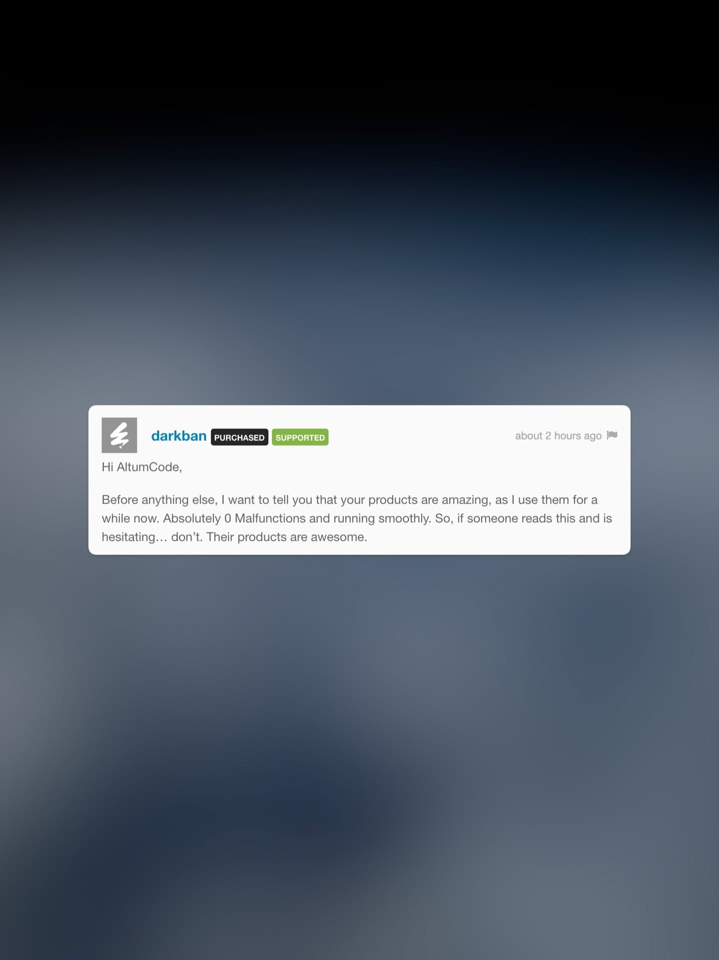
The design features a clean, modern interface utilizing a dark background contrasted by bright white elements to highlight key information and testimonials. The visual language is professional and trustworthy, focusing on clear communication of product support and positive user experience.
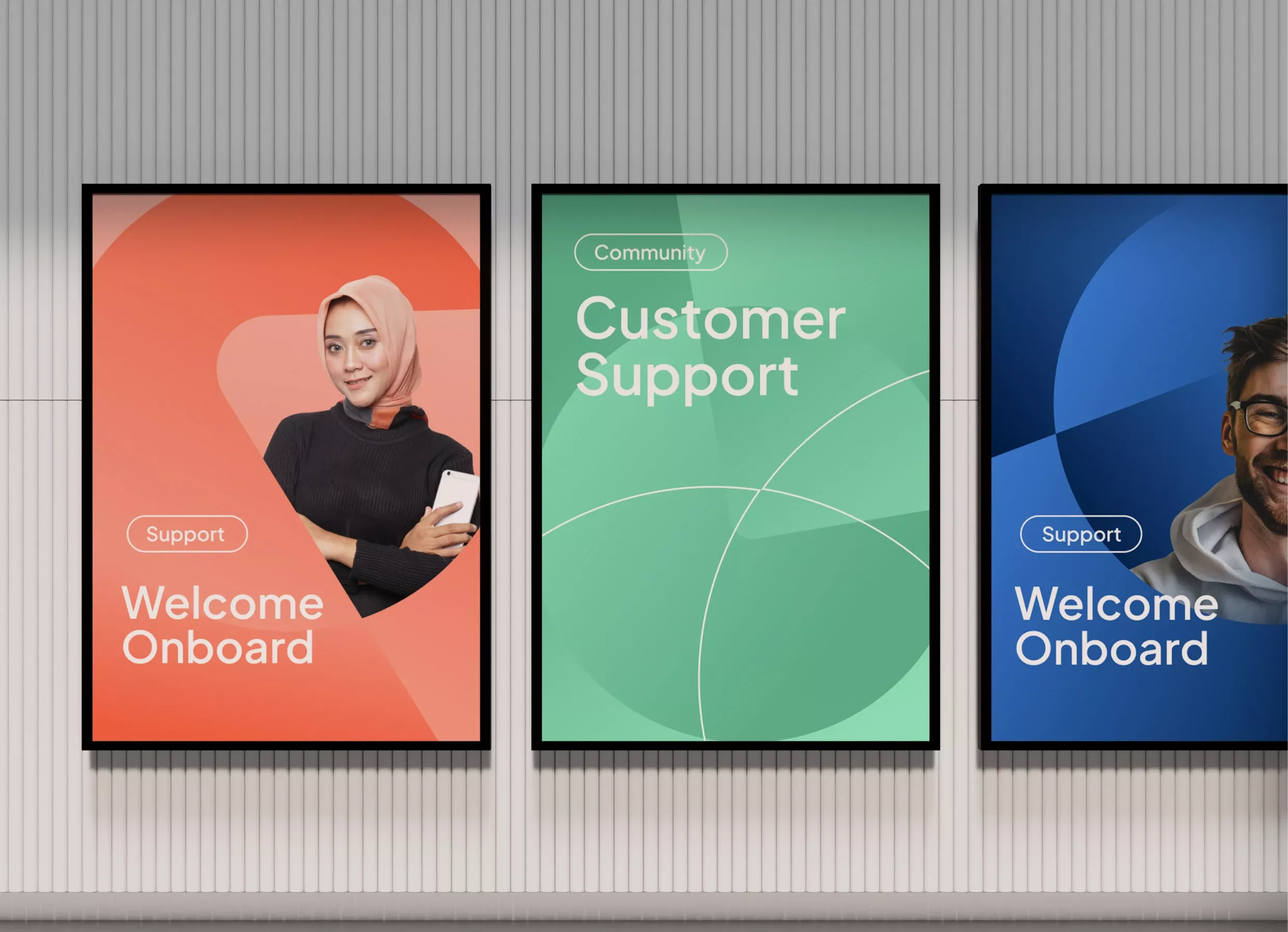
This set of visual panels employs a clean, modern aesthetic using bold color blocking and soft gradients to convey trust and approachability. The design effectively uses imagery and clear typography to segment different support services, creating a cohesive yet distinct visual language for user onboarding.
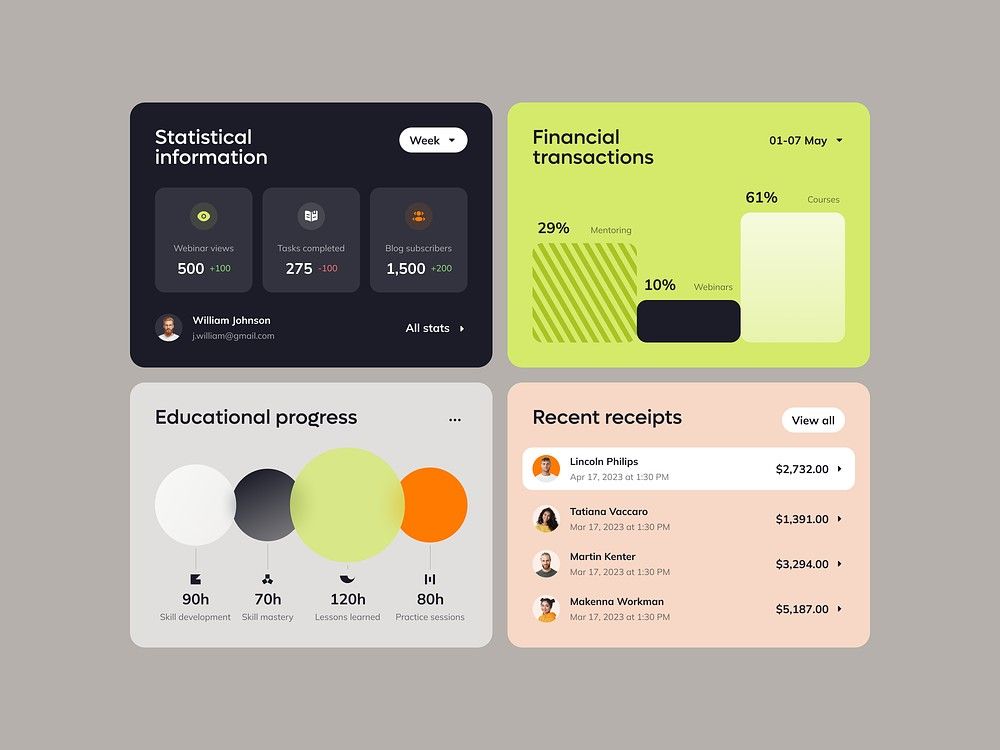
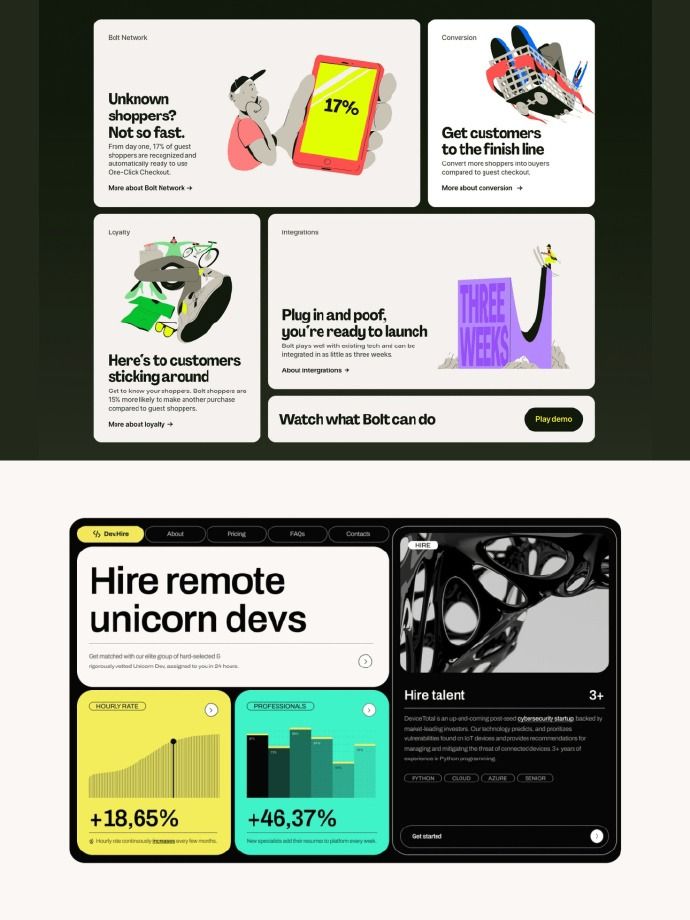
This image showcases a clean, modern dashboard design utilizing card-based layouts to present statistical and financial data. The visual language is minimalist, relying on clear typography and subtle color accents to ensure high readability and data hierarchy. The overall feel is professional, organized, and highly functional.
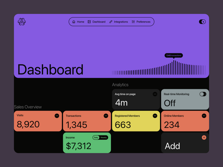
This dashboard features a clean, modern dark mode interface designed for clear data presentation. The design utilizes strong visual hierarchy through distinct color blocks and simple typography to make key metrics immediately accessible. The overall feel is professional, organized, and data-focused.
This presentation deck utilizes a clean, modern aesthetic characterized by strong blues and ample white space, conveying professionalism and technological competence. The design is highly structured, employing clear hierarchy through typography and simple data visualizations to present information efficiently.
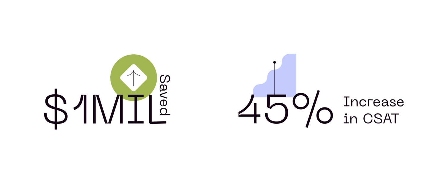
This design utilizes a clean, minimalist aesthetic to present key performance indicators (KPIs) clearly. The visual language relies on simple typography and a single, recognizable icon to convey financial savings and service improvement metrics effectively.
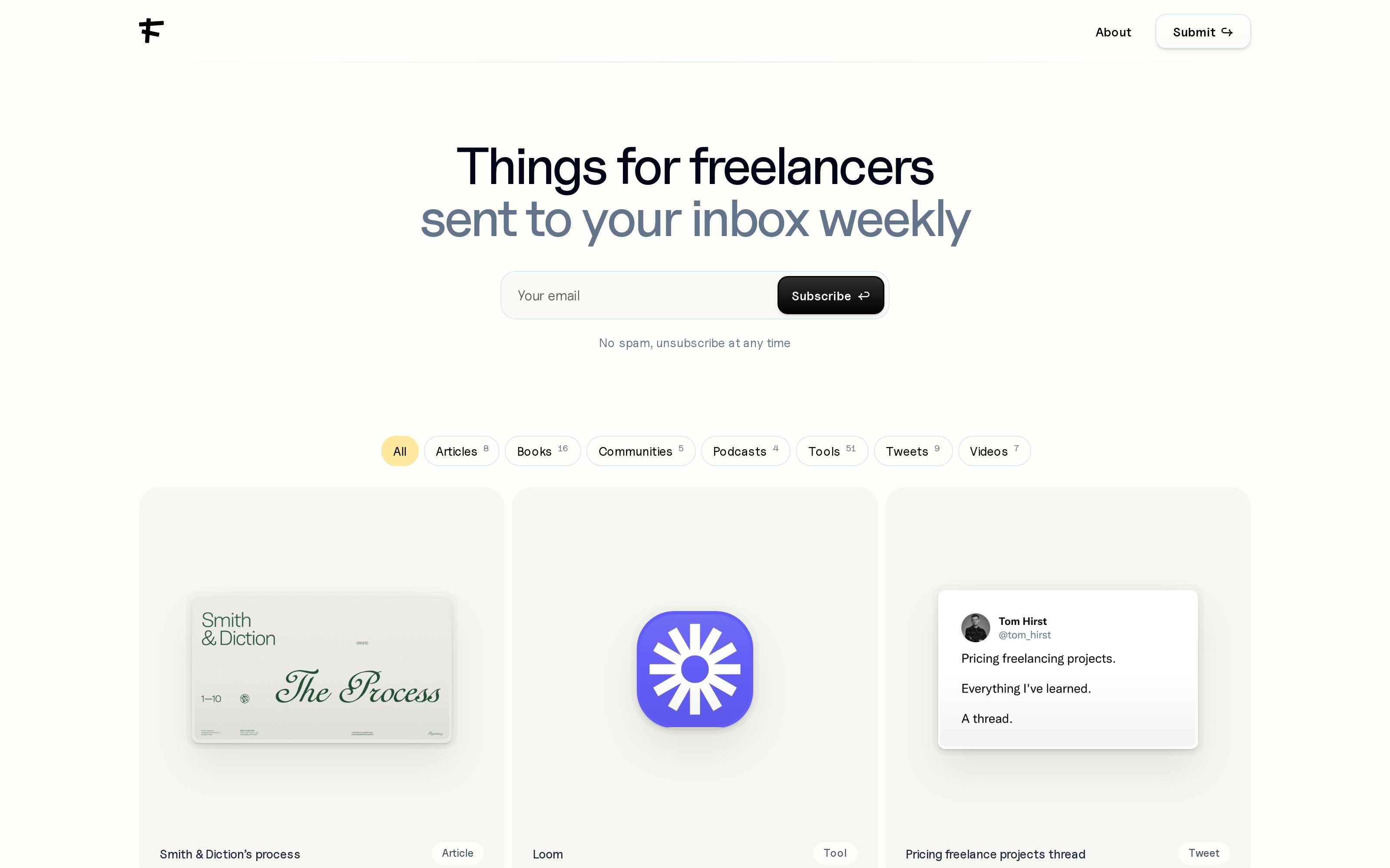
The design employs a clean, minimalist aesthetic characterized by ample white space and clear typography to focus the user on the subscription call-to-action. The visual language is professional and uncluttered, prioritizing readability and a modern, trustworthy feel.

The design exhibits a clean, minimalist aesthetic characterized by ample whitespace and clear hierarchical organization. The visual language relies on subtle shading and structured components to guide the user through various functional sections efficiently.
The design features a clean, modern dashboard aesthetic utilizing card-based layouts to present statistical data clearly. The visual language is professional and focused on metrics, employing ample white space to ensure high readability and a corporate feel.
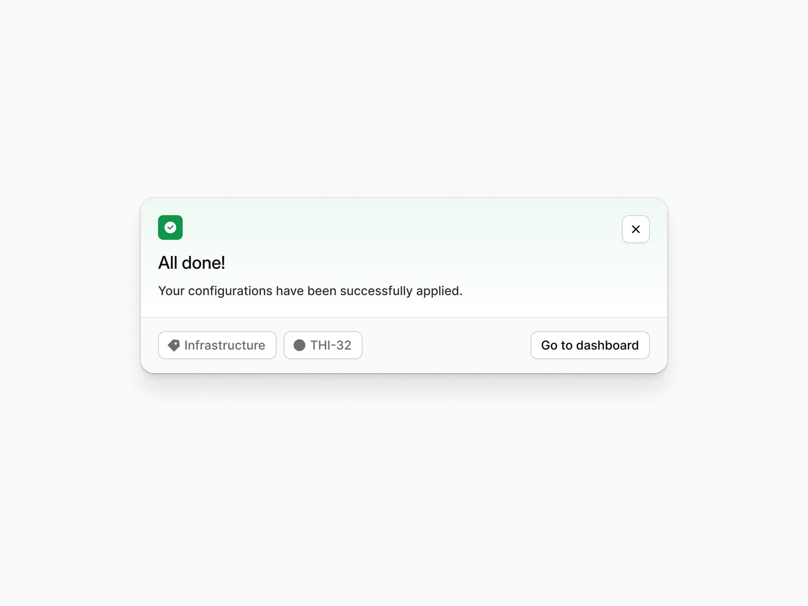
This is a clean, modern user interface component designed to provide positive feedback on a successful operation. The design emphasizes clarity and functionality, using ample white space to ensure the success message is immediately readable.
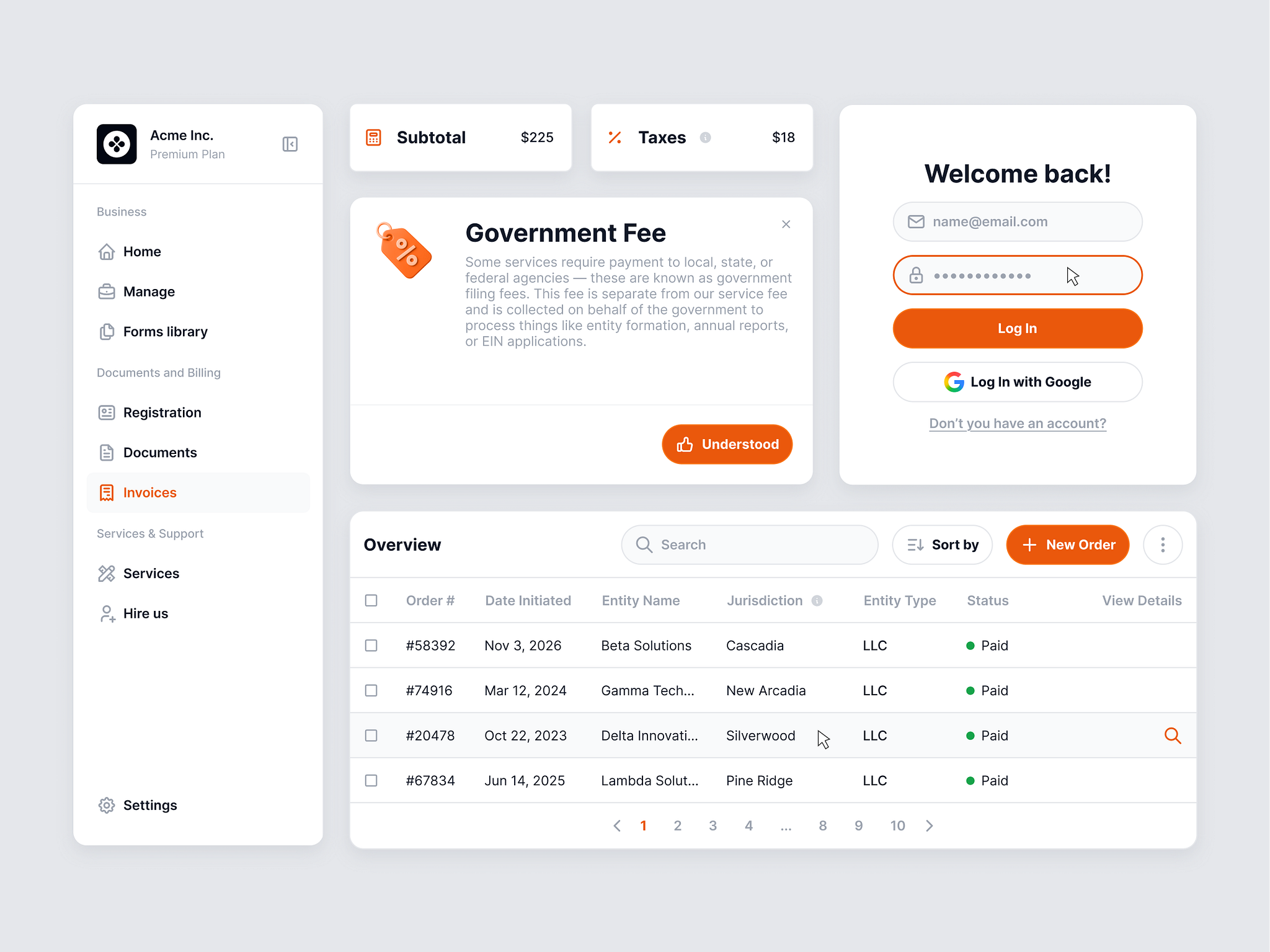
This interface features a clean, modern, and highly functional design typical of professional SaaS applications. The visual language relies heavily on ample white space and subtle gray tones to create a sense of order and professionalism. The layout is organized using clear cards and tables, ensuring that complex financial data is presented in an easily digestible manner.
The interface features a clean, modern, and minimalist design utilizing ample white space to ensure high readability. The visual language is professional and encouraging, focusing on clear information hierarchy through strong typography and simple graphic elements.